This long read is dedicated to cluster analysis and is aimed at beginners. In the article, you will find a simple explanation of cluster analysis of market volumes, its purposes and applications.
Additionally, in the article, you will find links to detailed guides and overview videos on setting up cluster charts in the ATAS platform.
What Is a Cluster in Trading?
Broadly speaking, clustering involves taking something as a whole and grouping its parts into clusters based on a specific attribute.
In case of stock market analysis, the whole entity is the price chart, more precisely, the candlesticks.
Clusters are created based on price levels and time.
Example. The screenshot below shows two charts of the E-mini S&P 500 index futures, both with a 5-minute timeframe:
- On the left, there is a regular candlestick chart. It provides information about the opening and closing prices of the candle, as well as the highest and lowest prices within the candle formation period.
- On the right, there is the same market, but in the form of clusters. The numbers represent volumes in trades that were made at each price while the candle was forming. Two numbers form one cluster, where the first one indicates the volume of a sell trade and the second one of a buy trade.
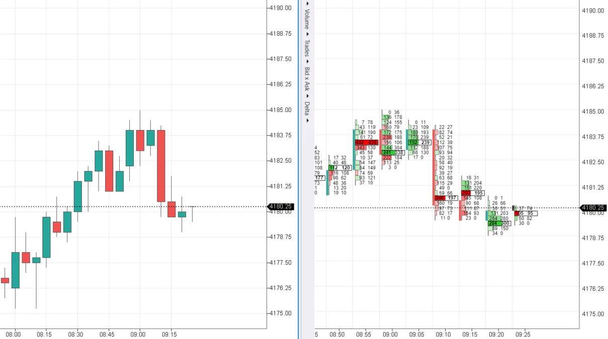
When a candle as a whole is clustered based on price levels, we get a cluster chart, also known as a footprint. It displays the market in much finer detail than a regular candlestick chart. It offers valuable insights into trading dynamics, giving you a competitive advantage over other traders.
The screenshot shows another example of a trading cluster (indicated by an arrow).
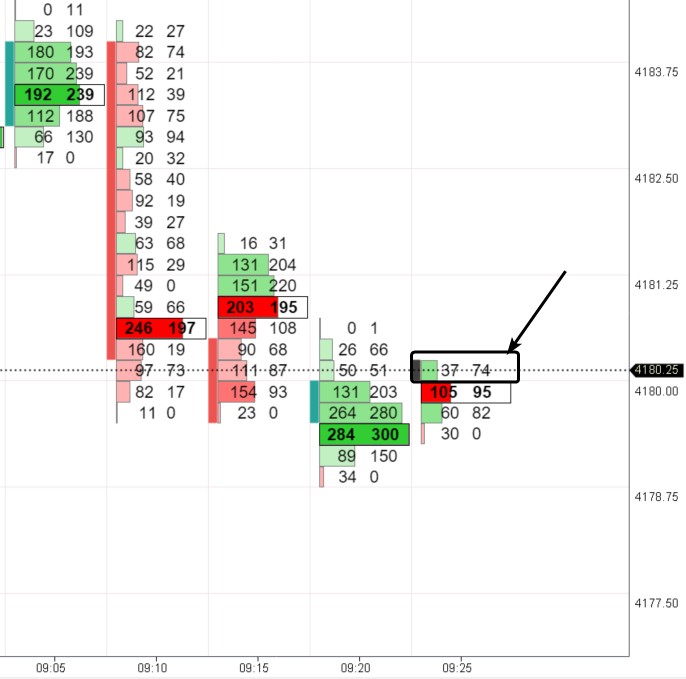
The cluster gives the following information: 74 contracts were bought, and 37 were sold at the price of 4180.25. Since the candle has not closed yet, the numbers inside the cluster can change.
Cluster analysis involves studying these clusters within candles to assess the course of exchange trading in the past and make a forecast for the future.
Special Features of Cluster Analysis
Market cluster analysis allows you to observe participants’ activity even within the smallest price bar (candle). It is the most precise and detailed way to obtain market information – you see the precise distribution of trading volume at each price level of the asset.
To create a cluster chart, complete information about each trade is required:
- the exact time when the trade was made;
- volume: the number of contracts/coins of the trade;
- direction: market buy + limit sell or market sell + limit buy.
For conducting cluster analysis, you need:
- high-quality and comprehensive raw data;
- connection to the exchange to receive real-time data;
- software for creating and analyzing cluster charts. The ATAS platform is the best choice since it is developed as a professional solution for analyzing trading volumes.
Settings of Cluster Charts
To get started with cluster charts:
- download ATAS;
- launch the platform and open the chart. To do this, click the Chart button in the main window and select the desired trading instrument. When the chart opens, the data will be automatically downloaded from the ATAS servers;
- switch the opened candlestick chart to cluster display mode. To do this, press Shift+K or drag the candlestick chart along the time scale with the mouse.
Please note! When the chart switches to cluster display mode, a menu for selecting types of cluster charts will appear on the left.
Cluster charts are divided into four categories of your choice:
- Cluster charts are divided into four categories of your choice:
- By Volumes – trading volumes will be displayed in clusters in different variations;
- By Trades – the number of trades will be displayed in clusters in different variations;
- By Bid/Ask – information about trades on bids and asks will be displayed in clusters in two separate columns;
- By Delta – delta information will be displayed in clusters in different variations.
ATAS offers unparalleled options for configuring and customizing market cluster analysis charts.
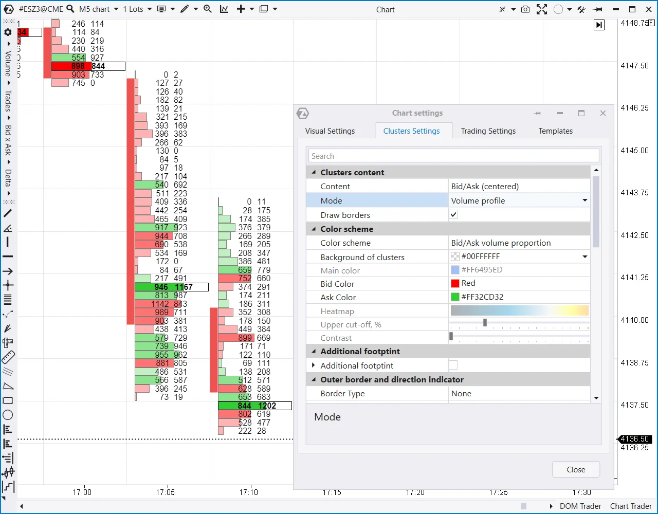
To configure a cluster chart, press Ctrl+S. Alternatively, you can access the Chart Settings window through the context menu or by clicking the icon in the top menu bar of the chart and selecting the Clusters Settings tab.
The screenshot above shows an example of settings:
- The display of Bids and Asks in volume profile mode is selected in the Clusters Content section. You see two columns of numbers and a histogram: the higher the volume in the cluster, the taller the bar on the histogram.
- In the Color Scheme section, the visualization of the chart is configured: the color of the histogram bar (red or green) displays the predominance of Bids and Asks. The greater the predominance, the brighter the color.
By combining content, modes, and color schemes, you can create over 440 different variations of cluster charts.
Detailed information about cluster charts, their types, and settings can be found in the review article Possibilities of Cluster Charts. Next, we will discuss their practical application for analysis and making trading decisions.
How to Analyze Cluster Charts
Let’s go over what cluster analysis is for beginners once more. Imagine a soccer match where teams are wearing red and green jerseys. One team attacks, the other defends, and then they switch roles. If one team is stronger, their advantage leads to goals (price shifts in their favor). If the team is weak, it gets trapped offside (price traps, false movements).
The game might seem like players chasing after a ball for someone uninterested in soccer. But for soccer fans, the game is filled with a deep understanding of tactical moves and strategic significance.
Similarly, understanding the movements of red and green market indicators (representing sellers or buyers) allows you to anticipate future price movements.
In this example, sellers predominated at the bottom of the candle. This is clear from the numerical imbalance in the left column, i.e., the number of contracts sold.
But why did the price close above the selling levels?
It is possible that stop-losses were placed below the 4150 round level. A major player, who was anticipating an upward movement, absorbed liquidity and formed a long position with these contracts.
But in which direction will the price move next? ‘The score on the board,’ or in our case, the answer lies on the chart:)
Assessing the interaction between price and volumes (or other information) within the clusters is crucial. In doing so, the following principles of logic are applied:
- the principle of effort and result: trading volume is regarded as effort, and subsequent price movements are seen as the reaction or result of the applied effort;
- the principle of cause and effect;
- the law of supply and demand;
- the principle of ‘the majority usually loses’.
Let’s have a look at a few examples from different timeframes.
Example 1. A price decline on the E-mini S&P 500 chart
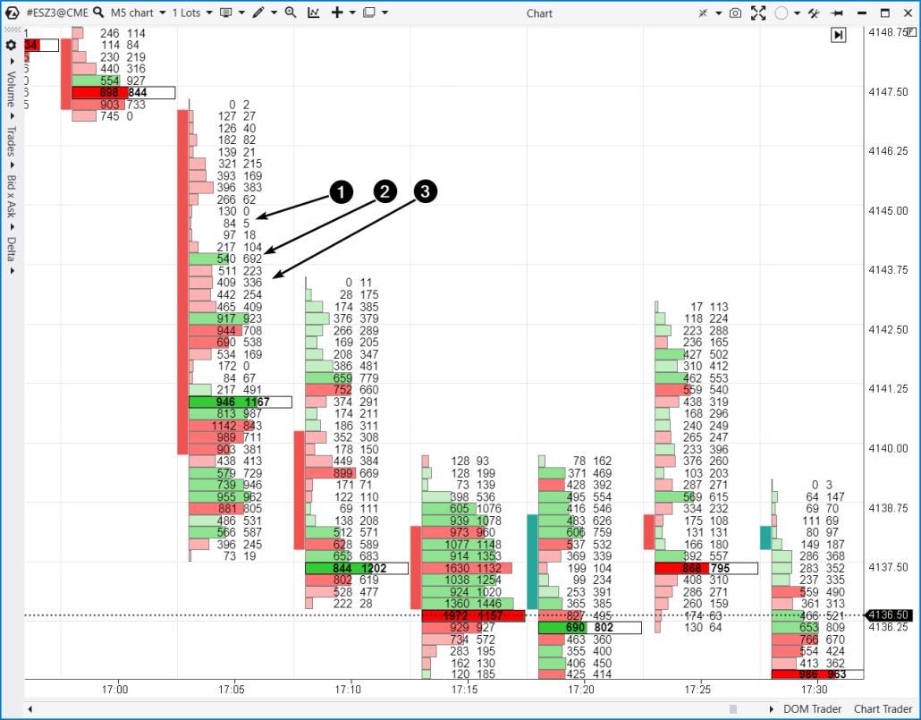
Numbers indicate:
- A narrow profile. Clusters indicate that sellers had an undisputed advantage. A very small number of market orders were executed for buying, with most orders being market sells.
- At this level, buyers attempted to stand up to the pressure from sellers by forming a defensive line against the attacking team in red jerseys. This is evident from the 692 purchased contracts. The attempt was unsuccessful…
- …the price continued to fall, and sellers had the upper hand for four consecutive levels below.
- Thanks to the information ‘from the heart’ of the candle, an analyst can speculate if the price rises towards the 4143 level, it will encounter resistance – clusters indicate the presence of solid supply forces there.
- Another factor to consider. If 692 contracts were purchased at point 2, buyers would be eager to sell them without incurring losses (if market conditions permit). Hence, point 2 becomes a resistance level where sellers will likely be active.
- The candles at 17:10 and 17:25 offered chances to enter a short intraday position, providing a modest ‘profit’ until reaching the level where 692 contracts were bought. The market did not leave the battlefield unscathed.
Example 2. E-mini S&P-500 chart, 4-hour time frame
The screenshot below proves that cluster market analysis can be applied for higher time frames, too.

At the 18:00 candle, a strong cluster block formed on the left side of the chart. It indicated buyers’ dominance:
- more than 12 thousand contracts were purchased;
- the price closed significantly higher.
As the price approaches this block, it is reasonable to expect a bounce in the following candles. Buyers will defend their level. Or perhaps the market might just rattle those who bought contracts and hurried to relax (or moved the position to breakeven).
The chart shows two similar instances of the price approaching the specified level. These data provide an opportunity for a long entry and confirm the legitimacy of cluster analysis. What other analytical tool will allow you to see the level so accurately?
Example 3. E-mini S&P-500 daily chart
Below the chart, several levels are combined using the Scale tool, which is located at the top right of the panel, just to the right of the Chart label.
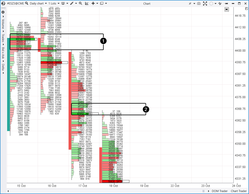
The clusters show that the primary trading volume occurred in the narrow upper part of the candle (1) on October 15th. The following scenario is possible: initially, some positive news was published, and market participants hurried to buy contracts. However, their enthusiasm likely collided with a substantial wall of limit sells – trading was active, but the price did not fluctuate significantly.
The maximum volume shifted downwards the following day, which was a bearish sign. However, the situation seems more optimistic in traditional candlestick analysis: the high and low are higher, and the bearish candle’s body is not very wide. The positive sentiment sparked by the news on October 15th began to fade, and the overall market atmosphere turned more bearish. Buyers attempted to use the 4368.75 level, where they had succeeded the day before, and on October 16th, this also brought some success.
On October 17th, things took a different turn. The high-volume area (1) acted as resistance. The narrow cluster profile suggests that trading was relatively inactive, likely due to a lack of buyers. However, quite a few buyers were around the lows on October 16th. Perhaps they found the price attractive, but the closing happened in the lower part of the candle, significantly below the levels of clusters with maximum volumes (2).
On the following day, October 18th, the levels of trapped buyers acted as resistance. In other words, the support at the lows of October 15th-16th started to function as resistance – the principle of mirror levels in trading came into play.
Cluster Analysis of Cryptocurrencies
Cluster chart analysis for the cryptocurrency market does not differ from analyzing traditional futures in stock markets.
The only difference is that cryptocurrencies can form clusters with large numbers inside if the coin’s value is a fraction of a dollar or even a cent. In such cases, the Clusters values divider parameter can be helpful, making the clusters more readable.
Apart from this, the analysis process and applied principles remain the same, as demonstrated above.
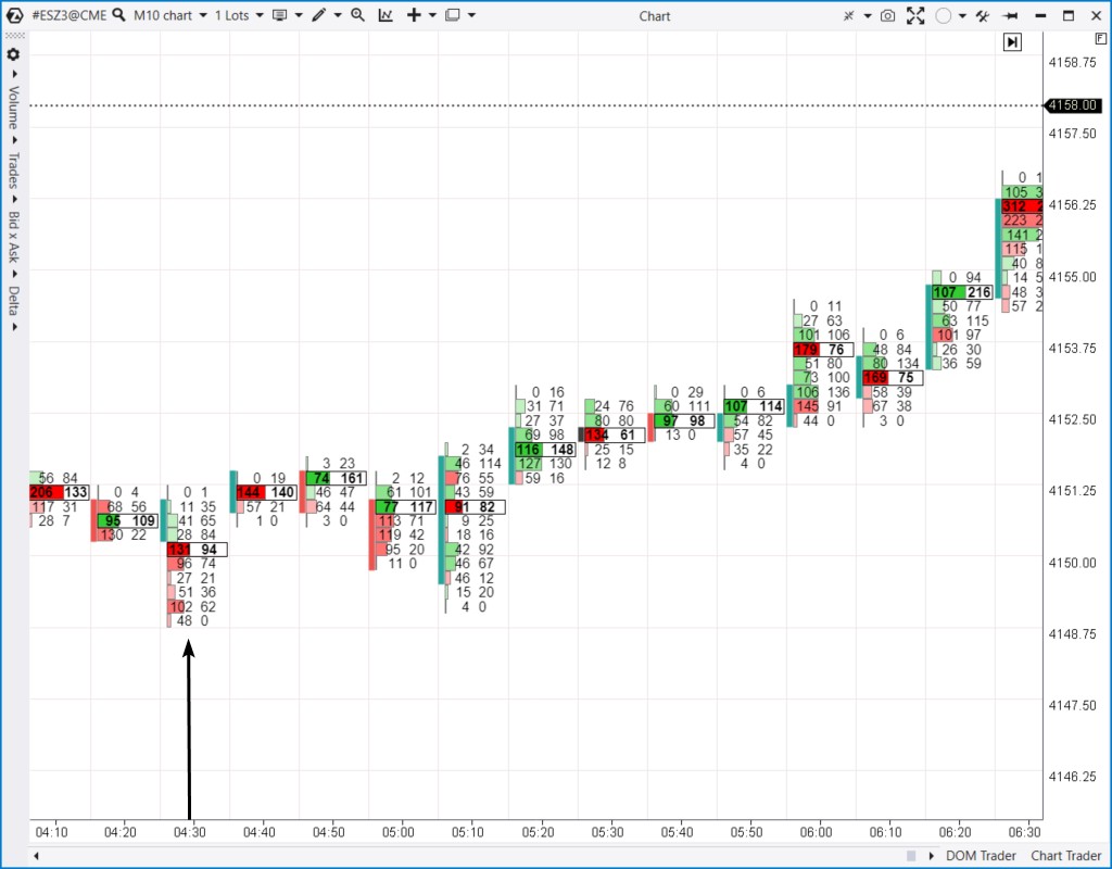
Example. Cluster analysis of the PEPE crypto coin on a 10-minute chart
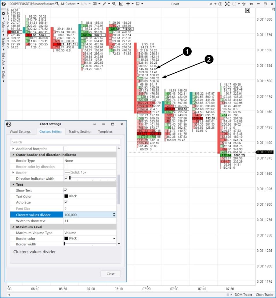
Arrows indicate:
- Sellers’ dominance when approaching the support level of 0.00115, after the price was temporarily balanced between supply and demand.
- Buyers attempted to counter the selling pressure, hoping for a rebound from a relatively round level, but they failed.
The ‘trapped buyers’ bulge marked a reference point for the resistance level, testing the bearish breakout level.”
How to Trade Using Clusters
Cluster trading results in making informed and thoughtful trading decisions.
Interpreting cluster charts is a meticulous task that involves forming an independent perspective. There is room for creativity here, such as drawing channel lines or applying technical analysis patterns (head and shoulders or double bottom).
A trading plan based on clusters should always include risk management. However, clusters themselves assist in reducing potential losses – they crystallize the most critical levels on the chart to which the price will react.
The literal sense of footprint is a mark left on a surface. Analyzing clusters is like following the traces left by market participants on the chart. To accurately determine the direction they may take in the future—upward or downward—it is essential to practice first on a demo account or in a simulator.
Let’s have a look at a 4-hour footprint chart from the Euro futures market. On the left side is October 26, and on the right side is October 27. Additionally, the chart includes the Big Trades indicator (circles) and Cluster Search, which highlights clusters in pink based on specified criteria.

If you want to trade based on clusters, you can use a classic approach: outline a daily plan on the higher timeframe and seek confirmations for position entries on the lower timeframe.
The 4-hour clusters indicate that highly effective trading occurred around the 1.0555 level (which indicators confirm). As a result, the test of this level the next day confirmed a significant rebound.
The footprint of the lower timeframe will help confirm the approach of the price to the clusters of large volume and choose the entry point for a long position (below is the 10-minute timeframe):
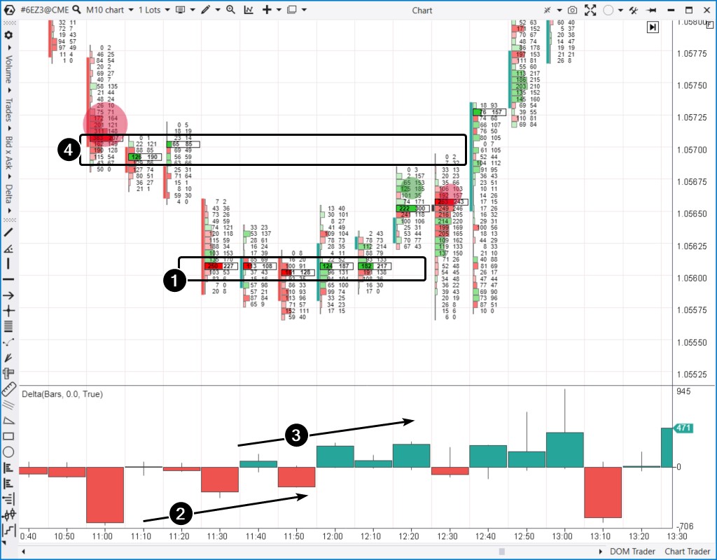
The chart illustrates:
- Sequential formation of significant clusters at the 1.056 level (1). Around this level, the market finds a balance between supply and demand.
- As selling pressure on the delta indicator diminishes noticeably (2) and a rise in market buyer activity (3), it provides solid grounds for entering a long position on a rebound from the zone of significant clusters from the previous day.
- However, above it, you can see a critical resistance level at 1.057, where large clusters formed, and a Big Sell occurred (indicated by the red circle at 11:00). It was only natural that sellers attempted to seize control (as indicated by the red Big Sell circle at 12:30). Yet, the support at 1.056 held firm, serving as the foundation for a notable intraday trend.
We cannot provide specific recommendations on how to trade in this situation because each participant has their own style, risk tolerance, and individual circumstances. Nevertheless, with footprints, you can interpret the evolving history by using various timeframes and the data within the clusters.
Pros and Cons of Cluster Analysis
Pros of Cluster Analysis
- It enables you to evaluate the balance of supply and demand in dynamics, i.e. to understand the reasons and anticipate the direction of subsequent price movements.
- The data is received in real-time.
- It is applicable across different timeframes and markets.
- It can be combined with other analytical methods. For example, you can combine cluster analysis and breakouts of important technical analysis patterns.
Cons of Cluster Analysis
- The pieces do not always fit together perfectly. It is naive to assume it is an easy way to make a lot of money in the market quickly. Analyzing cluster charts is a meticulous task and can lead to incorrect conclusions. It is not about how often you are right or wrong but how much you lose when you are wrong and how much you earn when you are right. That is why risk management is essential!
- Cluster analysis is dependent on the quality of the data source. You cannot create clusters based on the commonly used OHLC+Volume data format.
- Specific software requirements are necessary.
Cluster analysis is always subjective. It can be a disadvantage but also an advantage when you hone your skills to develop your independence and expert judgment.
FAQ
What are cluster volumes?
What does cluster analysis show?
Is conducting volume cluster analysis a must?
What is a cluster in cryptocurrency?
ATAS Capabilities for Cluster Analysis
Working with cluster charts on the ATAS platform provides significant advantages:
- Visualization settings. All cluster charts offer various customization options for fonts, colors, and gradients. ATAS platform is highly flexible, allowing you to create unique and personalized cluster charts.
- Large volume detection. By default, ATAS highlights the largest clusters within a candle as they are relevant to many market participants and can significantly influence the price in the future.
- Indicators. To help you with the cluster chart analysis, ATAS offers the Cluster Search indicator with multiple search criteria and cluster highlighting options that may interest you.
- Variability. By combining different content within clusters and using various settings, you can create unique cluster charts tailored to your market perspective and trading strategy.
- Work organization. ATAS allows you to organize workspaces, save cluster chart settings as templates, ‘merge’ cluster charts, and use other features for a more productive workflow.
- Reference materials. The blog and Knowledge Base contains specific instructions on working with and configuring cluster charts for cluster analysis.
- Market Replay. You can configure the Market Replay to replay historical data and practice interpreting cluster charts as if in real-time.
It is worth mentioning the capability to develop custom tools — indicators and automated trading strategies that can be connected via API. ATAS eliminates any limitations for analyzing cluster charts.
More information on cluster analysis:
- in the article: Combining Cluster Analysis and Volume Levels in ATAS
Conclusions
Using clusters in trading allows you to assess the dominance of buying or selling activity in the market. Cluster analysis enables you to track volumes within bars of any timeframe. This becomes especially crucial when approaching significant support or resistance levels. Analyzing clusters is the key to understanding the market.
The ATAS platform provides you with a powerful toolkit for cluster analysis of futures, stocks, and cryptocurrency markets:
- the main focus in the program’s development is placed on volume analysis indicators, including those for cluster charts;
- footprints can be created on regular timeframes as well as on range charts or charts of other types;
- the list of available indicators is constantly expanding with each ATAS platform update;
- ATAS enables you to load tick data history from futures, stocks, and cryptocurrency markets, providing you with a comprehensive foundation for studying cluster charts;
- the platform offers many other advantages for traders who combine professional-level cluster charts with useful indicators and other features.
Download ATAS. It is free. During the trial period, you will get full access to the platform’s tools to experiment with the DOM and footprint charts. Moreover, you can continue using the program for free even after the 14-day trial period is over, whether it is for cryptocurrency trading or volume analysis.
Do not miss the next article on our blog. Subscribe to our YouTube channel and follow us on Facebook, Instagram, Telegram, or Twitter, where we publish the latest ATAS news.
Information in this article cannot be perceived as a call for investing or buying/selling of any asset on the exchange. All situations, discussed in the article, are provided with the purpose of getting acquainted with the functionality and advantages of the ATAS platform.