Why do professional traders pay so much attention to the trading volume? What is behind the Volume indicator? Why is the volume analysis important? We will try to answer these questions in this article in the popular-scientific form.
If you have never used the volume, you would, most probably, wish to try to include it into your trading system. You will definitely have some ideas on how to improve your efficiency after you read this article.
A specific feature of the simple Volume indicator
The absolute majority of the technical analysis indicators (MA, MACD, Stoch, RSI, BBands, CCI and hundreds of others) use previous price values in their calculations.
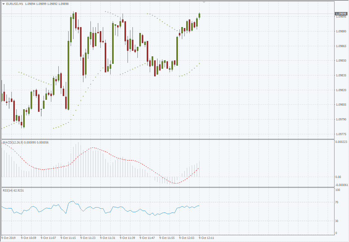
The picture above shows examples of indicators based on price values (screenshot from MetaTrader).
The Volume indicator is a completely different story. The specific feature of volumes is that they do not use the price and are not its derivative. Volumes do not pass through formulas and are delivered to the terminal:
- in tick terms (each tick represents 1 executed trade);
- in absolute terms (a number of executed trades);
- in money terms (a sum of the costs of executed trades).
The first volume type – tick volume – is well-known mostly to MetaTrader users. The volumes in the absolute and money terms are real volumes of the trades, which are provided by official exchanges in real time.
Advanced volume indicators
Growth of computing capacities of personal computers made it possible for everyone to conduct a professional volume analysis with the help of specialized platforms.
Check what it can do:
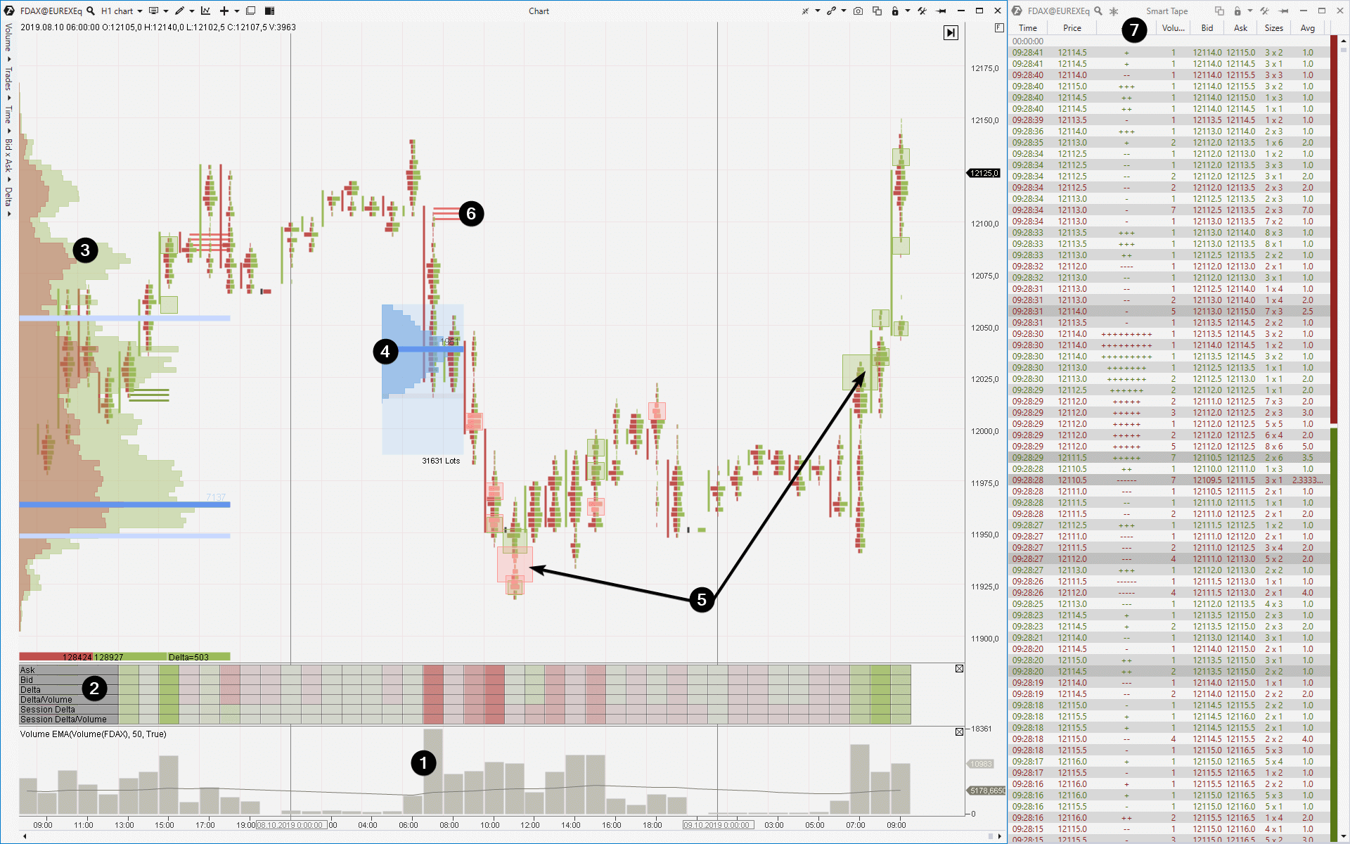
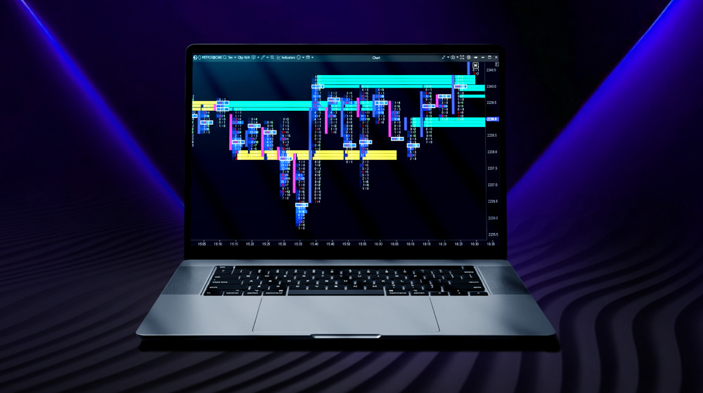
It is a FDAX futures price chart with a 1 hour period. The chart type is cluster or footprint . The footprint variant in the chart shows coloured clusters instead of traditional candles: green clusters are buys and red clusters are sells. A wider cluster shows more trades. Convenient, isn’t it?
Now let’s look at the chart more closely. The numbers show:
- A traditional trading volume indicator per unit of time.
- Cluster Stat, which gives the complete statistics by volumes. For example, Delta is a difference between buys and sells. The data are visualized with colours, but if we change the scale we would be able to see numeric values.
- Market Profile (or horizontal volumes) for one week. It is possible to select any period of time) with a breakdown into buys and sells.
- Arbitrary profile. ATAS immediately builds horizontal volumes for any part of the chart, which you select by the mouse.
- Big Trades indicator. It marks major buys (green) and sells (red). Set Big Trades Alert and you will not miss a major volume trade. Besides, the right arrow points to major volumes of buys when the resistance, which you can see in the arbitrary profile in point 4, is broken.
- Imbalance indicator. It shows disbalances between buys and sells in clusters.
- Smart Tape allows to analyze all (or filtered out) trades in the course of their execution on the exchange.
We’ve just briefly outlined what progressive methods of the volume analysis could do. Do you realize that we’ve just had an insight into a new universe, which differs from the one drawn by classical indicators? The volume analysis brings us closer to trading on the basis of real market mechanics.a
And now one more argument in favour of using volumes.
Volume analysis and the Law of Demand and Supply
Look at the picture below. It is a graphical interpretation of the Law of Demand and Supply. Perhaps, you saw such a chart when you were a senior student at a high school or junior student at a higher economic school.
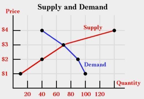
It seems like a very simple picture for beginner theoretical economists.
- Blue line is the Demand curve.
- Red line is the Supply curve.
- Intersection of the curves is the Equilibrium point or fair price.
- Price is the price axis.
- Quantity is the axis of a number of bought/sold commodities/services.
However, this simple picture is meaningful. Dependencies of Demand (a wish and readiness to buy) and Supply (a wish and readiness to sell) are a cornerstone and sacred truth, which is the foundation of any commercial trading, including trading on the exchange.
A reader of the article called Volume Analysis may ask: “What has the volume indicator to do with it?” Just look at the Quantity axis. In fact, it shows the value of trading ACTIVITY, which is transmitted through the volume indicator.
While the picture above is a two-dimensional projection of the demand and supply interaction, the typical chart of an exchange trader is a three-dimensional projection, since the Time axis is added to Price and Quantity.
- price
- and trading volume
- in time.
And now we have a fertile ground for analysis of the demand and supply dynamics based on the interaction of the values of price and volume in time.
Advantages of the volume analysis
Note that a trader who analyzes the volume doesn’t have to consider fundamental factors, track expert forecasts and process other additional sources. All the necessary information is already in the chart: time, price and volume.
This is the advantage of the volume analysis – the chart is a sufficient source for making conclusions regarding the forces of demand and supply and it provides all the necessary information in the form convenient for analysis. And it matters not what the motives are behind the actions of buyers and sellers – intersection of moving averages, deficit of demand in the overbought area, Trump’s tweet or ‘unexpected’ Flash Crash.
If a chart reader correctly interprets interaction of price and volume in time, he acquires the ability to act in harmony with strong players who rarely make mistakes. Major insiders already performed a correct fundamental analysis and their actions in the market (you can track them in the chart by volume splashes) lift the veil on their true intentions. The price and volume chart allows to do it.
The idea of the trading volume analysis
The idea of the trading volume analysis is reduced to the search for the most probable answers to the following questions:
- Why did the price move up (down) and the volume increased (decreased)?
- How much did the volume increased (decreased) when the price went up (down)?
- Why does the volume increase and the price doesn’t move?
- How did the delta (the difference between buys and sells) change?
- How did the price behave when an abnormal volume emerged?
- What happened after an abnormal volume emerged?
- and so on.
Thus, analyzing the volume and its interrelations with the price, a trader forms his own opinion about the change of the demand and supply balance. Figuratively speaking, he ‘reads’ the dynamics of confrontation between buyers and sellers from the chart in real time.
Consequently, well founded trading ideas are developed.
For example:
- The price grows slowly on falling volumes to the resistance level. The strength of buys is exhausted. It is a deficit of demand. A signal for selling since the current price is, most probably, higher than the fair one.
- The price falls slowly on falling volumes to the support level. The pressure of sells ‘dries out’. It is a deficit of supply. A signal for buying since the current price is, most probably, lower than the fair one.
- The price refuses to grow despite a big volume of buys. It means that a major player sells out the asset using sell limit orders. It is a signal for selling.
Here we touch the subject of the market rationality. Followers of this theory believe that the current price is always fair and the market automatically takes into account all factors of influence on the price.
However…
The Wall Street business is financing corporations and selling securities. The public has a comparatively weak understanding of their real value.
Richard Wyckoff
The market prices are formed in the minds of human beings and Errare humanum est (everyone makes mistakes). You will be able to understand that the price is far from being fair in the pivot extreme points if you study price and volume charts, especially the moments of buying and selling climax patterns.
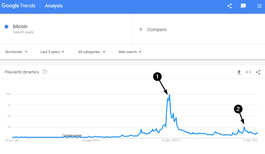
Abnormal splashes of volumes on the exchange are often accompanied with media activity. The current price, most probably, moves far away from the fair one at such moments. The picture above shows:
- The buying climax in the bitcoin market in December 2017 when the price quote reached USD 20 thousand per one coin.
- The recent buying climax at the end of June 2019 when they asked USD 13 thousand per one coin.
You can find more examples of situations when the current market price may differ from the real asset value in ‘Extraordinary Popular Delusions and the Madness of Crowds’ by Charles Mackay (by the way, the favourite book of the greatest speculator Jesse Livermore.
We already mentioned above the buying climax at the end of June 2019. Let’s analyze trading volumes at that period. Below is the footprint (what footprint is) from the BitMEX exchange with a 1D period.
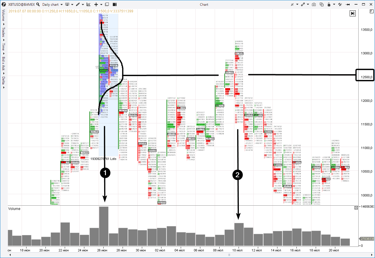
- The buying climax day. Surely it was accompanied with an avalanche of positive news in mainstream media. Note the buyers activity (massive green clusters) when the level of 12,500 was broken. If those green clusters were a true demand strength, why did then the bitcoin roll down so low in the next few days?
- July 10. Test of the level of 12,500. Note the clusters. There are ‘greenish’ buyers in a trap (these are traces of the stop loss activation). The main candle body are red clusters, which mean the sellers pressure.
Having compared facts in the price and volume chart, an analyst can make a conclusion that the market is not interested to move higher. It means that we should expect downward movement.
He can find a good entry point using the Smart DOM or Smart Tape data. This is how the trading on facts is carried out.
FAQ
How to use the Volume Indicator?
What types of volume indicators are there in trading?
- the vertical volume indicator is the most standard volume indicator, typically displayed as a histogram below the price area. Variants of vertical volume are derived by breaking down volume data into two components – buys and sells. Traders can then analyze indicators like Bid/Ask, Delta, and Cumulative Delta.
- the horizontal volume indicator is the market profile (or volume profile indicator). It is displayed within the price area as a layer above or below candle, sometimes positioned to the left of them. More details can be found in the article: How to Use Market Profile.
the indicator of a volume inside a candle is not exactly an indicator but rather a specialized chart type known as Footprint or cluster chart. Footprint enables the analysis of volumes within a candle, including breakdowns into buys and sells.
Which volume indicator is better?
Vertical and horizontal volumes complement each other, while the footprint indicator categorizes all traded volumes according to levels within candles. Install a platform for volume analysis, explore the capabilities of each indicator, and apply them according to specific tasks, combining them as necessary.
Summary
You need to find the point of support for trading on a long-term distance. The law of demand and supply, which lies in the foundation of price formation and reflects constant behaviour of people (ACTIVITY) in various market situations, could be (maybe even should be) such a reliable support:
- if the price moves too low, the majority of buyers would wish to buy, but only few sellers would agree to sell;
- if the price goes too high, the majority of buyers would not wish to buy, but the majority of sellers would gladly agree to sell;
- abnormal activity (extremely high volume) is a sign of panic sells or euphoric buys (the Fear Of Missing Out effect).
Analysis (reading) of the chart of the price and volume in time is an interpretation of the market mood or analysis of the changing balances of demand and supply in the sensitive financial markets.
The chart never lies.
Tom Williams
If there are no volumes in the chart, it is impossible to analyze demand and supply. The price chart without volumes is like a bicycle with one wheel. Yes, you can ride it as you can ski in the Sahara. But what do you need this experience for?