If you want to find online exchange charts in Google to learn about the USD or EUR exchange rates or current price quotes of stocks on MICEX (Moscow Interbank Currency EXchange), the search system will give you the answer in the search results in real time. You even will not need to go to other online-services to see the exchange charts.
Here’s what Google provides if you search for USD exchange chart online.
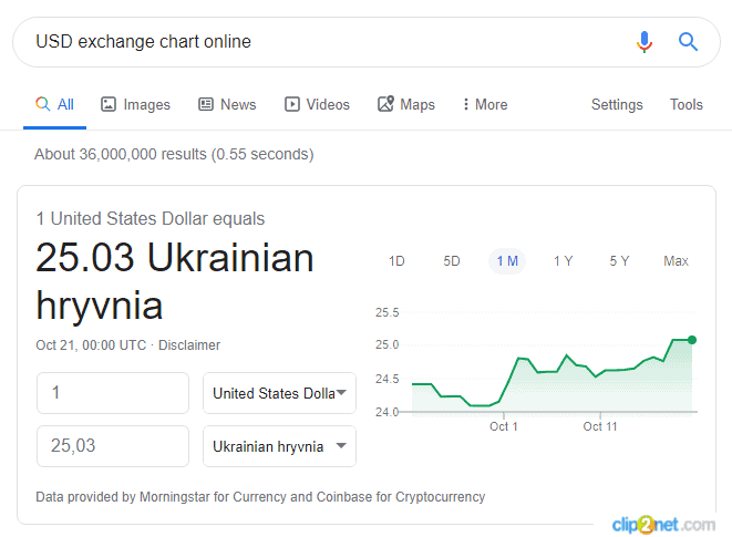
This chart type is called Line Chart or just ‘line’. It is represented by the green polygonal line in the picture above. The coloured area below the line can classify this chart type as Area Chart. Advantages of the line chart are its minimalistic presentation, quick download and simplicity. Its advantages end here.
The line chart is often used online to present current stock and currency prices in real time to the users.
If you need not just to learn about the current price but also to analyze the market in order to develop your own opinion regarding its strength/weakness/prospect, you’d better use other more professional chart types. We will speak about these chart types in this article.
Types of exchange charts:
- line chart;
- vertical line chart;
- candlestick chart;
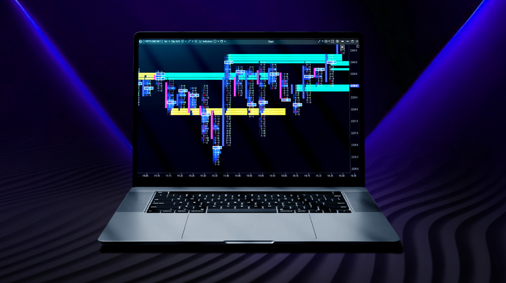
- cluster chart (footprint);
- time-independent charts.
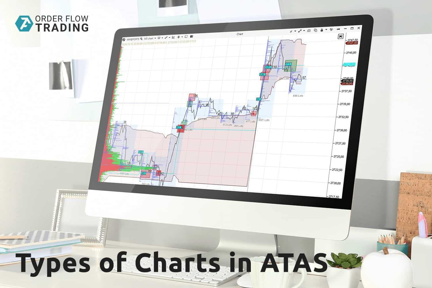
Let’s briefly consider each chart type. You will need to download a free test version of the professional trading and analytic ATAS platform in order to reproduce the charts we will show you below on your computer.
Line Chart
The line chart is just a polygonal line. Each interval reflects a trading result per unit of time (for example, 1 minute, 15 minutes, 1 hour and so on). Each point in the line chart is the price (closing price) of the exchange instrument at the moment of the end of the selected unit of time.
We started this article with a line chart. However, you shouldn’t think that line charts are used only online and only for providing information about current prices to the public. Professionals also use lines. For example, when there are many indicators on the screen, the line chart will help to ‘release the picture’ and make it easier to perceive information. Let’s look at one example.
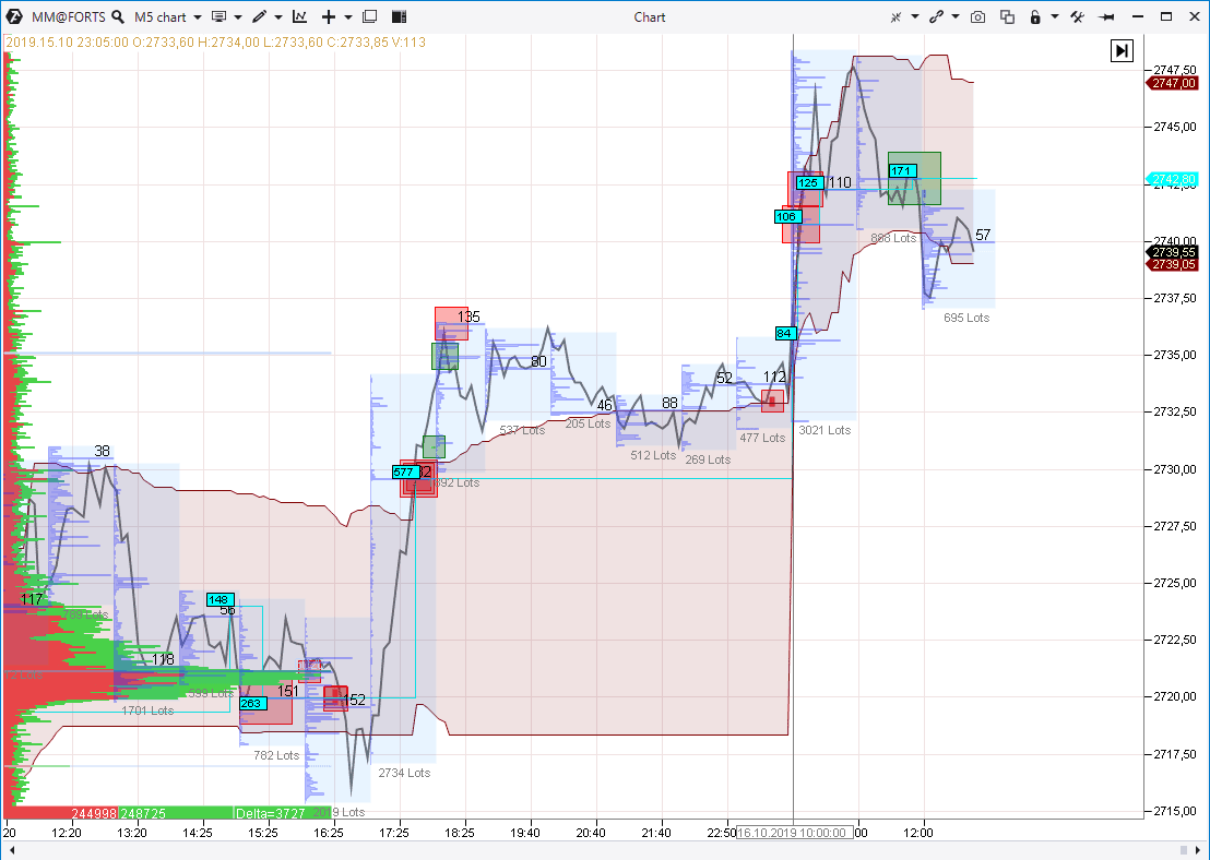
The picture above shows the MICEX stock index futures (what futures is) chart with 5-minute period. There are following indicators in the chart:
- general and hourly profiles (how to use market profiles);
- Big Trades indicator;
Dynamic Levels indicator.
The grey polygonal line shows the price changes. This type of the exchange chart helps to view hourly profiles better.
Vertical line chart
The vertical line chart differs from the simplest line chart in the fact that the bars contain information about the price dynamics for a selected period of time:
- Left small line is the instrument price at the moment of the beginning of the period.
- Right small line is the instrument price at the moment of the ending of the period.
- Vertical line is the price range from the low to high for the selected period.
The vertical line chart emerged with the development of Western markets. It was standard for the Wall Street in the first half of the 20th century. The picture below shows an original illustration from the Richard D. Wyckoff Method of Trading and Investing in Stocks.
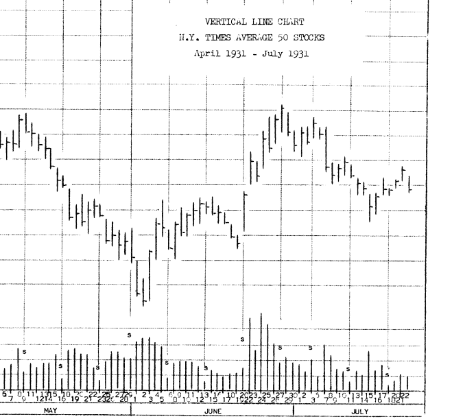
Vertical lines in this example do not have the opening price (a small line to the left). These vertical lines are called HLC bars (built by High, Low and Close prices). They will become OHLC bars (built by Open, High, Low and Close prices) if we add the opening price.
Candlestick chart
The candlestick chart originates from Japan. As with vertical lines, the candles provide information about the price dynamics for a period of time but in a slightly different form:
- the opening and closing prices form the candle body;
- the high and low prices form the candle shadows.
Market analysts use candlestick patterns for assessing and forecasting. We wrote about it in the following articles:
- Candlestick patterns. How to increase accuracy of candlestick patterns;
- Searching for candlestick patterns and clusters in M5 chart.
The picture below shows the candlestick chart. The instrument is a USD/RUB futures with 30-minute period and the date of October 15, 2019. The Volume indicator is also in the chart.
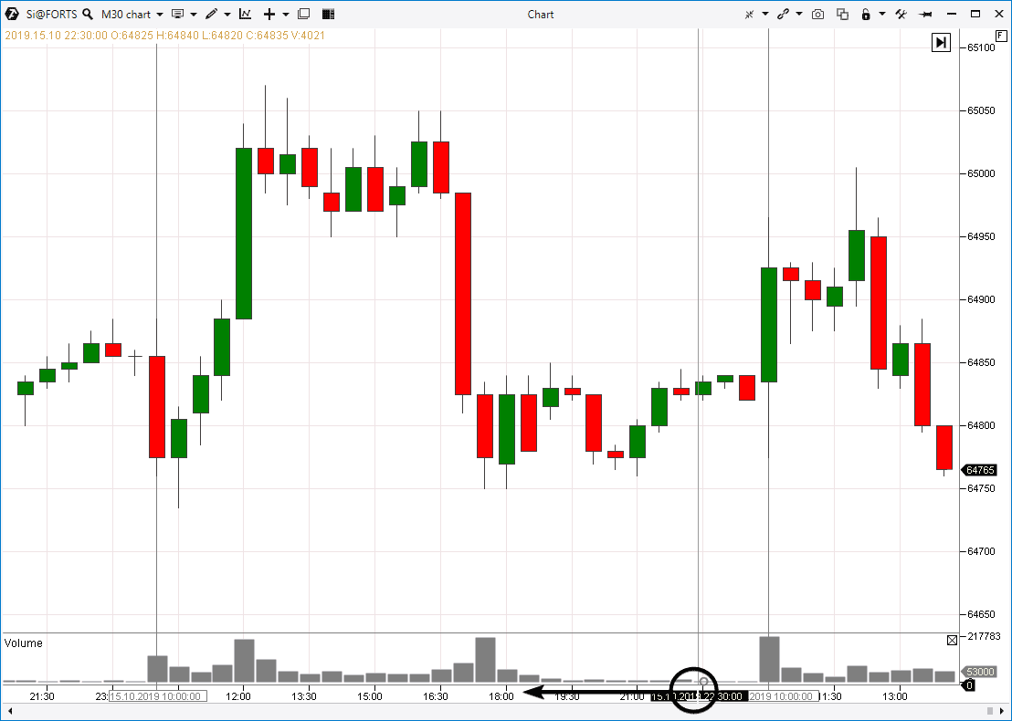
If you click on the time scale and drag the mouse to expand the chart (as it is schematically shown in the picture), the candles will expand and … at that very moment the candlestick chart will automatically be transformed into the cluster chart (another name is footprint).
Cluster chart
The picture below shows the same USD/RUB futures with 30-minute period and the date of October 15, 2019. However, the candles clusterized and became ‘transparent’ due to ATAS. This is the footprint when a trader can study detailed information at each candlestick level. ATAS has 25 types of footprint and each contains plenty of settings. In our case the clusters show the balance of buys and sells (delta) at each level:
- green clusters mean dominance of buys;
- red clusters mean dominance of sells.
The wider and brighter a cluster, the bigger the dominance is.
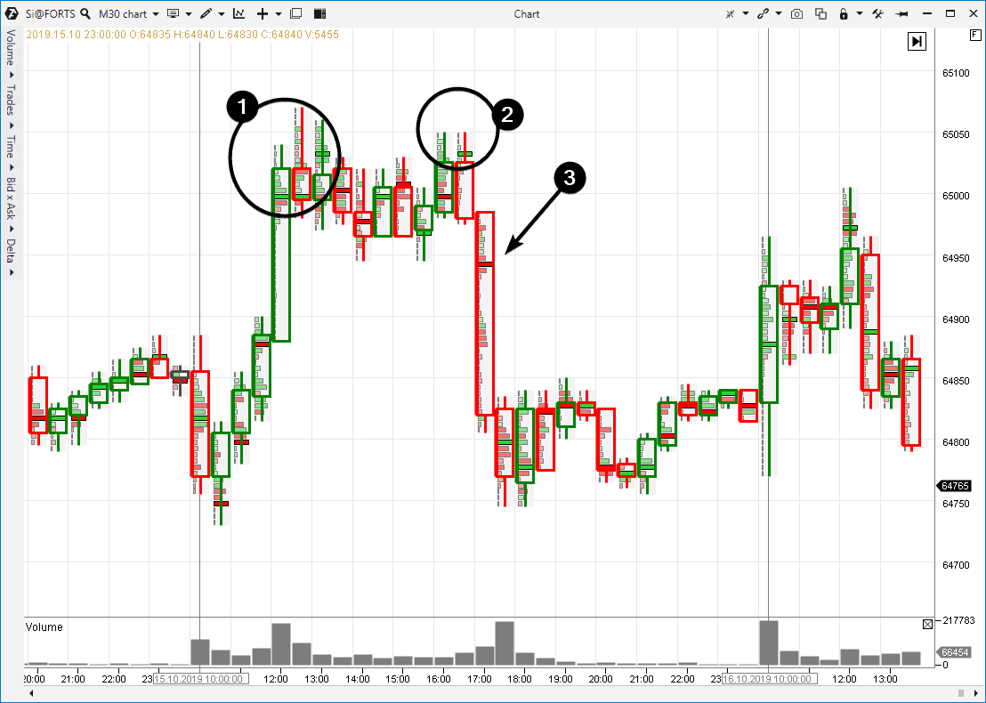
Apart from the information contained in classical vertical line and candlestick charts, the cluster chart adds important facts for analysis.
Thus, for example, the cluster analysis allows to discourse as follows:
- The volume concentrated a bit above the level of 65,000 after a wide ascending candle. It is a bearish indication. Buys at this place without significant growing progress most probably mean that major players close their longs using the sell limits above the round level (hidden weakness). If the buys would have really been the consequence of real demand, the price would have showed a more pronounced progress in growth.
- A trap for bulls who buy after a consolidation, waiting for the trend continuation. Read more about traps for bulls before the down movement in the article about upthrusts.
- Efforts of sellers at the support breakdown. These red clusters are a real power of supply since the price showed significant progress in moving down.
Note that the whole 1-2-3 formation formed a resistance area which reversed the price down the next day.
Time-independent charts
The above considered types of exchange charts are based on time periods. It means that equal time intervals are laid down along the horizontal axis.
However, there are charts with unequal time intervals along the horizontal axis. Advantages of such charts are that they:
- filter out market noises and flats. Long periods of flats are reduced;
- allow to focus on the most important things. Important quick and wide candles are split into smaller parts for making valuable conclusions.
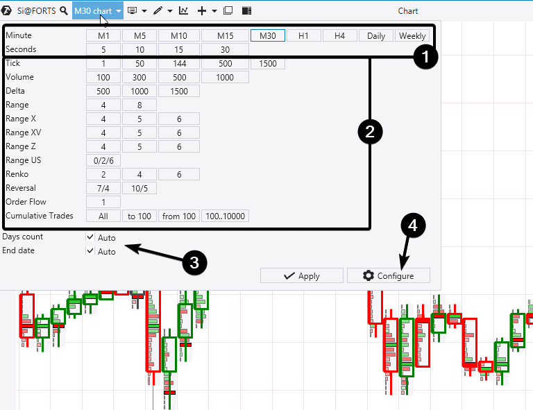
ATAS has a wide selection of various types of exchange charts. The picture above shows possibilities for setting a chart type:
- selection of periods for the charts based on time (standard);
- selection of settings for the charts not based on time (nonstandard);
- possibility to load historical data;
- possibility to create own settings for any chart type.
We will not discuss in detail each chart type not based on time in this article. But we will provide a link to a special comprehensive video on exchange chart types.
Summary
Your actions should be determined by your goals. If you need to check the EUR exchange rate in the form of a chart or the current oil futures price online a couple of times a year, Google will provide you with minimum but sufficient information in the form of a line chart in the search results.
However, if you are a beginner or professional trader and/or investor who closely works with exchange charts every day, ATAS will help you. This platform contains many types of charts with multiple settings. You can even build your own unique chart with a unique set of indicators in order to receive exclusive signals from the market.
We want to remind that you can continue to use the ATAS platform after the free test period (but with some restrictions which are acceptable for many cases including for training).

