It is a rather popular indicator and there are many trading strategies on the Internet, which use it. Both intraday and position traders like this indicator.
About the Squeeze Momentum (SM) indicator
The indicator was created by John Carter. He made USD 18.2 million on options and futures trading in 2020, which is 1,270% of annual yield. Squeeze Momentum shows periods when volatility increases or decreases, in other words, when the market goes from the trend into flat movement and vice versa.The market consolidates 80% of time and only 20% of time it moves in a certain direction. It is true for any time-frame. There is always a breakout after the flat movement (especially if it lasts long enough). Traders like to trade such breakouts very much because these breakouts are often followed by a strong and lengthy trend movement, on which they can make money.
It is also very important for traders to understand the current market state because different types of trades work differently in the trend and flat.
For example, a trader can confidently buy on a new high during a trend market (how to identify a trend day). However, if he buys on a new high during a flat, he will be losing his capital.
Similarly, it is dangerous to short new highs during an obvious bullish trend. Despite the fact that SM is a technical indicator, it is not lagging and can give a warning about a price reversal.
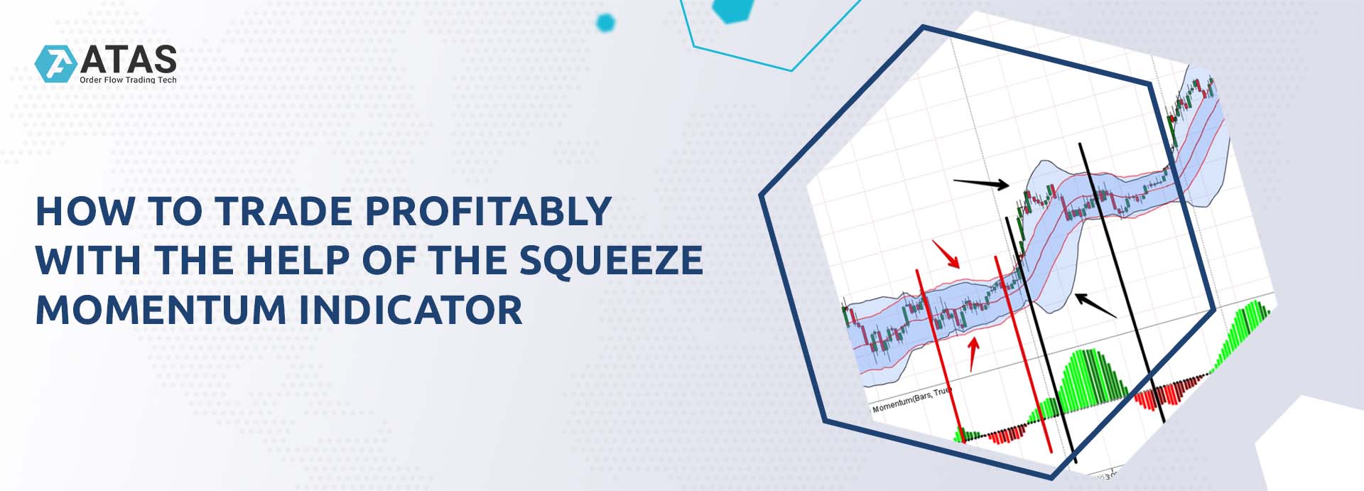
In fact, Squeeze Momentum combines two indicators – Bollinger Bands with 20.2 settings and Keltner channel with 20 and 1.5 settings – and helps to find consolidation periods, after which a breakout may take place and the trend price movement may start.
- Bollinger Bands measure a standard price deviation from the average value. Bollinger Bands measure volatility in the market. If they shrink, it means that the market is inactive. If they expand, it means that there was a breakout and the volatility increased.
- Keltner Channel measures Average True Range (ATR).
Technically, the SM indicator looks for places where Bollinger Bands go outside ATR. At these moments, ‘energy is released’ and bands expand. See Picture 1.
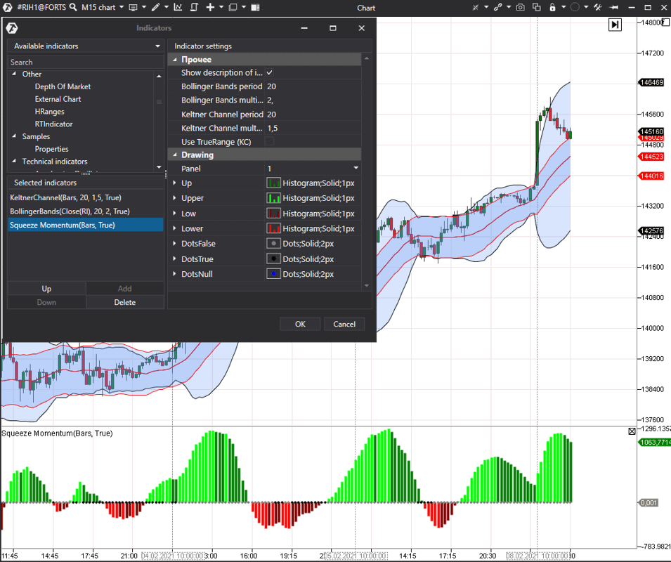
Indicator visualization
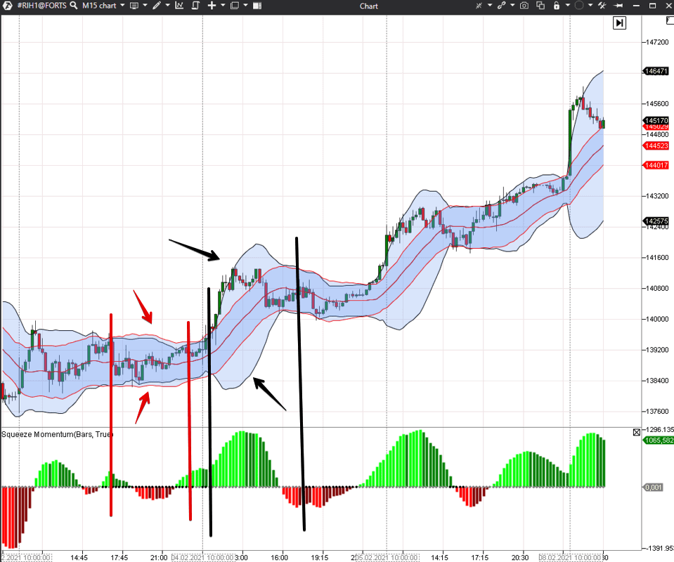
Squeeze Momentum has 2 visualization types.- Grey and black dots. Black dots appear on the indicator when Bollinger Bands are inside the channel. As soon as Bollinger Bands break outside the Keltner Channel, the dots turn grey.
- Red and green histograms. They show the price movement. Bright-green colour changes into dark-green colour when the price starts to decrease and, consequently, bright-red colour changes into dark-red colour when the price starts to increase.
Example. We marked the period of a flat price movement with red vertical lines in a 15-minute RTS index futures (RIH1) chart. At this time, Bollinger Bands are inside the Keltner Channel and there are black dots on the indicator.
We marked the period of the trend price movement with black vertical lines. At this time, there are grey dots on the indicator and the bands go outside the channel. See Picture 2.
How to trade with the help of the indicator
John Carter writes that, technically, the first grey dot shows the trade entry.If the histogram is above zero, a long position should be opened, if it is below zero – a short one.
You should stay in the trade until the histogram becomes bigger/smaller. The average movement lasts for about 8-10 bars.
If movements on different time-frames coincide, it intensifies signals.
You can use the following as exit signals:
- Fibonacci numbers,
- certain range expansion,
- significant support/resistance levels.
However, despite the simple indication in the form of the histogram colour, traders may experience difficulties in identifying the direction, in which the price would move after a breakout. That is why, even the indicator creator applies additional filters for identifying the trade direction.
For example, you can use the ADX indicator.
- If the blue line is above the red one, it means that it is an uptrend.
- And vice versa, if the red line is above the blue one, it means that it is a downtrend.
Example of trading by the Squeeze Momentum indicator
Let’s consider the 15-minute RTS index futures (RIH1) chart example. See Picture 3.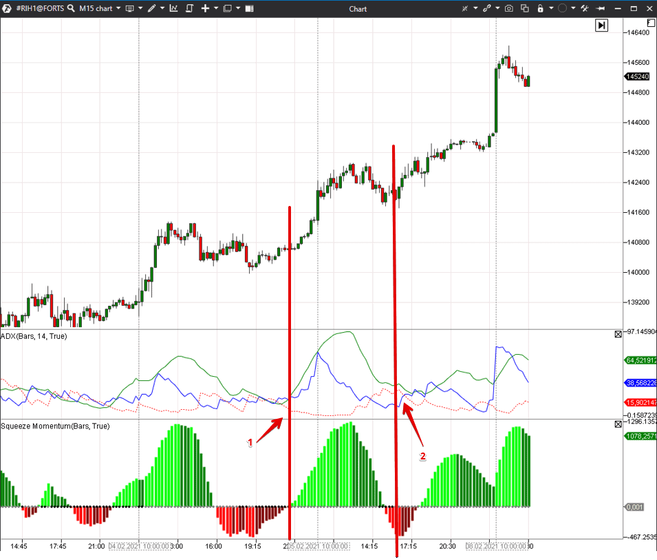
Squeeze Momentum gives a signal about a breakout in point 2, but ADX, in this situation, cannot give traders an exact direction because all three lines are closely interwoven.
Combining with cluster analysis
It could be difficult to filter out signals with the help of the technical analysis indicators. That is why we will try to improve signal quality with the help of cluster analysis and Market Profile. Cluster analysis is the most modern and perspective variant of working with exchange information. It doesn’t lag and shows information in real-time mode.We will use the Cumulative Delta indicator as the first filter.
Cumulative Delta shows how buyers and sellers ‘fought’ during a session. Unlike the standard Delta, Cumulative Delta sums up (in other words, accumulates) the difference between market buys and sells from the beginning of a trading session (or from another chosen moment). This indicator allows correlating the price movement and aggression of traders that work with market orders. If a big number of market buys or sells cannot move the price in the required direction, it means that there are stronger players that have other plans.
Example. Let’s consider the same 15-minute RTS index futures (RIH1) chart but we add Cumulative Delta instead of ADX. See Picture 4.
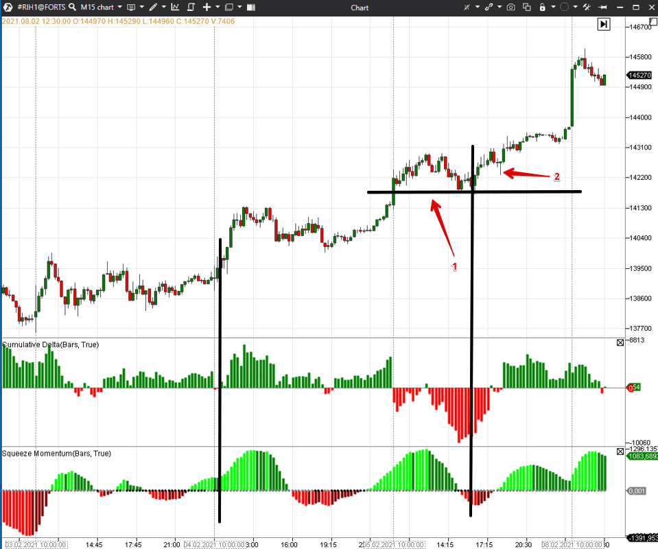
The situation is more complex near the second black vertical line. Squeeze Momentum is in the negative zone and shows the beginning of the first impulse. Cumulative Delta shows a huge number of market sellers, who have no luck in pushing the price below the middle of the trading session’s first bar. If such a situation emerges in the chart, it means that limit buy orders absorb market sell orders. If the ‘managed money’ buys, perhaps, it is waiting for the price increase. It is safer to open a long position in point 2, when both indicators move into the green zone. However, aggressive traders can enter into a trade earlier when they see the first grey dot and understand that market sells cannot move the price down.
One more example.
We will try to use the Dynamic Levels Chanel indicator as the next filter. This indicator shows the levels, at which the price tried to move outside the Value Area, with green and red arrows. Arrows are not full-fledged signals for opening trades, however, if the price moves up or down simultaneously with the Value Area during a long period of time, it confirms the local trend.
Let’s consider a 15-minute S&P 500 index futures (ESH1) chart example. See Picture 5.
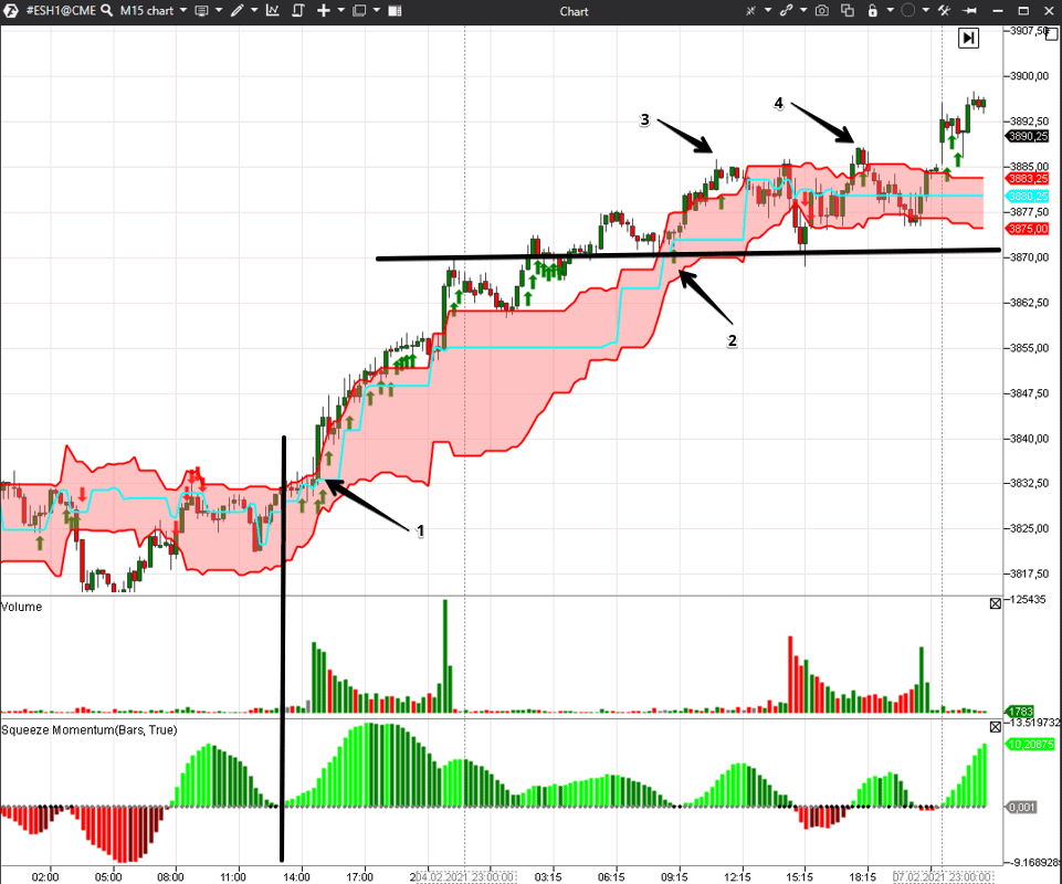
The American trading session started in point 1. Dynamic Levels Chanel shows green arrows all the time – it means that the price moves up together with the Value Area. The day definitely developed as a trend one and long positions would have brought traders a good profit.
The black horizontal level is the end of the American trading session and simultaneously a local high. Next day, this level was the resistance level first and later – the support level.
The SM indicator dots become grey near number 2 and a small breakout starts. However, despite the grey dots on the Squeeze Momentum indicator, the price failed to consolidate above the Value Area on the high number 3 and it rolled back to the level. The situation repeated on the high number 4 and the price rolled back again. It is very difficult to work with a technical indicator alone in this trading situation. However, when we see what takes place in the Value Area, it is easier to make efficient decisions.
Conclusions
We considered only two variants of filters. It is possible to find other unique combinations in ATAS, which would exactly correspond with your market vision.Download the ATAS platform and check how the Squeeze Momentum indicator works in your favourite markets. Perhaps, you will find out how to apply this indicator efficiently in your strategies.
Information in this article cannot be perceived as a call for investing or buying/selling of any asset on the exchange. All situations, discussed in the article, are provided with the purpose of getting acquainted with the functionality and advantages of the ATAS platform.

