What Is a Japanese Hammer Candle?
Simply put, the hammer is a reversal pattern that indicates a potential shift from a bearish trend to a bullish one. You might ask: Is the hammer a bullish pattern? Yes, it is. The candle looks like a hammer: the long lower shadow resembles the handle, while the small body represents the hammer’s head. In the 15-minute chart (LTC/USDT, data from Binance Futures) shown below, you can see a Japanese candle that serves as an example of the hammer pattern: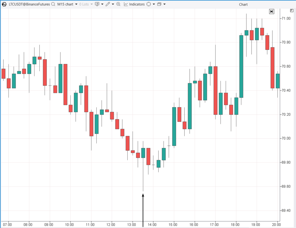
- The candle forms after a period of falling prices.
- It has a small body and a long lower shadow (the handle).
- The next candle is bearish, which could be seen as a failed confirmation.
- However, despite this, the downtrend still eventually reversed into an uptrend within the day.
Limitations of the Hammer Candlestick Pattern
Subjectivity. While the pattern is just a single candle and visually easy to recognize, an analyst might still question whether the shadow is long enough or the body is small enough. These uncertainties can make interpreting the pattern more challenging. No guarantee of an upward reversal. The hammer pattern could represent a test of a bearish breakout level, suggesting the continuation of the bearish trend. Time dependency. Let’s clarify with an example. Imagine the price follows a simple trajectory, as shown by the jagged line in the chart below.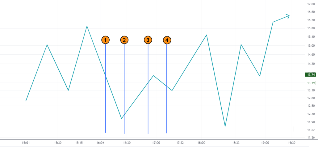
Enhancing Hammer Pattern Trading with Volume Analysis
To overcome the limitations and boost your confidence when trading the hammer pattern, it is recommended to use professional volume analysis tools, such as: Notice how the hammer pattern becomes clearer on the LTC/USD chart when you use the Magnifier tool, which shows clusters within the candle (to activate Magnifier mode in the ATAS platform, simply press “M”).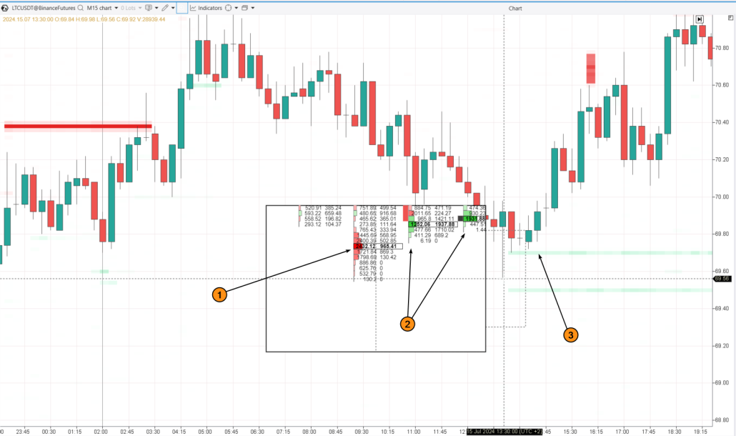
- Sellers capitulated (1);
- Buyers became more active (2);
- Market was supported by Limit-Buy orders (3), highlighted by the DOM Levels indicator.
How to Identify the Pattern on a Chart
The Cluster Search indicator can be useful for this. For example, to identify seller capitulations that form a hammer pattern, you can use the following settings:
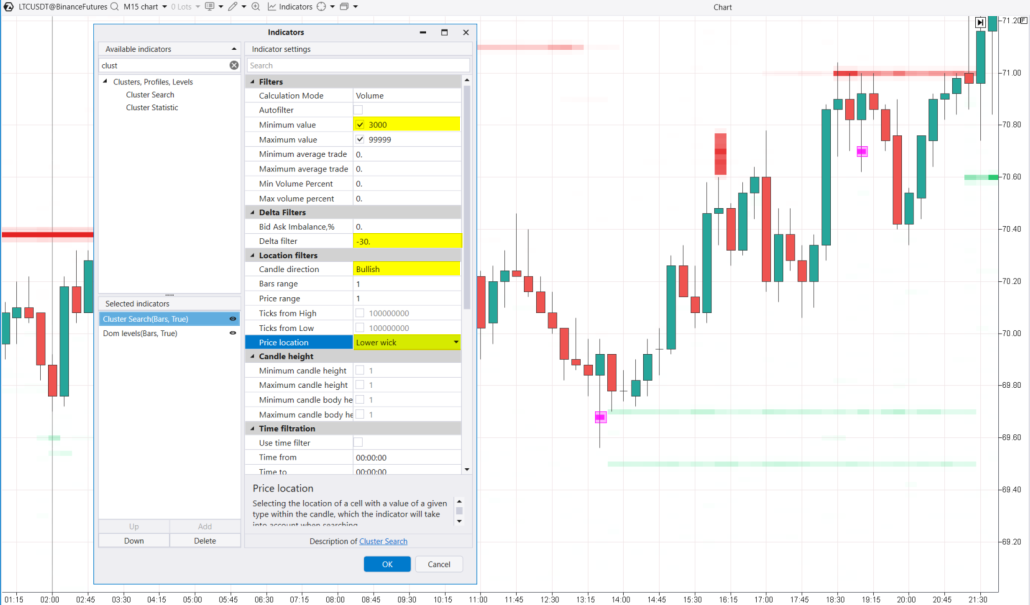
- Minimum Volume = 300;
- Delta filter set to negative, to detect spikes in selling activity.
- Candle Direction = Bullish though any candle type can be used.
- Price Location Filter = Lower wick (this helps identify clusters in the lower shadow of the candle).
The Inverted Hammer Candle
The inverted hammer is similar to the hammer pattern, but flipped upside down. It has a small body with a long upper shadow. Like the regular hammer, the inverted hammer appears after a period of falling prices. There are two main ways to interpret the inverted hammer:- The most common view is bullish. In this case, the long upper shadow suggests that buyers stepped in and pushed the price significantly higher from the opening point.
- Bearish. Alternatively, the inverted hammer can indicate that buyers failed, and the downtrend may continue. A close near the low point shows that sellers became more active, erasing the buyers’ gains during the candle.
- the opening and closing prices are close to each other, around the 57,650 level;
- the upper shadow is long, with the price almost reaching 60k.
The Hammer Candle in an Uptrend
The term hammer candle in an uptrend is more accurately used for a different pattern known as the hanging man. However, to provide the most practical and valuable information, let’s look at an example of a hammer appearing after brief price declines within a larger uptrend. Below is a screenshot from two charts showing a period of rising prices in the NQ futures market in late spring 2024:- On the left – a daily timeframe. This chart shows a hammer pattern that formed after two days of decline.
- On the right – a 5-minute timeframe. This is a classic example of the hammer pattern.
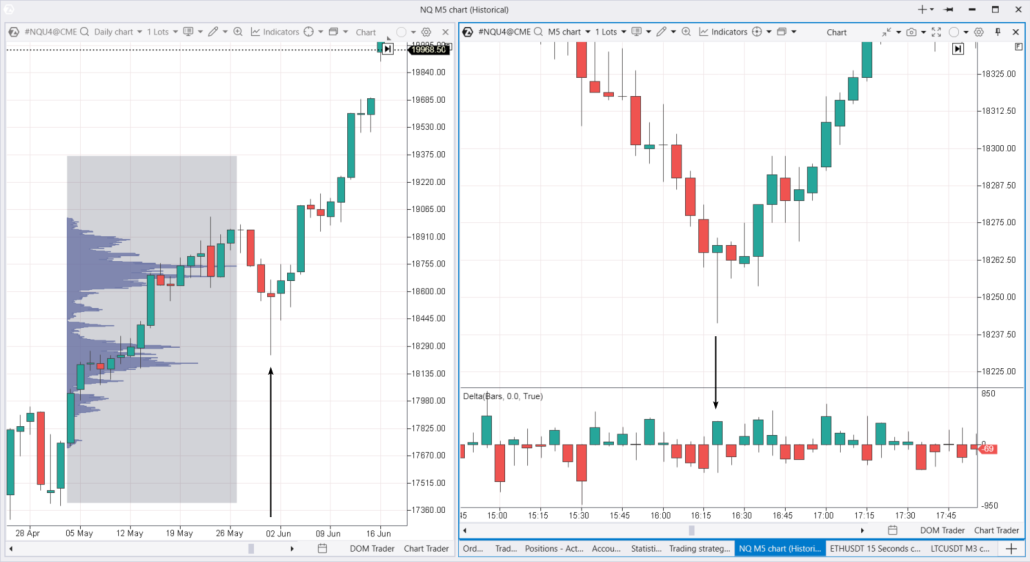
- at first, buyers absorbed the sell orders;
- then, they enjoyed seeing their positions become profitable after July 13-14. Their stop-losses might have been moved to breakeven in the 18,250-18,300 zone;
- however, the hammer candle on May 30 probably triggered those stop-losses, taking away the joy of their profitable long positions. The uptrend continued but without those buyers.
Inverted Hammer in a Downtrend
As mentioned earlier, the inverted hammer is a bullish pattern that forms during a downtrend, signaling that buyers might be stepping in and potentially reversing the trend. Below is a screenshot of the AAPL cluster chart on a daily timeframe: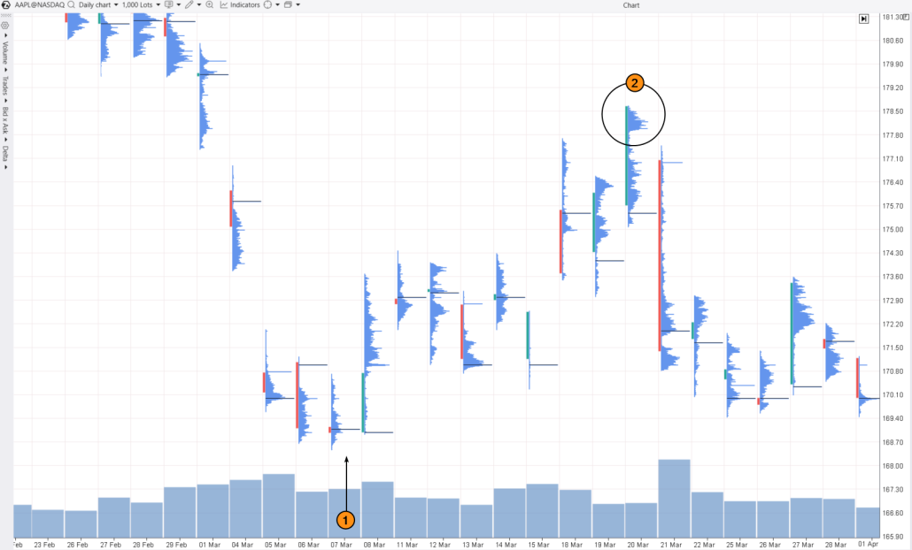
- they were actively purchasing the stock as the price surpassed the $178 level;
- however, the following day, trading opened at $177. The price did not give the bulls a chance to exit their positions, closing at the day’s low after a substantial decline.
FAQ
What is the hammer pattern?
The hammer pattern is one of the most recognized candlestick patterns in technical analysis. It suggests a potential reversal from a downtrend to an uptrend.How to interpret the hammer pattern?
- A bullish pattern signals that the selling pressure is weakening and buyers are starting to take control of the market.
- A reversal pattern suggests a potential change in the current trend. In the case of the hammer, it indicates a reversal from a downward to an upward trend.
- An inverted hammer pattern appears after a downtrend and shows that buyers tried to push the price up but could not maintain it at a higher level, which might signal further attempts at growth.
How profitable is trading the hammer pattern?
Thomas Bulkowski, a recognized expert on candlestick patterns, estimates that the hammer pattern has a 60% chance of signaling a bullish reversal. When the market is already in an uptrend, this pattern’s effectiveness can rise to 80% (after short-term declines). Research by CandleScanner, covering daily charts from 1995 to 2015 for S&P 500 stocks, reveals:- the hammer pattern appears about 1% of the time;
- it provides a false signal in 20-21% of cases;
- the chance of achieving significant profits ranges from 35% to 44%.
How to increase the profitability of trading the hammer pattern?
The simplest approach is to look for bullish hammers near significant support levels. Of course, like any method, this does not guarantee profit. More effective strategies involve using volume analysis to confirm a shift in sentiment from bearish to bullish.How to Use the Hammer Candlestick in Trading
Even though research shows that the hammer is a straightforward pattern with positive profit potential, traders should be cautious and not rely solely on this pattern for their strategies. To see how effective the hammer pattern can be for trading trend reversals, try using the ATAS Market Replay simulator for traders. This feature of the ATAS platform uses historical data to recreate real-time trading conditions. Beginner traders can hone their skills in real conditions, avoiding any financial risks. To try the simulator, download the ATAS platform for free, install, and launch it, and then: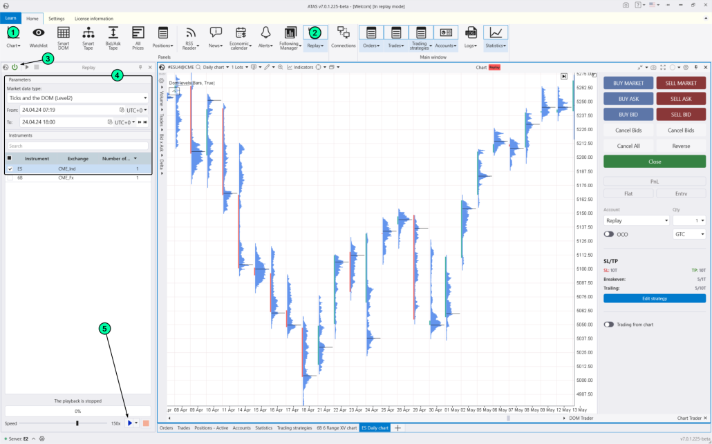
- adjust the playback speed, and pause;
- analyze footprint charts;
- use more than 400 indicators. Alternatively, you can use Cluster Search to help identify hammer patterns;
- use Chart Trader and other features to trade on the built-in demo Replay account and then analyze your performance;
- use drawing objects, for example, mark support and resistance levels;
- use various chart types (e.g., non-standard Range XV). It is important to note that the hammer pattern and its variations will not work with these types of charts since they form on classic candlestick charts and standard timeframes;
- use exit strategies;
- do much more to sharpen your skills in spotting hammer patterns.
Conclusions
The hammer pattern is popular, but trading it comes with risks since it involves opening a position against the current trend. Therefore, to gather enough evidence for opening a position based on the bullish hammer and inverted hammer patterns, it is recommended to use professional volume analysis tools like cluster charts, the Delta indicator, market profile, and others. Download ATAS. It is free. Once you install the platform, you will automatically get the free START plan, which includes cryptocurrency trading and basic features. You can use this plan for as long as you like before deciding to upgrade to a more advanced plan for additional ATAS tools. You can also activate the Free Trial at any time, giving you 14 days of full access to all the platform’s features. This trial allows you to explore the benefits of higher-tier plans and make a well-informed purchasing decision. Do not miss the next article on our blog. Subscribe to our YouTube channel, follow us on Facebook, Instagram, Telegram or X, where we publish the latest ATAS news. Share life hacks and seek advice from other traders in the Telegram group @ATAS_Discussions.Information in this article cannot be perceived as a call for investing or buying/selling of any asset on the exchange. All situations, discussed in the article, are provided with the purpose of getting acquainted with the functionality and advantages of the ATAS platform.