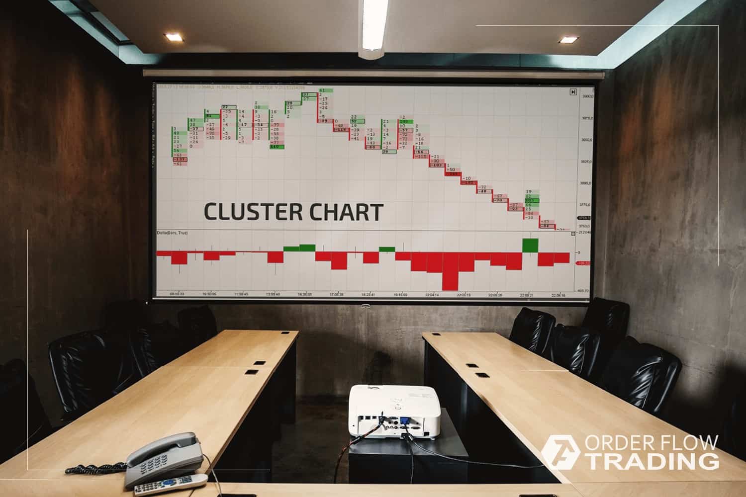
The main aim of the Range Bar charts is to get rid of the market noise or of insufficient market fluctuations of the price. A Brazilian trader Vicente M. Nikolellis used this type of a chart for the first time in 1990s. The market was very volatile at that time and Nikolellis decided to use volatility as an advantage.
How to build Range Bar charts
Principles of building range bar charts:- each bar is formed after passing a set price value, regardless of time;
- each next bar opens beyond the boundaries of the upper or lower point of a previous bar;
- each bar closes in its top or bottom point.
Thus, it is simpler to analyze the market volatility with the help of range bar charts – there will be less bars during a consolidation and more during a trend movement.
Example of reading a footprint in a Range Bar chart
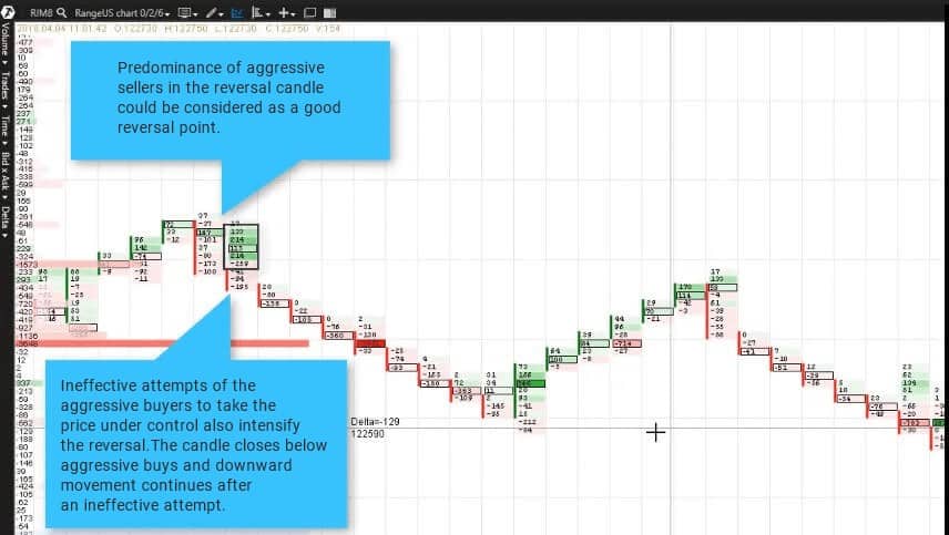
We will use the volatile market of Ri, Russian Stock Market Index futures, for our practical studies.The Range US Chart with 2/6 parameters separates trend movements from the reversal candles. Let us adjust the presentation of the cluster chart by the delta and track the activity of sellers and buyers at the moment of reversal. A good reversal point would be a predominance of aggressive sellers in a reversal candle. Ineffective attempts of the aggressive buyers to take the price under control also intensify the reversal.
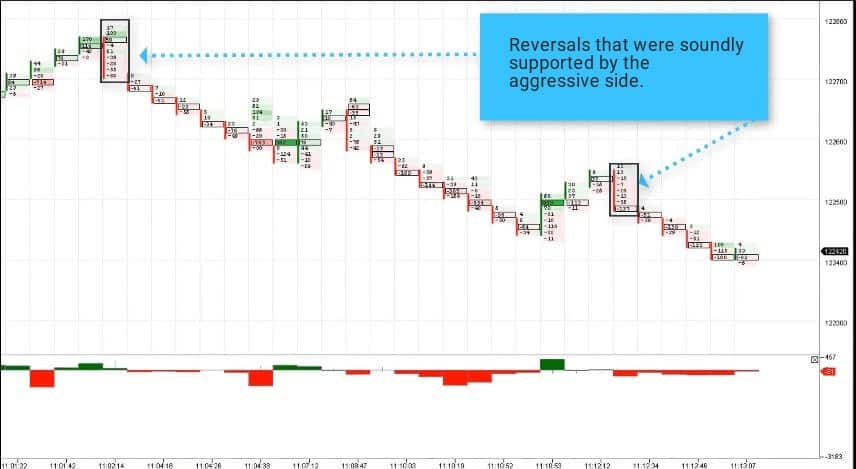
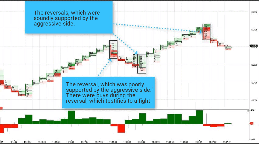
Reversals that were soundly supported by the aggressive side are shown in chart 2.
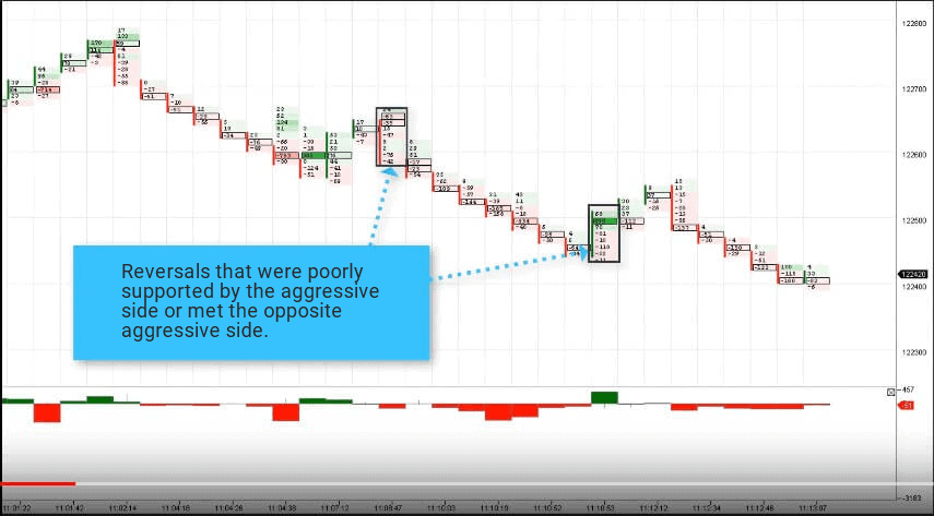
The cluster analysis in the following chart (Picture 3) shows efforts to reverse the market upwards, which were not supported. The buyers were not active enough and met the opposite aggressive side.
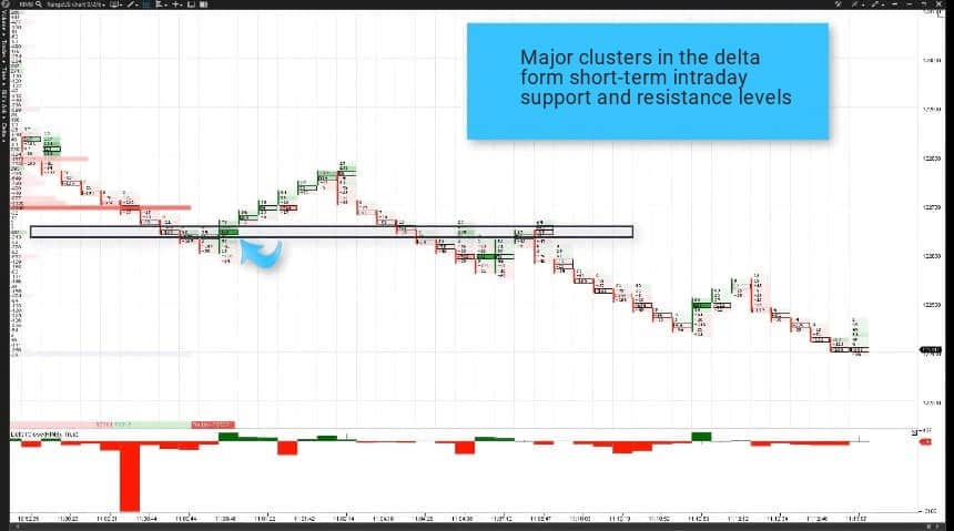
The next chart shows how major clusters in the delta, fixing volatility splashes, form short-term intraday support and resistance levels.
- one poorly supported reversal. It is an effort of sellers to break the emerging upward rally;
- two soundly supported ones.
There are buys during a poorly supported reversal, which testifies to a fight
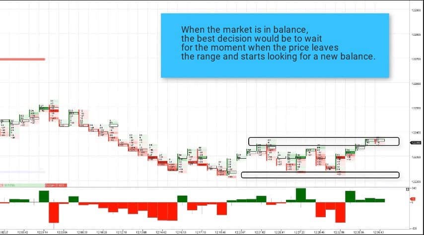
If the market is in the state of temporary balance of supply and demand, it makes sense to wait for the moment when the price leaves the range in search for a new balance.
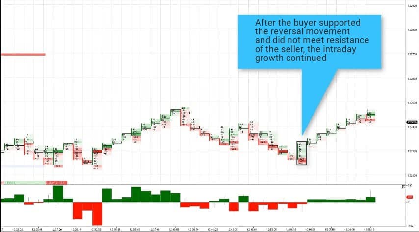
We can see in the cluster chart of volumes 7 that the sellers support the reversal movements downward more boldly than the buyers support the upward movement. After the buyer manifested himself actively in the footprint and supported the reversal movement, he did not meet resistance of the seller and the intraday growth continued.
Summary
Reading the cluster analysis and range bar chart allows noticing reversals and the beginning of a new trend movement and also avoiding trade opening during the market consolidation.The modern software provides the users with a competitive advantage and simplifies the market analysis due to a cluster chart of volumes. Read other articles from the OrderFlowTrading blog and you will have a detailed instruction for reading the cluster chart.
Check how your favorite patterns would look like in the range bar chart. Download ATAS free of charge.

