In the first article of the series, we introduced you to bar-by-bar analysis and also discussed how to use it in the bitcoin market.
In this article, we will continue to study the topic using examples of other markets:
Bar-by-bar analysis of the S&P-500 index futures market
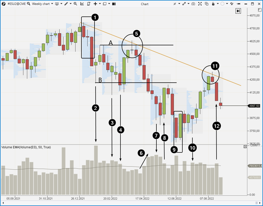
To give you a better idea of how to use bar-by-bar analysis in practice, let’s look at an example of reading a chart (weekly period) of the S&P-500 index futures market for the first eight months of 2022 (at the time of writing the article). Market profiles have been added to the chart.
Number 1 indicates three bearish candles – the year started in a negative way for the stock market. According to the statistics, it was one of the worst Januarys in the history of the stock market. Growth of volumes (but not extreme) amid price decrease in bar-by-bar analysis means selling pressure.
Number 2 indicates an extreme spike in volumes on a candle with a long lower shadow. This can be interpreted as the appearance of buyers. They decided to take advantage of panic that broke out as futures declined under the lows of the fall of 2021. According to buyers, the market could provide an opportunity to sell contracts at a higher price later.
Having the selling pressure (number 1) and the appeared buyers (number 2), we can assume that the market will achieve some balance (AB range). Such consolidations with false breakouts usually form after a sharp spike in activity (in this example, a sharp decline in January 2021).
Number 3 indicates another activity of buyers who pushed the price up, it means that demand is present only near level B.
Number 4 indicates a bearish candle with exhausting volume. Selling pressure is insignificant, which increases the likelihood of an upward impulse (it happens on the next candle).
Low trading volumes (5) near the upper limit of the AB range can be interpreted as market indecision. The rise to level A is approximately equal to 50% of the decline from the high to level B. Rising prices cooled buyers’ willingness to pay for contracts. The subsequent decline on growing volumes (6) confirmed the dominance of sellers.
When the price declines to the support level on growing volumes, it is a sign that the support level will be broken. After pushing the market through the support at level B, sellers met the activity of buyers around 3675, it is indicated by a candle with a long lower shadow and high volume marked with number 7. It is followed by a bearish candle which probably reflects the weakening of the selling pressure – we can see a false bearish breakout about the low of candle 7.
Buyers decided to take advantage of the fact that sellers’ activity was exhausted – a bullish candle (8) appeared on the chart. But the next narrow candle with low volume shows another period of indecision (a similar one was marked with number 5). A bearish exit on rising volumes from a period of indecision suggests that the market will reach a new low.
Very large volume is recorded on a bearish candle 9. At first glance it may indicate sellers’ pressure but if sellers controlled the market, why did the next candle close higher? A bullish engulfing pattern, where the bearish candle has high volume, suggests that major traders used the situation to buy back the panic. Apparently they assumed (using insider information?) that the market could recover during the corporate reporting period.
Number 10 indicates a candle which has a “bear trap” at its low. Similar traps often form at the very beginning of a bullish impulse.
Strong corporate reports raised the value of the S&P-500 index stocks. Optimism returned to the market and to the media headlines. But low volumes (11) indicate a new period of indecision, and a bearish way out of it is if sellers take the initiative.
When reading a weekly chart bar-by-bar, the situation may not always be obvious. But the more you practice on history, the more ideas you will have about what position to take at one point or another. Cluster charts and useful indicators of the ATAS platform will help you by providing more detail.
For example:
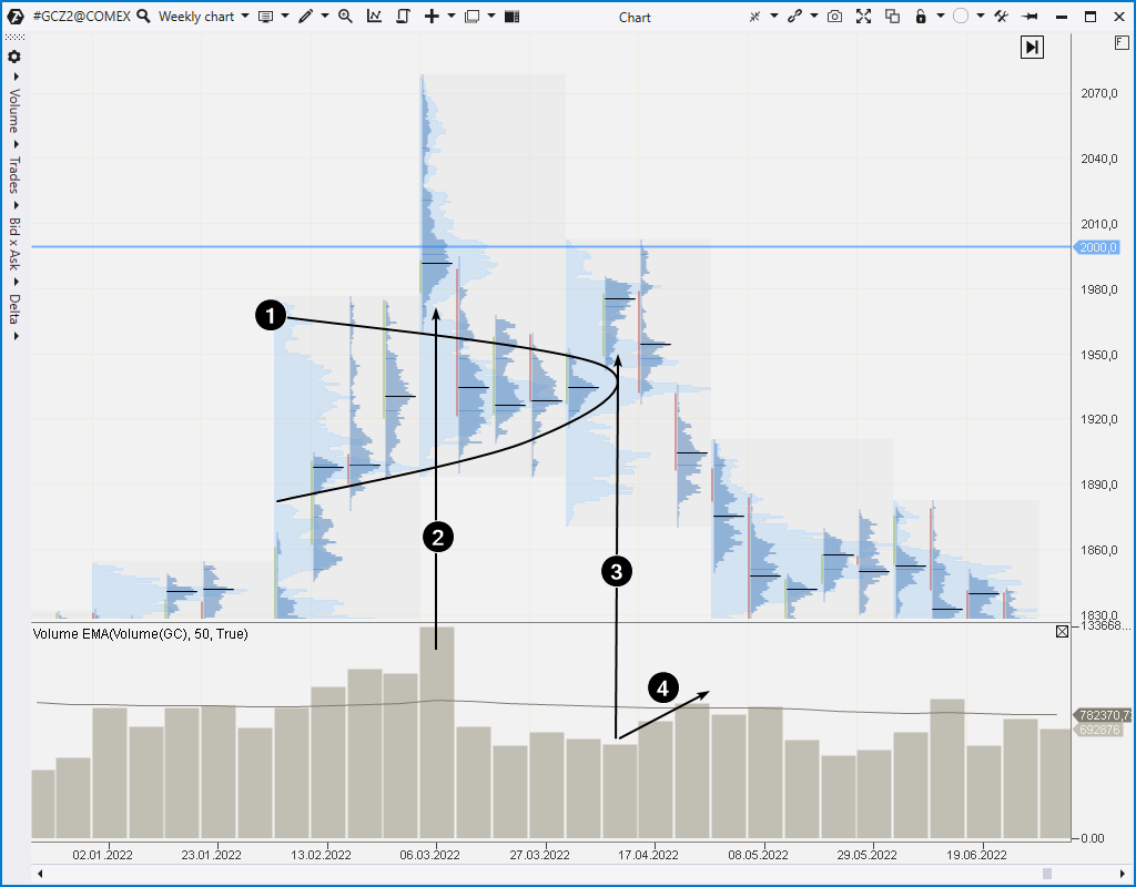
In the spring of 2022, gold futures quotes rose to the level of 2000. Daily levels of maximum volume and the market profile (1) show that the market equilibrium established around $1,930 per contract (one troy ounce).
A weekly chart shows two attempts to upset this equilibrium.
The first attempt (marked with number 2) is associated with the outbreak of hostilities in Ukraine. Investors were scared because of this news, and the price reached a maximum of $2,070 per contract and even rose a little higher. However, the price soon returned to the 1930 area. The fact that the price was not able to consolidate above the psychological level (as well as the thin profile and high volatility) indicates the extreme emotionality of the market, which, however, did not affect the real intrinsic value of gold.
The second attempt (marked with number 3) occurred on low volume. This is a sign of weak demand. Most likely, major traders were adding to their short positions around 1930 just before the Fed tightened their policy and a period of a strong dollar occurred. The second attempt looks like an upthrust which ends the distribution period and a test of the 2000 level. These signs of weakness confirm the subsequent decline in prices on growing volume (4).
Conclusions. How to start using bar-by-bar analysis in trading
Bar-by-bar analysis is a complex approach that helps you form your own opinion about the market based on the price and volume chart alone. The view is subjective, which can be both a disadvantage and an advantage of the method. It depends on the trader’s experience and personal qualities.
In our opinion, the method has proved to work best on daily time frames. However, it can also be successfully used intraday, given the uneven distribution of volatility. Bar-by-bar analysis can hardly be carried out on range and renko charts due to their peculiarities.
To develop bar-by-bar chart reading skills, we recommend that you read our articles from the “VSA and Cluster Analysis” series:
To develop a better understanding of the market, take the time to study history on price and volume charts. The ATAS platform provides the best way to do this. Moreover, there are other good reasons to download the platform:
It is free and you can continue using the program even after the 14-day trial period.
You will be able to practice your bar-by-bar analysis skills on historical charts of the stock, futures and crypto markets.
There is a demo account built into the ATAS platform, so you can practice trading without risking your real capital.
Information in this article cannot be perceived as a call for investing or buying/selling of any asset on the exchange. All situations, discussed in the article, are provided with the purpose of getting acquainted with the functionality and advantages of the ATAS platform.