Unlike simple trading platforms, ATAS has:
- instruments of cluster analysis,
- horizontal volumes,
- various chart display modes,
- unique custom indicators (for example, OI Analyzer) for building real trading strategies.
This set of instruments gives traders a possibility to analyse the market from different angles and see actions of major professional players or managed (smart) money.
How to do it? We will discuss in this article how to efficiently combine:
- maximum volume levels,
- cluster charts,
- various chart display modes
… in order to understand the actions of major market participants.
Maximum volume level indicator
Movement of the maximum volume levels during a trading session could be seen with the help of the Dynamic Levels indicator. There are no such levels in technical analysis but professional traders can see them, that is why the price slows down here and a breakout or a bounce takes place after that depending on who is stronger – buyers or sellers. The indicator has flexible settings and a trader can see levels for a selected period and turn off/on the Value Area. Moreover, the system is able to calculate the maximum volume level (Point Of Control – POC) by Bids, Asks, trades, Delta or time. If you select the day type of calculations, the maximum volume level will change during a trading session. A trader can select various colour settings and add sound alerts. See Picture 1.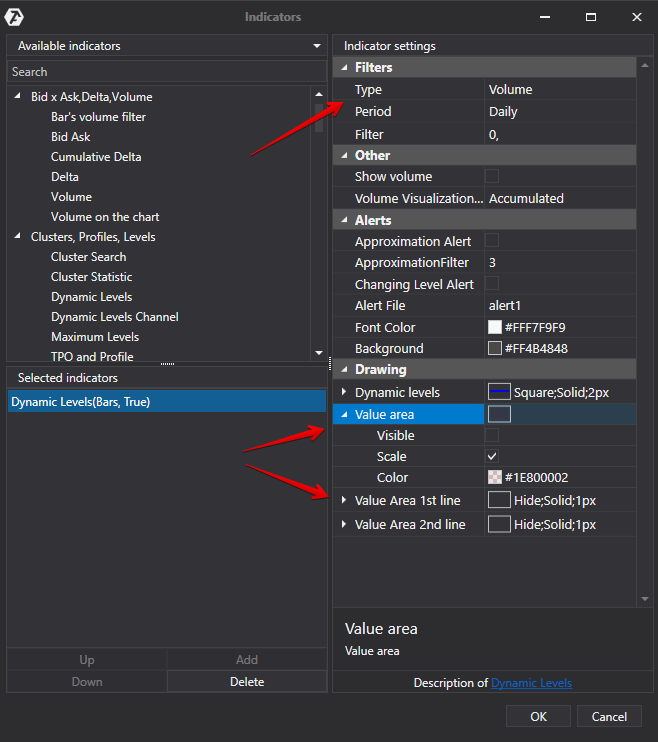
The maximum volume level is marked with a blue line and it changes as the session develops. Analysis could be conducted every time when POC changes its position. See Picture 2.
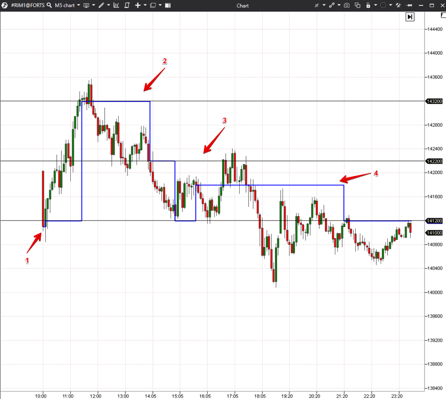
It is visually seen that the price stops several times near levels 1 and 3 and then bounces and breaks them. It means that you could look there for potential trades with a low risk level.
Here are some regularities with respect to a test and breakout in significant areas:
- If a trader looks for sells, he needs a level test from bottom to top and absorption of all market buys by limit sell orders. We will consider these examples in the charts below and you will see how it looks like in practice. This is a good sign of a movement stop and presence of a major seller.
- If a trader looks for buys, he needs a level break from bottom to top and obvious predominance of buyers in a candle, which breaks the level. Absorption of market sells by limit buy orders should take place before a breakout. Despite a big number of aggressive market sells, the price will not fall under such conditions. Breakouts are often accompanied by a big number of market orders, that is a significant predominance of the Delta in clusters.
As a rule, a retracement and test of the broken level take place after a breakout. There may not be a big absorption of sells at a test, but a major buyer, who can push the price higher, should emerge.
Cluster analysis
Let’s have a look at a cluster chart to see how the fight between sellers and buyers developed at the first level. See Picture 3.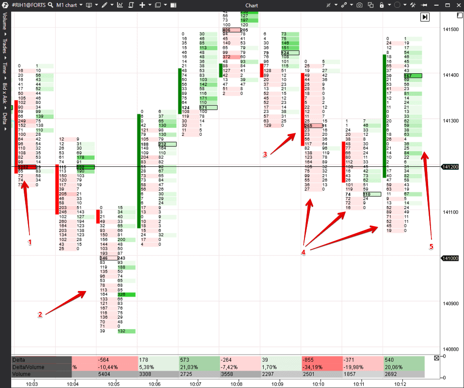
After that the level is tested and a small absorption of market sells by limit buys takes place in point 3 and sells ‘dry out’ in candles marked with number 4. There are no participants in the market at this moment, who could push the price lower and, most probably, it will grow.
Buyers emerge in candle 5 in small numbers, however, we want to remind you that it is not a level breakout, it is a test.
You can understand this situation in such a detail in a cluster chart or Smart Tape. A cluster chart is more convenient for beginner traders because it is formed a bit slower and stays in front of your eyes unlike the constantly changing Tape.
Reversal analysis
Now we move to the second level where a reversal took place. Let’s consider a cluster chart again. As it was in the first case, we use the Bid Ask Ladder mode to see Bids and Asks in separate columns. See Picture 4.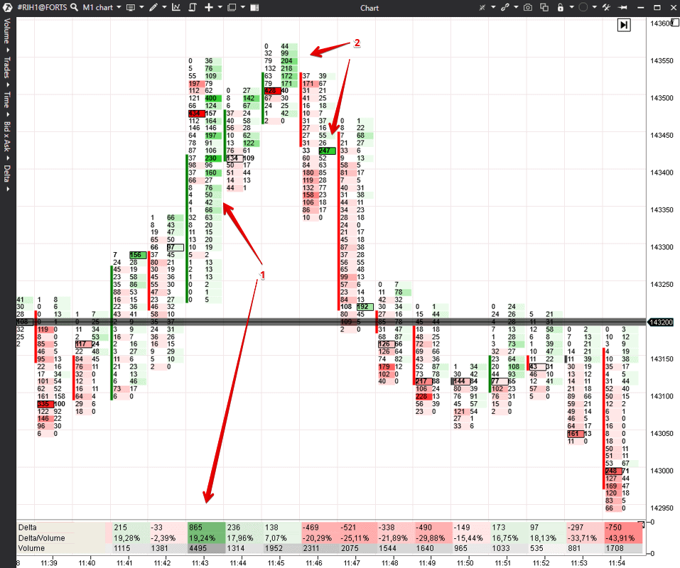
In order to increase a competitive advantage even more, let’s change the chart type to Range US (0/45/15). It is a custom chart type, which allows avoiding the market noise. Range charts do not depend on time and are formed only when the price changes. Thus, a trader can see trading ranges, in which the price stopped and from which a focused movement may start.
Price movements in the market look like a continuous repeated cycle
balance –> trend –> balance –> trend –> …… –> …… –> ……
It is very important to find balance areas to ‘catch’ a breakout and beginning of a trend movement.
Range chart settings are very different for different instruments and you can find them only by trial and error, that is why we do not recommend you to simply copy/paste settings of this example.
Example of using the Delta indicator
We continue to consider the RTS index futures of February 26, 2021. See Picture 5.
- If the Delta is positive, it means that there are more market buys than market sells.
- If the Delta is negative, it is vice versa.
As a rule, the Price and Delta dynamics should coincide for confirming the current trend. Non-coincidence of the Delta with Price movement should put traders on guard and attract their attention. For example, if the Delta grows and the price doesn’t grow, it means that limit sell orders absorb market buys. If the price is actively ‘kept from growth’, it may start to fall.
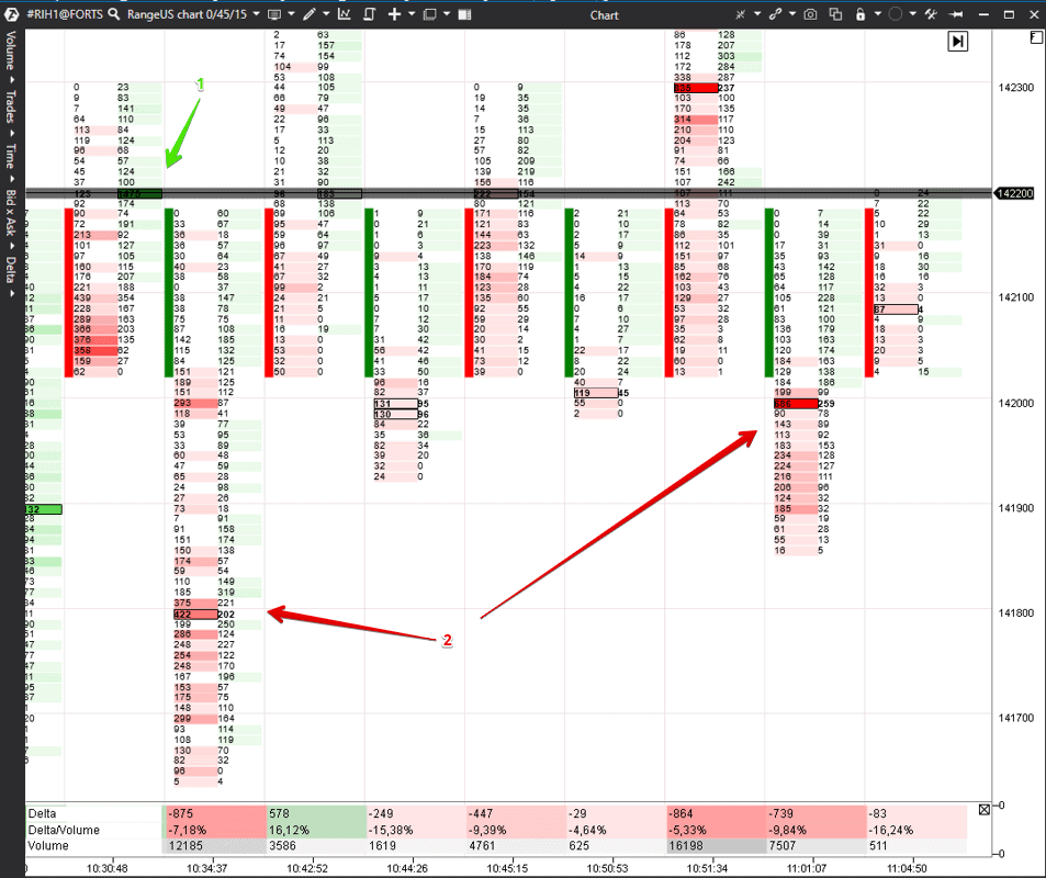
There is a big negative Delta in the first range but the price doesn’t fall. It means that limit buyers absorb market sellers.
In the second range, market sellers tried to push the price down during half an hour, but the price didn’t fall again despite their efforts. If the price doesn’t fall, it means that it will grow.
Let’s have a look at this area in the context of clusters. See Picture 6.
Conclusion
This logic could be applied not only at the maximum volume levels but also at extreme points or in the price consolidation areas.It is important for beginner traders to switch off emotions and feel confidence during trade execution. ATAS instruments will help you in it and will create a competitive advantage.
Download the ATAS platform in order to develop your own trading strategy, based on professional indicators for volume analysis.
Information in this article cannot be perceived as a call for investing or buying/selling of any asset on the exchange. All situations, discussed in the article, are provided with the purpose of getting acquainted with the functionality and advantages of the ATAS platform.

