ATAS is a powerful software for analyzing order flow and market microstructure of futures, stocks, and cryptocurrencies. While classic candlestick charts only show the final price movement, ATAS displays the mechanics of its formation in detail:
1. at which price levels volume is concentrated.
2. which side shows initiative.
3. how liquidity is distributed.
4. how orders behave in the order book.
The analytical platform receives data directly from your exchange or data provider and displays it in an easy-to-read format. ATAS doesn’t provide trading signals or predict the market — instead, it provides tools for independent market assessment based on factual data.
Start now!
Try ATAS free with no time limit
Why Choose ATAS
ATAS is chosen by those who need to work with the market at the data level, not visual assumptions:
- 400+ footprint chart variants with different data types and visualization modes;
- 70+ volume analysis tools;
- 240+ technical analysis indicators;
- 14 timeframes, including non-standard ones (Renko, Range, Reversal, XV, Z, US, etc.);
- 25+ connections to global stock, futures, and cryptocurrency exchanges;
- Advanced heat map;
- Replay for learning and testing strategies without risk;
- Ability to develop and connect custom tools via API.
ATAS combines several market analysis approaches — from detailed study of volumes inside candles to liquidity assessment and contextual references. You can use them separately or combine them to see the market from different angles.
Connectors to Major Global Exchanges
Connect your accounts independently and access futures, stocks, and cryptocurrencies through the ATAS interface:
- US and European stock and futures markets: NYSE, NASDAQ, CME, Eurex, etc.;
- crypto exchanges: Binance, Bybit, Kraken, Bitget, OKX, etc.;
- quotes, trades, volumes, and order book data — from reliable data providers: dxFeed, IQFeed, and Tai-Pan;
- popular brokers: NinjaTrader, Interactive Brokers, Gain Futures, Exante, CapTrader, etc.;
- stable and secure connection through gateways: Rithmic, CQG, dxFeed, etc.
Prop Firms and Challenges
ATAS supports work with leading prop firms so you can use volume analysis tools during evaluations:
- dxFeed Prop, The Trading Pit, BluSky, Vision Trade Futures, FunderPro, Trade OPM, etc.
- Built-in statistics help track performance and execution discipline based on account data.
Participate in regular ATAS Challenges for community members — simulations of real prop evaluations, but in a safe demo environment without entry fees! Assess your trading skills, share achievement statistics, and win valuable prizes.
Disclaimer: ATAS Challenge is a trading simulation for educational and competitive purposes. It does not involve trading real money.
Demo Accounts for Practice and Hypothesis Testing
- ATAS Sim — built-in simulator for practicing futures trading mechanics.
- Crypto Sim — simulator for practicing Binance Futures trading mechanics.
- Detailed statistics on all actions and trades — in one place.
Security and Data Control
Your data is under your control: account information is stored encrypted locally on your computer. ATAS does not have access to your accounts and does not manage them — the connection goes directly to the broker/exchange via API, and all actions are initiated by you.
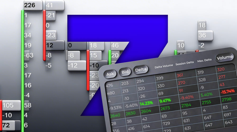
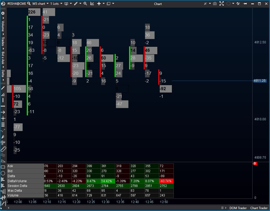
Volume Analysis on Footprint Charts
Footprint is the foundation of volume analysis in ATAS. It’s a special type of chart that shows how buys and sells are distributed at each price level within a candle — i.e., how price forms in real time.
Footprint allows you to analyze:
- how many trades occurred at each price level;
- where maximum and minimum volumes are concentrated;
- which side showed initiative — buyers or sellers;
- in which zones the price shows signs of support or resistance.
Unlike classic candlestick charts, footprint focuses not on the result of movement, but on the processes that led to it.
400+ Footprint Chart Variants
ATAS offers over 400 footprint chart display variants — from classic numerical clusters to profiles and heat maps.
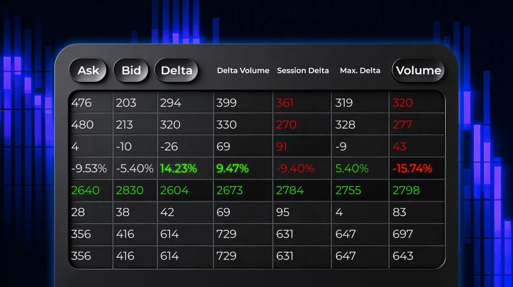
The footprint chart type determines what data you see at each price level inside the candle:
- Volume — trade volume at each price level;
- Trades — number of trades (activity intensity) by levels;
- Bid × Ask — separation of buys and sells inside the candle;
- Delta — difference between buy and sell volumes at the price level;
- Heatmap — simplifies footprint reading through color marking: the brighter and more intense the color, the higher the activity at the price level — by volume, number of trades, or delta.
For each type, different visualization modes are available: numerical values, histograms, profiles, heat maps, different color schemes — to customize the chart for specific tasks. Additional Footprint allows you to display an additional data representation on top of the main chart — to compare multiple modes in one candle without switching between charts.
Footprint Modes in Smart DOM
In Smart DOM you can activate special footprint columns to analyze market activity at price levels and in time perspective:
- Footprint — shows time-based clusters with buy and sell volumes at each price level. There are flexible timeframes, display modes, and color settings — to analyze price movement structure in detail.
- Rolling Footprint — displays activity for the last N seconds, helping track in real time how volume and buyer/seller initiative change.
ATAS Magnifier: Footprint Highlighting on Regular Chart
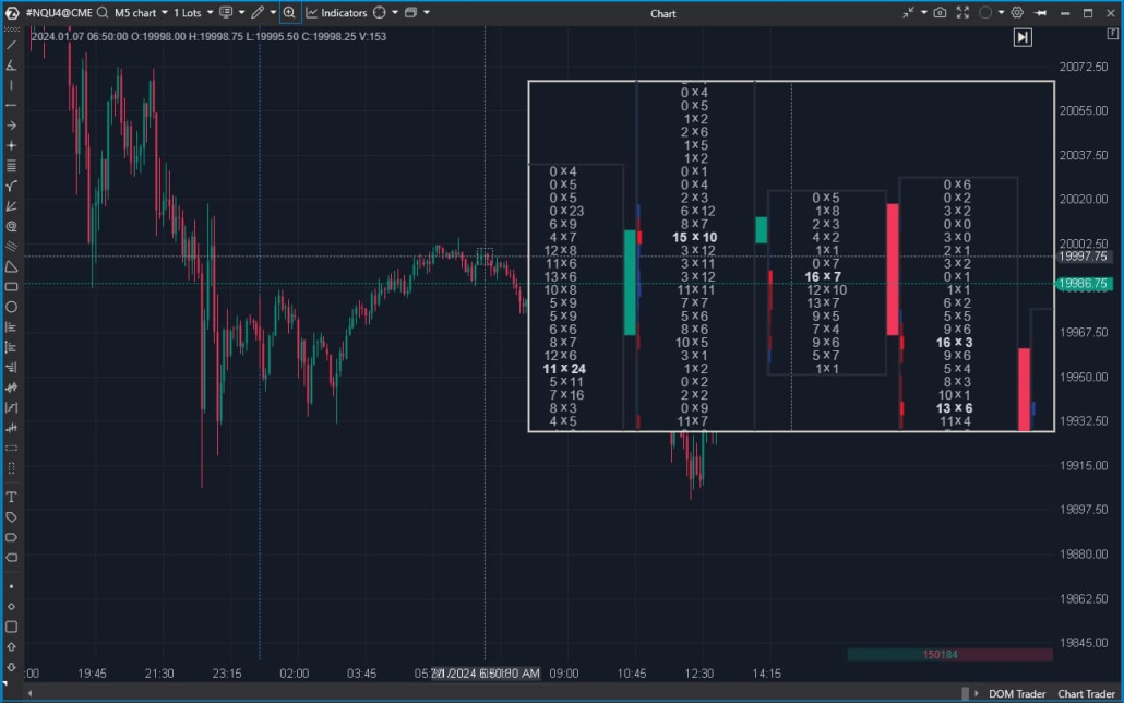
ATAS Magnifier is a “magnifying glass” for the chart that allows you to quickly view footprint detail of a selected area right on regular candles. Always at hand — activated by hotkey M.
With Magnifier you can:
- Analyze detailed volume and activity distribution inside a selected candle without switching to footprint chart mode;
- more accurately interpret areas of increased activity and price reaction to volume;
- Footprint based API (our API is specially designed for fast and easy work with Footprint data, developers don’t need to generate this data on their side, which significantly reduces the complexity of creating footprint indicators).
Vertical Volume Confirmation
Cluster Statistics — complements footprint analysis with summary vertical volume data for each candle. The indicator displays a table below the chart and helps quickly compare bars by key activity metrics.
What Cluster Statistics shows:
- 15+ parameters for each bar: Volume, Bid/Ask, Delta, Trades, Max/Min Delta and other values;
- convenient candle comparison without manual search — for example, by volume spikes or pronounced delta imbalances;
- capture of extreme values and atypical situations that are easy to miss on a regular candlestick chart.
Footprint Pattern Analysis
Thanks to advanced indicators and ATAS modules, you can work not only with individual clusters, but also with recurring footprint data structures.
They allow you to find characteristic activity patterns and systematically analyze market participant behavior.
Cluster Search
Cluster Search automatically finds and highlights clusters that meet specified conditions. You set criteria — by volume, delta, or number of trades — and get focus on price levels with atypical activity.
Used when it’s important to:
- find zones of increased or decreased interest;
- select significant levels by specified criteria without manually reviewing each bar;
- work with footprint data more systematically.
Initial Balance
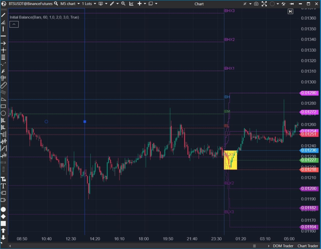
Initial Balance shows the activity range during the initial period of the selected session. Helps understand where the basic balance of supply and demand forms at the start of trading.
Used for:
- evaluating the starting session context;
- analyzing subsequent range expansion or retention;
- comparing activity inside and outside the Initial Balance.
Stacked Imbalance
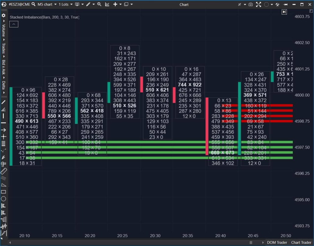
Stacked Imbalance identifies consecutive price levels with a pronounced imbalance on one side. Unlike a single imbalance, it analyzes a sustained activity structure across several consecutive levels.
The tool helps:
- find zones of directional pressure;
- see where initiative manifests not sporadically, but in series;
- complement Bid × Ask and Delta analysis with structural context.
Absorption
Absorption analyzes stop order data and identifies absorption levels using the imbalance method, where significant order volumes indicate potential support or resistance zones. It allows analyzing the interaction between market activity and limit liquidity.
Used to:
- identify levels where volume is “absorbed”;
- analyze price reaction to increased activity;
- better understand supply and demand structure.
Exhaustion
Exhaustion helps identify signs of decreasing activity after impulsive movements. It shows moments when volume or initiative stops supporting further development of the movement.
Applied for:
- analyzing phases of weakening activity;
- assessing changes in market conditions;
- complementing footprint analysis with volume dynamics context.
Order Flow Analysis
Order Flow helps view the market in the moment — through the flow of market trades. ATAS consolidates raw fragmented prints into a complete picture, so large orders are read as one action rather than dozens of lines.
Unique Smart Tape Algorithm
Smart Tape is an enhanced tape of prints that helps read the flow of market trades without “noise” and fragmentation.
- Print aggregation: the algorithm consolidates prints split by the exchange so you can analyze aggressive trades in their full size, not as a set of disconnected data.
- Volume filters: separate the flow by trade size and track the activity of large and small participants separately.
- History mode: analyze the flow of trades on any time section
- Templates: save your settings and quickly switch between analysis scenarios.
Building Chart by Order Flow
Use the advanced OrderFlow timeframe: it collects the flow of market trades into bars by volume / number of trades / delta and shows what happened at each price level.
This way you see not just the direction of movement, but its mechanics: where active buying and selling occurred, where large prints appeared and at which levels the price met liquidity.
Speed of Tape
Speed of Tape is an indicator that displays the speed of the tape of prints: it calculates the activity of the trade flow for a specified interval and highlights bars where the pace is noticeably higher (or lower) than usual.
Applied for:
- quickly finding sections where the flow of trades accelerates or, conversely, fades;
- highlighting bars with atypical activity to further analyze the context: at what prices the main flow occurred, and how the price reacted to it;
- filtering “noise” and focusing on significant spikes.
Order Flow
OrderFlow is an indicator that displays the flow of executed trades directly on the chart. Geometric markers with numerical values help instantly notice significant volumes. Essentially, it’s the print tape in graphical form — assess the balance between buyers and sellers dynamically, without constantly switching to a separate Time&Sales window.
Useful to:
- read initiative faster: where buys/sells dominated and how the activity balance changed during the movement;
- filter noise: you can leave only trades that are important for your analysis scenario (for example, by size/thresholds), and not overload the chart;
- complement footprint and Smart Tape: find areas that are worth analyzing deeper by clusters and price reaction.
Big Trades
Big Trades and Adaptive Big Trades are indicators that help quickly highlight large aggressive trades against the general flow and see where atypical initiative appears in the market.
Big Trades — highlights trades that exceed a specified volume threshold.
Adaptive Big Trades — adjusts the threshold more flexibly to better adapt to changes in the “normal” trade size during different periods.
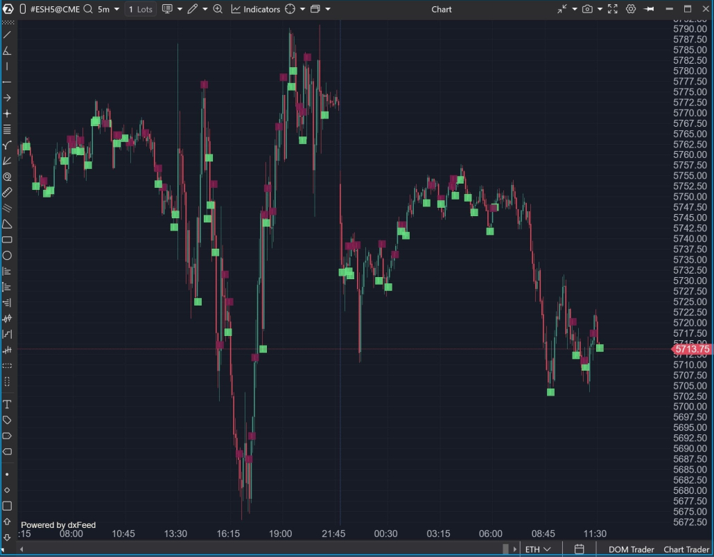
Tape Patterns
Tape Patterns is an indicator that takes data from the print tape / Smart Tape and marks on the chart chains of trades that meet specified criteria (by default — with colored squares). It has flexible settings: calculation mode (Any / Bid / Ask / Between / Bid or Ask), price range in the chain (Range Filter), and time filters.
Useful to:
- notice intensity spikes faster and the speed of volume appearance in the flow, without manually “peering” into the tape;
- see chain characteristics: minimum volume in prints, minimum total chain size, time distance between prints;
- compare areas with each other by flow “scale” (where volume passed noticeably more/less);
- find atypical dynamics: very fast print formation and appearance of large single prints.
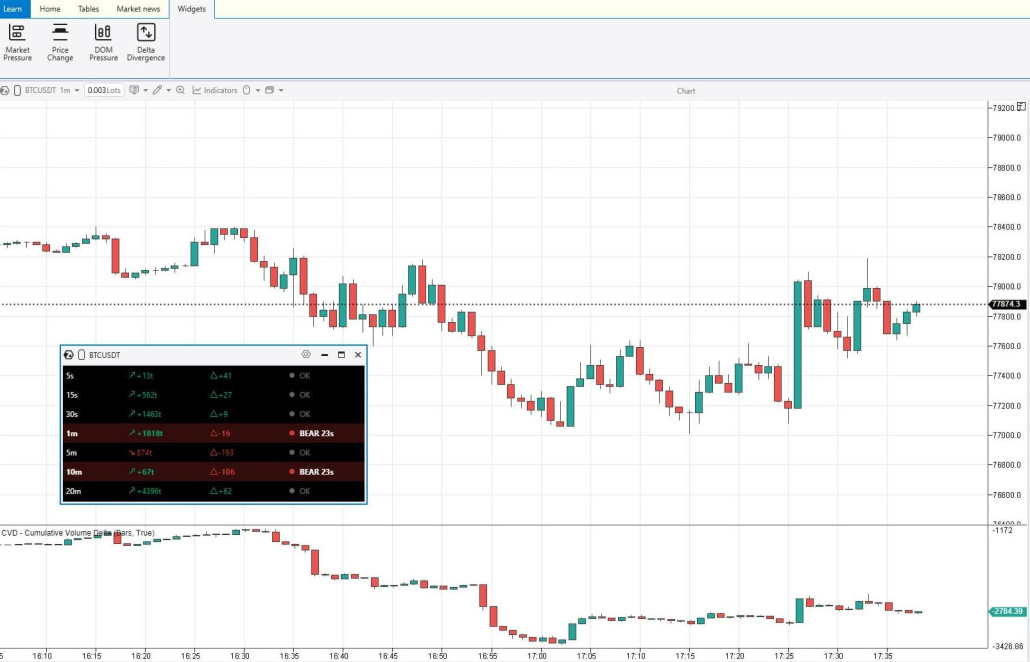
Market Pressure Widget
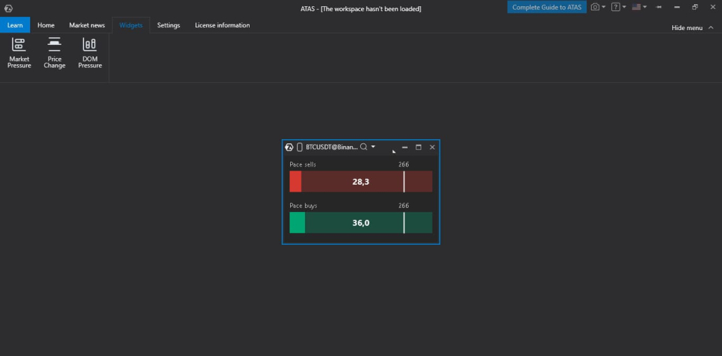
Market Pressure is a separate module in the Widgets section that shows buyer and seller pressure in real time. It tracks all trades and calculates the overall pressure of buyers and sellers using exponential decay.
Useful to:
1. track market activity spikes as they appear;
2. view pressure in two modes:
- VP (Volume Pressure) — weighs trades by volume (large trades contribute more),
- POT (Speed of Tape) — calculates “tape speed” by number of trades, regardless of size;
Price Change Widget
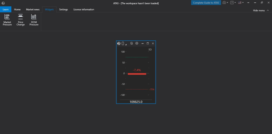
Price Change is a separate module in the Widgets section that shows the intensity of price change in real time. It translates the current price movement dynamics into an understandable scale from –100 to +100: the higher the value relative to the set threshold, the more noticeable the movement activity.
Useful to:
- quickly notice volatility growth when movement accelerates (even before it becomes obviously visible on the chart);
- compare movement “strength” at different moments — on one scale and in one window;
- adjust sensitivity to your analysis style: calculation method (Standard Deviation / Rate of Change), measurement window, normalization period, and trigger threshold;
- visually filter sideways or low-volatility markets;
- alert about sharp price changes.
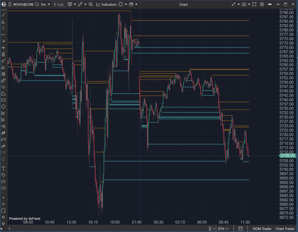
Liquidity Analysis
Heatmap
Heatmap is a liquidity heat map in the order book over time. It shows where and how long limit volumes stood in the order book: levels are colored by “intensity” — the more noticeable the color, the more volume was placed at that price.
This format is convenient to see at a glance not only the current order book, but also the history of liquidity behavior: where it accumulated, where it changed, and which levels remained the most “dense” over time.
The heat map allows you to:
- see liquidity concentrations at levels and how they change as price moves (not just a “snapshot” of the order book at the moment);
- find potentially significant zones on the chart faster without manually reviewing levels;
- work directly on the chart through market depth tools: Heatmap is built into DOM Trader and DOM Levels.
Users using dxFeed as a data provider can also analyze heatmap history for classic futures (for example ES, NQ, GC, FDAX, etc.) — that is, see not only current liquidity, but also its “trace” over time. For other users, heatmap history is available when analyzing cryptocurrencies.
Rolling Heatmap in DOM Trader and Smart DOM
Rolling Heatmap in DOM Trader and Smart DOM is a “live” heatmap mode that continuously updates and shows liquidity in the order book for the last N seconds/minutes (the window is set in settings). It’s convenient when you need to see not the history for an hour, but what’s happening right now — without switching to separate charts.
How this helps in your work:
- Read liquidity changes in the moment: where levels strengthen, where volume is removed, where new “spots” appear.
- Track how liquidity moves with the price: it’s noticeable where volumes “pull up” or, conversely, disappear.
- Quickly find relevant levels: bright and stable zones in the rolling window immediately stand out against the noise.
Essentially, it’s the same Heatmap principle (the more saturated the color — the more volume), but in the format of a short “rolling” window — for the most timely reading of the order book in DOM.
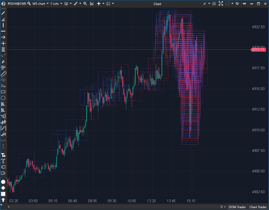
MBO DOM
MBO DOM — The indicator builds the order book based on “Market by Order” data – information coming from the exchange about the volumes of individual orders. You’ll be able to see which orders make up each exchange level – their volumes and the sequence of placement on the exchange. You can analyze detailed information for each order: price, volume, time of last order change, its ID, and priority in the execution queue.
Useful for:
- seeing liquidity structure deeper than in the aggregated order book — down to the order queue;
- faster finding atypical clusters (by volume or number of orders) through filters and highlighting.
DOM Power Indicator
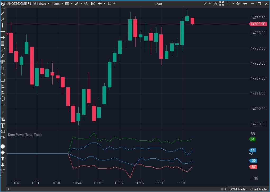
DOM Power is an indicator that displays Bid, Ask, Min Delta, and Max Delta as curves, helping assess the ratio of buyers and sellers in the order book and see how the balance of liquidity changes across price levels.
Useful for:
- quickly reading the supply/demand imbalance in the order book and comparing it with price reaction;
- finding prominent liquidity zones and reducing noise using filters.
DOM Pressure Widget
DOM Pressure is a separate module in the Widgets section that visualizes liquidity pressure in the order book and shows the current balance of buying and selling power based on weighted liquidity.
Useful for:
- quickly comparing the bid and ask side in real time on a unified scale;
- seeing where liquidity concentrates in the order book and how it changes;
- adjusting the analysis depth (number of levels), weight of near/far levels (Weight Decay), and threshold for visual monitoring/alerts.
Bid Ask Тape
Bid/Ask Tape — a special print tape that shows volume by bids and asks at each price level. It has a columnar format, where each row displays details of an individual trade:
- on the left column — trade execution time accurate to the second;
- followed by the price where the Bid was located during the trade;
- then market sell volume (Bid);
- volume inside the spread (traded between bid and ask);
- market buy volume (Ask);
- price where the Ask was located during the trade;
- delta value.
All Prices
All Prices — a module that shows horizontal volume values for specified time intervals according to price scale. These values are typically good support and resistance levels. The columns display:
- price level;
- volume — number of contracts traded at this level during the selected period;
- number of trades executed at this level during the selected period;
- Bid — number of market sells;
- Ask — number of market buys;
- Delta — difference between Bid and Ask.
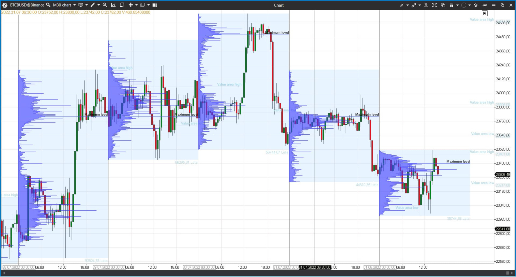
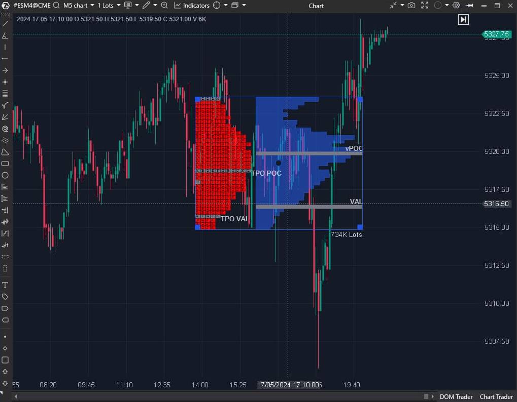
Identifying POC and Value Area Levels
POC (Point of Control) — the level of maximum interest, where the most volume passed during a given period.
Value Area — this is the working range where approximately 70% of trades are concentrated during a given period. The upper and lower boundaries of the zone serve as levels where a reaction is often noticeable: the market either returns inside the range, or consolidates above/below and begins to form a new value zone.
TPO (Time Price Opportunity) shows how long the price stayed at certain levels during a trading session. Each time interval is assigned a letter or block. The accumulation of these blocks forms the profile structure.
Volume Profile — a more modern technology. It shows the volume traded at a specific price. This way traders have the opportunity to see not only when there were significant volumes, but also at what prices.
When building the histogram, tick data is used that accounts for each trade; also in settings you can specify volume construction by the needed data types.
In ATAS you can add as many profiles to the chart as required for your strategy. Moreover, for each profile you can set individual settings.
Market Profile & TPO Indicator
The indicator builds the profile automatically and helps you see POC and Value Area in the flow, without manual markup.
Useful for:
- keeping POC/VA in view throughout the analysis;
- comparing how value zones change from period to period;
- quickly reading the distribution shape (balance/skew) by profile.
Market Profile & TPO Drawing Object
A drawing object that serves for manual profile markup: you manually specify with your mouse the section for which to build the POC and Value Area histogram.
Useful when you need to:
- analyze a specific movement fragment (impulse, pullback, consolidation);
- compare volume distribution across several different segments;
- Do a “post-mortem analysis” of history, setting precise analysis boundaries.
Profile Variants
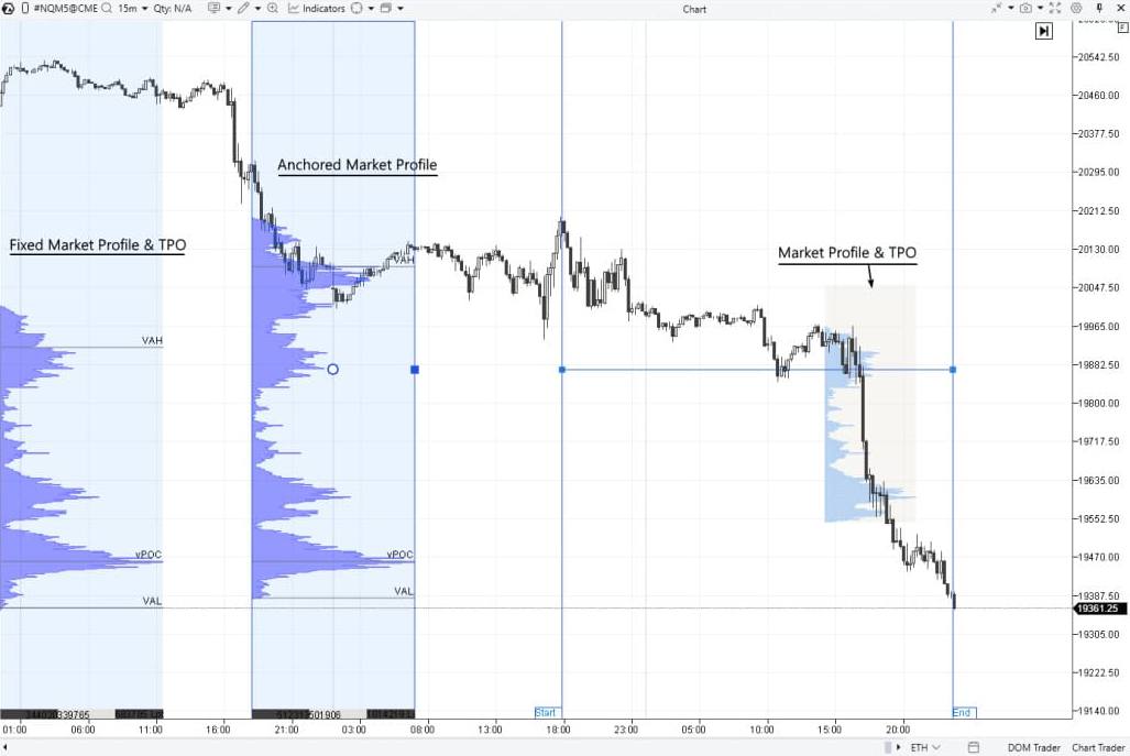
Fixed Market Profile & TPO – by default anchored to the left part of the chart and builds a profile for the current day.
Anchored Market Profile & TPO — the user manually specifies the start and end of profile construction with two points on the chart. Session Volume Profile (SVP) — a market profile displaying horizontal volumes for a given trading session.
ZigZag Market Profile & TPO
ZigZag Market Profile & TPO — a unique ATAS drawing object: the profile is built not simply by time, but by arbitrary price movement curves that the user selects manually with the mouse. This is convenient when the movement structure is more important than equal time intervals.
Useful for:
- comparing profiles on individual impulses and corrections;
- seeing where the value zone formed within a specific wave;
- finding areas with changed volume distribution and POC shift faster.
Delta Analysis
Delta shows the difference between buy and sell volume. It makes it easier to track how participant initiative changes over time and at specific price levels — and compare this with how price behaves.
Delta
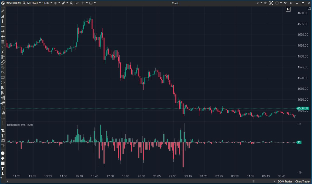
The Delta indicator displays at the bottom of the chart the difference between market buys and sells for each candle, and can also highlight delta divergences — situations where delta dynamics and price movement diverge.
Useful for:
- seeing where buys or sells dominated within the candle;
- tracking initiative shift from bar to bar;
- noticing “price vs delta” divergences faster as a signal for more detailed analysis.
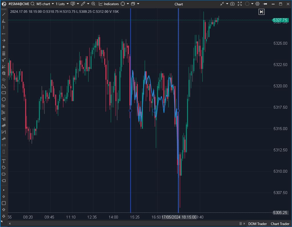
CVD Indicator
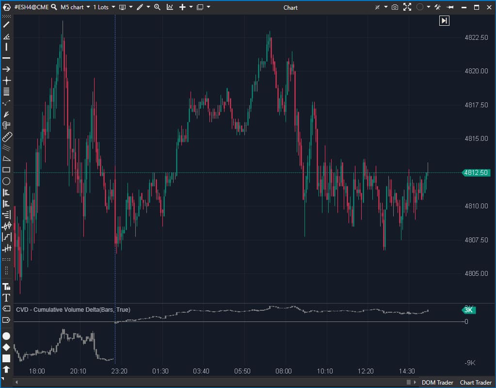
CVD (Cumulative Volume Delta) shows the accumulated delta over a specific time period. While regular delta shows the difference between market buys and sells for each bar separately, cumulative delta shows how the excess of buys or sells accumulates over time (from the start of the trading session or contract).
The indicator is useful for:
- seeing the direction of initiative accumulation over long stretches;
- comparing movement sections by the nature of delta accumulation/decline;
- adding context to impulses and pullbacks on the chart.
CVD Correlation Drawing Object
The CVD Correlation drawing object is a tool that helps analyze cumulative delta changes on a selected section directly on the chart. Essentially, it’s an alternative to classic CVD: the object draws cumulative delta tied to price movement, making it visually easier to compare delta dynamics and price behavior.
Useful for:
- quickly comparing how cumulative delta changed on a specific segment without activating additional panels;
- comparing price movement and delta in a single visual field — as additional context for section analysis.
CVD Pro / Market Power
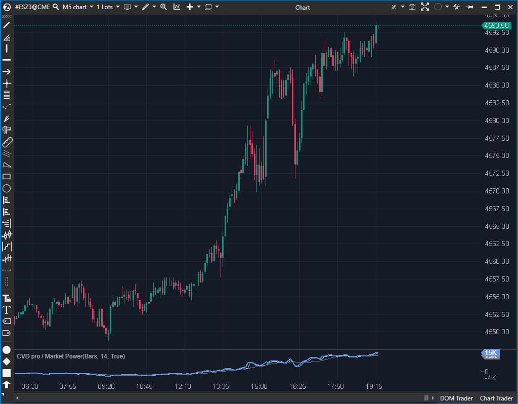
CVD Pro / Market Power — cumulative delta with trade flow filtering. Displays data only for the current session.
Key feature: the settings include a Minimum/Maximum Volume filter — it determines which trade volumes will be considered in the calculation.
Useful for:
- reducing noise and viewing cumulative delta by a selected flow slice (for example, only by larger volumes or by a specified volume range);
- comparing delta behavior for different types of activity (large vs small prints) and supplementing price/footprint analysis with this;
CVD pro (multi) / Multi Market Powers
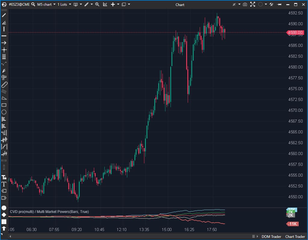
CVD Pro (multi) / Multi Market Powers — an indicator that allows you to display multiple “Market Power” (CVD Pro) simultaneously on one panel. Convenient when you want to compare delta under different conditions in one scale — without switching between panels.
Useful for:
- comparing initiative by different volume filters (for example, “small” vs “large” prints) in one visual field;
- seeing divergences between multiple CVD series and adding context to price movement;
- configuring different flow “slices” and quickly tracking how the picture changes from period to period.
Delta Divergence Widget
A new widget displays in real time the divergences between price movement direction and delta over a specified period from 5 seconds to 20 minutes.
- If price rises with positive delta or falls with negative delta — the widget confirms movement within the trend.
- If price falls with positive delta — the widget indicates a bullish divergence, during which price growth may begin.
- If price rises with negative delta, the widget indicates a bearish divergence, during which price may start to fall.
- Bullish and bearish divergences can also be accompanied by a time marker — how long the current divergence persists in the market.
Advanced Modules and Solutions
Independent Order Management
Place and control orders independently through Chart Trader, DOM, directly on the chart, by dragging with the mouse or using hotkeys.
- Close/reverse existing positions
- Configure leverage size, margin type, and other parameters for cryptocurrencies
- Flexibly configure risk management and position management using Stop Loss, Take Profit, Breakeven, and Trailing Stop through a separate menu block or directly on the chart using the position marker
- Automatically cancel pending orders when closing or reversing a position
Workspace Flexibility
ATAS is designed so you can customize every pixel to your strategy, minimizing visual noise and focusing on what matters.
Configure the architecture to your analysis style:
- Workspaces & Layouts: Organize charts, modules, and widgets so that all important information is always in front of you. Quickly switch between different markets or strategies.
- Templates: Save chart settings, indicators, drawing objects to apply proven configurations in one click.
- Visual Comfort: Choose light or dark theme, customize background and heatmap gradients, candle colors, markers, graphic objects for perfect data perception.
- Information Filter: Connect Watchlist, customize alerts and news feed to receive only important notifications.
- Localization: Configure time zone and language for convenient work from anywhere in the world.
Replay
Market Replay is a simulator that recreates past trading in the present. Figuratively speaking, it’s a “time machine” in a trading platform — with Play, Pause, Stop buttons:
- reproduces the real flow of trades and order book data, including cluster charts (Footprint) and non-standard timeframes;
- simultaneously plays a large number of instruments;
- works with all indicators and platform modules;
- adjustable speed from x1 to x1000 to save time;
- learning volume analysis and testing strategies without risk to real capital.
Following Manager
Manage multiple accounts simultaneously with a unified control center. Automate routine tasks — focus on strategy, not switching tabs.
- Smart trade copying. Create groups from a master account (provider) and multiple follower accounts. All operations of the main account are instantly duplicated to linked accounts.
- Seamless synchronization. Positions and orders are synchronized between accounts in real time.
- Unified analytical hub. Track balance status, open positions, and overall performance of all accounts in a single convenient interface.
API
Using the extended API, you can supplement the ATAS arsenal with custom indicators, robots, or protective strategies:
- allows you to use all the capabilities of the C# language;
- opens access to unique data categories: cluster content, aggregated trades, volume profile;
- providing access to developments to other ATAS users through a personal account/separate API.
If you have an idea for a new tool but lack programming skills, you can order development from professionals on our marketplace.
Resources, Support, and Community
We create an environment where both beginners and professional traders will find answers to any questions. Our ecosystem includes:
- Launch support. Visual manuals on working with the main ATAS tools await you in the “Learn” section inside the analytical platform. Here you’ll also find free trading books that will help you understand Market and Volume Profile concepts, footprint analysis, and tape settings. Ready-made chart and indicator templates are also available so you can immediately proceed to analysis.
Want to learn even more useful information? Get familiar with settings and functionality in the Quick Start section or join Live training on the YouTube channel to ask questions to an expert.
- Instructions and market analysis. Detailed instructions on setting up and working with each tool can be found in the Knowledge Base. Principles of working with tools, pattern identification, strategy building with examples on real charts await you in the blog and on the YouTube channel.
- Strong community. Trading is not just numbers, but also people. Join an active community of experienced traders on Discord and Telegram. Here you can always discuss market situations or ask colleagues for advice.
- Multi-channel support. Our managers are ready to help you with any question: on the website, via email support@atas.net, or on Telegram.
Download ATAS. It’s free. After installation, the free START plan is automatically activated — you have access to a basic set of features to get acquainted with ATAS functionality. You can use the free plan as long as you want and return to it at any time. You can also activate Free Trial — 14 days of free access to full functionality, which will help you evaluate the advantages of paid advanced plans and make an informed purchasing decision.
Subscribe
Get the latest ATAS news delivered conveniently