Every trade in the market comes down to two types of orders. Limit orders are placed in advance — a trader sets a price, say “buy at 5700, no higher,” and waits. These orders sit in the order book and form the market’s passive liquidity. Large players typically work through limit orders, which is why zones of their concentration become significant levels on the chart. Market orders are for traders who want in right now — they hit whatever is already sitting in the book and push price forward.
A candlestick chart shows only the outcome of that collision. Order flow is the collision itself: who was pressing, who was holding, and how it ended.
A trading heatmap is a visualization of the limit side of the market over time. Not a single snapshot of the order book, but its full history: where large volumes were building in advance, where they were pulled at the last moment before price arrived, and where they actually held under pressure. The denser the limit orders at a level — the brighter it appears on the map.
A candle will never show you this. It only records what has already been executed. The heatmap shows what is sitting in the book right now — and how that picture changed as price approached.
Start now!
Try ATAS free with no time limit
One quick note: in some contexts, “heatmap” refers to a multi-ticker market overview — which sectors or stocks are up or down. That’s a different tool with different logic. In ATAS, we’re working with a market depth heat map: a color-coded view of a single instrument’s order book, where you can see liquidity building and disappearing in real time.
Here’s what we’ll cover: what is heatmap in trading and how it’s built, how to read colors and volume bubbles, how to tell real liquidity from fake, four core patterns to recognize, and how it all fits together in ATAS with Footprint, Delta, and Volume Profile.
What Is a Heatmap in Trading?
Heatmap in ATAS is a standalone analytical module where liquidity is displayed through color. Where a large number of limit orders are resting in the order book, the color markers are brighter. Where there are few orders — less saturated. Across the entire price scale, in real time.
Heatmap vs. candlestick chart. A heatmap in trading works like a thermal camera. The device detects objects by temperature where the naked eye sees only darkness. A heatmap does the same with limit orders — it displays liquidity where a standard chart shows only the price at which trades were executed.
Heatmap vs. DOM (Level 2). A heatmap and an order book look at the same thing — limit orders in the book. The difference is that the DOM shows the Bid and Ask only at the current moment—like a snapshot. A heatmap unfolds that same picture over time—like a dashcam. You see how liquidity at a level changed as price approached it: where it was building, holding, or being pulled before the touch.
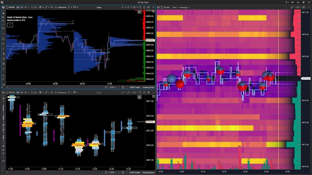
This does not mean one tool is better than the other — they complement each other naturally. Candles show the structure of price movement, the order book gives a current snapshot of liquidity, and the heatmap gives its history. Together, they give the trader more context for decision-making. In ATAS, you can flexibly build your workspace around your heatmap chart trading strategy: combine the module with footprint charts, DOM, widgets, or a Watchlist in a single window to see the most complete picture of the market.
The heatmap works equally well on futures, stocks, and crypto. On crypto exchanges, the available depth depends on your connection settings. On CME, full book depth usually requires a separate data subscription. Check with your broker or data feed provider about what’s included in your plan — what you see on a heat map in stock market or futures trading depends directly on the quality of your feed.
How to Read Heatmap in Trading
The mechanics of a trading heat map are straightforward. The vertical axis is price, the horizontal axis is time. The more limit orders sitting at a given price at a specific moment, the brighter the marker.
The map updates in sync with the order book in real time. New limit orders appear at a level — the marker gets brighter. Orders are pulled — it fades. Market orders absorb the limits — same result: the level loses saturation because there is less liquidity there.
One important nuance
A bright marker tells you only one thing — there are more limit orders at this level right now relative to neighboring levels. It is not a guarantee of a reversal or a price reaction. What happens next depends on how liquidity behaves as price approaches the level.
Reading Heat Map Colors: What Each Zone Means
The specific colors depend on the palette you choose — ATAS offers more than twenty. But the principle is the same across all of them: a saturated color means a high concentration of limit orders at a level; a muted color means low. The logic is universal, the shades are not.
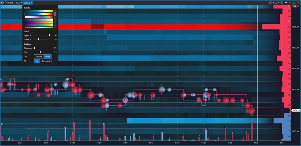
Every trader picks a palette that works for them. Some read warm tones better — dark to yellow to white. Others prefer cool — dark blue fading to light blue. The key is that the gradient feels natural to your eye: in active heatmap trading you are looking at the map for hours, and color fatigue is a real issue.
One important caveat
Saturation tells you about order density — not about whether price will react at that level. Orders can be pulled at any moment, especially large ones, which are exactly what creates the brightest zones on the map.
Learning how to read heatmap for trading correctly means understanding this distinction — we’ll cover how to tell real liquidity from fake in a dedicated section below.
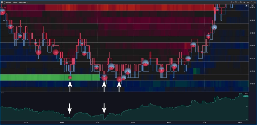
Volume Bubbles (Dots): How to Interpret Executed Trades
The heatmap background shows you the passive side of the market — limit orders resting in the book. Bubbles cover the active side: the market orders that absorb them. Each bubble represents trades executed at a specific level over a given period of time. Understanding both layers is what heatmap trading is really about.
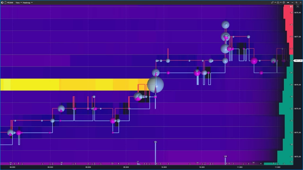
Bubble size reflects volume: the larger the trade or series of trades in one direction, the bigger the bubble. Color indicates the direction of aggression — buyers hitting the Ask or sellers hitting the Bid. The exact colors depend on your settings, but the logic is the same: two sides, two colors.
The most interesting moments happen when a large bubble appears directly on a bright heatmap level. Knowing how to read heat map trading context opens you two scenarios:
- aggression is being absorbed by limit orders and the level holds;
- there are not enough limit orders left and price breaks through.
This combination — a bubble plus liquidity behavior — is the foundation of order flow heatmap trading.
Key Heatmap Components You Need to Know
A heatmap for trading is not a single-metric view of the market. Its strength lies in layering three data streams at once. Below are the three pillars in ATAS terms: DOM, Volume indicator, and Cumulative Volume Delta (CVD) — each working alongside the heatmap chart.
Together they answer three different questions:
None of them gives a complete picture on its own — but combined, they give the trader context that is simply not available on a standard chart.
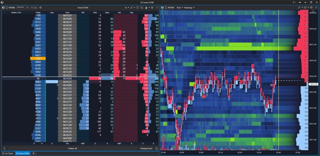
DOM: Where Liquidity Sits Right Now
ATAS offers several ways to visualize the order book: the full-featured Smart DOM module, as well as DOM Trader and DOM Levels indicators, both of which also work in heatmap mode. The order book in the Heatmap module is displayed in its most concise form — only the key order data relevant to liquidity analysis.
Order book data is displayed directly on top of the heatmap. To the right of the price axis, you’ll see horizontal bars extending left into the chart:
- red bars above the current price — these are Ask, resting sell limit orders that form resistance;
- green bars below — Bid, resting buy limit orders that form support.
The longer the bar, the more limit orders are sitting at that level.
The current price runs as an invisible line across the entire screen, dividing it into two sides. Price moves up when market orders absorb the Ask. Down — when pressure hits the Bid.
ATAS is a powerful heatmap trading software where you can cross-reference live order book data with heatmap history — and see not just where liquidity sits, but how it behaved when price got there.
One critical note
Orders appear and disappear from the DOM instantly. Making trading decisions based on order book appearance alone, without watching how liquidity behaves as price approaches, is one of the most common mistakes in order book heatmap trading.
Volume Indicator: Context at the Level of Every Candle
The Volume indicator is displayed below the heatmap as vertical bars — one per candle. Bar height shows the traded volume for the period. Color indicates direction: bars are colored by delta, reflecting the dominance of buyers or sellers over that same interval.
A volume spike on a bar is a reason to pause and look at the heatmap: what was happening at nearby levels at that moment? Did liquidity hold under pressure or was it absorbed?
In the settings, you can switch the data source: total volume, asks only, bids only, or tick count. This lets you isolate aggression from one side and examine it independently from the overall flow. As part of an order flow heatmap trading setup, the Volume indicator answers a key question: when exactly was the market active — and who was pressing harder. That context is what separates a reactive heatmap trading strategy from one built on guesswork.
Cumulative Volume Delta (CVD): Who Was Pressing and How Hard
Delta is the difference between aggressive buying and selling on each bar. Cumulative Volume Delta (CVD) sums that imbalance on a running basis — showing how the balance of aggression shifted throughout the session.
Why does this matter alongside the heatmap? A bright level on the map indicates a concentration of limit orders. But without confirmation, it can be a trap. CVD adds the missing data layer: if buyers were pressing for several bars in a row but price wasn’t moving up into a wall of limit sells — that’s a reason to consider an absorption scenario, where large limit orders were containing the buying pressure.
That’s why in ATAS the heat map is rarely used in isolation. Combined with CVD, it reveals the full picture: where liquidity was sitting — and who was pressing against it, with what force, and for how long. That combination is the core of any serious liquidity heatmap trading and order flow heatmap trading approach — and the foundation of a data-driven heatmap trading strategy.
Section summary
— Heatmap shows where liquidity is sitting and how it changes over time
— Volume tells you when the market was active and who was pressing
— CVD confirms who was pressing harder — turning observation into hypothesis
— No single tool is enough — the three work together
Real vs. Fake Liquidity: How to Tell the Difference
The heatmap shows what is in the order book right now. But the presence of an order is not a guarantee of its execution.
Large players sometimes place a significant order to create the right psychological effect — and cancel it the moment price approaches the level. This is called spoofing.
What is spoofing?
Spoofing is the practice of placing large orders in the book to influence market participants — then canceling them before execution. It is prohibited on traditional exchanges and monitored by regulators. On crypto markets, oversight varies significantly, which is why spoofing is far more common there.
This is not paranoia or conspiracy theory. It is market mechanics — and understanding it is what prevents you from being trapped by your own heatmap trading analysis.Below are two scenarios illustrating fake and real liquidity heatmap trading: what each looks like on the map, and what happens when price reaches the level.
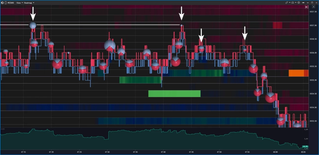
Fake Liquidity: Spoofing and How It Looks on the Heat Map
Imagine: a massive wall appears in the order book — thousands of contracts at a single level. Some traders see support and buy. Others see resistance and close their longs. The market moves in the direction the spoofer needs. Once the effect is achieved — the order is pulled. That’s spoofing — and it’s one of the most important traps to understand in order book heatmap trading.
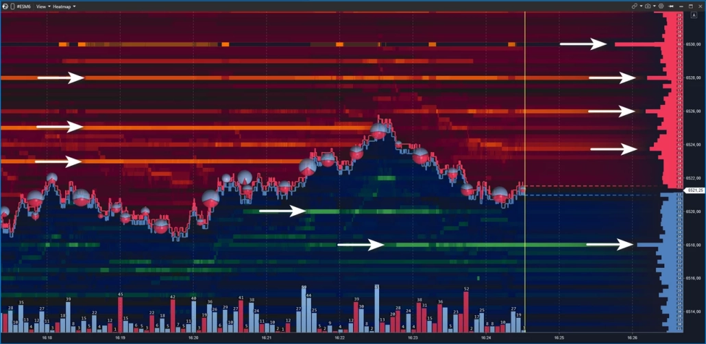
On the heatmap, it looks like this: a bright zone appears in advance, holds as price approaches — and vanishes at the last moment, before the touch. For example, the price moves toward the 6520 support zone, where the map shows a dense cluster of limit buy orders. But as the price approaches, the zone fades and disappears — the price passes through the level with no reaction, because there’s nothing behind it anymore. The same happens at levels around 6518 — they were similarly pulled before the price dropped.
Another telltale sign of false levels is the absence of large market sell trades. If real large-scale support existed, breaking through it would require a flood of market sell orders hitting at once — they would show up on the chart as large Bubbles circles with a red imbalance.
That’s why experienced traders don’t rush to act when they spot a bright level on the map — they wait for price to reach it and show what actually happens. A bright zone is a hypothesis. Confirmation is the touch, the volume, and how price behaves after — and reading that sequence correctly is what separates a reactive heatmap trading strategy from chasing levels on color alone.
How to spot fake liquidity on the heatmap
1A bright zone appears well in advance, but vanishes right before price touches it
2Price passes through the level with no volume bubbles — no real aggression was absorbed
3No delta confirmation — if the level were real, breaking it would require significant one-sided aggression
Real Liquidity: Absorption and Price Reaction
Real liquidity is when an order stays in the book, price reaches it, the limit orders get executed — and the market reacts. The level holds, price bounces or reverses. That’s absorption in action.
How do you tell a real level from a fake one? Three things to watch at the moment of contact:
Signs of real liquidity (absorption)
✓The bright zone holds as price approaches — it doesn’t fade or disappear
✓Large volume bubbles appear right at the level — aggression is hitting the limits, but price isn’t moving through
✓Delta diverges from price movement — for example, buyers are pressing but no new highs are being made
All three together make a strong case for an absorption scenario. One out of three is a reason to observe — not to conclude.
The core of any liquidity heatmap trading approach comes down to this: it’s not about where orders appear to sit — it’s about how price behaves when it gets there. The heatmap shows where. Volume and delta show what. That read is the foundation of order flow heatmap trading — and what makes the difference in a data-driven heatmap trading strategy.
Heatmap Trading Setups — 4 Patterns to Know
A heatmap does not provide ready-made entries — it provides context. Below are four repeating scenarios that traders use as a basis for order flow heatmap trading analysis. Each of them requires confirmation: price behavior, volume, and delta. Without that, any heatmap trading strategy comes down to reading color on a screen — and that’s not enough.
Setup 1: Absorption — When a Level Holds
Aggressive market orders press into a level, but price does not break through. The bright zone on the heatmap holds. Large volume bubbles appear right at the level — large, in one direction. Delta diverges from price movement.
In a buy-side scenario, sells hit the bid but price does not fall lower — limit buyers are absorbing the aggression. In a sell-side scenario — the mirror picture.
Traders working with this pattern typically monitor price behavior after the first touch of the level — watching for delta divergence as the key confirmation in order flow heatmap trading. If the level breaks — the absorption hypothesis was not confirmed.
Setup 2: Exhaustion — When Momentum Runs Out
Unlike absorption, there is no powerful opposing wall here. Aggression simply runs dry: volume bubbles get smaller with each bar, price slows and stalls in a low-liquidity zone on the heat map.
In a buy-side scenario, large bubbles give way to smaller ones and price stops making new highs — the fuel is gone. In a sell-side scenario — the mirror picture.
Traders working with this pattern track the sequential decrease in bubble size as confirmation that momentum is fading, not just pausing. Knowing how to read heatmap trading exhaustion correctly means distinguishing between a genuine slowdown and a brief consolidation before the next push — and volume bubbles are the key to that read.
Setup 3: Iceberg Order — Hidden Size at a Level
The visible order size in the book is small, but the level never runs out — it keeps refreshing as orders are executed. Price returns to it again and again, volume bubbles keep printing, and the limit never seems to shrink. This is one of the more subtle patterns in order book heatmap trading — and one of the hardest to confirm without the right tools.
The hypothesis: a large participant is breaking up their order into smaller pieces, hiding the real size. Confirming an iceberg from the heat map alone is not possible. In ATAS, traders use several tools for this:
- Footprint — shows the execution structure inside each bar: if large volume keeps printing at a level while price doesn’t move, it’s visible in the bid/ask breakdown inside the candle
- Smart Tape — if large prints of roughly the same size keep appearing at a level, it’s an indirect sign of algorithmic iceberg execution
- TTW Iceberg Detector — a specialized indicator for those who hunt icebergs systematically
Setup 4: Liquidity Sweep — Stop Hunt and Reversal
Price sharply breaks through a known level, collects stops and limit orders — and quickly returns. On the heatmap: a fast spike through a bright zone, minimal volume bubbles on the breakout, sharp reversal.
This pattern is most commonly observed on futures at the session open or around macro data releases. Unlike absorption or exhaustion, the sweep is built on speed: the move through the level is sharp, the return is equally fast — and the window for reading it on the order book heatmap trading view is narrow.
Traders working with sweeps typically wait for price to return back through the broken level and monitor liquidity behavior on that return — making it one of the more demanding setups in any heatmap trading strategy. The same mechanics apply on crypto, where liquidation heatmap trading zones often overlap with classic sweep levels, amplifying the move. More on liquidity zones and sweep mechanics — in a dedicated article.
Quick reference: 4 setups compared
| Setup | What you see on heatmap | Key signal | Confirmation |
|---|---|---|---|
| Absorption | Bright zone holds at touch | Large bubbles, no breakout | Delta divergence |
| Exhaustion | Low-liquidity zone, no wall | Shrinking bubbles each bar | Price stops making new highs/lows |
| Iceberg | Level keeps refreshing | Volume > visible book size | Footprint + Smart Tape |
| Sweep | Fast spike through bright zone | Minimal bubbles on breakout | Sharp return through the level |
What Is Liquidation Heatmap in Crypto Trading: Different Data Types
⚠️ An order book heatmap and a liquidation heatmap are two different tools. They have different data sources, different reading logic, and different conclusions.
A liquidation heatmap in crypto trading does not show limit orders in the book. It displays zones where leveraged positions have accumulated — those that the exchange will forcibly close if price reaches them. Large liquidation clusters above the current price often act as magnets: the market gravitates toward them to collect stops and close longs. But these are not support and resistance in the classical sense — this is a map of potential forced closures.
A standalone liquidation heatmap is not available in ATAS — for that, traders turn to third-party dashboards: Coinglass, Hyblock, and others. However, ATAS does offer tools that allow you to build a close approximation independently. An example workspace for liquidation heatmap trading strategy:
- DOM Heatmap — liquidity concentration zones in the order book and how they behave as price approaches
- Aggregated Liquidations — aggregated liquidation data by instrument
- Coinglass Open Interest — open interest data from Coinglass. Rising OI with rising price indicates new positions being opened; falling OI with falling price indicates liquidations
- CVD — cumulative volume delta for tracking the balance of aggression
- Volume — traded volume per candle with delta breakdown
Please note: Aggregated Liquidations and Coinglass Open Interest indicators are not available for all crypto instruments.
Heatmap + Footprint Chart: Why Use Two Layers
A heatmap shows where liquidity is sitting. But it doesn’t answer what was happening inside the bar at the moment the price touched the level. That’s where Footprint comes in.
ATAS is a specialized footprint analytics platform with more than 400 variations of cluster charts. Footprint shows the distribution of volume across Bid and Ask inside each candle at the level of individual price ticks: who was pressing, with what force, and exactly where aggression met resistance. This two-layer read is what separates serious order flow heatmap trading from working with color alone.
The workflow looks like this:
- Context: Use Heatmap to identify zones of interest — where liquidity has accumulated and how it behaves as price approaches.
- At the touch: Heatmap shows whether the wall holds as price approaches. If the density holds, open the footprint on a timeframe from m5 to m30 (depending on your preference) and examine the execution structure inside the bar: evaluate delta by level, imbalances, and absorption.
- Hypothesis execution: After entry, Heatmap helps you track whether new limit order density has appeared that wasn’t there at the planning stage. Footprint shows how the execution structure changes as the scenario develops. If the picture has changed, that’s a reason to pause and reassess the scenario rather than act on inertia.
ATAS works across different assets — and the same two-layer workflow applies regardless of the instrument. For traders looking for the best heatmap trading software that combines depth-of-book visualization with footprint analytics in a single workspace, this combination is hard to match. Heatmap for stock trading, futures, or crypto — the data layers and the logic are the same. Learn more about footprint analytics in ATAS — dedicated section.
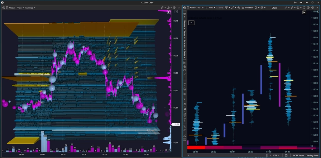
How to Read a Heat Map: Chart Examples
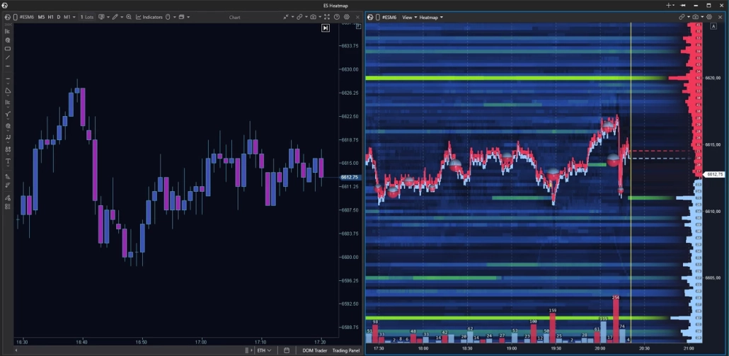
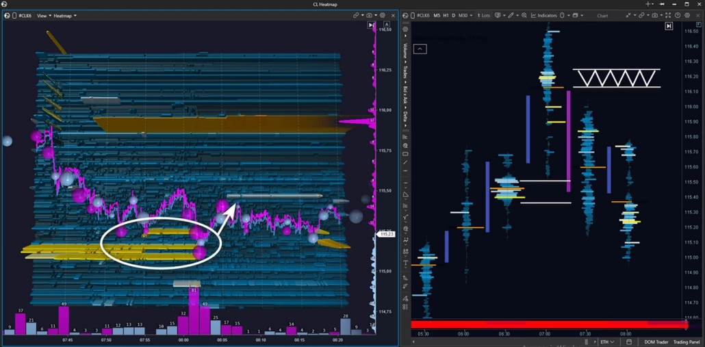
Let’s break down a real situation: how to read heatmap trading on the CL crude oil futures. Heatmap + Footprint combo, M30 timeframe. Context: intraday uptrend.
As price moves up, the heatmap chart trading view shows several zones with large clusters of limit sell orders — potential resistance zones.
Price breaks through the first yellow zone with momentum and holds above it — buyers are in control. Then price approaches the next major level on the heatmap and stalls in front of it. After a pullback and a second attempt to break through, buying pressure visibly weakens: the blue Bubbles shrink — buyer aggression is fading.
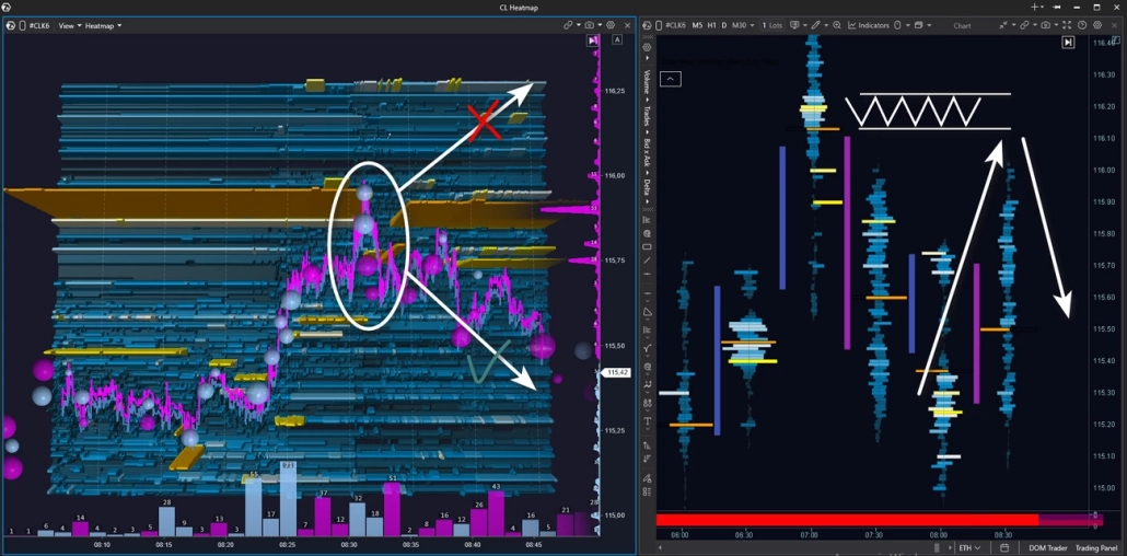
In the next segment, price moves down under selling pressure — pink Bubbles dominate. Price drops below the previous limit level that buyers had broken through earlier: if a seller was truly positioned there, their position is now in profit.
At this point, look at the cluster chart. A fresh absorption cluster appears — price reacts with a downward impulse. All the signs are in place: buyer weakness, seller strength, buyer aggression absorbed by limit sells. The intraday uptrend is now in question.
This example illustrates a practical heatmap trading strategy: combine liquidity visualization with footprint execution data to read shifts in market structure — and reassess your scenario when the picture changes.
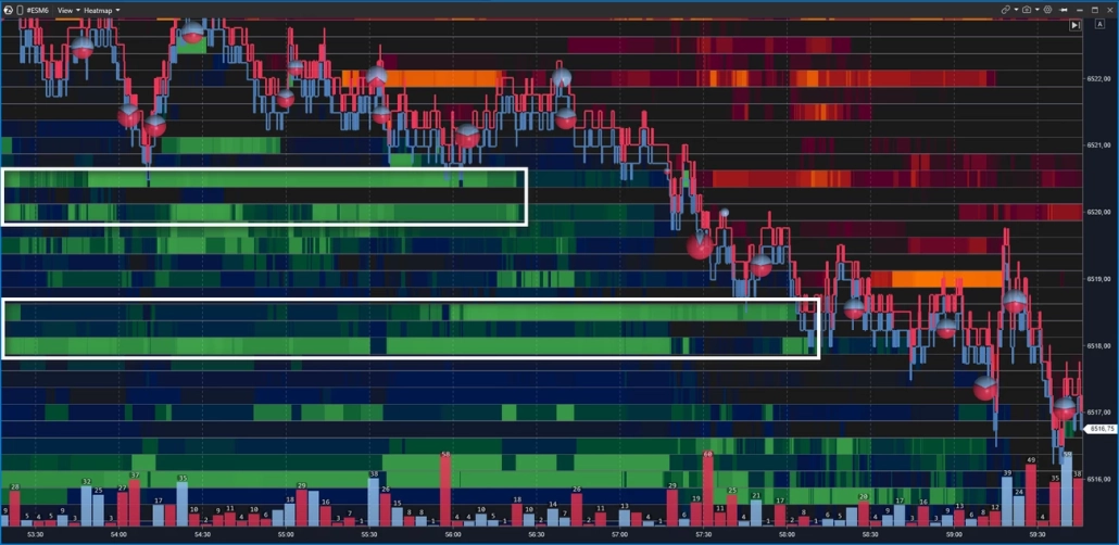
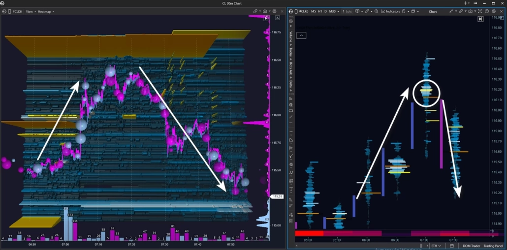
After a downward impulse, price runs into a zone of limit buyers — the seller pushes, but can’t break through support, and the market settles into a tight range.
What’s more interesting: a fresh limit sell zone has appeared above that wasn’t there before. It holds firmly in place and looks like a potential resistance zone in a developing downtrend. The next step is to wait for a test of this zone to assess who proves stronger at the touch.
Price tests the seller zone — large buy Bubbles appear, but there’s no breakout. The bounce down is instant: buyer aggression is absorbed. The footprint chart shows a fresh seller cluster — and the price reaction confirms it’s being defended. Price moves down.
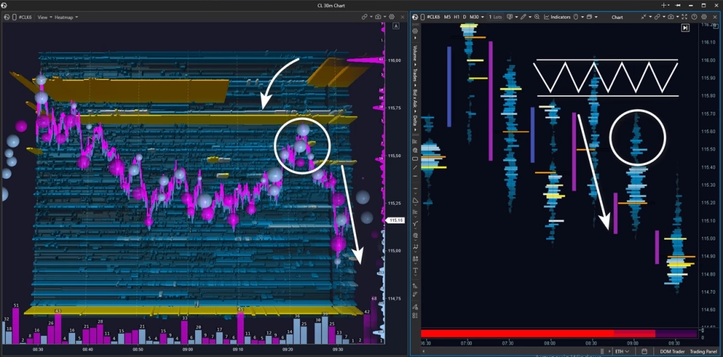
After a bounce and a brief range, price reverses and heads toward the limit resistance zone again. But this time buyers can’t reach the level — no market buys, no pressure. Price stalls on its own and turns down: there’s no buyer support left.
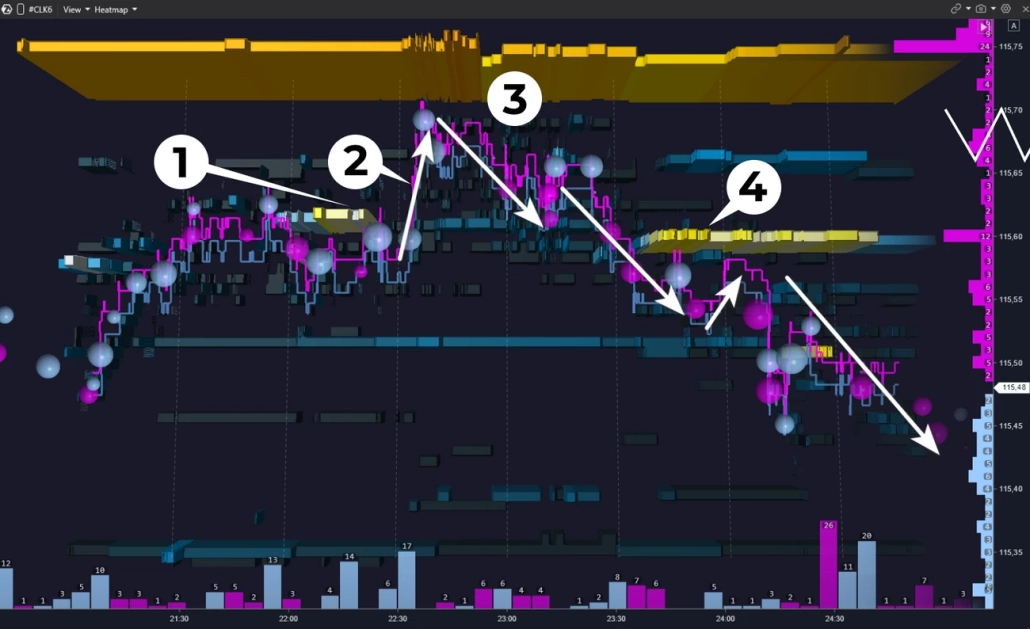
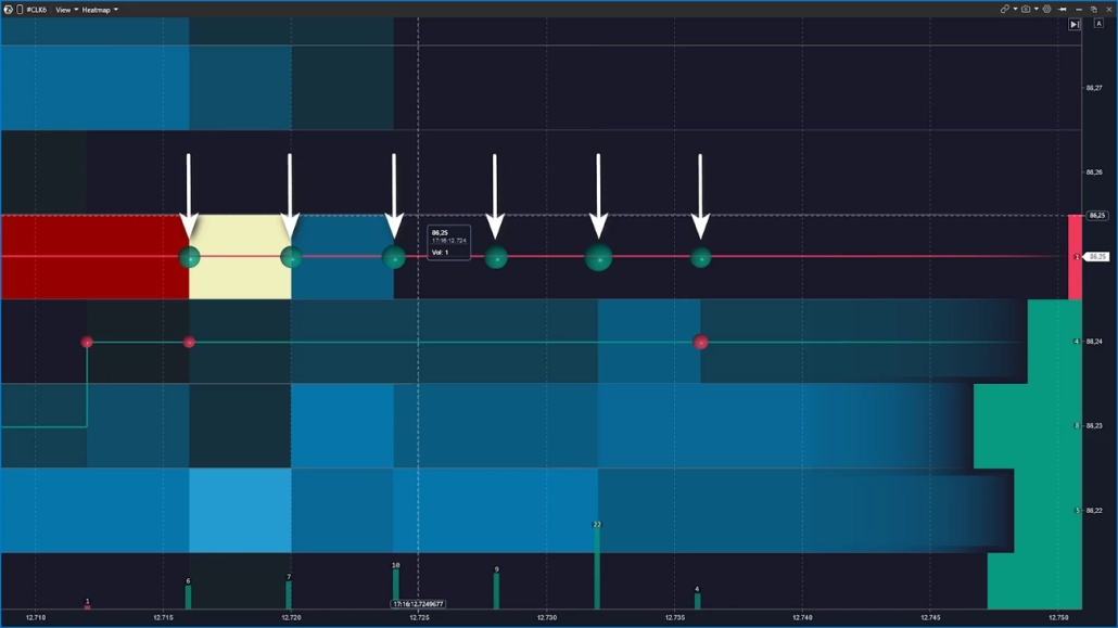
Let’s examine the seller zone retest in more detail — zooming in on the heatmap.
At point 1, a limit sell level appears. At point 2, price breaks above it — the aggressive buyer is still in control.
At point 3, the picture changes: price starts sliding down, there are no large market buys — there’s no one to drive price higher. At point 4, a fresh strong seller level appears. This isn’t just downward pressure — the seller is establishing a resistance zone to defend with limit orders.
After several small tests of this zone, the decline continues.
This pattern repeats regularly — and offers a vantage point to observe even during a directional move. For those who missed the entry at the main level test, this is an additional opportunity to join the move with confirmation
Every hypothesis has a point of invalidation. It’s important to define your stop-loss and take-profit levels in advance — before price reaches the zone. If the level breaks and liquidity failed to hold — the scenario doesn’t play out, and the stop captures that fact with minimal damage.
5 Common Mistakes Traders Make With a Heatmap
A heatmap is a powerful analytical tool. But there are several recurring mistakes that undermine its potential entirely.
1. Entering a trade at every bright zone
Many large zones on the map become invalid over time — they get pulled or repositioned before price reaches them. Brightness indicates liquidity concentration, but not that it will stay there.
2. Reading the heatmap without context
Without higher timeframe structure and volume profile, the map becomes a set of colored bands. A level needs to make sense in the context of the daily range, POC, and balance — otherwise there is nothing to analyze. This is where how to read heatmap trading correctly begins: not with the map itself, but with the structure behind it.
3. Confusing a liquidation heatmap with an order book heatmap
Different data sources, different reading logic, different conclusions. If you’re asking what is liquidation heatmap in crypto trading — we covered it in detail above. These are not interchangeable tools.
4. Reading color without delta
A bright zone in the order book is only half the picture. If aggression doesn’t confirm what the heatmap is showing, the wall may be a decoy. Delta is what turns an observation into a hypothesis — and it’s a core part of any serious heatmap trading strategy.
5. Zooming in too far
A tick-level heatmap on an active market creates visual chaos. Start with a scale where levels are clearly readable, then adjust the depth. Getting the right zoom level is key to using any heatmap trading software effectively.
FAQ
Yes, and in several different forms.
The Heatmap is first and foremost a standalone module. It features lightning-fast rendering at 600+ FPS on high-end GPUs — meaning display performance is only limited by your hardware. Smooth color transitions help you focus on real liquidity movement without visual noise. You can zoom in as close as you need to examine price action details that would otherwise go unnoticed. The Heatmap module can be combined with Smart DOM, Smart Tape, footprint charts, or widgets — and you can add indicators or drawing objects directly on top of the heatmap for additional precision.
The Heatmap is also a core component of two indicators:
DOM Trader — a full-featured order book module with a built-in heatmap. It displays the current state of the order book, the history of liquidity changes, and executed trades in a single window. Ideal for scalping and short timeframe work, where reading market microstructure in real time is essential.
DOM Levels — an indicator that displays the order book heatmap directly below the chart. Unlike DOM Trader, it doesn’t replace the main chart — it complements it: you see candles and liquidity at the same time without switching between windows. Works well on medium timeframes when you need order book context without losing sight of price structure.
Finally, Heatmap is available as one of the footprint visualization modes. It color-codes each price level inside the candle based on Heatmap by Volume, Heatmap by Trades, or Heatmap by Delta.
A heatmap is a visualization of limit orders in the order book over time. Color reflects the relative density of orders at each price level. The tool shows where liquidity is building, holding, or disappearing as price approaches.
A candle shows what already happened — open, close, high, and low for the period. A heatmap shows the cause: where liquidity is sitting in the order book, ready to either stop a move or let it through. A candle is the outcome — a heatmap is the context.
An order book heatmap is built from real limit orders placed by market participants. A liquidation heatmap shows zones where leveraged positions have accumulated — those that the exchange will forcibly close when price reaches them. Different data sources, different reading logic.
A saturated color means a high concentration of limit orders at that level relative to neighboring levels. Less saturated means low concentration. The exact shades depend on the palette you choose — ATAS offers more than twenty. Brightness indicates density, but does not guarantee a price reaction.
Absorption is when aggressive market orders hit a level but price doesn’t break through. The bright zone holds on the map, large volume bubbles appear right at the level, and delta diverges from price movement. It often precedes a reversal — but always requires confirmation.
Yes, provided you have a quality Level 2 data feed and correct depth settings in your connection. On crypto, the available depth depends on your connection settings and the specific exchange. It’s important not to confuse the order book heatmap with a liquidation heatmap — these are different tools with different logic.
Key Takeaway
The heatmap is not a magic button or a prediction machine. It’s an observation tool: where pending orders sit in the order book, how they behave under pressure, and what happens when price reaches them.
A bright zone on the map is a hypothesis, not a fact. Large orders sometimes get pulled at the last moment, levels get broken, and patterns don’t always play out. That’s exactly why it’s best to use the heatmap alongside other advanced volume analysis tools — delta, footprint, and volume instruments. You’ll find all of these and other powerful tools in ATAS.
- Combine the Heatmap module with any other windows in a single workspace: Smart DOM, footprint, tape of prints, watchlist, various widgets — everything to bring your strategy to life.
- Modules synchronize along the price axis: simply scroll the heatmap, chart, or order book vertically — and the rest of your workspace moves with it.
- Lightning-fast response at 600+ FPS on a high-end GPU ensures smooth performance on the most dynamic markets. Rendering speed is limited only by the power of your machine.
- Phenomenal detail and smooth color transitions between levels cut through visual noise. You can zoom into the chart down to the finest detail.
- Bubbles, indicators, drawing tools — layer additional analysis right on top of the heatmap.
- 3D mode and a wide selection of color schemes open up customization possibilities.
Want to see how it works in real time? Download ATAS and try the Heatmap in action — for free.
And one last thing: ATAS provides analytics and visualization. The decision is always yours.
Information in this article cannot be perceived as a call for investing or buying/selling of any asset on the exchange. All situations, discussed in the article, are provided with the purpose of getting acquainted with the functionality and advantages of the ATAS platform.
Subscribe
Get the latest ATAS news delivered conveniently