Order Flow:
the Mechanics Hidden Behind Every Candle

A regular chart shows the result. Order Flow shows the reasons.
Try for free

What is Order Flow?

This is a market analysis method that reveals the flow of executed trades and available liquidity in the order book: who is buying, who is selling, where volume is concentrated, and how the opposing side responds. Unlike traditional chart analysis, Order Flow shows market activity in real time — not after the move has already happened.

Order flow analysis allows you to analyze participants' intentions in the order book — before the move takes shape on the chart

Every price movement is the result of an ongoing clash between two types of market participants. While some wait, others take action. Understanding how they interact is the foundation of Order Flow analysis.
  • Aggressive participants — move the price

    Market orders are trades executed here and now at the best available price. When these orders consume available liquidity at the current level, the price moves to the next one.

  • Passive participants — slow or absorb the price movement

    Limit orders are placed by traders who want to enter at more favorable prices. These orders wait at predefined levels, adding liquidity to the order book and acting as barriers to price movement.

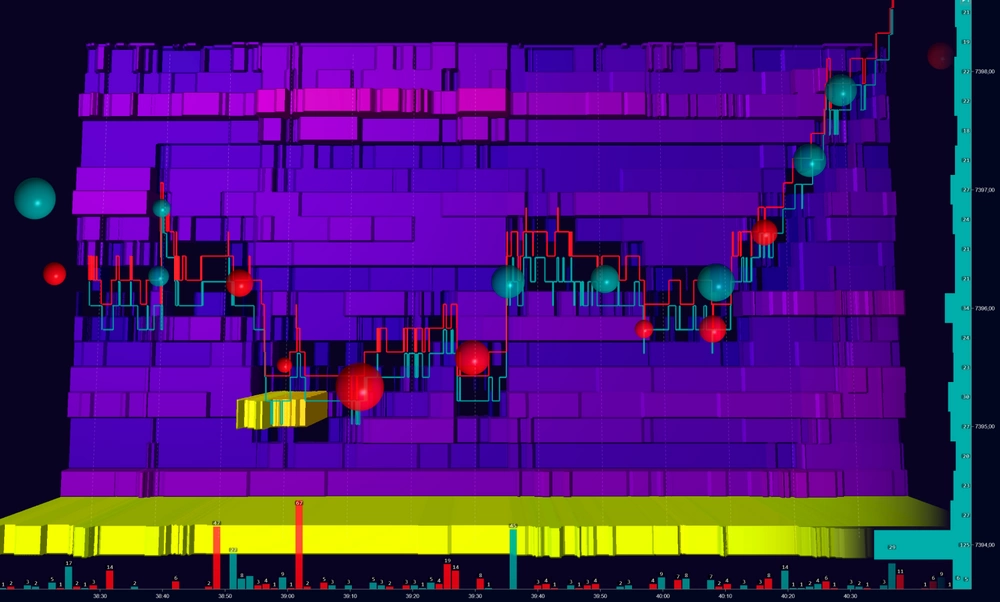
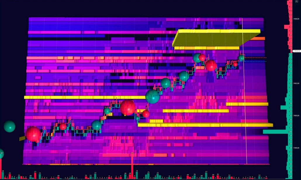
Levels with large concentrations of limit orders often become support or resistance zones. If the liquidity is genuine and strong enough, the price may slow down, stall, or reverse at these levels.

What order flow analysis reveals

Order Flow reveals market behavior that remains invisible on a regular chart. Here are three core scenarios — a solid starting point for analysis.

  • Order Flow Absorption_1

    Absorption

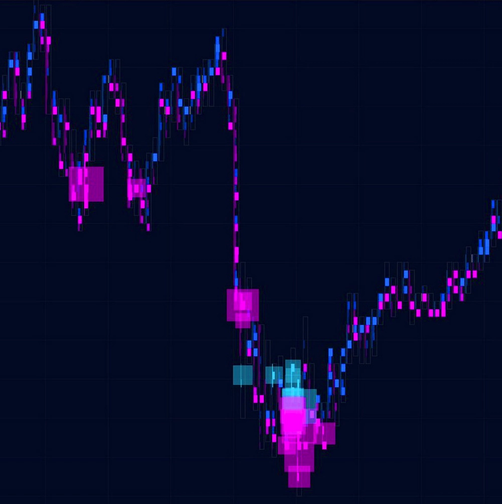
    Market orders hit a dense liquidity wall, where a large passive participant absorbs the incoming flow. Volume at the level increases, but the price stalls or pulls back.

    In analysis: Potential reversal or a strong range boundary

    Where to look: Footprint, Heatmap, Smart DOM

  • Order Flow Exhaustion_1

    Exhaustion

    The volume of aggressive orders gradually fades. Each new candle within the trend forms with lower volume, showing that the impulse is losing strength. If liquidity ahead remains untouched, the movement eventually runs out of momentum.

    In analysis: Potential reversal or deep correction

    Where to look: Footprint, Speed of Tape, CVD Pro

  • Order Flow Imbalance

    Imbalance

    One side of the market takes clear control: aggressive buying or selling significantly outweighs the available counter-liquidity. The price moves through levels quickly, with little or no resistance.

    In analysis: Directional impulse or the start of a new move

    Where to look: Footprint (imbalances), Heatmap, Big Trades

How to read the order flow

See what happened inside the candle
Assess the aggression of market orders in real time
Analyze the structure of liquidity in the order book

Order Flow tools help solve three tasks:

In ATAS, each task has its own group of tools.

01

What happened inside the candle

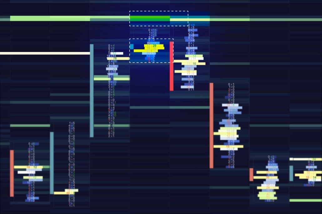
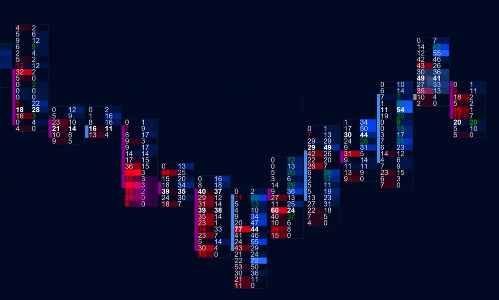
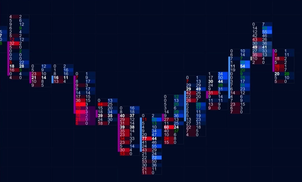
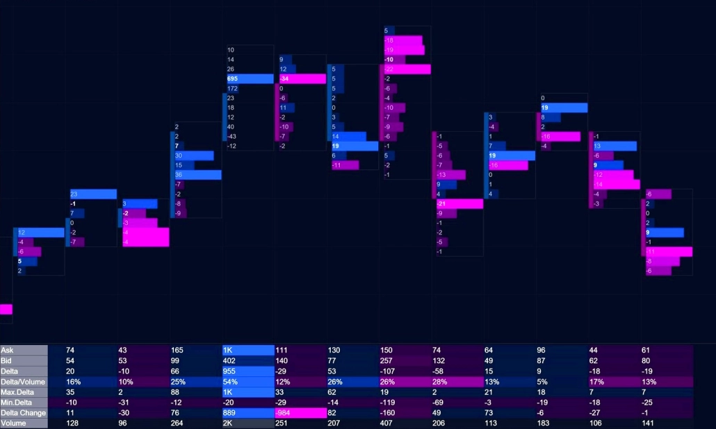
What exactly happened at each price level inside the candle? Who was in control — buyers or sellers? Did abnormal volume appear at a key level? ATAS analytical tools break down each candle and reveal the distribution of executed trades, vertical volume, and the balance of power in full detail.

Footprint
Footprint ATAS features - Order Flow

Analyze volume distribution, delta, and the balance of buyers and sellers at every price level

On a regular chart, you only see OHLC — open, high, low, and close. A candle may look strongly bullish: long, green, and impulsive. But once you break it down into clusters, you may discover that 80% of the volume actually came from sellers.

Footprint reveals what remains hidden behind the standard chart. You can see buy and sell volume at every level, deltas, absorptions, imbalances, exhaustions, and many other Order Flow signals in real time.

Footprint is not just a single chart type — it’s a full analytical ecosystem. ATAS offers 400+ cluster chart variations based on Volume, Trades, Bid × Ask, Delta, and Heatmap data.

Cluster Search, Absorption, Exhaustion, and other specialized indicators automatically highlight key patterns directly on the chart, helping you spot important market activity faster. Additionally, you can work with both the classic Footprint mode and the unique Rolling Footprint integrated into Smart DOM.

Learn more

Cluster Statistics
Cluster Statistics ATAS features - Order Flow

Analyze key candle metrics in a compact table format

While the Footprint reveals the internal structure of each candle, the Cluster Statistics indicator summarizes the most important data in a concise table for every bar.

It provides 15+ metrics, including total vertical volume, delta, Bid × Ask ratio, number of trades, and maximum and minimum delta values at specific price levels.

Extreme readings and anomalous activity are automatically highlighted, allowing you to compare candles by their key characteristics without manually scanning each level.

CVD + CVD Pro
CVD + CVD Pro ATAS features - Order Flow

Analyze the balance between buyers and sellers over time and identify divergences between delta and price

Cumulative Delta (CVD) continuously sums the difference between aggressive buying and selling from bar to bar. The result is a curve that reveals which side has been dominating over time.

The real strength of CVD lies in spotting divergences. For example, if the price continues to rise while CVD declines, it may indicate that buyers are losing initiative and that the current move is weakening.

CVD Pro takes this analysis further by filtering the delta based on trade size, from small to large participants. This allows you to observe how different groups behave independently.

With CVD Pro Multi, you can apply up to five filters simultaneously, each displayed in its own color on a single chart.

02

Market order analysis

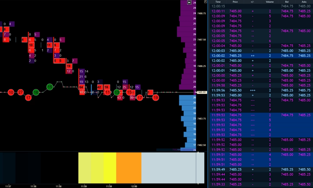
Market orders move the price. ATAS helps you see who initiates the move, how aggressive the activity is, and how much pressure stands behind it.

Big Trades / Adaptive Big Trades

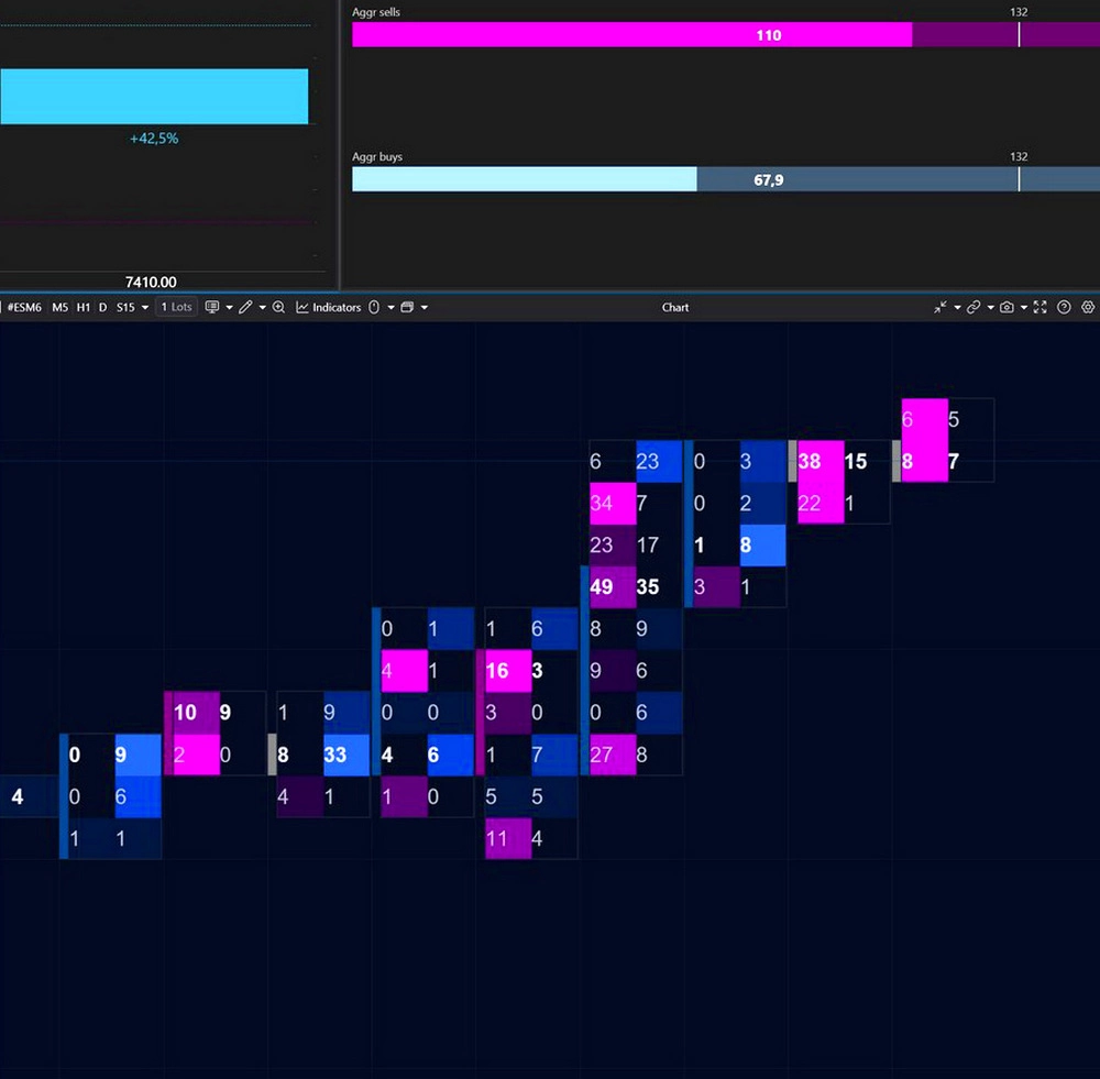
Purpose: Quickly detect large-volume trades.

Imagine a large participant sends a market order for 200 contracts. The exchange splits this order across nearby liquidity levels: 15, 8, 42, 17 contracts, and so on. In the tape, this often appears as scattered small trades, making it difficult to distinguish institutional activity from retail flow.

Big Trades reconstructs the original executed volume and marks it directly on the chart. Instead of dozens of fragments, you see the complete large trade and the exact level where it occurred.

Adaptive Big Trades goes one step further by analyzing historical volatility over a selected period and automatically adjusting the threshold for anomalous volume.

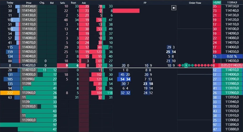
Volume reconstruction is one of the core principles behind ATAS. The same logic powers Smart Tape, where reconstructed trades are displayed in a structured table format.

Tape Patterns extends this concept even further by detecting recurring sequences among reconstructed trades — identical sizes, repeating intervals, and other patterns that may reveal algorithmic activity rather than organic market flow.

ATAS Big Trades + Adaptive Big Trades - Order Flow

Market Pressure + Price Change

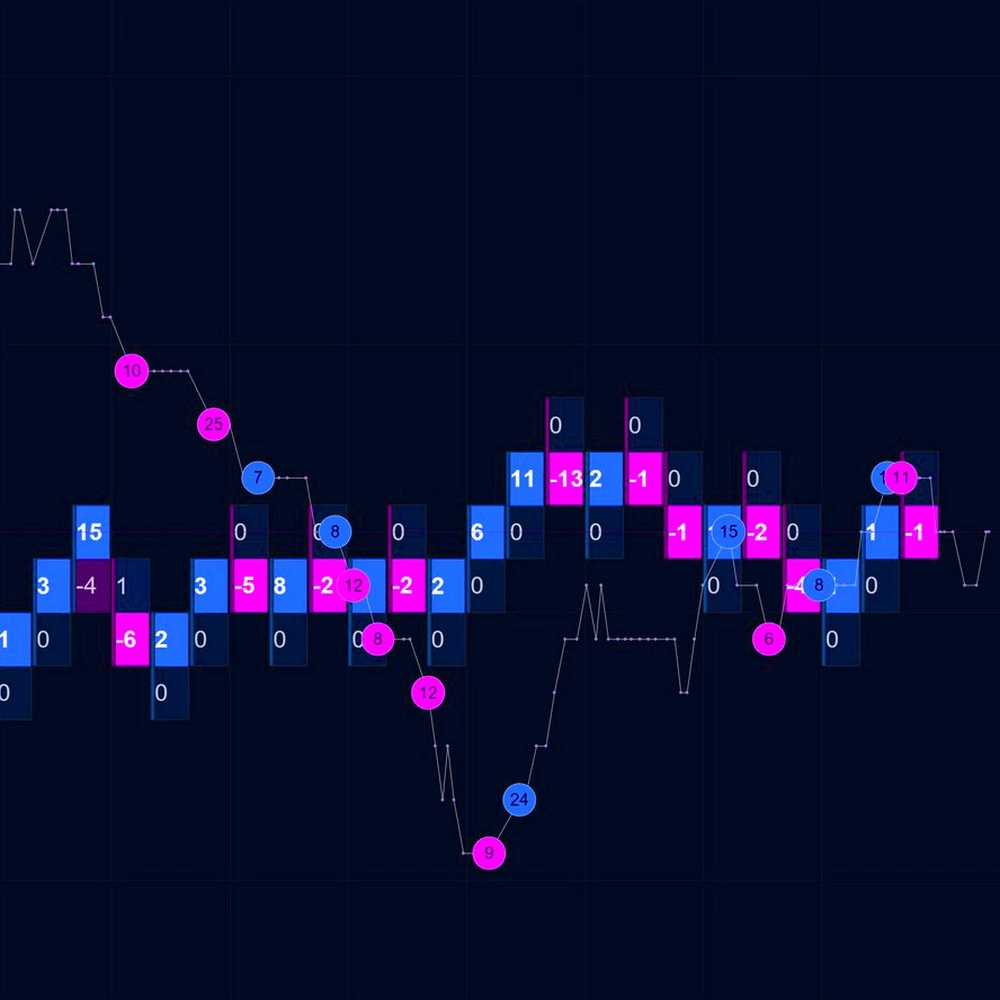
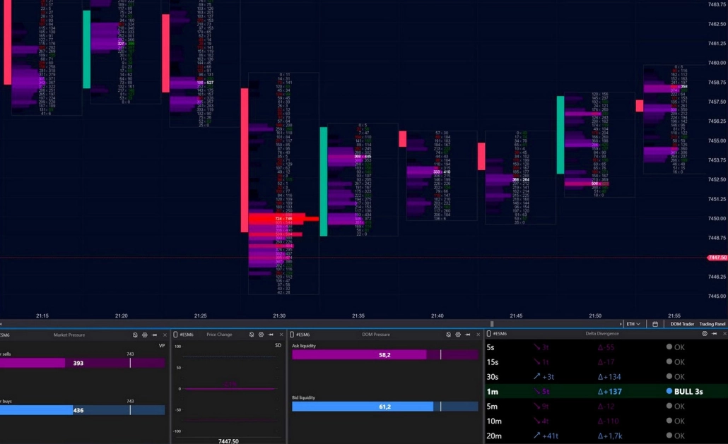
Purpose: Real-time analysis of buyer/seller pressure and price movement intensity.

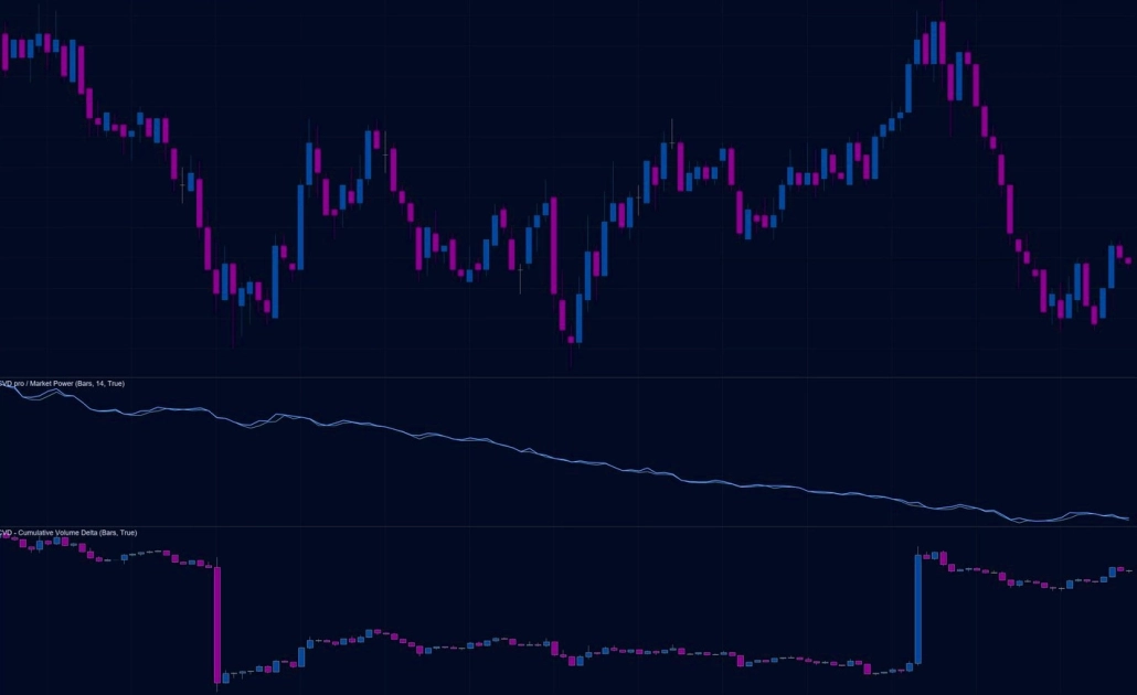
Market Pressure tracks all executed trades and calculates buyer and seller pressure in real time using exponential decay logic. The tool operates in two modes:

  • VP (Volume Pressure): weights trades by volume, giving more influence to large trades.
  • POT: measures tape speed by the number of trades, regardless of size.

Price Change measures the intensity of price movement on a normalized scale from –100 to +100, adjusted to the instrument’s current volatility. This allows you to evaluate not just raw movement, but how abnormal the current activity is relative to normal market conditions.

Market Pressure + Price Change - Order Flow

Order Flow Chart

Purpose: Analyze Best Bid and Best Ask dynamics in real time using a chart format.

The chart is built directly from changes in the best Bid and Ask prices — the exact point where aggressive market activity interacts with available liquidity.

Unlike traditional charts, a new candle forms not at fixed time intervals but whenever the best buy or sell price changes.

The height of each candle equals the current spread, making moments of thin liquidity and sharp market shifts immediately visible. Technical indicators and graphical tools can also be applied to turn raw order flow into measurable analytical data.

✓ On illiquid instruments, the chart may temporarily freeze if Bid and Ask prices don’t change. The Order Flow Chart does not simulate activity when there is no real competition between buyers and sellers.

OrderFlow Indicator

Purpose: Analyze the tape directly on the chart.

Each executed trade is displayed as an individual geometric marker, with its size representing the volume traded. In real time, you can see:

  • what volume was executed,
  • at which price,
  • and in which direction.

The same visualization principle is also available inside Smart DOM through a dedicated order book column.

Order Flow Chart ATAS- Order Flow

Speed of Tape

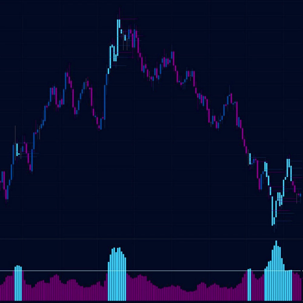
Purpose: Analyze market activity and execution dynamics.

Speed of Tape measures the pace of trade execution and highlights candles where activity is significantly above or below normal. For example, a sudden acceleration in execution speed may signal either exhaustion at the end of a move or the beginning of a new impulsive phase.

Order Flow Speed of Tape- Order Flow
03

Liquidity analysis

Analysis of executed trades shows what has already happened. Liquidity analysis shows what may happen next: where large limit orders are resting, how they react as the price approaches, and where the market is likely to move more easily.

Heatmap
Heatmap Order Flow - Order Flow

Purpose: visual analysis of liquidity

The Heatmap brings the order book directly onto the chart: the denser the liquidity, the brighter the level. Bright areas indicate large resting limit volume, while pale zones show thin liquidity. Colors change in real time, allowing you to see where liquidity appears, accumulates, or disappears.

The Heatmap “remembers” liquidity changes over time. Unlike a regular DOM, you see not only current orders, but also levels where liquidity accumulated for hours, absorbed aggressive market activity, or disappeared instantly as price approached.

✓ In ATAS, the Heatmap is available in several formats: as a standalone module, as an integrated mode in DOM Levels and DOM Trader, and directly inside Footprint charts.

Heatmap (Beta) takes liquidity analysis even further:

  • 3D mode helps visualize liquidity levels and order concentration in space;
  • Volume Bubbles display aggressive market trades in real time;
  • seamless synchronization with Footprint and Smart DOM — zoom and scrolling move together;
  • 600+ FPS rendering provides smooth performance and high detail;
  • indicators and drawing tools can be applied directly on the Heatmap.
Smart DOM
Smart DOM Liquidity analysis

Purpose: Comprehensive analysis of market and limit orders, combined with independent order management.

Smart DOM is a multifunctional workspace where both sides of the market are visible simultaneously. Executed trade columns display aggressive activity at each level, while the order book reveals resting liquidity and potential resistance zones. You observe their interaction in real time — how market orders attack liquidity and how passive participants respond.

At the same time, Smart DOM includes a complete toolkit for your independent order management: limit orders, stop strategies, and advanced execution controls — all within a single window.

DOM Trader
DOM Trader Order Flow - Order Flow

Purpose: Scalping module with built-in order book, Heatmap, order flow and tape speed markers

Instead of viewing the order book and candles separately, DOM Trader shows how market orders interact with limit liquidity at specific price levels. Market depth is visualized directly on the price scale: the longer the line, the larger the resting limit volume at that level.

The module includes four visualization modes:

  • Liquidity Map — a Heatmap integrated directly into the chart;
  • Orderflow Eclipses and Orderflow Blocks — executed trades displayed as spheres or rectangles, with size proportional to volume;
  • Only DOM — a minimal, high-focus mode designed for traders who need only the live order book.

Additionally, you can set up one-click order sending with pre-set volumes.

DOM Pressure
DOM Pressure Order Flow - Order Flow

Purpose: Analyze the balance of forces inside the order book.

DOM Pressure is a weighted liquidity widget designed to measure buyer and seller strength in real time. The tool sums the resting limit volume on both sides of the book, but assigns different weights based on distance from the current market price: the closer the liquidity is to the market, the greater its influence. The result is displayed as two normalized values on a 0–100% scale, representing the relative pressure of buyers and sellers at any given moment.

The scale automatically adapts to the instrument’s current liquidity conditions, allowing you to evaluate meaningful deviations rather than raw volume numbers.

MBO DOM
MBO DOM Liquidity analysis

Purpose: Detailed analysis of every individual order in the book.

A standard order book shows only the total volume available at each price level. MBO (Market by Order) goes much deeper: it displays each order individually, including the order ID, volume, last modification time, and queue priority.

This opens up an entirely different level of analysis.

  • Structure Analysis: You can determine whether a level is supported by a single large participant or by hundreds of smaller orders.
  • Spoofing Detection: You can track how specific order IDs disappear, move, or reappear as price approaches — helping identify potentially manipulative behavior from large participants.
  • Position Monitoring: You can see your own order inside the execution queue and understand exactly how many contracts remain ahead of you before execution.

✓ MBO data is a premium CME standard available through providers such as Rithmic. Most platforms only provide MBP (Market by Price/Level 2) data, which shows aggregated volume at each level but offers no visibility into individual orders or IDs.

FAQ

  • Volume analysis is a broad term that includes everything related to trading volume: volume profiles, vertical volume, delta, accumulation, distribution, and other volume-based concepts.

    Order Flow is a branch of volume analysis focused specifically on real-time market activity: who is entering the market right now, with what volume, and how liquidity responds. If traditional volume analysis answers “where”, Order Flow explains “who” and “how.”

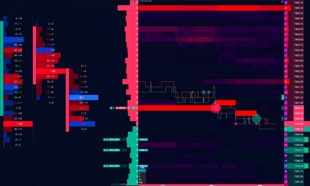
    Footprint is one of the tools used to visualize Order Flow. It breaks down a standard candle and displays executed volume at every price level inside it.

    But Order Flow analysis goes beyond Footprint charts alone. It also includes: tape analysis (Smart Tape), order book analysis (DOM), liquidity tracking, and market microstructure analysis in real time.

  • ATAS supports cryptocurrencies, futures, and stocks.

    • Crypto: direct connections to exchanges including Binance, Bybit, and Bitget.
    • Futures and stocks: connections through brokers and market data providers such as Rithmic, CQG, and Interactive Brokers.

    Order Flow tools work across all supported markets. The analytical principles remain the same — only liquidity characteristics differ from instrument to instrument.

    Liquidity quality also varies by market:

    • CME futures provide centralized and highly complete market data.
    • On crypto exchanges, data quality depends on the exchange itself. Platforms like Binance and Bybit generally provide sufficiently detailed flow for full-scale Order Flow analysis.
  • Yes. Smart DOM and DOM Trader combine analysis and independent order management within a single interface. You can place and manage limit orders, stop orders, and stop strategies directly from the chart or order book without switching to a separate terminal.

  • Yes. After installing ATAS, you automatically receive the free Start plan with no time limit. It includes basic Order Flow analysis tools and connectivity to crypto exchanges. To unlock the full feature set, you can activate a 14-day trial or subscribe to one of the paid plans, which provide access to advanced indicators and modules.

  • The main difference lies in the level of autonomy and the depth of visualization.

    DOM Trader and DOM Levels include a built-in Heatmap integrated into the order book interface. This setup is convenient for scalping, but the Heatmap remains part of the DOM module rather than an independent analytical environment.

    The new Heatmap is a standalone module with its own rendering engine and expanded functionality.

    • Synchronization: The new Heatmap can be linked with any other modules in the workspace. All windows synchronize along the price axis.
    • Performance: GPU rendering supports 600+ FPS for smoother visualization and faster interaction.
    • Detail: Smooth color transitions and deep zoom capabilities reveal fine liquidity structures with less visual noise.
    • 3D mode and extended color palette customization are available only in the standalone module
    • Additional layers: Bubbles, indicators, and drawing tools can be placed directly on the Heatmap.

    At the same time, the Heatmap in DOM Trader and DOM Levels remains fully functional and can be used alongside the new module. For traders focused on fast execution and scalping within a single window, DOM Trader remains highly practical.

  • Start with a minimal setup:

    • the order book,
    • Bid × Ask column,
    • and the Delta column.

    These three elements are enough to see where aggressive market activity collides with passive liquidity.

    Disable unnecessary panels at first. Reducing visual noise makes core Order Flow scenarios much easier to recognize.

    You can also start with the Heatmap — its interface is more intuitive than a multifunctional DOM.

  • It can become overwhelming if you try to analyze everything at once. The best approach is to start with one tool and one recurring setup. Choose the concept that feels most intuitive to you: absorption, exhaustion, or imbalance. Even reviewing one or two repeated scenarios per day helps develop the ability to filter noise and focus on meaningful market behavior. Once these patterns become familiar, you can gradually add more tools and move deeper into volume analysis.

    Start with the free ATAS plan to access the core tools without time restrictions.

    At the same time, explore the Quick Start materials:

    You can also discuss real chart situations with other traders inside the Telegram and Discord communities.

The market will remain the same. But you will see it differently

Start working with the order flow in real time — to analyze the orders, volumes and balance of power behind every candle

Try for free