How is supply and demand absorbed in footprint graphics?
Independent from what market you trade in, whether it is the Forex, futures or stock market, you will face absorption of minor market participants by major market participants every day. Today we will show you how this absorption looks like on a simple example of a Bid x Ask Volume Profile Footprint chart of the ATAS platform.
In this article:
- What is absorption?
- Absorption through the example of an E-mini S&P 500 futures.
What is absorption?
Absorption is a scenario which shows unproportionally high trading volumes near the bar’s high or low in absence or insignificant movement of the price behind that level.
An ideal variant is the appearance of this pattern of higher, than usually, volumes at the support and resistance levels.
Absorption of sells occurs when the aggressive market sells bump into the passive limit buys, which absorb the supply of the selling side.
Absorption of buys occurs when the aggressive market buys bump into the passive limit sells, which absorb the demand of the buying side.
The roles of passive buyers or passive sellers are usually played by major professional traders or institutional players, which possess significant financial resources. It allows them to post big limit orders in the market at those price levels, which present interest to them or which they intend to protect. Figuratively speaking, they ‘sit’ on these price levels and absorb demand or supply, created by market orders of aggressive, and often less professional, market participants.
Absorption through the example of an e-mini s&p 500 futures
If aggressive buyers or sellers fail to overcome the price level, at which their absorption took place, then the market bounces from the absorption area due to the fact that ‘aggressors’ are in a hurry to close their loss-making positions. Let’s consider two simple examples.
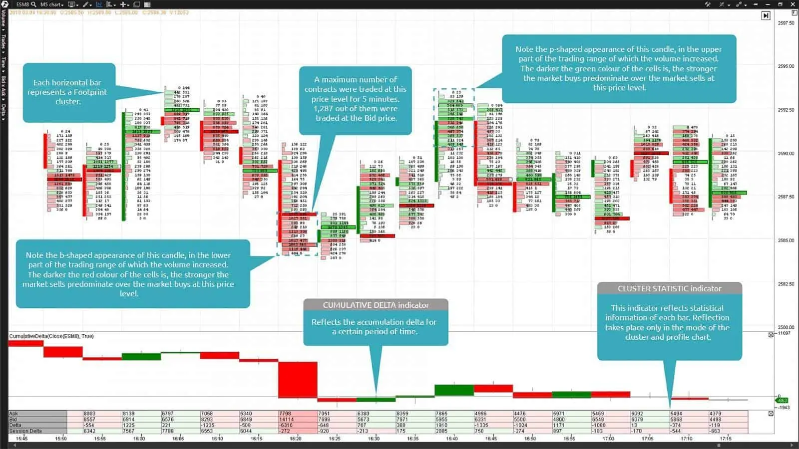
5-minute timeframe of an E-mini S&P 500 futures (ticker: ES). The Bid x Ask Volume Profile Footprint chart and Cumulative Delta and Cluster Statistic indicators are in the lower part of the chart.
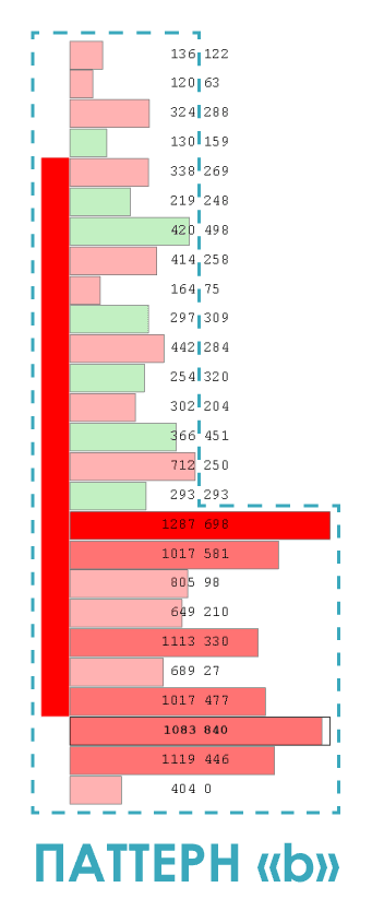
You can see in the above E-mini S&P 500 (ticker: ES) futures Footprint chart how the price quickly fell down to the lower boundary of the flat, after which the volume increased in the lower part of the trading range of the falling candle. It is easy to distinguish this candle from others since it has the shape of the letter ‘b’. Apart from that, note that the Footprint cells in the lower third of this candle are coloured dark red, which tells us about domination of aggressive market sells in this price range.
However, accumulation of the volume in the lower third of the candle and especially in its lower shadow testifies to the fact that although aggressive sellers started the downward price movement, the limit orders of a major passive buyer met them at the lower boundary of the flat, in the result of which absorption of all aggressive sells took place.
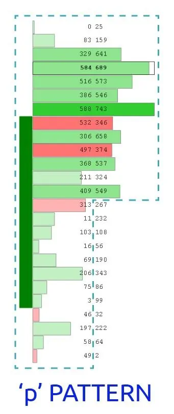
You can see an opposite example in the same 5-minute chart. After the price tested the lower boundary of the flat in the first example, it reversed upward in order to test the previous high, where it earlier met limit orders of a major passive seller.
The second example shows that a growing candle, which resembles the shape of the letter ‘p’ and in the upper part of the trading range of which the volume increase took place, was formed at the upper boundary of the flat. This growing candle is also interesting due to the fact that the main volume was formed mostly in its upper shadow. This fact more vividly testifies to availability of limit orders of a major passive seller at the upper boundary of the flat. We do not insist, but, perhaps, it was a result of work of the same major participant who earlier absorbed the supply of aggressive sellers at the lower boundary of the flat in the first example.
Another type of absorption, which could be met quite frequently in the Footprint charts, is volume vs range or, as they often call it, effort vs result. For example, the traditional culmination of buys at the end of the ascending movement often finishes with a huge volume, but also with the inability of the market to move further (a narrow trading range of one or several candles).
The Footprint chart of the trading and analytical ATAS platform provides traders with a possibility to monitor such market situations at a micro-level. It is easiest to find absorption areas with the help of the volume indicators of the Bid x Ask and Bid x Ask Imbalance Footprint charts. Pay more attention to the number values than to the cell colours. For example, while the price fluctuates at the support level, you can observe how the supply of aggressive sellers would emerge at this level. Perhaps, you would even see 2 or even 3 dark red cells with high values of aggressive sells at the Bid price.
This demonstrates availability of demand from passive buyers, who provide liquidity for market orders of aggressive sellers with the aim to absorb them and to activate own limit buy orders.
The main thing you should pay attention to when the absorption pattern appears is whether it manages to stop the price movement or not. If the price stops, one should expect a bounce from the level.
If the price level, at which absorption of the market sells took place, was broken, it is evident that the price would continue its down movement. As one could expect in such a situation, the former support would, most probably, become the resistance. Frequently, after some time, the price comes back again to the earlier broken price level, since passive buyers and aggressive sellers displayed active interest to it earlier.
In this situation the bears start to protect their market territory, which they retook from the bulls, which is accompanied with rather high trading volumes at the Ask price. Thus, passive sellers open their limit sells at the level of the former support due to emerging buys of aggressive buyers. Also, the return of the price to the former support level allows the passive buyers, whose positions turned out to be loss-making when this level was broken, to close their buy positions with minimum losses, opening sell trades.


