What is VSA? VSA – Volume Spread Analysis – is a universal approach to assessment of the strength and weakness of the market on the basis of analysis of the price and volume action.
- Volume is a size or quantum;
- Spread is a difference between high and low or a bar range.
VSA contains a set of patterns (signals), which help an analyst to interpret the current market situation with consideration of the previous background and with a view to the future.
This method became popular in many countries due to its specific features:
- VSA divides the market participants into strong professionals and weak beginners;
- it works with the demand and supply powers;
- it does not use indicators. You will not find RSI, MACD and Stoch in the charts of the VSA founder Tom Williams.
In our following articles on the VSA and cluster analysis topic we will speak about:
- how to perceive VSA patterns. Each article will be devoted to one or two patterns;
- how to combine the cluster analysis with VSA for increasing the exchange trading efficiency.
The story of the VSA founder
A boy was born in a small Austrian town Lithgow on January 4, 1929. The parents named him Tom. The full name is Thomas George Williams. When he was 2 years old, the family moved to Brighton, England. When he was 16, he started to work in a cinema hall and studied to become a male nurse. In 1960 Tom moved to Beverly Hills, California, to try his luck.He had a SRN (State Registered Nurse) medical certificate and found a job where he looked after an old stock exchange tycoon who managed a trading syndicate. Tom got interested in stock trading and asked the tycoon (the name is not mentioned) to teach him to understand the stock market. Then Tom was employed by the syndicate. His work was to build charts. There were no computers at that time and traders built stock trading price and volume charts using a piece of paper, pencil and ruler.

Tom properly performed his duties but he still could not perceive the real market mechanics. Then the syndicate sent him to the Stock Market Institute to study Wyckoff methods. And there, day after day, Tom started to perceive real rules of the cunning market.
I never heard a true thing about market actions on TV or from papers. As a trader, you will see that you are always misinformed by lies, fraud and false information. And, on the basis of this false information, you and thousands of other traders will never understand what a true intention of the market is. – Tom Williams.
Twenty years later Tom moved back to England being already an experienced trader. His approach to the market analysis was based on the Richard Wyckoff principles, but it was simplified a bit. For example, Tom did not build the Wyckoff Wave, did not use point-and-figure charts and indicators developed by the Wyckoff followers. Tom called his approach VSA, founded the Genie Chartist company and started to popularize the Volume Spread Analysis.
The geniechartist.com web site is not available any more, but there is its copy in the Internet archive (unfortunately, without pictures). This is what Tom Williams writes on the main page of that website, where the Internet learnt about VSA for the first time:
Believe me, the markets move under pressure of big blocks of professional money, changing the demand and supply balance one way or another, which you can read if you learn how to do it and become a keen observer.
We all heard how experts from the financial markets department told us that one or another market went up, down or aside for one specific reason or another. For example: “the oil price went up and the stock market went down”.
Of course, the oil price will later change and the stock market will go up, but it seems that nobody would never want to explain this evident inconsistency. A simple truth lies in the fact that nobody knows why news made markets move one way or another. In fact, the news do not move the markets. They follow the markets.
The prices are determined by demand and supply. When the demand is strong and supply is limited, the prices go up. When the demand is weak or supply is excessive, the prices go down. The market can even go up in spite of a negative information background.
The key to successful trading is identification of the supply and demand balance in the market.
Many traders have a gut feeling about this balance without making efforts. These are born traders, who, as it seems, are always on the right side of the market, but if you cannot do it instinctively, you can learn how to do it with the help of the Volume Spread Analysis. And you will be astonished to realize how much you can learn in a short time.Tom Williams passed away on November 7, 2016, in his house in Worthing, a small town on the southern shore of England. But his system continues to develop.
Tom opened the door into the Volume Spread Analysis describing the End of Rising Market pattern. We will also start from this pattern.
End of Rising Market pattern
A very eloquent name. By the way, many VSA patterns are self-explanatory.Tom Williams describes the End of Rising Market pattern as follows:
Let us assume that the stock market was in a bullish move for several months and everybody is trying to catch the leaving train. The news is good, your friends already made good money on trading stock and all experts in the media and on TV predict even higher prices.
Professional money, however, has different ideas.
If we build a chart and see a day similar to the one that is marked with an arrow in the chart, what VSA – volume and spread analysis – can say about it?

There is good news and the volume is very high. The prices grow and everything looks good – correct? Except for the fact that the price spread is narrow.
The high volume tells us that there is a big activity in the market, but if the demand is high we expect that the spread will be wide and the price will sharply go up. But it does not happen.
Let us look at some popular mass media pages dated September 21, 2018. The picture below shows what happened on that day.
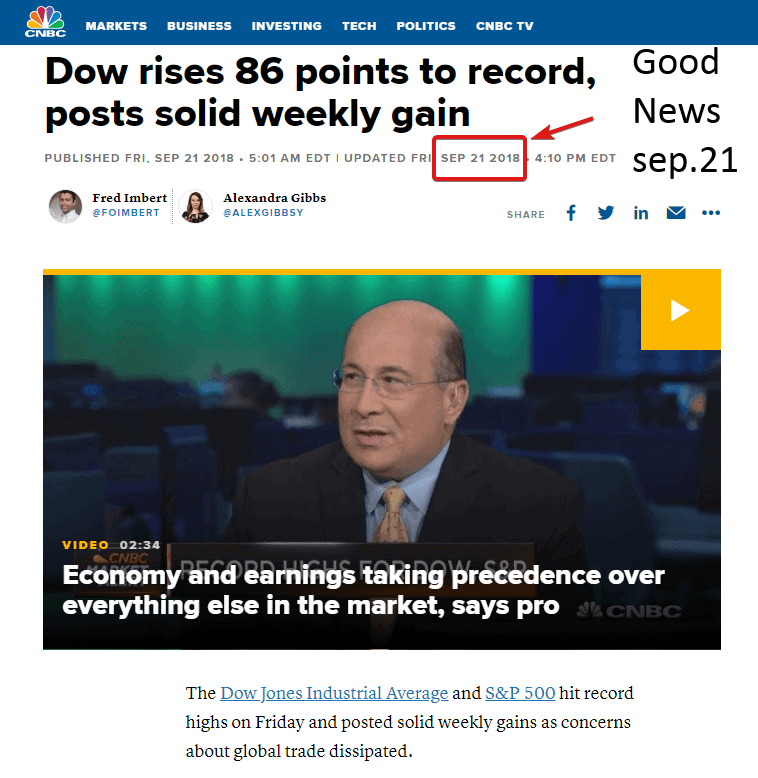
But something went wrong. The VSA pattern turned out to be more shrewd than “talking heads”, since the stock market plunged into a lengthy bearish dive.
What was the real reason? The VSA founder Tom Williams explains:
Perhaps, what happens is that market makers (who can see both sides of the market) have big orders for selling, posted a bit above the market. Execution of these sell limit orders restricts the growing potential of the market, which results in a narrow spread. By itself it is not a signal for selling, but a clear sign of the fact that professional money is not interested in growth at the moment and it is a sign of weakness.
So, the End of Rising Market pattern is:
- a narrow spread;
- the closing price is higher than that of the previous day (bar);
- the closing price is usually in the middle or near it;
- the volume is significantly above the average;
- in the background – the period of upward movement;
- the next bar (day) – the price usually goes down, confirming weakness on the End of Rising Market pattern;
- the news background is good. Sometimes the End of Rising Market emerges when the price reaches a new record high or crosses the round psychological level.
Let us consider some more examples of the End of Rising Market pattern in different markets with the use of the instruments of the cluster analysis of the ATAS planform.
VSA End of Rising Market pattern in the GAZP market
For the sake of fairness let us acknowledge that you do not come across ideal VSA patterns in harsh reality too often, especially in the day periods of the market volatility. That is why let us look into the intraday charts in our search for useful End of Rising Market examples. Let us study the Gazprom stock market and unwind the time to the end of November in order to find a typical story.Everything started from an information bomb in the mainstream financial media.
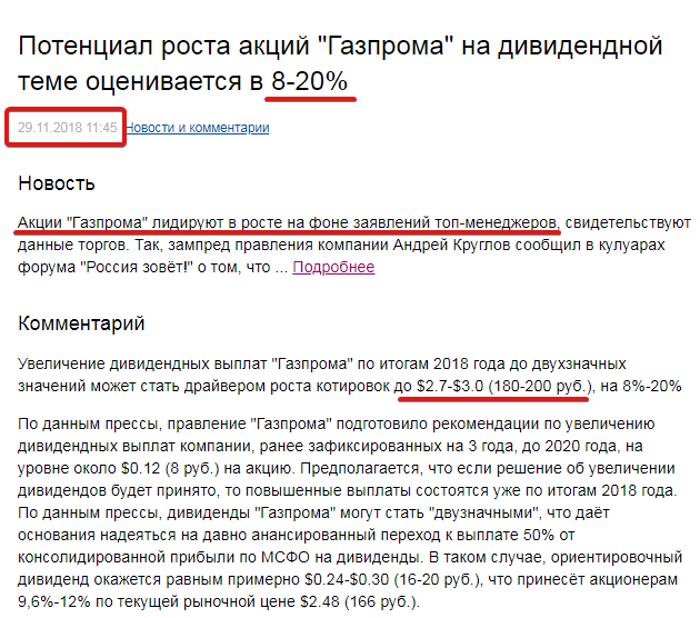
Potential of the Gazprom stock growth on the dividend subject is assessed in 8-20%
Increase of dividend payments of Gazprom at 2018 year end up to double values can become a driver of the growth of prices up to USD 2.7-3.0 (RUB 180-200) by 8-20%.
According to the media, the Gazprom management prepared a recommendation for an increase of dividend payments of the company previously fixed for 3 years until 2020 at the level of about USD 0.12 (RUB 8) per share. It is assumed that if the decision about the dividend increase will be made, the increased payments will take place by the 2018 year results. According to the media, the Gazprom dividends can become “double-valued”, which gives ground to hope for the long-ago announced transition to the payment of 50% from the consolidated profit by IFRS (International Financial Reporting Standards) on dividends. In this case, an approximate dividend will be equal to USD 0.24-0.30 (RUB 16-20), which will bring 9.6%-12% to shareholders at the current market price of USD 2.48 (RUB 166). The price rushed upward against the background of positive “insider” news in media about a probable price of Gazprom stock of RUB 200 per share.
Let us check the chart.
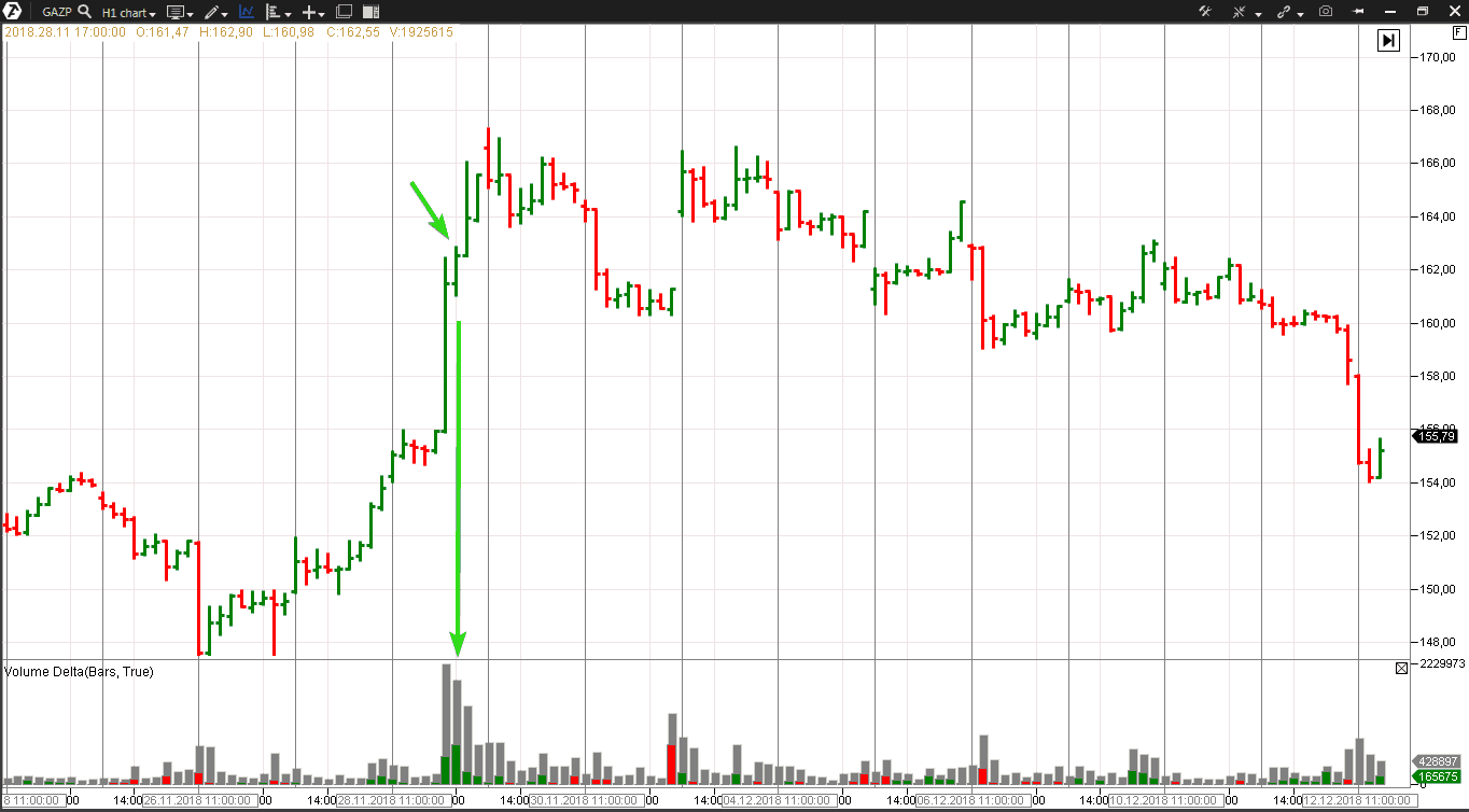
The green arrows point to an indicative bar:
- narrow spread;
- high volume (note the delta. The indicator mainly shows buys. Perhaps, this volume reflects activity of the buyers who were in a hurry to buy for 160 and sell later for 200).
This bar corresponds with the ERM (End of Rising Market) criteria, however, the price continues to grow. Moreover, the stock is traded above the ERM bar during the whole next day. Why didn’t the market reverse downward?
Recall what Tom Williams said above:
By itself it is not a signal for selling, but a clear sign of weakness.
What happened in reality?
For sure, professional money had more large-scale plans and was not in a hurry to push the price downward before it accumulates enough shorts. And the bar marked with arrows simply specified the level where the pressure of a “crowd” of buyers met their first sell limit orders.The professionals supported the stock price during the next days, warming up the market by stimulating the retail traders buys and forming, at their expense, a bearish position, since, in reality, they prepared for a downward movement.
And it started on December 11, when the Gazprom stock dropped by 1.5%. The downward movement continued down to the low of about RUB 146 per share at the bottom of December 25, 2018. The reason for beginning of this downward movement was the US call to the European countries for withdrawing from the Nord Stream-2 pipeline project.
So, what this situation teaches us about. It turns out that using a VSA pattern in isolation from the general context could be an ill-considered decision. Well, is it worth trusting and applying it at all? Definitely yes. Since the principle of order reduction, which lies in the basis of the End of Rising Market pattern, is a core one. It works in any market/timeframe and ERM features appear, in one form or another, practically in each downward reversal.
This is how unconventionally the ERM pattern looks like in the event of a false breakout of the day’s high in the Volume type chart. It is the same market – the Gazprom stock. One bar equals the 10 thousand contracts volume
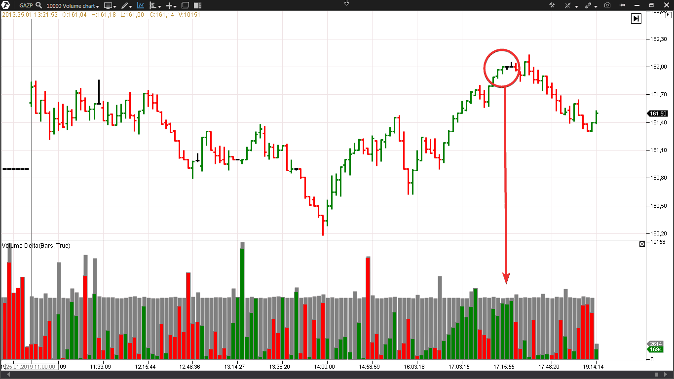
The price made an effort, closer to the end of the main session, to break the high of the range formed during the first hours of trading. However, what does the chart tell us?
The chart never lies. Tom Williams
When making a breakout effort, the delta becomes practically completely green (trades on the exchange are initiated by buyers), however the price progress is not big and the spreads become narrower. That is, the buys that reflect:
- entries into longs of buyers “for a breakout”;
- exits from shorts of the sellers that set stop loss orders above the day’s high level (someone, for the sake of good order, “hid” the stop behind a “reliable” resistance 162.0) …
… met sell limit orders of professional intraday players that aimed to get a quick profit from the subsequent down movement by 70 kopecks. Well, the price reversed upwards later, but it is, as they say, a completely different intraday story.
Let us consider one more example of the End of Rising Market pattern. This time, an example from the futures market.
End of Rising Market in the RTS futures market
“Good” news came on December 7.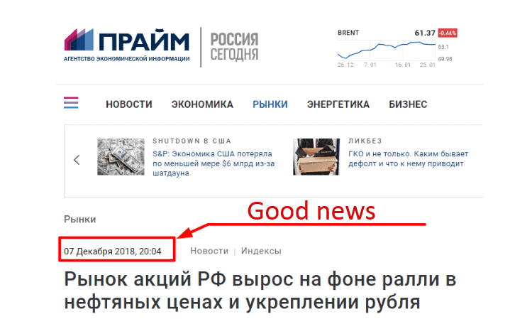
December 07, 2018, 20:04
The RF stock market went up against the background of rallies in oil prices and strengthening of the rouble However, what does the chart say? It can give a topical information about the demand and supply balance if you can read VSA patterns in the chart.
The picture below shows the RTS index futures trading chart with an hourly timeframe. (By the way, Tom Williams used the HLC (High Low Close) bar charts without the opening price).
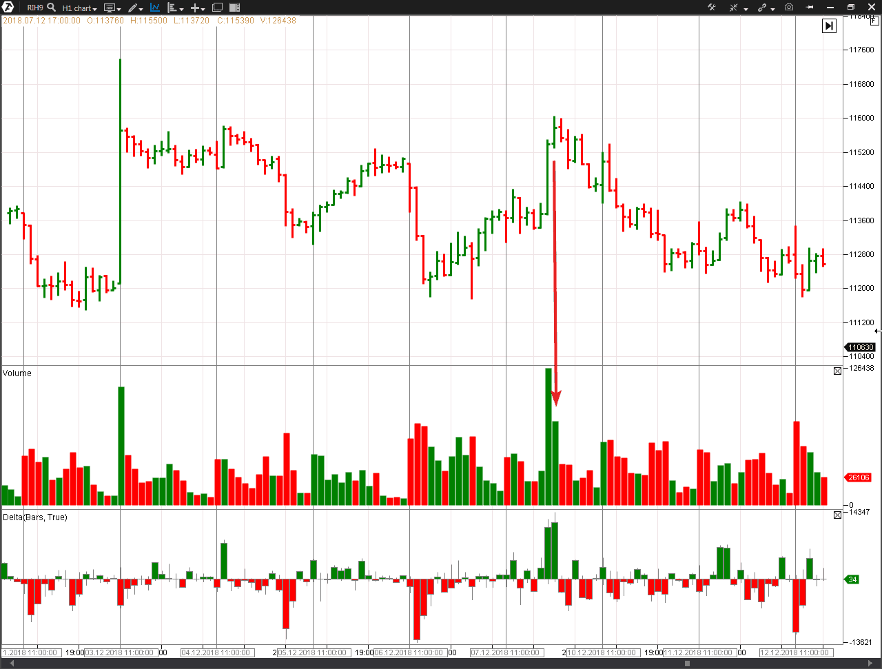
- the prices grow but the dynamics slows down, which results in a narrow spread;
- a high volume, which is evidently uncommon for the bars with such a spread.
The next bar is closed lower. Tom Williams said that the bar, which goes next after End of Rising Market, should be closed lower, confirming a real weakness hidden behind that pattern. Note that the delta is positive. Tom Williams did not say anything about the delta since he did not use the cluster analysis.
However, ATAS provides us with an opportunity to look deeper into the End of Rising Market bar/candle in order to efficiently assess the situation. We can see predominance of the buyers (green color on the delta). But if these buys represent a real power, why did the price go down on the next bar? Perhaps, because the executed buy orders represent:
- entries into longs of the buyers, that get into a trap, “for a breakout”;
- exits from shorts of the sellers that set stop losses above the highs levels of December 4-5. Those who hid the stop behind the 116000 level also “burnt down”.
These are “poor quality” buys. The futures passed from professionals to the “crowd”, which suffered (as usual) losses and did not get profit from the further price reduction from 116000 down to 101640 (-12%) on the low of December 24.
This reversal is more transparent in the cluster chart.
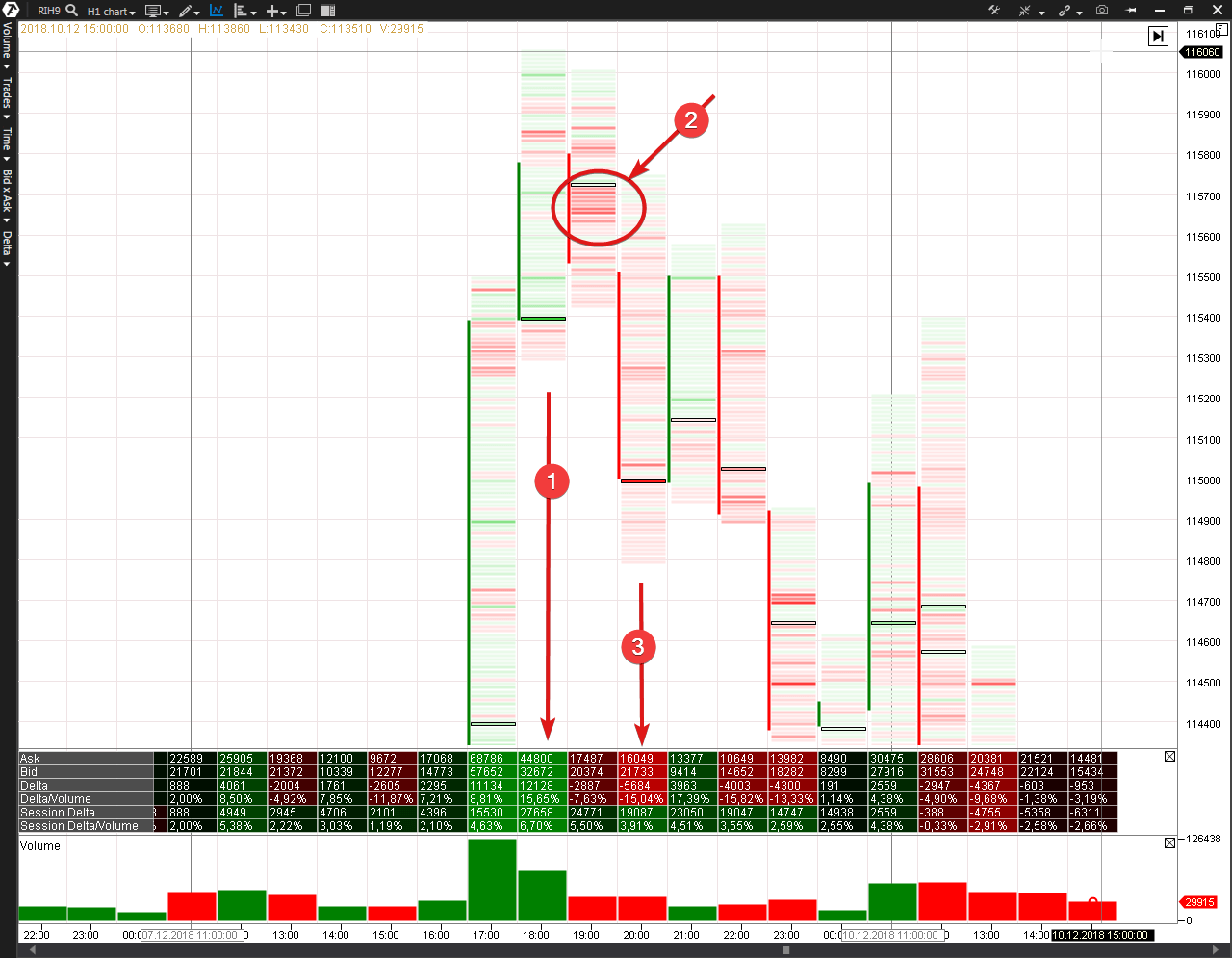
- End Of Rising Market. Note the bright green color on the Cluster Statistic Indicator;
- The aggregation of red clusters shows levels, at which professional money “showed its cards”. It started to sell aggressively;
- The seller’s aggression is evident, but ERM was the first sign.
Download ATAS and analyze reversals on peaks. You are sure to find a splash of buys against the background of the narrowing spread as a predecessor of a change of the market mood from bullish to bearish. And note that End of Rising Market works better at the levels where there are signs of weakness already.
We continue to analyze VSA through the use of modern instruments for the market analysis and move to another pattern – Bag Holding
VSA Bag Holding pattern
The Bag Holding pattern is a mirror reflection of the End of Rising Market pattern. It is an “upside down” situation.The name implies “hold your bag wider”.
The VSA Bag Holding pattern is:
- a narrow spread;
- the closing price is lower than the previous bar;
- the closing price is usually in the middle or close to it;
- the trading volume is much higher than the average one;
- the background – the period of downward movement;
- the next bar – the price usually goes up, confirming a hidden force on the Bag Holding pattern or is traded for a short period without changes on a small volume;
- the news background is negative. Sometimes the Bag Holding emerges when the price reaches a new record low or when there is a downward breakout of the round psychological level.
This is how one more VSA expert Philip Friston (a close partner of Tom Williams and manager of a hedge fund. He trades stock on the London Exchange, having started to study VSA in 1989) describes the Bag Holding:
The bar description:
- A down bar
- A narrow spread with an ultra high volume.
It is a rare pattern, but one of the strongest ones. It should be in the area of new lows. A point is achieved when the crowd is in panic and sells the stock at the lower price limit. The narrow spread tells you that professionals consume the whole supply that comes to the market (efficiently holding the bag in order to collect panic sells – the name originates from this situation). If they would not have done it, the spread would have been wide. There should be a clear downward trend in the background. Remember: in order to stop the downward movement in the market the demand should exceed the supply, which causes this movement. Naturally, this should appear on down bars.
As well as the End of Rising Market, the Bag Holding pattern is a rare thing in its ideal form. However, the principles that are characteristic for this pattern could be found, in one form or another, on many important lows.
Let us consider some examples.
VSA Bag Holding pattern in the MSFT stock market
On September 3-5, Microsoft was the news headliner in the American stock market. Its management decided to buy Nokia for USD 7 billion. The media covered this situation with pessimism, as if the plan was doubtful, risky and could result in losses. This negative news background accompanied the stock drop by 5% with the growth of volume.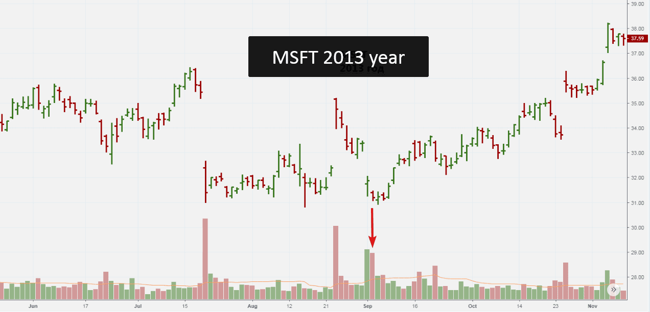
Those were the days when Tom William conducted webinars for VSA students. As usual, in the end of the webinar, he invited his students to ask questions. The author of this article asked him whether the September 4 bar is a true Bag Holding pattern. Tom said that it was not the Bag Holding in its pure form, because even the local low was not reached, but this bar was definitely a sign of strength.
The price dynamics stabilized during the next days. And on September 10, 2013, the stock started an outstanding up-trend from the level of USD 31 per share. The growth lasted for 5 years and the stock went up to USD 113 per share (+250%) in 2018, making Microsoft a company with the biggest capitalization in the world.
What really happened? As you can guess, professional money used the price drop following “the bad news” on September 3 in order to consume the panic sells. The price and volume interaction testifies to it – the spread becomes narrower and the volume is high without development of the bearish dynamics. Having accumulated the MSFT stock, the demand and supply balance changed and the growth was not late in coming.
VSA Bag Holding pattern in the cryptocurrency market
In an ideal situation, the Bag Holding appears only on an important low, which occurs twice a year or even more rarely. However, the principle that lies in the basis of this pattern, manifests itself, one way or another, in all markets, timeframes and chart types.In order to confirm this bald statement, let us launch ATAS Crypto and open a nonstandard tick chart of the BTCUSD cryptocurrency pair on the Bitfinex as of January 26, 2019.
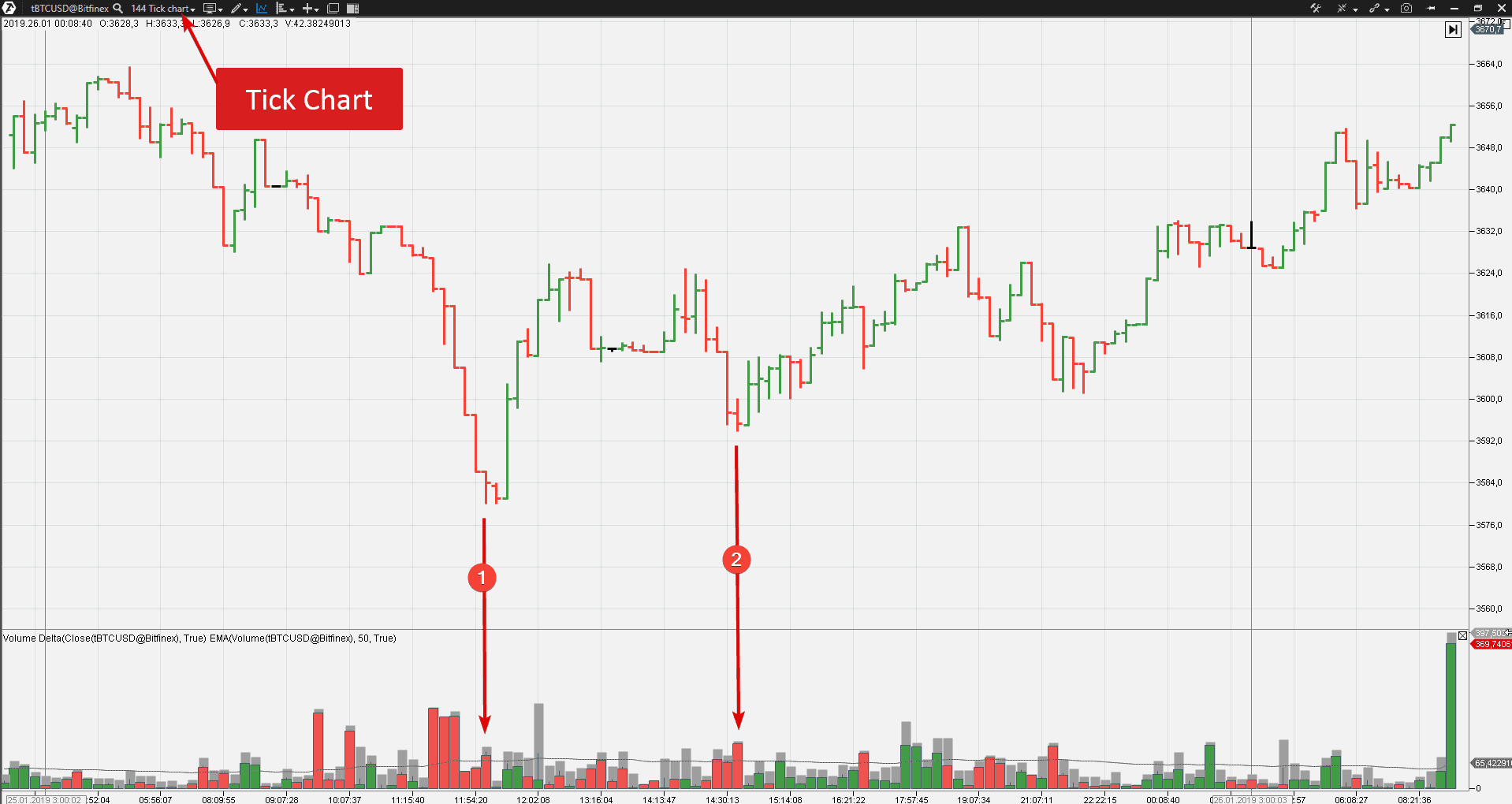
- Arrow 1 points at the volume splash (mostly sells) after a sharp drop. This moment, with certain reservations, corresponds with the Bag Holding criteria. The previous two bars had a smaller volume but a wider spread. This observation is sufficient to assume the strong player’s support. The next bars confirm this assumption. Note the delta after the Bag Holding. It changes from red into green telling us that professionals moved from buys at buy limit to buys at the market price.
- The second episode is too far from the classical Bag Holding signal, but, nevertheless, certain specific events also take place here. Perhaps, minor sellers thought that the downward trend would continue (which was suggested by the bearish signals of popular indicators) and decided to open shorts. But their sells met buy limit orders of professionals, the delta turned green from red and the cryptocurrency price went up fixing losses of “the crowd”.
Let us find the Bag Holding on the Moscow Exchange.
VSA Bag Holding pattern on a USD/RUB futures
A bar, which corresponded with the Bag Holding criteria, appeared in the intraday SiH9 chart on January 18, 2019. Look at the picture below (the timeframe is 3 minutes).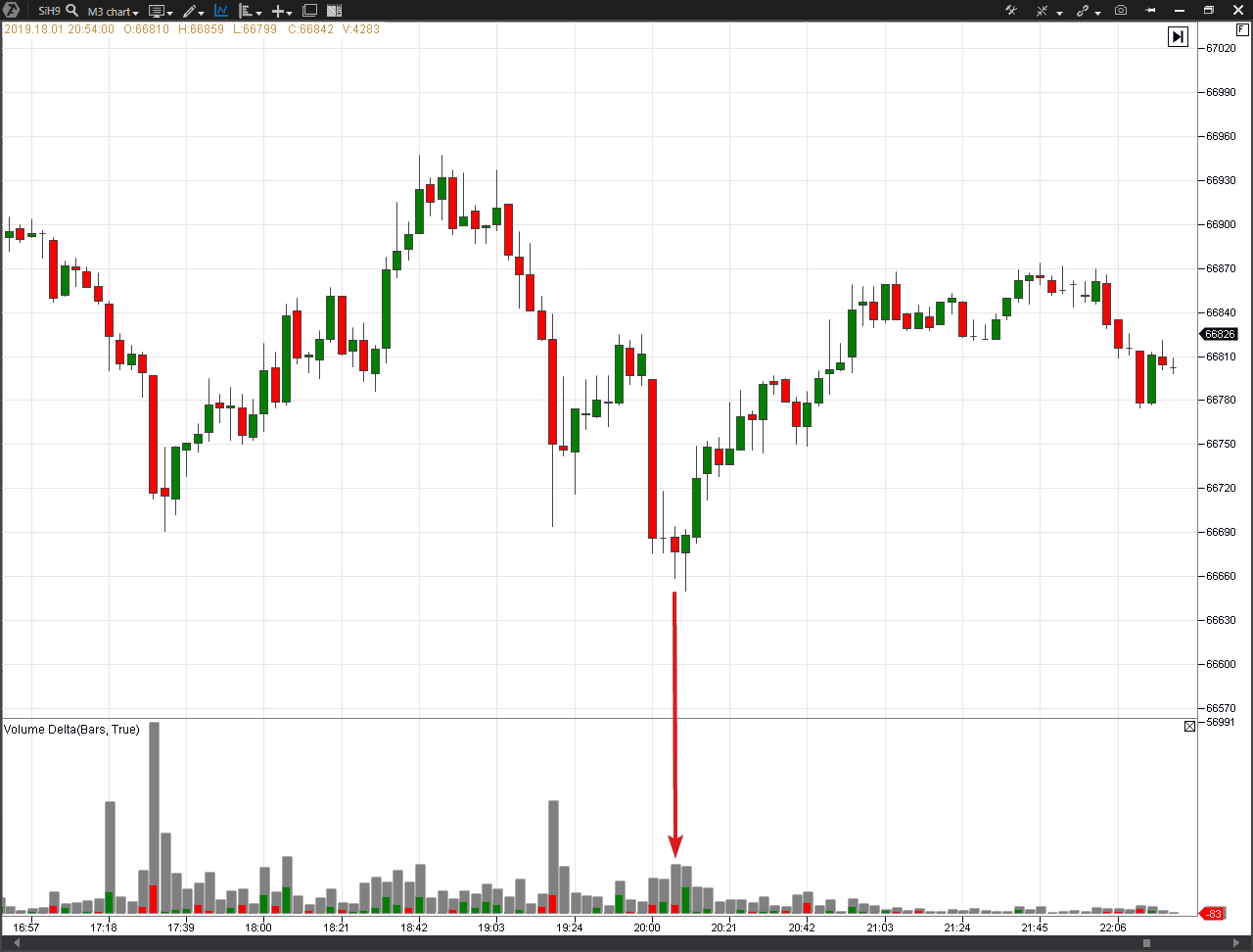
Perhaps, it is a manipulation on the evening session opening. The price was moved down, under the local lows, in order to “knock out” stop losses of the buyers. After crossing the local low level, the spread becomes narrower, the volume is above average and sells predominate (stop losses of hens came into action and the eggs got into the wolf’s basket).
The volume is also high on the next candle with a long bottom shadow and strong closing and the delta turned green. For sure, the manipulator completed his black mission on killing stops and moved from the buy-limit tactics to the buy-market one, pushing the price up.
The cluster chart clearly shows what happened.
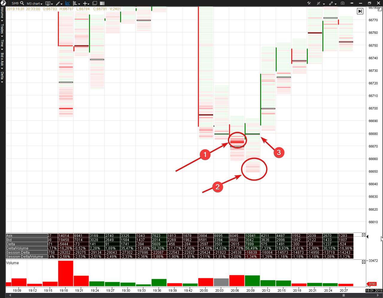
- The main accumulation of the buyers’ stop losses was here. At the expense of their activation, the professional buyers built up their long positions even more.
- The price was moved a bit lower in order to disappoint those who thought “whew, it missed by an inch” a couple of minutes ago. But the red color goes pale and there are less stops.
- And when a cunning professional cleaned up the level from stops and filled up his “bag”, he started to buy aggressively at market prices, pushing the price up, the sign of which is the overweight of buys 56% on the Cluster Statistic Indicator.
What happened the next day? January 19 was traded with a positive dynamics. But the buyers, who “hid” their stops under the local lows on January 18 failed to make a profit on it.
Summary
We considered two VSA patterns: End of Rising Market and Bag Holding. They are “twins” and are mirror reflections of each other.Let us refer now to the primary source – the Wyckoff System. Richard did not use eloquent names, such as End of Rising Market or Bag Holding, for individual patterns in his works. To explain a situation he used the Law of Effort and Reward term. What effort and reward did he mean?
Imagine that you drive a car, which moves up a hill. You press the throttle pedal as much as you can, but the car cannot reach the top of the hill, although the slope is not steep. This is bad news for the driver. You made a lot of efforts (fuel) but did not achieve the result (the car failed to get to the top of the hill). Absence of progress, despite the efforts made, gives solid ground to assume that “something is broken”.
This law acts in the considered VSA patterns:
- End Of Rising Market. Efforts of the buyers (a high green volume on the delta) do not produce a significant result in the price growth (a narrow spread on the up bar);
- Bag Holding. Efforts of the sellers (a high red volume on the delta) do not produce a significant result in the price reduction (a narrow spread on the down bar).
If something that worked in the 20th century continues to work in the 21st century, it is worth using. You can apply the cluster analysis instruments for increasing your efficiency. Don’t you think so?
Check our publications in the blog. We will continue to speak about VSA patterns and cluster analysis.

