Using the footprint through the example of e-mini s&p 500
E-mini S&P is undoubtedly one of the most popular trading instruments among those traders who use the Footprint/cluster chart in the trading and analytical ATAS platform. The reasons are high liquidity and volatility of the said market. The cluster chart not only shows the traded volumes but also structures these data depending on the aggressiveness of one or the other market side. The Footprint colours green the cluster cells with more aggressive buys (the result of trading activity by the demand price) and colours them red if sells were predominant in the process of trading (the result of trading activity by the supply price). The level of volatility of a trading instrument should be taken into account for efficient use of the cluster chart. Significance of the exchange data, provided by the Footprint chart to traders, depends on the degree of the price volatility. The sufficient market volatility allows to analyze it efficiently from the point of view of the principle of effort and result. That is why so many e-mini traders use the Footprint chart. In fact, any market, which demonstrates significant price fluctuations, is open to cluster analysis.
In this article:
- Basic principles
- Confidence and confirmation
- Strategy of E-mini S&P 500
Basic principles
Many traders know from the classical theory of technical analysis that the uptrend is a price movement with the increasing highs and lows while the downtrend is characterized with the decreasing highs and lows. All the other situations are generally believed to be ranges. The volume concept is not used in these widely-known definitions. Nevertheless, the volume is the key indicator of the exchange data, since it allows to identify the STRENGTH of a tendency.
When the market is in the downtrend movement, expect appearance of dark-red cells in clusters and dark-green ones when there is an upward movement. The major part of a bar/cluster should consist of the cells coloured in dark shades. A sign of a strong uptrend is availability of the most dark-green cells at the high and/or low of each bar. A sign of a strong downtrend is availability of the most dark-red cells at the high and/or low of each bar. Observation over these extreme prices in each bar gives a key for understanding when the impulse will start to weaken, since brighter cells will inevitably start to appear at a certain moment. The Volume and Delta will send a signal about a reversal or movement stop when the price approaches the support/resistance area.
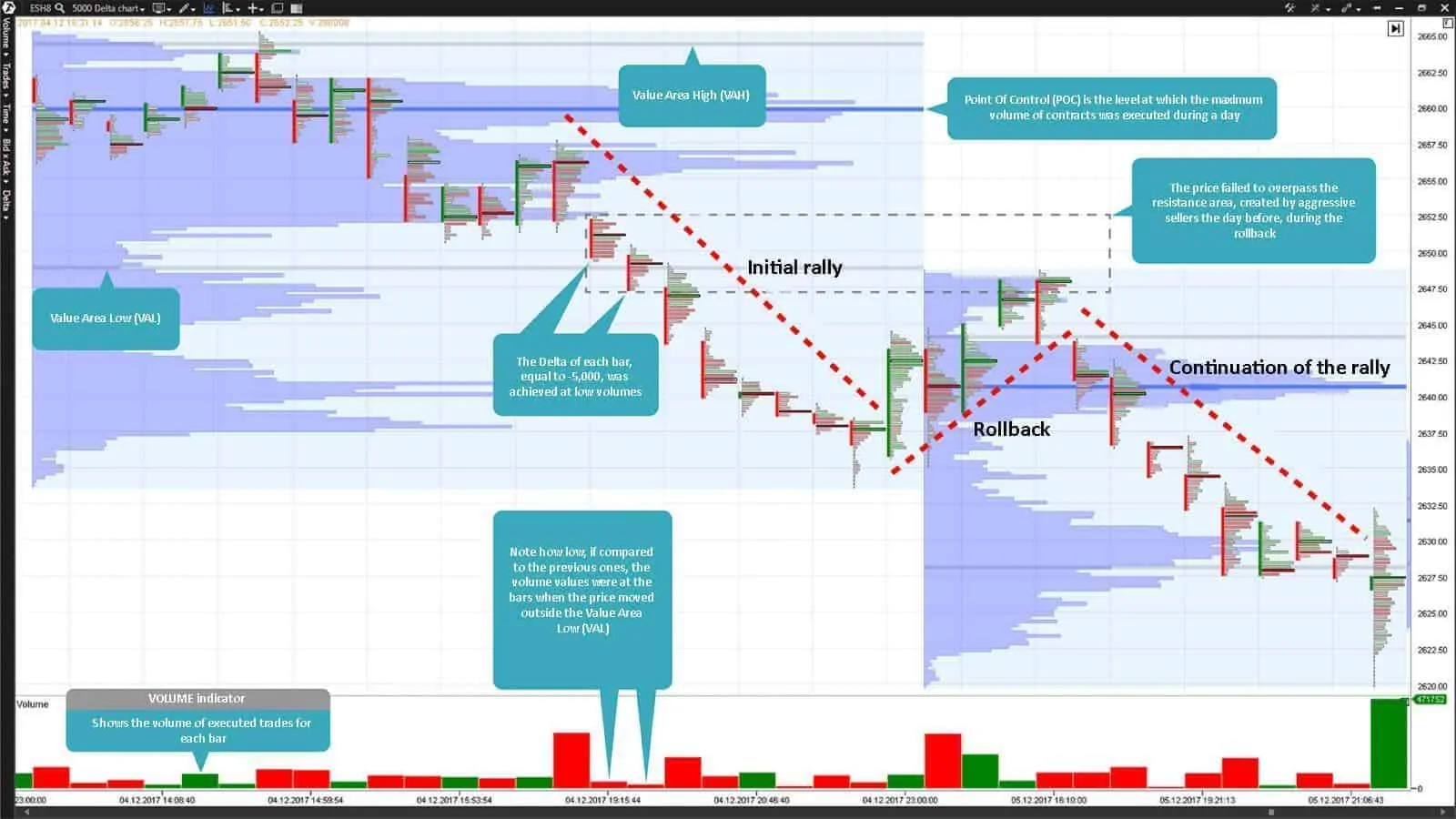
The market cannot endlessly move in one direction. There could be rollbacks in the process of the price movement with further consolidations after which the price would renew the initial movement. Look at the chart 1 below. The cluster cells were coloured in dark-red shades as the price moved down. And now look at how, afterwards, the price consolidated during a rollback and how it lacked momentum and strength, which it had during the initial rally. But later, as we can see from the chart, the price gained the initial strength again and rushed towards the trend on high volumes after renewal of the low.
The Footprint helps a trader to follow the trend. Each Footprint cell shows the level of pressure from the side of buys and sells and reflects the situation development in the form of a coloured thermometer. The colour intensity is automatically identified on the basis of whether there were more buys or sells at each price. Note the Footprint chart 1 shown below. The colour of each cell accurately reflects the general vector of the price movement. The price direction is multiply confirmed by the colour of the Footprint cells. For example, a big number of green cells is observed in the uptrend. The darker the green colour, the more confident the buyers are to push the price higher. The downtrend usually has more red cells. Look for dark-red or dark-green blocks to confirm the trend direction. They represent areas in which aggressive buys or sells predominated. They could serve as support/resistance areas after a rollback. It is shown especially clear in chart 1 below when the area of aggressive sells, which was formed during the previous day, became the resistance area, which the price failed to overpass the next day during a rollback. However, it’s even more important that these areas demonstrate strength and confidence of one or the other market side at consecutive price levels. Such situations are often a sign of a predominant demand or supply and may ensure an excellent method of tracking a tendency or its absence.
Chart 1. E-mini S&P 500 futures Footprint build by the Delta with the value of 5,000 contracts.
Confidence and confirmation
Many professionals made a conclusion that the Footprint could be used as a trend-tracking analytical instrument. It is easier for traders to avoid emotional tension during price fluctuations due to the use of cluster charts. Footprint became a revolutionary discovery in the world of trading. Volume is an integral component of efficient trading and it is very important, when you follow a trend, to know when the volume starts to weaken and the order flow changes its direction (supply will exceed demand). The Footprint constantly reflects the trading volume flow and warns traders about a change of the trend state through changing cluster cell colours. Traders that use the cluster analysis make more timely and justified decisions since they are more informed than the other market participants. The Footprint reflects the real market trend better than any other analytical instrument.
The Footprint demonstrates the volume behaviour as the price continues its focused movement into the support/resistance area. For example, if the price moves with the upward focus and then corrects itself towards the support area, use the Footprint for controlling demand and supply in this area. Analysis of volumes of the correction movement into the support/resistance areas, which are known to you, would help to identify the current trend’s strength in general.
Strategy of e-mini s&p 500
Chart 1 shows a unique specific feature of the Footprint chart – a possibility to build it on the basis of the delta data (delta is the difference between market buys and sells). Formation of each bar in the chart is completed only after the delta reaches the value set by the user in the ATAS platform settings. Besides, you can set different delta values for each financial instrument on the basis of liquidity and volatility inherent in this specific financial instrument. Periodicity of building bars takes place in real time exceptionally on the basis of the order flow data and volumes, which come to the market.
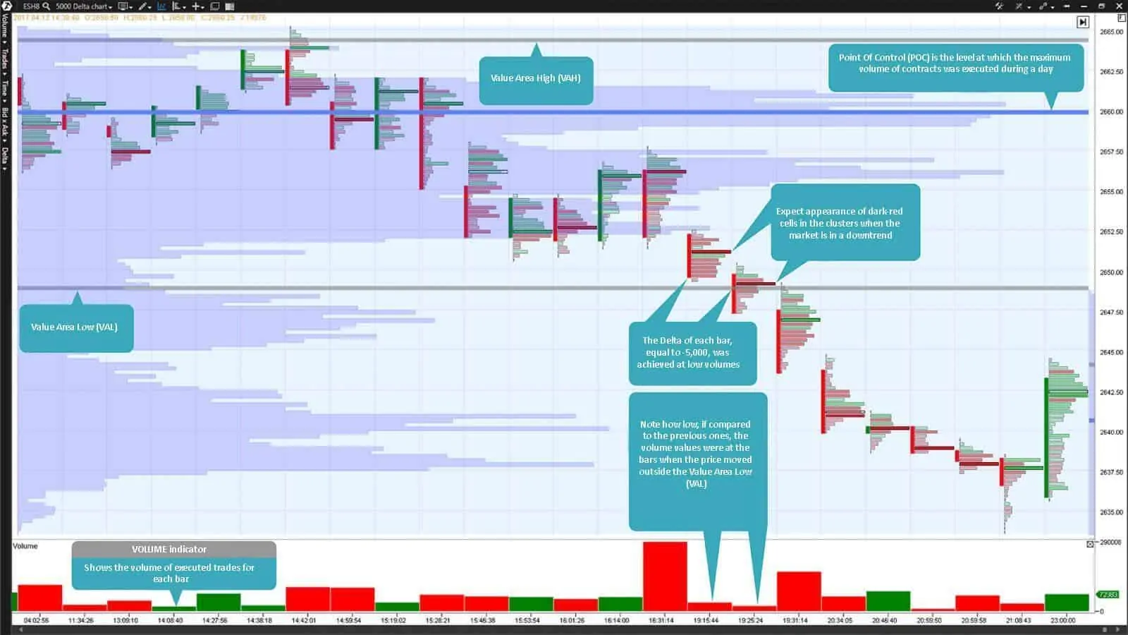
Chart 2. E-mini S&P 500 futures Footprint build by the Delta with the value of 5,000 contracts.
Chart 1 shows the delta value of 5,000. Consequently, when the delta reaches this value, independent of whether it is +5,000 (market aggressive buys predominate) or -5,000 (market aggressive sells predominate), formation of the current bar is completed and formation of the next bar is started. This bar building periodicity absolutely doesn’t depend on time. The logic, which lies in the foundation of the Footprint chart built by delta, is that new bars are formed when there is a disbalance of the demand and supply levels. Note how low the volume of the bars, when the price moved outside the Value Area Low (VAL), and the subsequent rally was. Namely the fact that the delta of each bar, equal to 5,000, was reached at low volumes, tells us about availability of aggressively disposed sellers and their interest in the further E-mini S&P 500 futures price reduction.
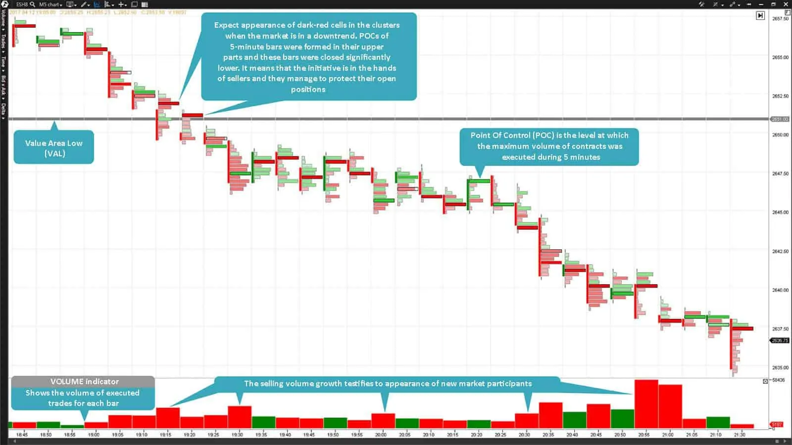
Chart 3. E-mini S&P 500 futures Footprint with the 5-minute time-frame.
Chart 2 shows the same trading day and the same futures but only with the 5-minute timeframe (M5 chart). This is the most traditional way of presentation of market data. The price move outside the Value Area Low with the subsequent volume increase is clearly seen in this Footprint chart. The initiative is in the hands of sellers.
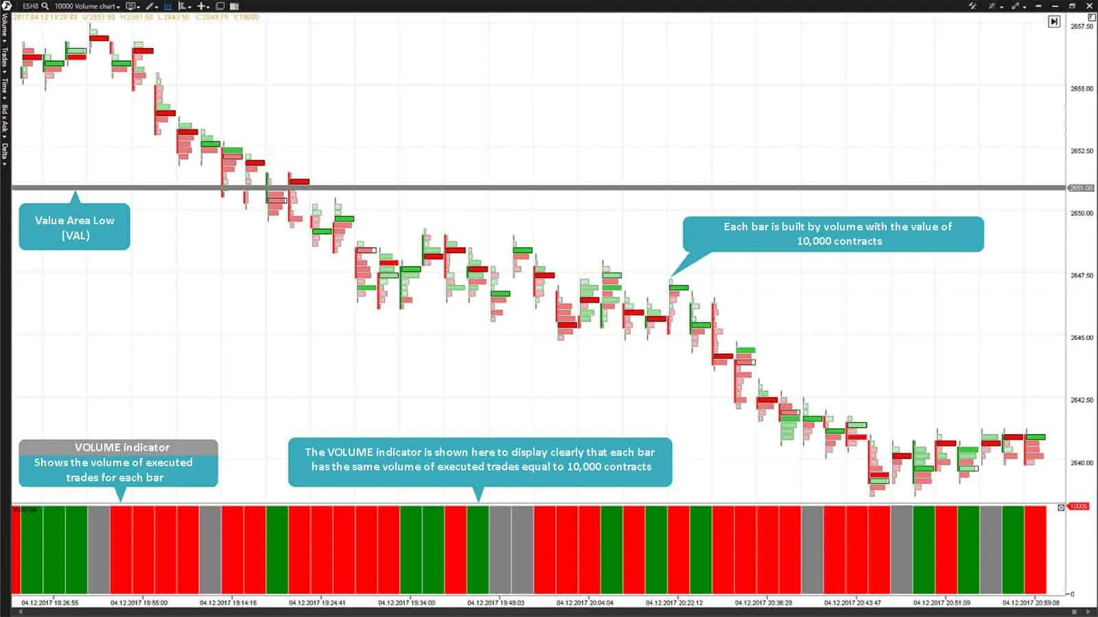
Each bar in chart 3 is built by volume with the value of 10,000 contracts. Thus, every new bar is formed not after expiration of a certain period of time but only when 10,000 futures contracts were traded in the market. This brings us back to the issue of the market volatility and activity of its participants. Usually, the market volatility attracts new participants to the market which is reflected in the increase of trading volumes.
Check out new publications about the strategies of using the Footprint charts of the trading and analytical ATAS platform. Best of luck!


