
What TPO is
TPO (Time Price Opportunity) is a classical visualization of the market profile. TPO was proposed to traders by Peter Steidlmayer in 1984.
The market profile, in this variant, doesn’t take into account the time, which the market spends at every price level. In its classical visualization, every 30-minute period of time is shown as a separate letter (or is coloured in a shortened variant). The maximum TPO level is formed where the longest row of letters is formed.
Maximum TPO profile and Volume profile levels do not always coincide.
The ATAS platform allows analyzing TPO both in the compressed and ‘running’ form.
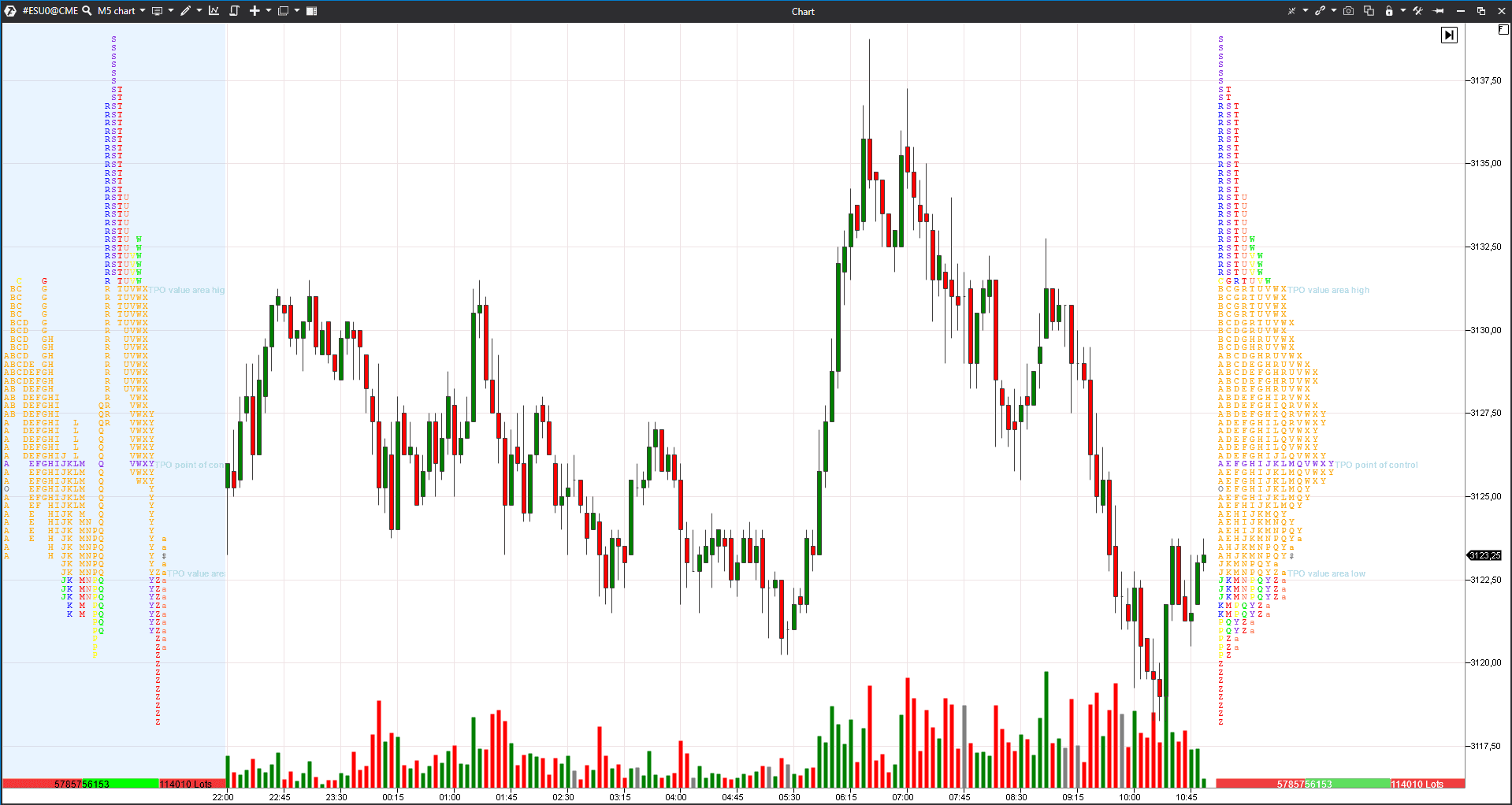
For example, the picture below shows the 5-minute E-mini S&P 500 futures chart. The ‘running’ profile is to the right and the compressed profile is to the left. Both profiles show the same trading session. See Picture 1.
How to set TPO
The indicator has multiple settings, which you can get acquainted with in the menu. See Picture 2.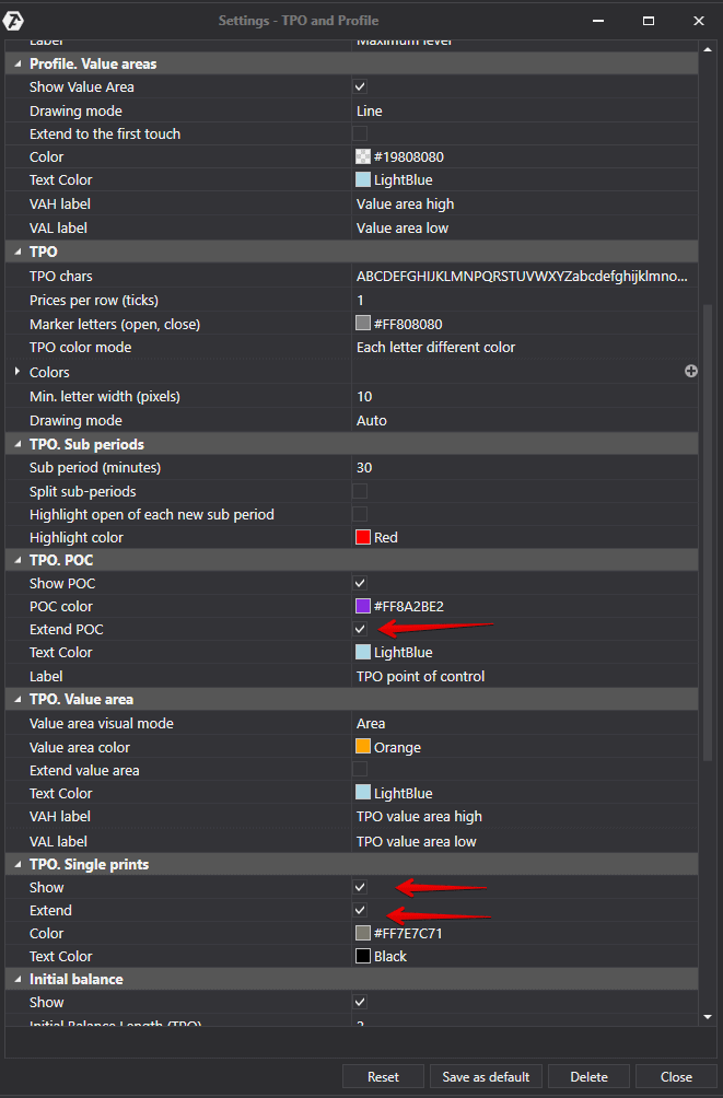
We will tell you about some settings in this article (and will provide examples of trading):
- if you check checkbox 2, you can mark single prints;
- if you check checkbox 1, every print will be built separately. This variant of the profile display is called ‘running’;
- if you check checkbox 3, you can prolong a single print level to the point of touching the chart;
- if you change the sub-period (in minutes), the prints will be built in the selected time period rather than the 30-minute one;
- you can mark Initial Balance in the chart and set the time of the trading session beginning.
Visual settings (colours, line width and labels) are changed depending on the trader preferences.
In case you are not acquainted with Market Profile analysis, you may read books by Peter Steidlmayer or James Dalton. Of course, these are not the only authors who wrote about the Market Profile, but they are the most famous ones and started to use these instruments before anyone else started.
How to analyse the market with the help of profiles and TPO
The main idea is that the market develops from a balance to a balance. The market moves in a certain direction between balances.The profile shape, during a balance, resembles a bell and value areas completely coincide or significantly intersect. A profile is stretched during a trend movement and value areas shift higher or lower than the previous periods.
If the distance between balances is big, it means that the trend has just started to form and the prices could move much further. If the distance between balances is not big, it means that the current period is close to completion and a reversal is possible.
Market Profile is not a readymade trading system. It is impossible to get mechanical signals for position opening and closing with the help of TPO or Volume analysis. However, it is possible to improve understanding of the market situation and forecast its further development with higher confidence. It is very important, when analyzing TPO, to take into account the global picture before you select a position for intraday trading.
5 important elements in TPO analysis
According to Jim Dalton, traders, when analyzing profiles and TPO, should take into account the following 5 important elements:
- movement of the value area with respect to previous trading sessions;
- movement of the maximum level;
- behaviour of single prints;
- tails at the beginning and end of the trading session;
- spikes and ledges.
Let’s consider each of the elements in more detail.
Element 1. Value area and its movement with respect to previous trading sessions.
Value Area (VA) in ATAS is marked with orange colour by default. If the Value Area resembles a bell and VA of several trading days practically coincide, it means that the market is balanced. Trend movements start from a balance, that is why the balanced market is very interesting for the position accumulation.
Let’s consider an example in the 30-minute Tesla (TSLA) stock chart. See Picture 3.

We marked balance areas with red and black rectangles. Of course, it is difficult to watch and wait for a balance to form. However, the price skyrockets practically vertically after a breakout of the second balance area and trading volumes grow.
It is difficult to forecast the trend movement potential. For example, you may be guided by the global support and resistance levels or, in order not to lose your profit, use protective strategies.
Element 2. The maximum volume level and its movement.
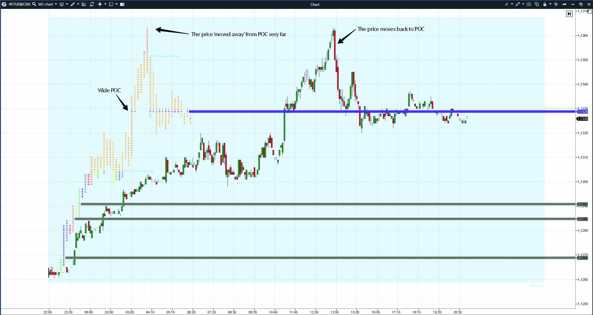
By default, POC is marked with a violet line and it could be prolonged to the point of touching the chart. Maximum volume levels could be support and resistance areas or attract prices when the local trend changes.
There are several violet levels in the above example in the chart in the course of development of a bullish trend. In this case, the big distance between these levels warns us about the strength of the growing trend. When the trend reverses, these levels would slow down the price decrease.
Intraday POC attracts the prices that moved far away. As a rule, it happens when the maximum volume level consists of a sufficiently big number of letters. Let’s consider an example in the 5-minute E-mini EUR (E7) futures chart. See Picture 4.
Element 3. Single print behaviour.
Single prints show the price acceleration levels. They also could be prolonged until they touch the chart. Single prints are marked grey in the example above.
Single prints show strength and aggression of one of the sides. These levels also serve as resistance and support areas. You may take that the correlation of market forces hasn’t changed while single prints are ‘not erased’.
Let’s consider an example in the 5-minute Moscow Exchange index futures (MX) chart. See Picture 5.
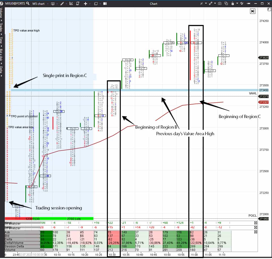
- The price grows from the very beginning of the trading session – the price never moved down through opening during the period under consideration.
- Region B starts significantly higher than the opening price and expands the range upward.
- Single print appears in Region C, when the price cannot completely overlap the previous print B. Dalton calls such a price movement the ‘one time-frame’, which means that one side is very strong in the market (buyers in our case). The fact that the single print is above the previous day’s Value Area High lends an additional weight to it.
Let’s have a look at the continuation of this chart. See Picture 6.
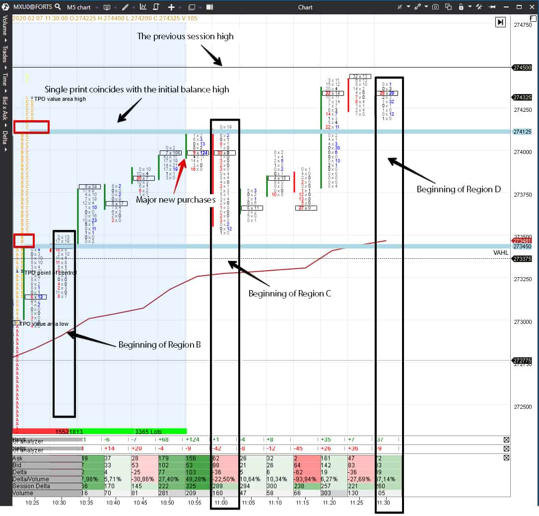
One more single print appears in Region D. This print coincides with the upper boundary of the initial balance area (IBH – Initial Balance High). The price breaks IBH on a good volume at 11:20, that is why, most probably, it is a real breakout. New big buys appeared at 10:50 and 10:55 – we marked them with a red arrow. We know that these are new contracts, because the Open Interest has grown, and we attentively monitored the Smart Tape. If the buyers are strong, they would hardly allow the price to move significantly down.
In our example, single prints confirm the buyers’ strength – it is dangerous for the deposit to short in such a market. The buyers are strong until the price erases single prints.
Element 4. Tails at the beginning and end of the trading session.
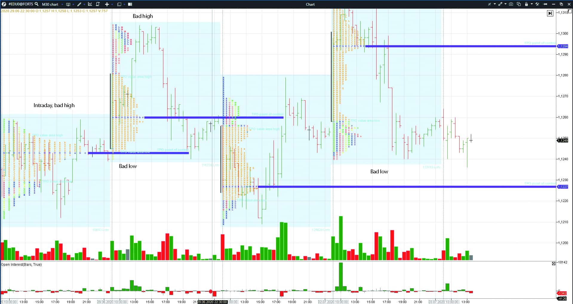
Dalton calls them ‘excess’. Every day should have tails above and below for completion of the trading session structure. If there are no tails, the auction is not completed or the asset is overbought/oversold.
From the trading point of view, ‘bad highs or lows’ could mean that the price should come back again to these levels and complete the auction. This formation looks very similar to the Unfinished Auction pattern. However, you shouldn’t trade these levels mechanically, since you need to take into account the global picture.
Let’s consider an example in the 30-minute EUR/USD futures (ED) chart. See Picture 7.
Element 5. Spikes and ledges.
Spikes and ledges work as support and resistance levels.
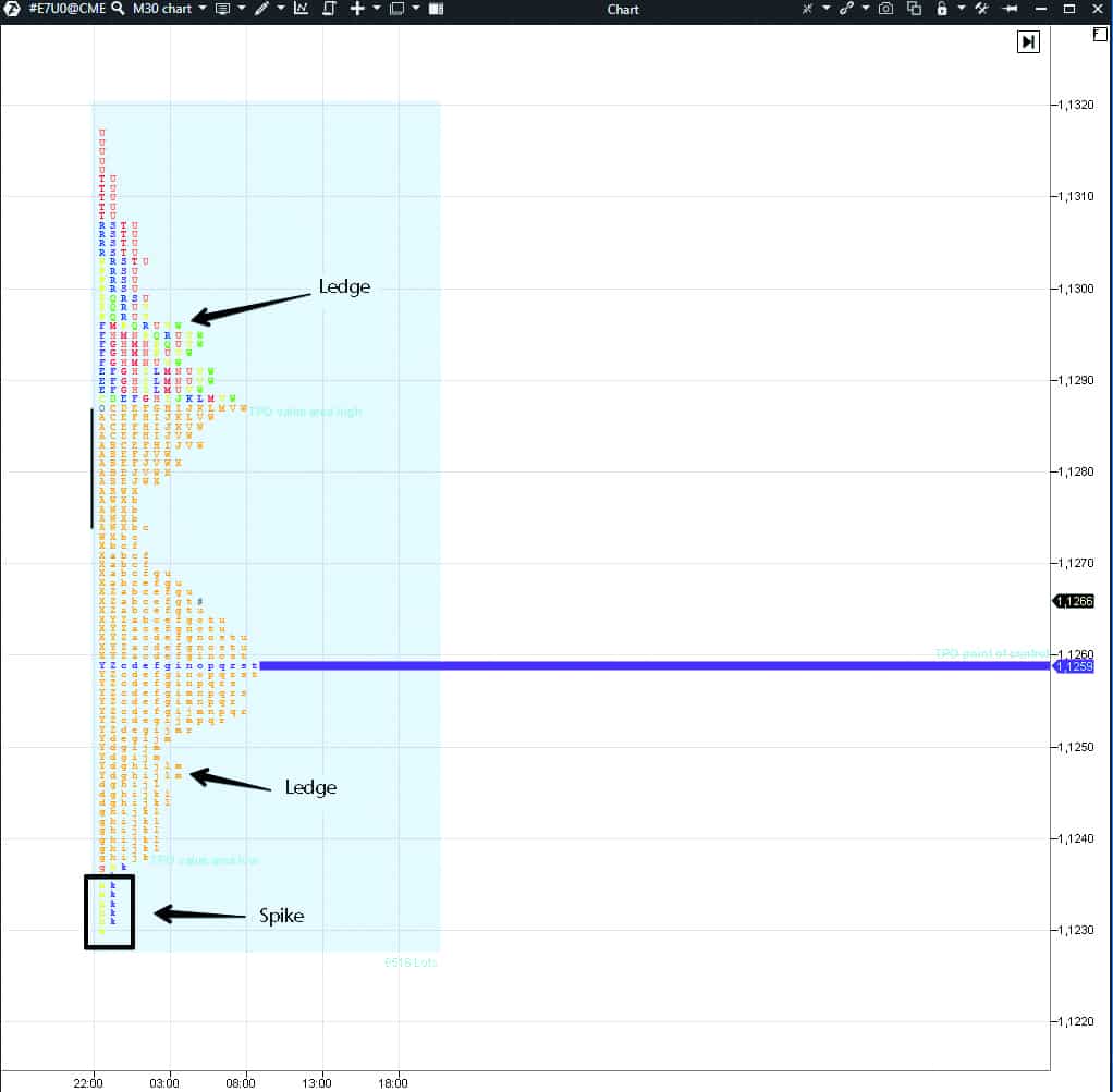
Spikes appear at the day’s extreme points if the price reverses fast. Let’s assume that the price fell and the sellers were very active and strong, but buyers entered at the day’s low and managed to take the lead. A spike tells us that the market situation in momentum has changed.
A ledge is a level where the price stopped several times but this situation could be repeated in the future as well.
An example of how these formations look like in the E-mini EUR futures (E7) chart. See Picture 8.
Conclusions
Traders, who are interested in the profile, usually read the ‘Mind Over Markets’ book. It is the first book of James Dalton. He often mentions in his webinars that he reconsidered some issues in his second book ‘Markets in Profile’, that is why it will also be useful.Here are some ‘re-considerations’, which Dalton made while working with TPO:
- he ceased to calculate TPO of buyers and sellers for assessing predominance of one of the sides;
- he assesses the volume only during a focused movement. He believes that the volume fluctuations might not be taken into account when trading in a range;
- the night trading session data are important for global futures;
- he enters with market orders if he clearly understands the position. Several ticks could be missed – it will not influence the result significantly;
- he analyzes the monthly-weekly-daily time-frame before opening a position;
- he doesn’t use the Initial Balance (IB) concept because he trades global, nearly round-the-clock, contracts;
- he considers extreme points of trading sessions, Value Area boundaries, maximum volume levels and support and resistance levels of longer time-frames as reference levels.
TPO profile is very similar to standard half-hour charts. It is not a magic wand and not a readymade trading system – it is yet another method of analyzing the market.
Perhaps, it will be useful and convenient namely for your trading strategy.

