Who activates your stop losses. Description of processes.
This article is about stop losses (what a stop loss is). Activation of these protective orders brings psychological discomfort to a trader. We already wrote about it in our article “How to derive benefit from the fear of being stopped out”.
We will continue the stop loss topic in our today’s publication in order to help you to better understand real processes, in which major participants take part.
Read in this article:
- Liquidity is the market engine.
- Where do stop losses ‘dwell’?
- What happens in the market when a big number of stop losses are activated?
- How to use areas of possible stop loss activation in trading?
Liquidity is the market engine
Any trade on the exchange needs two sides: a seller needs a buyer and vice versa (more details about order matching).
This could be a problem for major market participants, since they need to manage big positions. Consequently, they need to find a big number of counteragents in order to execute their trades.
That is why, major market participants are in constant search for liquidity. They use their advantages and create specific manipulative actions in the market in order to execute their big orders.
In view of this, it becomes interesting for a major player to find the places of accumulation of a big number of protective orders, posted by a big number of the market ‘minor participants’ (retail traders or simply ‘the crowd’).
Where do protective orders of market participants accumulate?
The main part of unprofessional market participants post their stop losses in a standard way, by the technical analysis rules, behind the local extreme points.
A professional player perfectly understands this ‘crowd’ behaviour and activation of a multitude of stop losses is beneficial for him, since he gets a possibility to gradually take on a big position. So, the phenomenon, when the price moves from one accumulation of stop losses to another, becomes visible.
- When minor players close long positions by stop losses (they sell), a major player buys them (builds up a long position).
- When minor players close short positions by stop losses (they buy), a major player sells (builds up a short position).
So, a major player puts a multitude of small positions, closed by minor traders, ‘in his pocket’. Nothing personal, just trading.
Is a stop loss visible in the chart?
It cannot be absolutely clear from the chart where other participants of exchange trading post their stop losses. However, any analyst, who has analysed footprints during a long period of time, is able to point with confidence where activation of stop losses took place.
Where do stop losses ‘dwell’?
What elements are required for accumulation of such a number of stop losses at some place, which would become an attractive ‘catch’ for a major player?
The following is required for this:
- An obvious level of stop loss posting, which would be a logical place to limit losses for many traders.
- Time. The more time passes, the more decisions are made to post a stop behind that level.
Standard technical analysis gives some recommendations where to post stop losses:
- Behind the most recent significant extreme points in the chart (example 1 below).
- Behind the most recent extreme points of the day, which are not broken by the price (example 2 below).
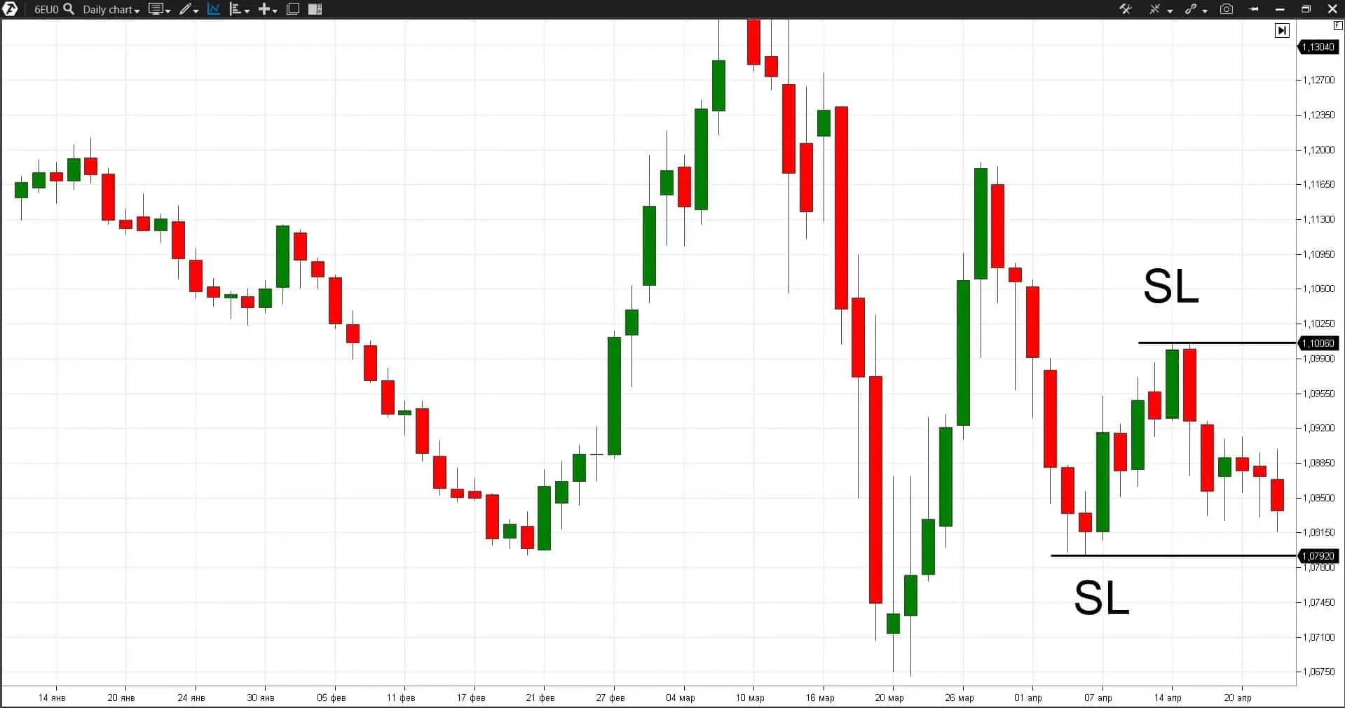
Example 1. Let’s consider the EUR futures chart.
Significant extreme points should be formed during several days and consist of several candles, which form an obvious fractal. These highs and lows become too obvious and then stop losses would gradually accumulate behind these extreme points:
- Seller stop losses would accumulate behind the most recent high.
- Buyer stop losses would accumulate behind the most recent low.
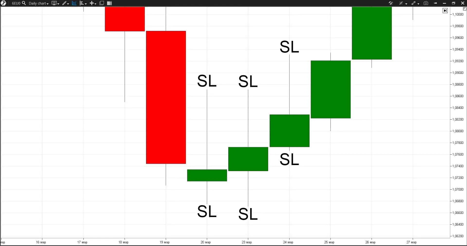
Example 2. The same EUR futures but it is a daily period.
The day’s extreme points are important reference points for traders who roll their positions overnight. This is one more reason for the stop loss accumulation.
How to identify activation of a big number of stop losses
How to identify that there was a ‘knockout’ of stop losses in the market and, as a consequence, the opposite trend reversal probability increased?
Let’s study this issue with the help of the trading ATAS platform and its cluster analysis functionality.
7 methods to identify that stop loss activation took place
Method 1. Significant level. It is better to look for the point of activation of a big number of stop losses after a breakout of significant levels. As a variant – round levels.
Method 2. Rollback. Stop loss activation is accompanied with a false breakout of the level and further rollback of the price behind the level.
Since the aim of this movement is ‘knocking out’ a big number of traders from the market, then, consequently, the movement stops after achieving this aim and the price moves back.
However, it might not happen immediately, since the cascade activation of stop losses may accelerate the market. Why?
For example, the stop loss of sellers is behind the resistance level and the order type is not the limit but stop order. It is executed by a market order when achieving the set conditions. That is:
- The seller’s stop loss is a buy at the market price.
- The buyer’s stop loss is a sell by the market.
And, consequently, when the resistance level is broken, seller stop losses are activated and a big number of market buys, which may additionally accelerate the upward impulse, come to the market. However, if this movement is not supported by further buys, a deep rollback starts.
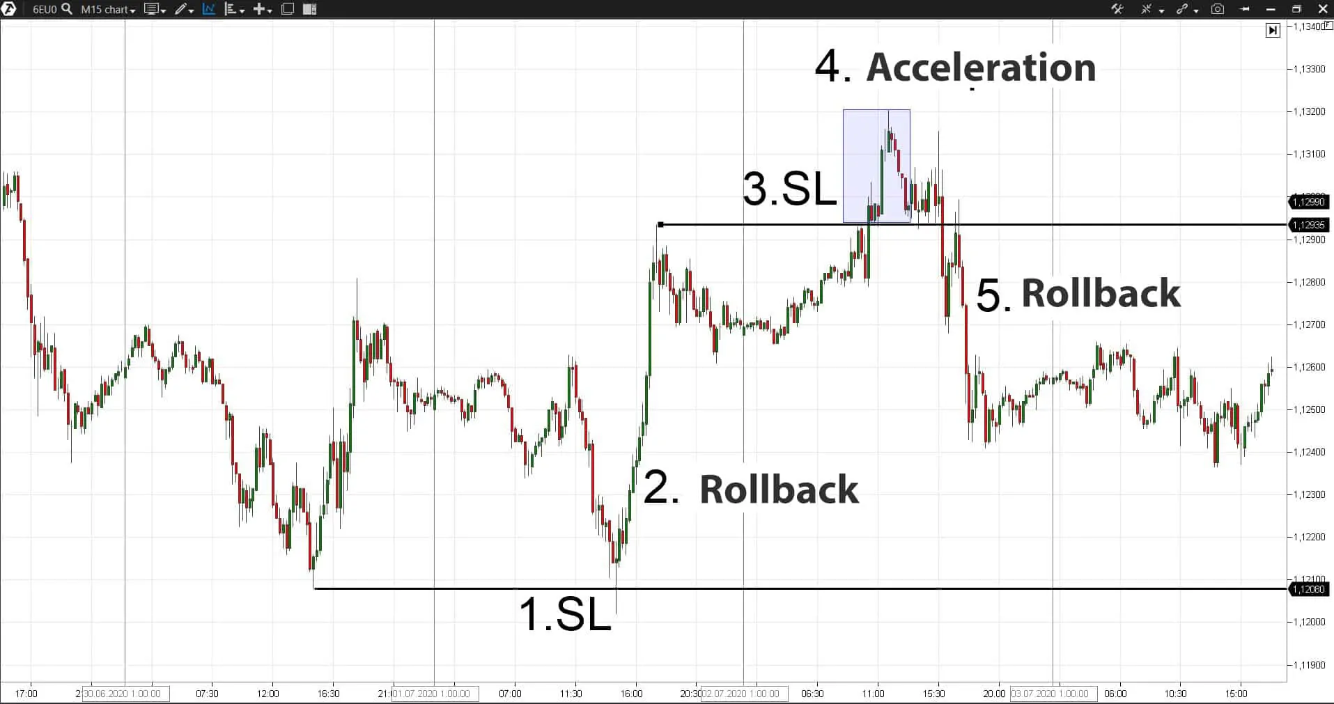
Let’s consider 2 examples of stop loss activation:
- Point 1. Sufficient liquidity (stop losses) accumulated behind the previous day’s extreme point for the market to visit this level.
- Point 2. The level thrust and subsequent rollback take place. Perhaps, the stop loss volume was insufficiently big for a strong market movement. The movement wasn’t supported by further sells and the rollback started.
- Point 3. New stop losses accumulated behind the new day’s extreme point.
- Point 4. The level is broken and the market accelerates after that, including due to the stop loss activation.
- Point 5. The rollback and movement behind the level started since that movement wasn’t supported by further buys.
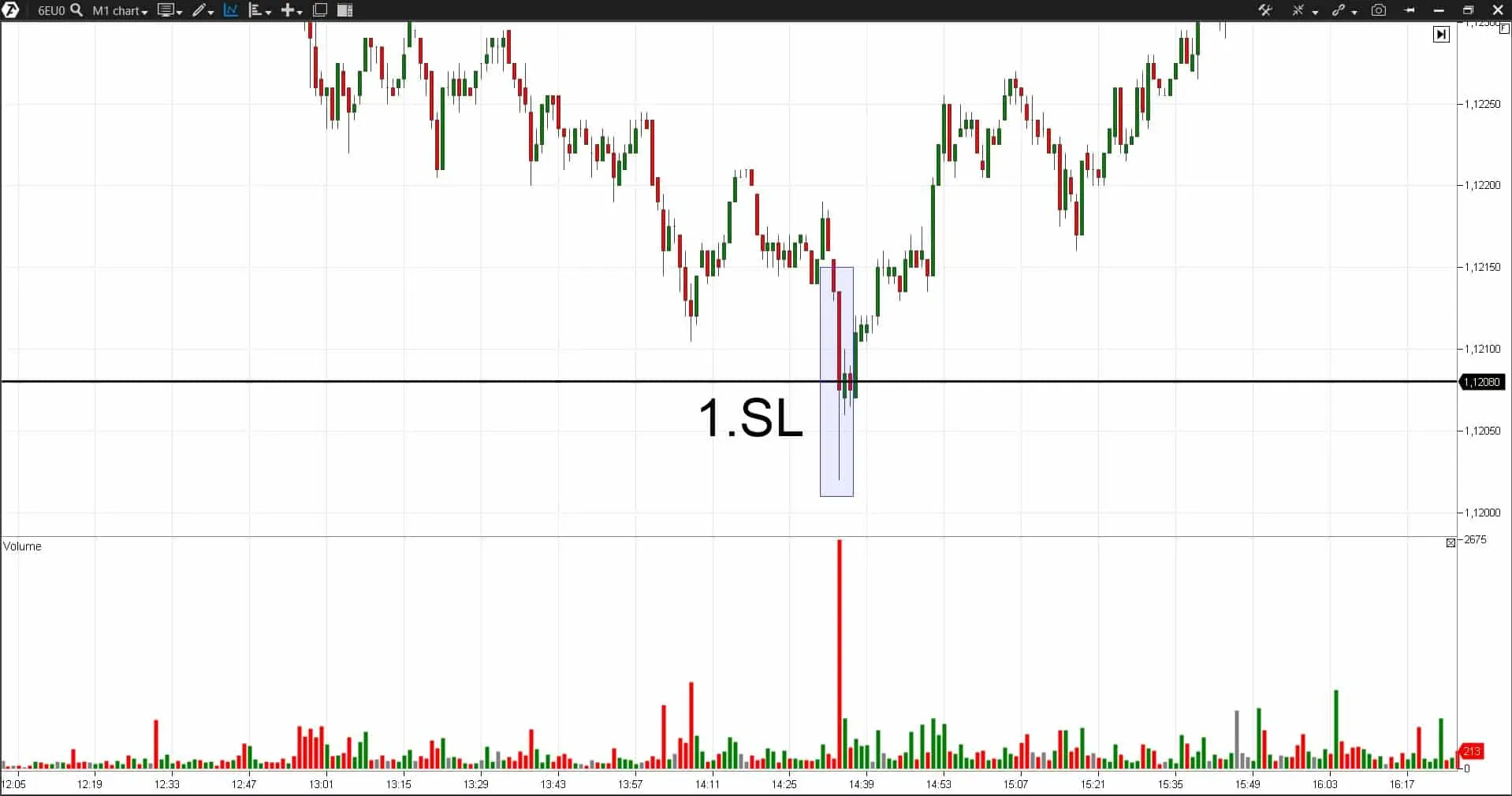
Method 3. Vertical volume. A splash of the volume is formed on the ‘Volume’ indicator when a quick activation of a big number of stop loss orders takes place.
It is especially clear on the M1 candle, which breaks the level. The biggest volume splash during the trading session takes place on this candle.
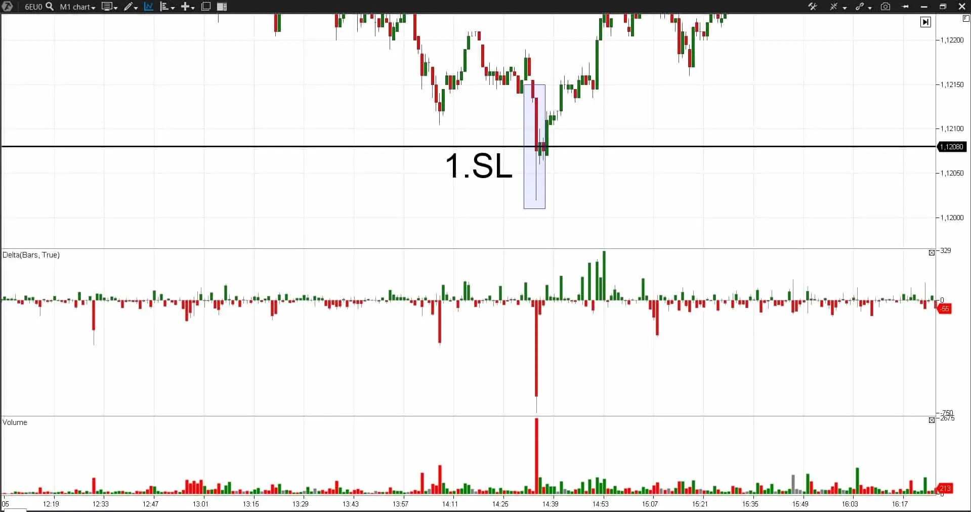
Method 4. Delta. Delta indicator shows the difference between the market buys and market sells.
- When the level is broken from top to bottom, buyer stop losses (market sells) are activated and, consequently, a big negative Delta is formed on the breaking candle.
- And vice versa. When the level is broken from bottom to top, seller stop losses (market buys) are activated. And, as a rule, we see a big positive Delta on the breaking candle.
See example in the chart below.
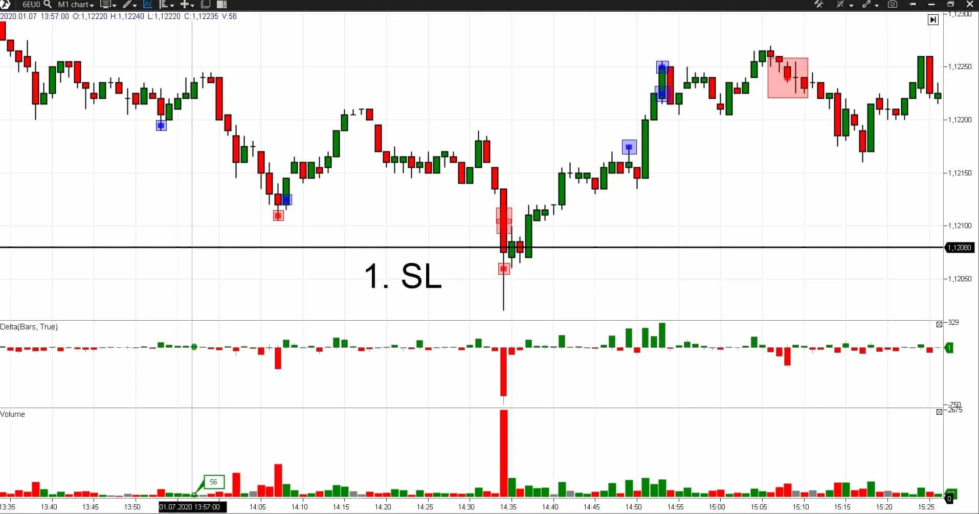
Method 5. Cluster Search and Big Trades indicator. These indicators show activity of major market participants; they are activated when big volumes inflow into the market. This is exactly what happens at the moments of stop loss activation:
Signals of these indicators very often emerge on the candle shadows, which initiate stop loss activation as in the example above.
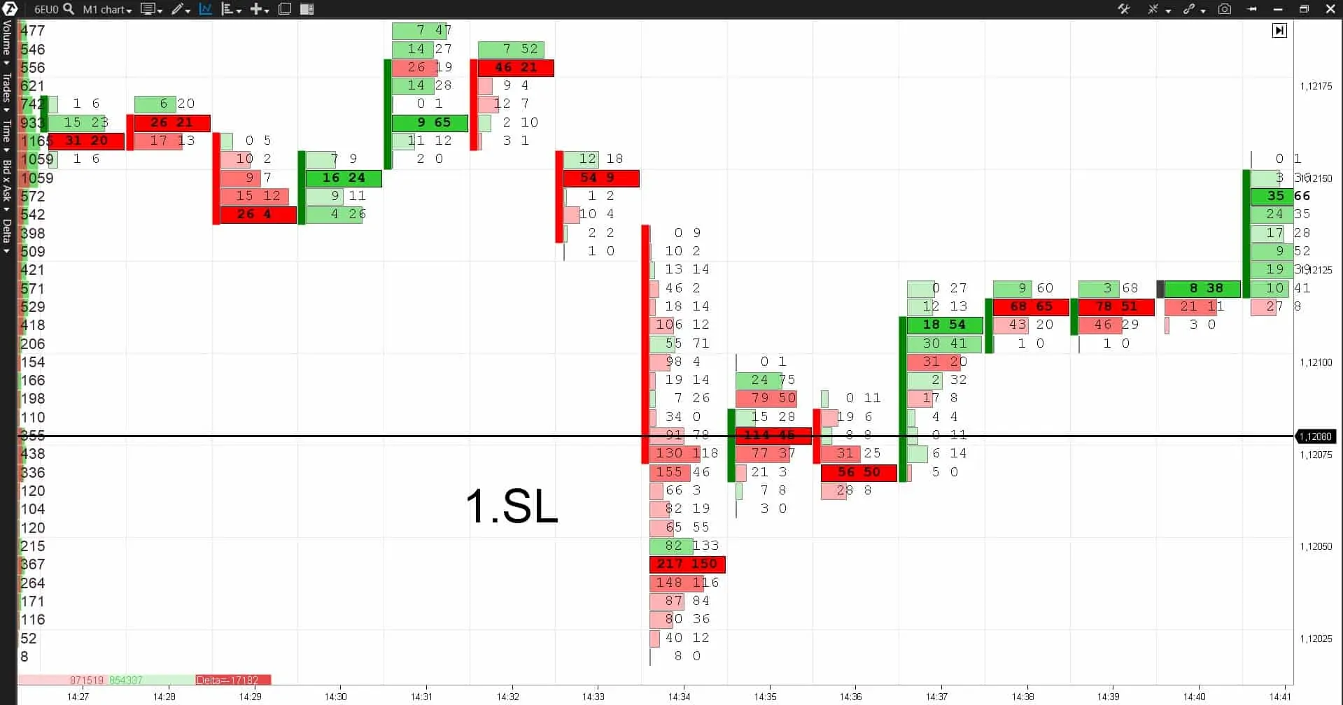
Method 6. Cluster chart. This chart type allows a ‘more transparent’ view of the stop loss activation moments:
We can see from the cluster chart that big market sells take place after the level breakout, which corresponds with a possible activation of the buyer stop losses. However, for whatever reasons, the price doesn’t move down after these big sells but reverses up and returns behind the level. The price wouldn’t have behaved like this if the red clusters would have meant real sells. It means that it was a stop loss activation.
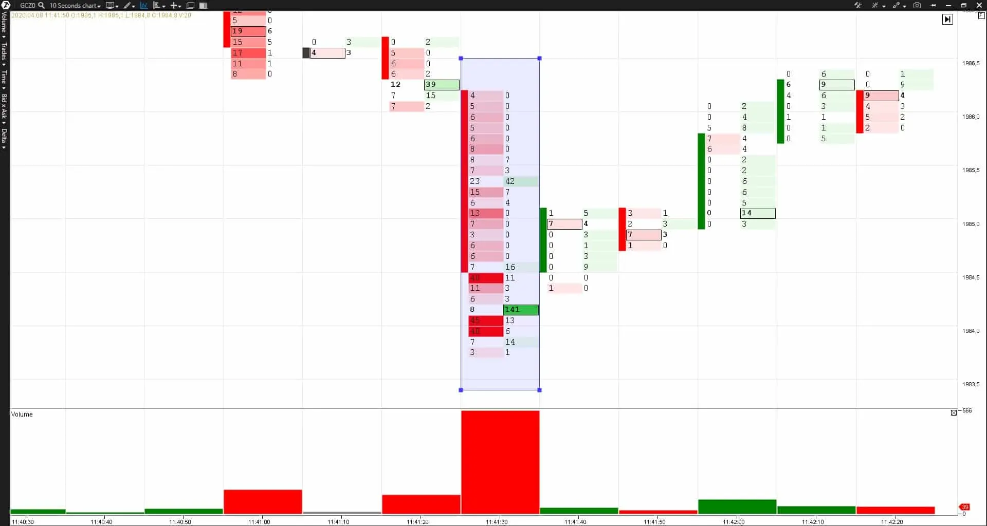
Method 7. Zeros in the cluster chart. Sometimes stop losses accelerate the market so much that, for example, we can see in the cluster chart, when the support level is broken downward, only sells (activated stop losses of buyers) and zeros in the buy column.
See example in the chart below.
This takes place due to a strong market movement, caused by a cascade activation of stop losses (market sells in this case), and market buys just fail to come to the market in due time. It is seen best of all on time-frames below M1 – for example, 10 or even 5 seconds, since these movements are very fast. This effect might not be seen on a bigger time-frame (for example, 5 minutes).
So, if you see zeros in the buy column in a cluster chart when the level is broken downward or zeros in the sell column when the level is broken upward, then, most probably, this is activation of stop losses.
All 7 methods listed above help to understand that a stop loss activation took place in the market. What do we have to do with this information in practice?
Using areas of possible stop loss activation
So, we made it clear that the price often visits the areas of protective order accumulation. A major player needs it for taking on his position. Understanding of this logic will give us ideas for trading in the direction of a probable market movement.
However, at the same time, it is important to understand that we can speak only about a probable development of events, which, say, could happen in accordance with our estimates in 55% of cases and against our estimates in 45% of cases. That is why, you should always add a proper risk management and capital management to proper analysis in order to trade profitably.
So, what actions could be undertaken if you want to apply the stop loss activation areas in your trading:
- Build a plan before trades start – identify possible levels, behind which there could be stop losses of other market participants.
- Assess the indicator readings when these levels are broken and the price comes back behind this level.
- The Volume indicator should show an excessive volume splash.
- The Delta indicator and cluster chart should show extremely big buys when the level is broken upwards.
- The Cluster Search and Big Trades indicators should show big volume inflows.
If all these components are available, it is quite probable that a stop loss activation took place in the market and the price would move in the opposite direction from the broken level. This gives traders a chance to act in harmony with a major player.
Limitation of losses for such trades could be posted behind the candle, which activated stop losses.
Conclusions
After you learn how to notice the moments of activation of a big number of stop losses, you will see that the price often moves along the circle “from the buyer stop losses to the seller stop losses and back”.
It is a must to take it into account in real trading, including for building your own strategy.
It is important to remember:
- Do not post your own stop losses in obvious places, since there is a high probability of a false breakout of these areas. Otherwise, you will be ‘knocked out’ from the market with a multitude of other traders.
- Conduct everyday analysis of probable areas of stop loss posting and use this information in your trading.
Download the test version of the ATAS platform free of charge. Try to build your own strategy on the basis of such a phenomenon as a ‘massive stop loss knockout’.


