The problems are:
- a major player is hardly interested in other traders knowing about his intentions;
- it is much more difficult to correctly interpret a big volume splash (or a series of splashes) than to notice it.
In this practically valuable article, we will show you how to increase efficiency in the search for a major player and identify his real intentions. We will use cluster analysis for this and other useful instruments of the trading and analytical ATAS platform.
Read in the article:
- prehistory of 90 years long;
- examples of detecting a major player in the BTC/USD chart;
- example of detecting a major player in the oil market;
- example in the NQ stock index futures market;
Interpretations of the price and volume interaction, presented in this article, work in all liquid markets and on all time-frames. It has been proved on the historical data.
Prehistory of 90 years long
Interest of market participants in the actions of a major player has been known for decades. Contemporaries wrote that when the stock ticker tape showed information about a big trade, exclamations of the most sensitive traders were heard in brokerage office halls.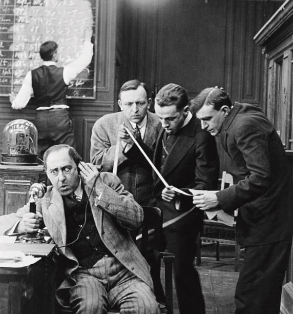
However, there is a rather simple logic for understanding what a major player does in the market. The key is in the price behaviour, which we would discuss later.
Perhaps, the first one who described this relation of the price and volumes was Richard Wyckoff, a Wall Street legend. Uniqueness of Richard’s career (started in 1891) lies in the facts that he was:
- a regular clerk in a brokerage firm, who worked with regular customers;
- the manager of his own brokerage firm, in which he monitored actions of major manipulators of those times;
- a practicing trader and investor;
- a teacher for financial tycoons (such as J.P. Morgan).
Wyckoff knew habits and tricks of major players and he could, just looking at a simple daily OHLC chart with a volume histogram, draw a conclusion about what takes place in the market in reality with a high degree of accuracy.
Here’s an example from the ‘Method of Trading and Investing in Stocks’ training course by Richard Wyckoff, in which the author analyses the NY Times Average 50 stocks index chart as of 1931.
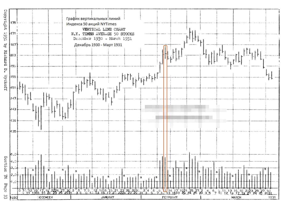
Here’s what Richard wrote about the February 11 bar (marked with colour in the chart):
An exceptionally big volume on February 11 plus impossibility of significant further growth on the high volume of February 11, as a rule, is the indicator of a certain distribution and regress. The index reached high on February 11 only one point higher than on February 10 and closed only with a small resulting growth – big supply surpasses demand on a big volume.
The logic is to compare the achieved progress on the high volume background. If the index reached the high only one point higher than the previous day’s high and closed with a small growth, it means that a major seller became active. If the big volume of February 11 had represented the strength of real demand, the progress in the price growth between February 11 and 10 would have been as big as between February 9 and 10.
February 11 marked the appearance of strong sell orders, which stopped a fast growth and became the beginning of the distribution phase, which lasted for several weeks.
Classics and modernity
Let’s have a look at whether the ‘outdated’ Wyckoff’s idea works for such a modern instrument as BTC/USD. Who could have thought in 1931, when one troy ounce of gold cost USD 17, that in 90 years time a coin, which doesn’t exist in reality, would cost USD 45 thousand?Let’s go back to the chart (5-minute period; the data are from Bitfinex). We added the vertical volume indicator (violet histogram) and ATR with the period = 1 to make it easier to assess the price dynamics.
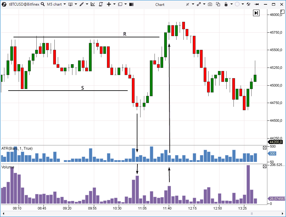
This is the Wyckoff logic, which points to the fact that a major buyer acts in the market and holds the price from its further decrease by the force of his limit buy orders. And the price moved back up after the thrust of sells was exhausted.
Candle 11:40. A similar example but the opposite one. We can see a narrow candle (judging by ATR) but with a high volume. Compare it with the previous one. There is also a big volume on candle 11:35 but the achieved growth progress is comparable with the volume size, which cannot be said about candle 11:40.
Judging by this 2 candle combination, we can form an opinion that a major seller emerged in the market at the breakout of resistance R, who met the up impulse and posted his big sell limit orders against the flow of market sells. The big supply overcame the demand. As a result, the price was USD 750 lower in 1 hour.
Could it be that the above computations are just guesses or coincidences? What if they work only temporarily and only in some markets?
Let’s look deeper into the patterns.
Modern analysis instruments of the ATAS platform will help you to understand what takes place ‘behind the curtains’ of the bars / candles, which have 2 specific features:
- an increased volume (the sign of the major player activity);
- a slow down of the progress in the trend movement compared to previous bars / candles.
Detecting a major player in the oil market
The screenshot below shows the oil futures chart from the Moscow Exchange (hourly period).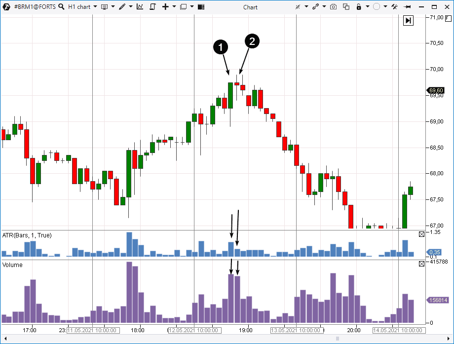
- The first candle has a high volume and significant bullish progress, which is confirmed by the strong closing and price increase between Open and Close. It is a strong dynamics.
- The second candle also has a big volume but without bullish progress, because Open and Close prices practically coincide and ATR is on average values. The price dynamics is mean but high volumes tell us that the major player is active. What is he doing?
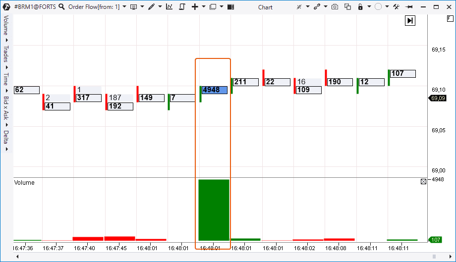
Let’s take more information from cluster charts. We also added an arbitrary profile to the bars with a high volume in the chart.
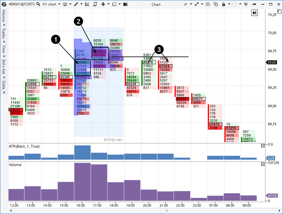
We see a bright red cluster in point 2 and, consequently, we have grounds to assume that the market buy order flow was exhausted and the major seller, meeting the flow of market orders with his sell limit orders, changed his tactics and started to sell along the market.
What’s interesting, the profile has the shape of the letter ‘P’, which tells us that a serious fight of major interests is taking place above 69,50. Bearish bar 19:00 gives us a cue that the major seller won.
We can see a test of the ‘letter P’ high volume level in point 3.
We can see a cluster with a maximum volume on bar 21:00, where sellers won. It was the beginning of a big price decrease (and a reasonable point of entry into a short position). We managed to identify the early sign of reversal on bars 1-2 due to the logic, which worked 90 years ago and, it seems, still works.
Does the described logic always work?
No it doesn’t. We believe that only swindlers could give you a guarantee that the market price will definitely be at a certain level in N minutes/hours/days. Experienced traders realise that they deal with probabilities. The main things are: retain chances in your favour and do not expose your capital to an unjustified risk, for example, trading against a trend.Let’s consider a Nasdaq stock index futures market example. We added two Speed of Tape indicators to the 3-minute chart. The upper one shows the speed of the market sells, while the lower one – speed of the market buys.
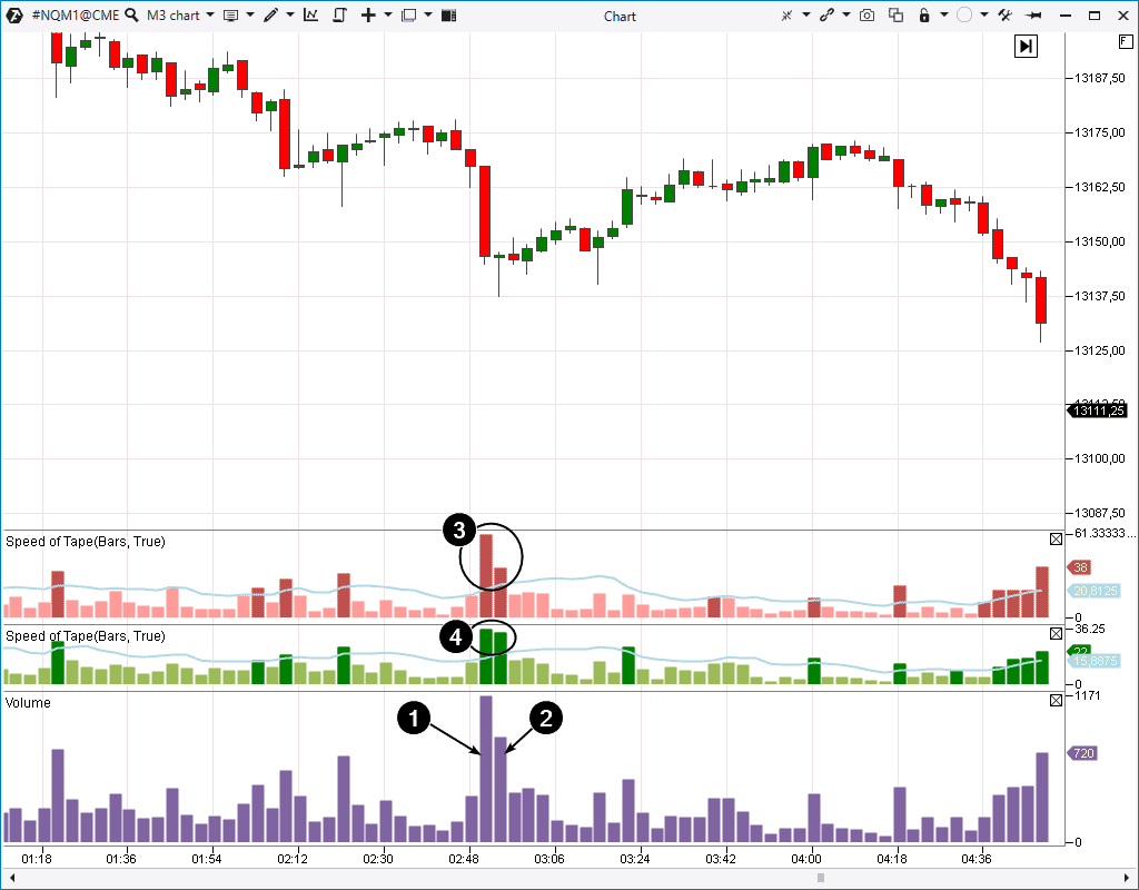
- first – wide bearish;
- second – narrow with a long bottom shadow (the pin bar type).
Based on the described logic, such a combination of price action with the volume indicator data could be interpreted as emergence of a major limit buyer. The Speed of Tape values confirm it, since the speed of sells has sharply decreased, while buys are active (numbers 3 and 4).
In other words, a certain big interest classified the low price as attractive and tried to use this moment in his favour. However, it hardly worked since a new bearish impulse moved the price down under the lows of candles with big volumes in 2 hours.
It’s all about the general bearish context. Emergence of a major buyer resulted only in a short-term increase within the framework of the downtrend, which dominated on the senior time-frame.
Conclusions
The market is the place of fighting between buyers and sellers and everyone tries to derive a benefit. Regular traders increase their chances to make profit if they act in line with the intentions of a major player. The above described method will help you in it.In order to increase its efficiency:
- apply it near significant support / resistance levels;
- take into account the general market picture and trends on senior periods;
- use the cluster chart and/or additional indicators for confirming your decisions.
Download the ATAS platform free of charge. Check how interpretations of the price and volume interaction, presented in the article, work in the markets you trade.
Information in this article cannot be perceived as a call for investing or buying/selling of any asset on the exchange. All situations, discussed in the article, are provided with the purpose of getting acquainted with the functionality and advantages of the ATAS platform.