How to use the TPO charts in ATAS
Many traders are acquainted with the Market Profile concept. In this article we will tell you about TPO.
TPO is the basic concept of the Market Profile and for the first time it was applied by Peter Steidlmayer. TPO stands for:
- Time.
- Price.
- Opportunities.
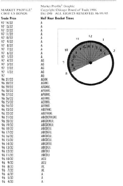
TPO appears in the chart as soon as the market touches a certain price during a certain period of time. Steidlmayer considered half-an-hour periods, each of which he marked with alphabet letters starting from ‘A’.
The first half-an-hour of the trading session is marked with letter ‘A’ in our picture. The price passed a long way from 96 4/32 to 97 14/32 during this period of time. The bigger number of times the market came back to a certain price level during different half-an-hour periods of time, the more letters at this level come in sequence. As a rule, the trading session opening is marked with letter ‘O’, while closing with symbol ‘#’.
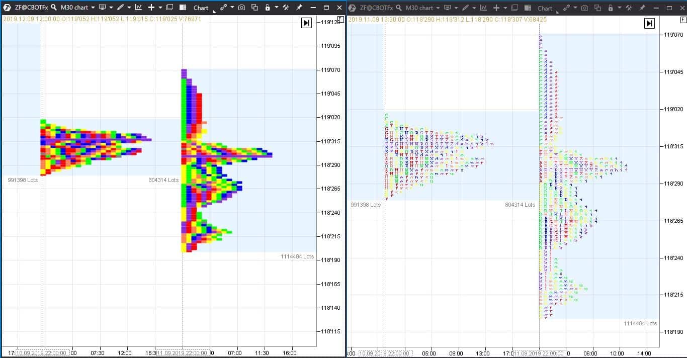
In ATAS, TPO can be seen in the form of letters or coloured blocks. If you expand the blocks along the vertical axis, you will see letters. Each letter corresponds to its colour.
We converted coloured TPO blocks in the left part of the 5-year US Treasury Notes futures (ZF) chart into TPO letters in the right part. The chart is the same, but the scale along the vertical axis is different.
You can set the block colours at your discretion. You can also:
- mark initial range of each bar;
- change the time period of a trading session;
- and, in general, set the indicator as you wish.
This training video on our channel (don’t forget to subscribe) will help you to set the indicator.
We already wrote about the Market Profile and horizontal volumes several times. In this article we will speak about the advantages of TPO charts.
Identification of the price movement type by TPO charts
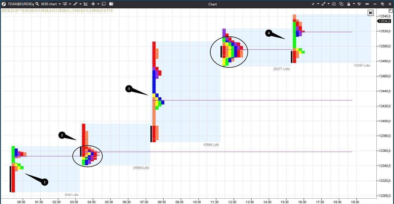
It is much easier to identify how the price moves during a day using letter charts. Let’s consider an example in the 30-minute German DAX stock index (what stock indices are) futures (FDAX) chart. We used TPO and Profile indicator (F3 key for fast access).
In standard settings we:
- changed the period to 4 hours;
- marked the initial balance area with black colour;
- prolonged levels of the maximum volume till touching the next bar.
Besides, we hid the price chart for convenience in order to see the profile only. You can do it in the upper menu.
Not more than 3-4 letters (or coloured blocks in our case) appear at each price level during a trend movement. As soon as a number of letters/blocks starts to increase at some level, it means that the focused movement becomes weaker.
We marked the trend movement in the chart with numbers 1-4. Appearance of 5 and more letters at one price level warns traders about the fact that the local fair price has been found. We marked these areas in the chart with circles.
If consecutive ranges expand with a focus, this is also a sign of the price trend movement. The neighbouring ranges moved upward and intersected insignificantly in our example.
The range is symmetrical and POC (Point Of Control) consists of 10-11 letters during non-trend periods. If TPO ranges decrease, it means that there is uncertainty or absence of major players in the market.
Initial range
Initial range is the price levels where TPO appear during the first hour of a trading session. This notion should be applied carefully for global markets since trading sessions, in fact, do not have a beginning and an end (we discussed it in the article about the time of opening trading sessions). However, there is a time of maximum activity, for example, when a regular American session opens. TPO, which expands into both directions from the initial range, is a sign of increase of volatility and warning about a possible focused movement. ATAS allows you to mark out the initial range of any period of time and not only the whole trading session. For example, we marked initial ranges of every 4 hours in the previous chart.
Some sources also distinguish the ‘pioneer’ range (apart from the initial range) or levels, which the price touches for the first time during a trading session or during another period of time. Traders need to monitor these ranges since it is important for them to understand whether the market accepts new prices or not.
If the price quote gets to a new level and the price stays at it as if getting accustomed to the new place, it means that the market accepts the price. If there is a fast bounce from the level, it is characteristic of manipulative movement, the goal of which is to pick up stop losses. We shouldn’t say in this event that the market accepts the new level.
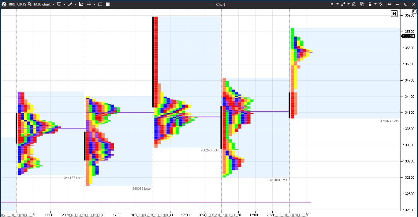
We again marked initial ranges of every 4 hours with the black colour in the 30-minute RTS index futures (what futures are).
Tails and single prints
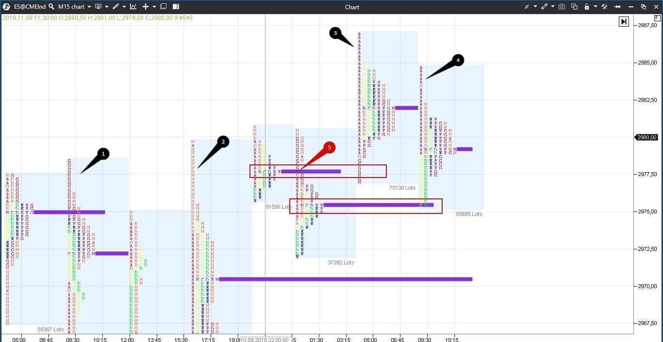
The price ‘tails’ are clearly seen with TPO. The tail appears due to a sharp run of the price from overvalued or undervalued area. Steidlmayer writes that tails appear due to the activity of long-term traders, that is they started to aggressively buy or sell namely at these levels. Thus, the tails help to understand the intentions of long-term traders: if the price goes down and they think that the price is unfairly low, they buy.
The longer the tail is, the higher the confidence of buyers and sellers is. Further on, the price often tests such levels to check whether sellers or buyers are still so aggressive as they were before or not. In other words, the tails become support or resistance levels.
A single print is not a tail but such a place in the profile which was touched by the price only once. For example, a single print may appear in the middle of the profile at a breakout of the previous balanced area.
Let’s consider the 15-minute E-mini S&P 500 futures chart example below.
We marked the tails with numbers 1-4. The longest of them is marked with number 2. We marked the single print which appeared at the level of the maximum volume of the previous bar with red number 5. We marked the levels which test the single print or price tail with red rectangles.
How to identify areas of balance and disbalance by a number of letters?
The bigger TPO at one price level is, the more this price is accepted by traders who consider it a fair price. Such levels are called POC or maximum volume levels. These are the price balance areas in the market. The more letters form POC, the more significant this level is. Less than 5 letters at one level is a warning to traders about the market disbalance at this price level. You can assess the balance only approximately without TPO and you should remember that an approximate assessment often results in losses.
Symmetricity, anomalies and convexities
You can make an assumption where the price has a higher tendency to move by a number of TPO below or above the POC level. If there are more letters below POC it means that traders considered low prices to be more fair than high ones. Consequently, currently there is a bearish mood in the market.
Anomalies is an absence of symmetry. These places are not seen in the chart but seen in the letter format.
Ordered sets of letters form patterns – models and structures which traders could use. For example, trend movements, as a rule, start from a balanced bell-shaped profile. The profile shape in the form of the letter ‘p’ at the end of the uptrend movement warns traders about long position absorption or registration of a profit by limit orders and also the formation of a new fair value area above which the price might not go.
Convexities and projections consisting of 3 letters minimum are also available in TPO charts. Projections often become support/resistance levels in a weekly profile.
How to get ready for a forthcoming session by the day profile
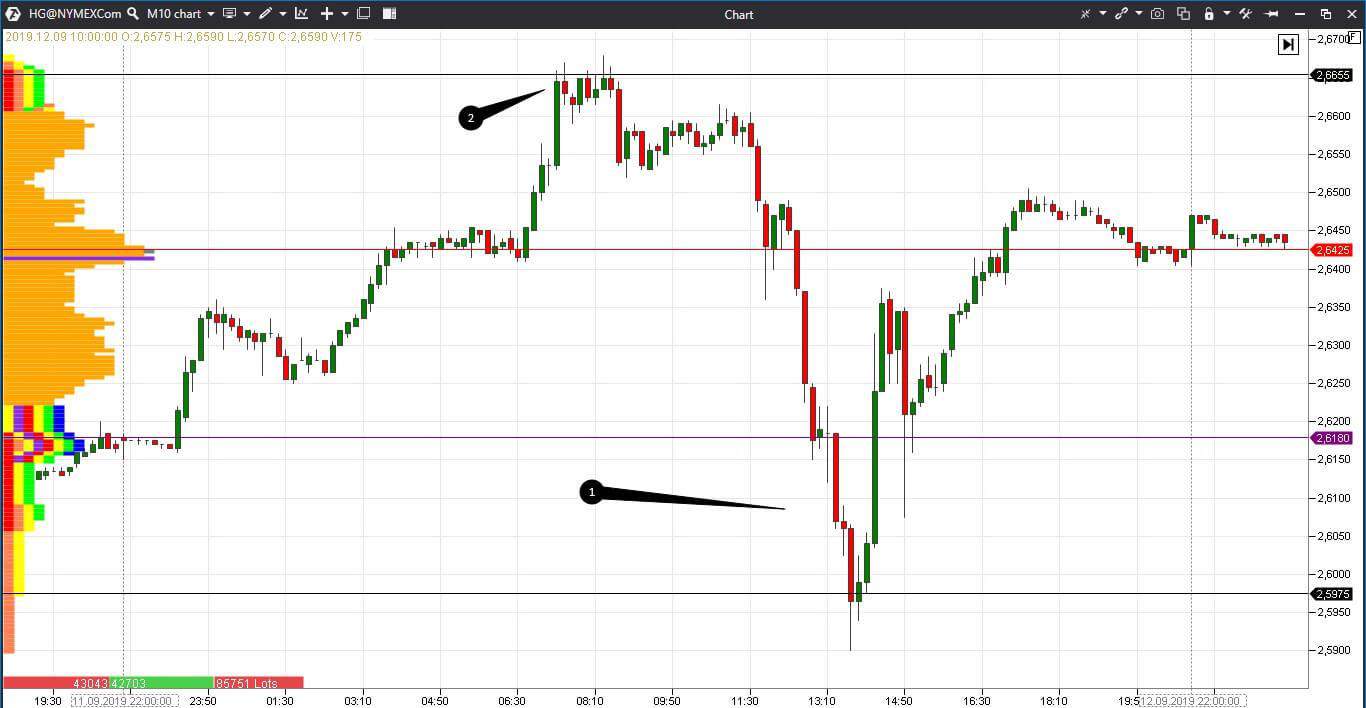
It is convenient to get ready for a forthcoming session and plan trades by TPO profile. We will show you a probable analysis through the example of the 10-minute copper futures (HG) chart.
In this example we will use a fixed profile and TPO (Ctrl+F3 for fast access). Since these are screenshots and not video, we will consider the previous day first and then the current day.
- Violet horizontal line is the opening price level (letter ‘O’ in the profile).
- Red horizontal line is the closing price level (symbol ‘#’ in the profile).
- black horizontal lines are resistance/support levels which we identified visually and by the candle tails.
- We marked the price levels which traders considered to be unfairly low with number 1. The profile consists here of several colours only and the volumes are low.
- We marked (with number 2) the level which traders also considered to be unfair for this trading session since the price failed to break it.
We expect that the next trading session will be opened in the area of the previous closure and the price will test the upper level since the closure level is above the POC level and the main volume was traded in the upper part of the profile.
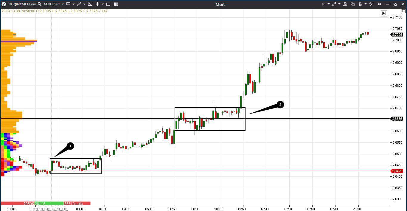
The next chart is the next trading session.
The trading session was opened approximately where we supposed it would open. The price consolidated for some time (we marked this place with rectangle 1) and then moved to test the high of the previous trading session. We marked the high breakout with rectangle 2. Look at the profile of this day – it is long and narrow. POC is in the upper part – it was a trend day.
Conclusions
TPO is yet another type of display of the Market Profile, which creates a competitive advantage in trading. Do not forget to get ready for a new trading session, analyze the profile and create “if … then” scenarios for yourself. The more different variants you would foresee, the more confident you will feel. The control over your emotions and ATAS will help you to become a successful trader on a long-term horizon.


