
The support area appears where demand accumulates and buyer activity prevents the price from decreasing. These are areas of price lows or boundaries, which the price didn’t break during a certain period of time.
The resistance area appears where supply accumulates and the seller activity prevents the price from increasing. These are areas of price highs for a selected period of time.
One of three main scenarios could be realised in the resistance/support areas:
- bounce;
- breakout;
- consolidation.
The more times the price fails to pass through some level, the more attention traders pay to this area. The same is true about time – those levels are more significant, which the price wasn’t able to break for a long time.
What takes place in support and resistance areas
Traders often subjectively identify support and resistance areas and emotionally open trades in these areas. For example, when the price grows from the support area, traders with long positions receive profit. They are happy and willing to increase their positions if the price returns to these levels once again.
At the same time, traders with short positions start to get worried about whether they assessed the market situation correctly. It is highly probable that they would close shorts if the price returns to the support area one more time in order to reduce losses.
Traders, who ‘stood aside’, will actively buy if the price returns to the support area. Which means that many traders want to buy a financial asset in this area. If all of them really buy, the price will bounce again.
However, if the price breaks the support area, the situation would change. Traders with long positions will dream to close them (sell). Traders with short positions will be happy and willing to increase their positions. And traders who ‘stood aside’ will start to sell. It means that the majority of traders would wish to sell rather than buy in case of a support area breakout. Namely this is how mirror levels or ‘shift areas’ emerge.
How to identify the support and resistance areas
Support and resistance areas could be identified in different ways. We will consider 6 of them:
- by candle extremes;
- by trading sessions’ and weeks’ opening or closing prices;
- by round levels;
- with the help of indicators;
- with the use of the Market Profile;
- with the help of cluster analysis and Smart Tape.
Let’s discuss them in more detail.
First method. By candle extremes.
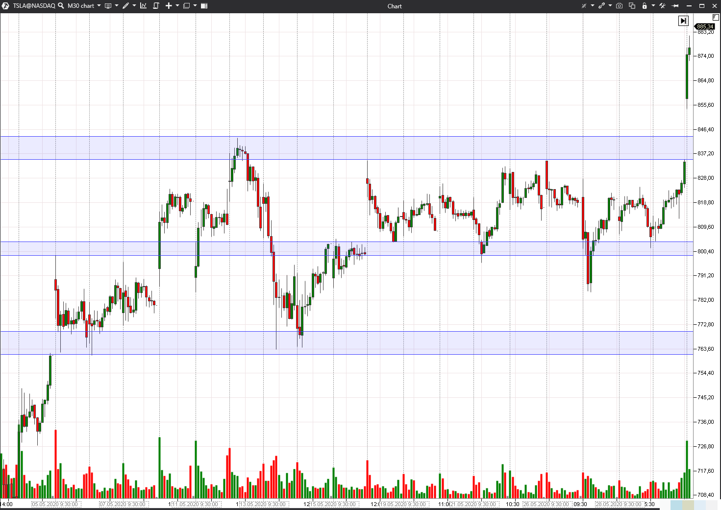
Let’s consider an example in the 30-minute Tesla stock chart. We built areas by candle extremes and expanded them to the next or previous extremes. This method is very subjective and creative – levels of various traders would hardly coincide. See Picture 1.
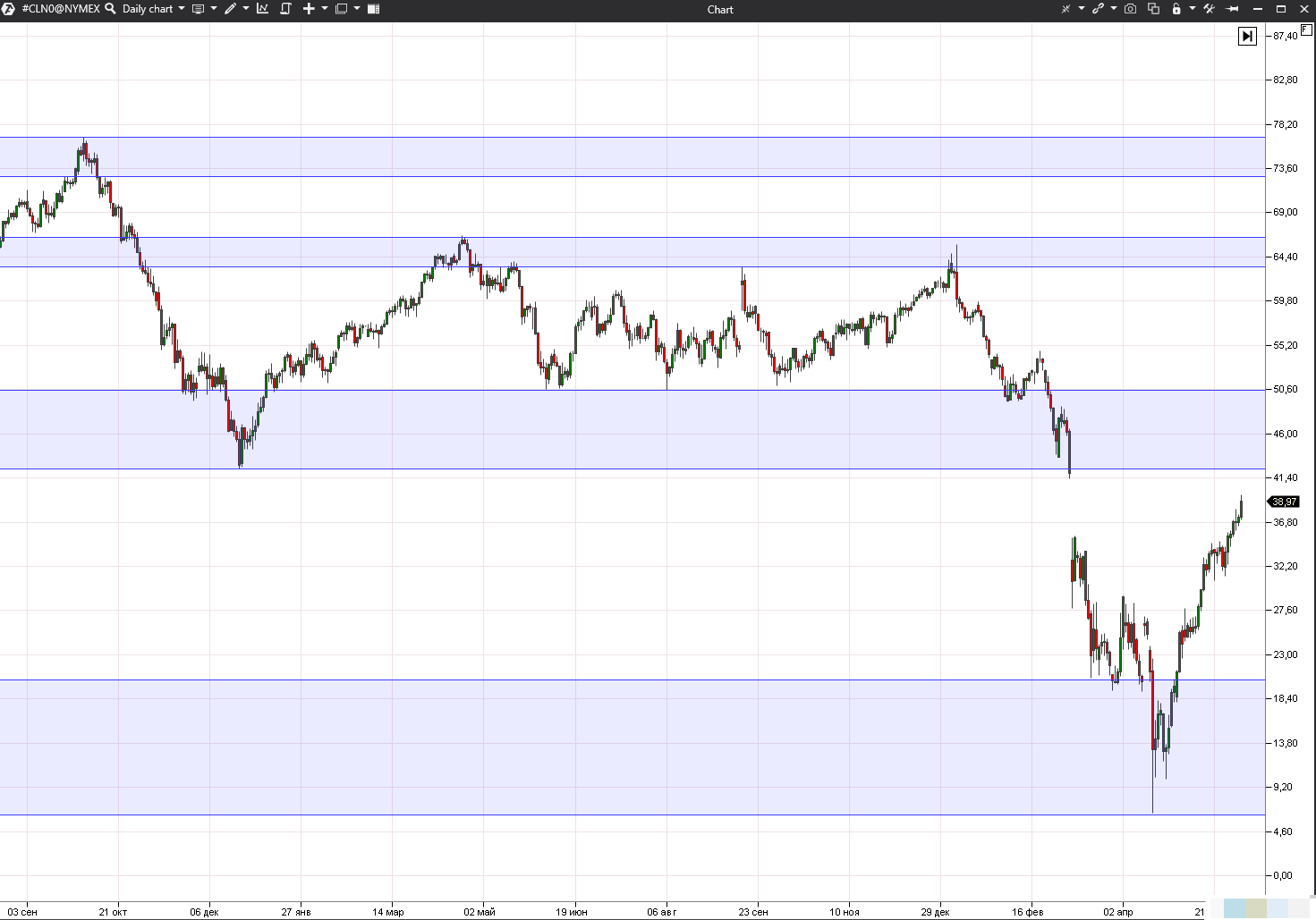
Let’s consider an example in the daily WTI oil futures (CL) chart. There are bounces, breakouts and reversals in the specified areas. See Picture 2.
Third method. Support and resistance areas could also be identified by round numbers. Many traders orient in trading towards ‘nice-looking’ round numbers. As a rule they post more stop losses and take profits close to these levels.
Fourth method. You can also specify important areas in the chart with the help of the technical or cluster analysis indicators. There are quite many support and resistance area indicators for MT4. They may draw various levels, for example, by extremes or pivots, or by Fibonacci or Gann numbers.
The cluster analysis indicators are more up-to-date and advanced that is why we use them in our example.
We added two indicators to the 10-minute E-mini EUR futures (E7) chart – Dynamic Levels and Maximum Levels. See Picture 3.
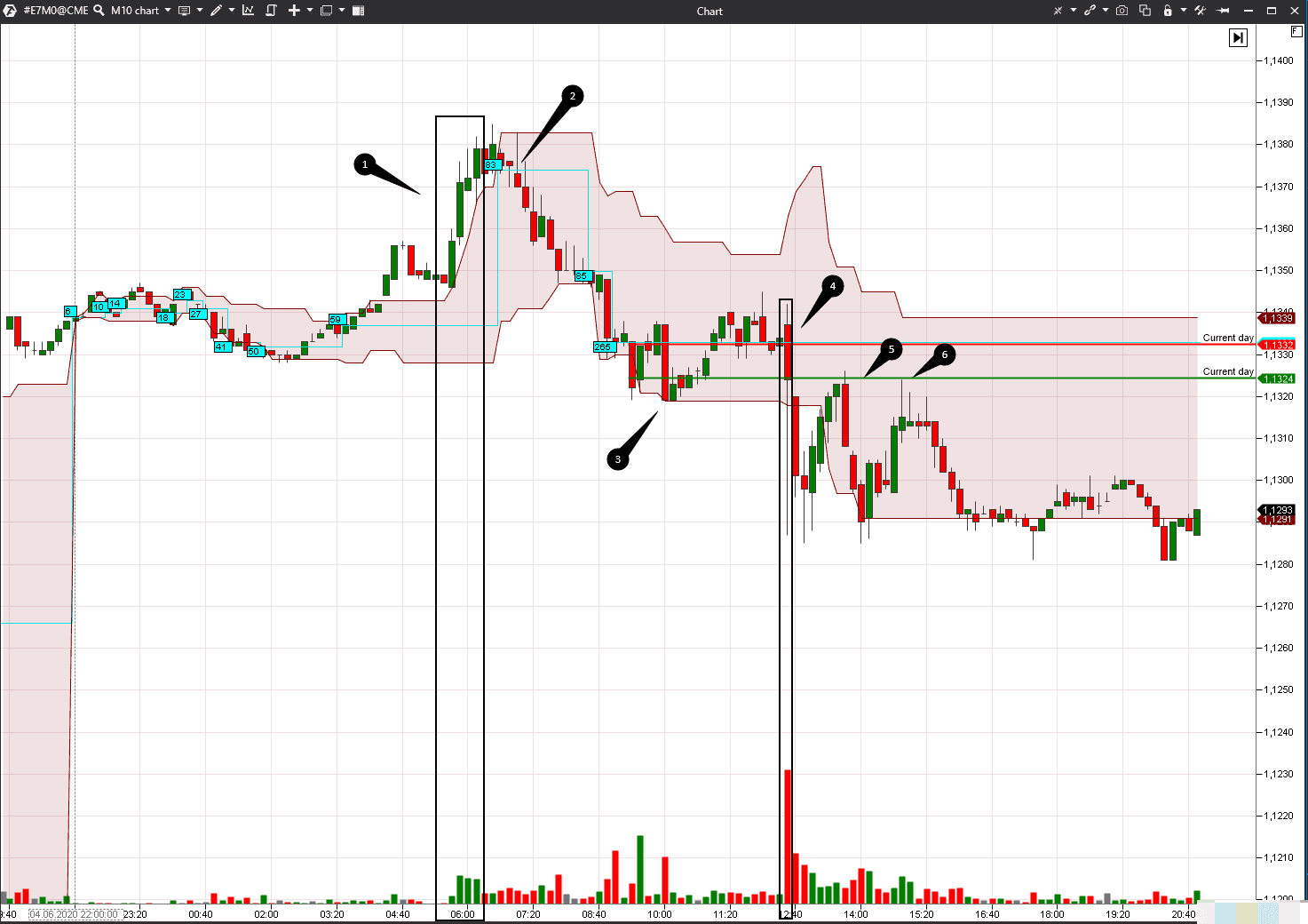
The Dynamic Levels indicator shows movement of the level of the maximum volume and value area for a selected period of time. It is one trading session in our case. By default, the maximum POC volume level is drawn in the chart in the form of a blue line, under which the current volume value is shown. The pink-coloured area is the Value Area (VA). 70% of the whole volume of the selected time period was traded in the VA, which means that the major part of trading activity took place here.
You can set colours, line width and transparency by yourself. You can also switch off VA display and leave only the maximum volume level. The indicator can build levels not only by volume but also by trades, bids, asks or time. You can learn more about the indicator settings on our YouTube channel.
Narrow chart areas are formed during ‘quiet’ trading periods, while the coloured area expands in times of volatility. The levels move as the selected indicator changes. For example, traders may assess whether the price increase is confirmed or not by the volume increase.
- The price grows in our chart during period 1 and POC also moves up, but then the situation changes. The price cannot break the Value Area High (VAH) several times.
- If the price cannot grow, most probably, it would fall and this is exactly what happens in point 2. The maximum volume level moves down together with the price, which means that lower prices attract a big number of traders.
- The price slows down in point 3 and the Value Area Low (VAL) resembles a horizontal line again. The price builds on VAL and approaches the maximum volume level. A fight between buyers and sellers takes place here.
- Sellers win and the price sharply falls again on a big volume in point 4. The price in momentum turned out behind the Value Area Low.
The price builds on the level, which we built with the help of another indicator – Maximum Levels, in points 5 and 6.
We have two Maximum Levels indicators in our chart.
The first one marks the level with the maximum negative Delta for the current trading session with a red line. The second one marks the level with the maximum positive Delta for the current trading session with a green line.
Using Maximum Levels, you can also mark levels with volumes or trades for various time periods – for example, for the past week, month or contract.
The level with a maximum negative Delta coincides with the maximum volume level – it increases significance of this area. Big volumes of trades were, mainly, sells. It is more efficient to trade with a dominating tendency, that is why it made sense to sell on bounces during the trading session under consideration.
The main advantage of the cluster analysis indicators is that they build levels, which are not seen by the traders, who use technical analysis. Support and resistance area indicators for MT4 are used by many traders, that is why the specified areas could be used for ‘stop loss activation’ or ‘trading against the crowd’.
Fifth method. Apart from using cluster analysis, areas could be built by the Market Profile – with the help of the fixed TPO and Profile instrument. Despite the name, the Profile itself is not static – it is formed in the course of the trading session development and only the indicator position in the chart could be fixed. If you monitor the Profile formation from the beginning to the end of the trading session, you will be able to see movement of the maximum volume level, pressure of sellers or buyers and how the price ‘is attracted’ to the value, which traders consider to be fair.
Resistance and support areas could be specified by single prints and profile ledges. Let’s consider one example in the 10-minute Canadian Solar stock (CSIQ) chart. The chart shows two trading sessions – the Profile to the left belongs to the first trading session. See Picture 4.
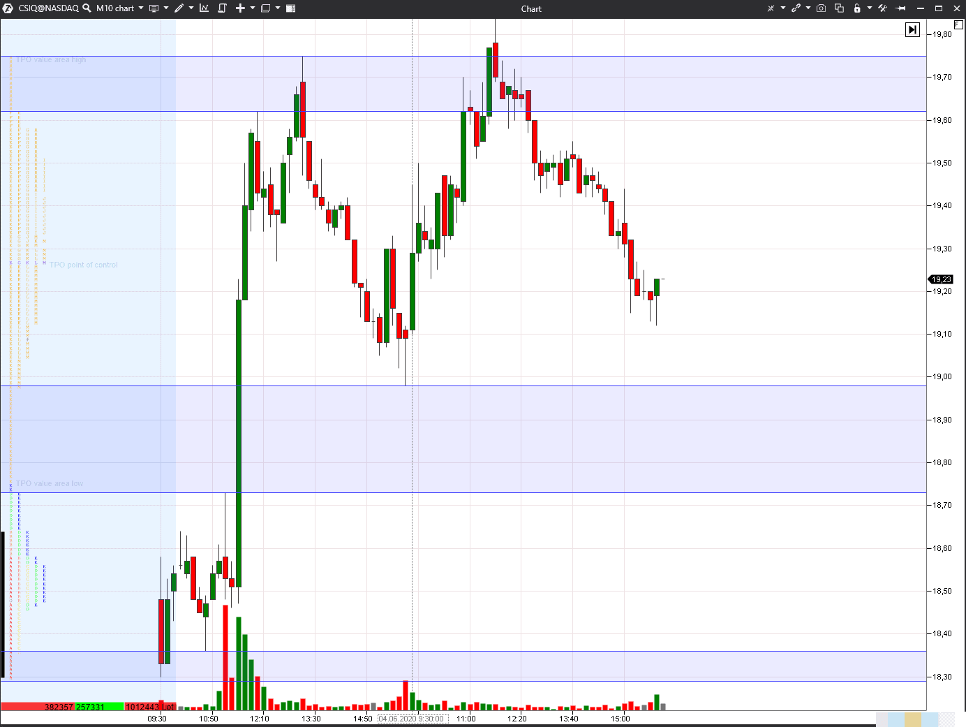
Single prints appear in the Profile when a strong disbalance of demand and supply emerges. Further on, these areas could become support and resistance areas. The first day, in our example, developed as a day of double distribution while the single print in the middle shows that buyers were very strong. If the prices pass through this area later, it means that the trading situation has changed and buyers lost confidence.
The upper single print tells us that buyers, who decided that the stock is overbought, emerged. The specified levels worked well during the next trading session. The Profile could be built for longer time periods – for example, for a week, month or contract.
Sixth method. Support and resistance areas could be found in the chart with the help of the Footprint and Smart Tape. For example, it is possible to see how major players with limit orders prevent aggressive market orders from passing through. Such a trading situation could be called absorption or accumulation of a position with limit orders.
Let’s consider an example in the 5-minute Moscow Exchange index futures (MXM) Imbalance Footprint chart. The imbalance in our chart is 400% and the tape is filtered out and shows trades of more than 25 contracts. See Picture 5.
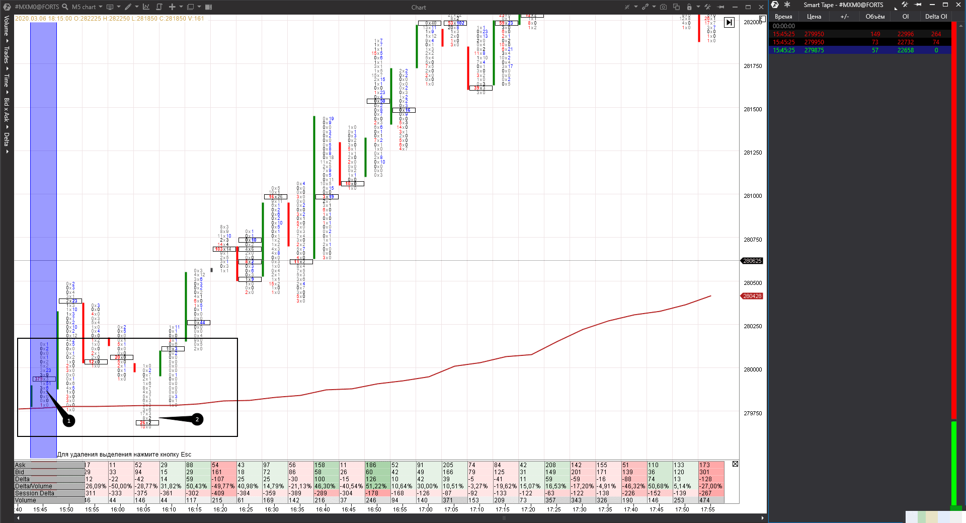
Big market sells took place in point 1 in the amount of 356 contracts. However, this trade didn’t move the price down and only 4 contracts were sold at lower price levels in the same bar. Judging by the increase of the Open Interest in the tape, these are new sells, which means that the opposite side of these sells are new buys. A major limit buyer accumulated his position directly above the VWAP. We want to remind you that the VWAP indicator shows the average price, weighted by volume. As a rule, this value is considered by major players to be the fair asset value.
A successful test takes place in point 2. A major buyer should check whether there are other market sellers in the VWAP area. There were sells, but insignificant ones, and the bar closes significantly higher than the clusters with sells.
We marked the support area with a black rectangle. It would have been inefficient to work with one big order level in this case, because the test took place lower.
And now we will use the candlestick chart to see whether the price increased after a major buyer accumulated his position. See Picture 6.
Summary
You can detect important areas in the chart using different methods, but the quality of trading setups will be different. The higher the quality, the bigger your confidence and potential profit are.There is no correct and direct answer to the question which of the 6 considered methods is more accurate than others. Every trader should answer this question by himself using his own skills and knowledge. If one of the described ideas inspired you, try it in action on your demo account. And only when you make sure that you are capable of identifying support and resistance areas, you can start trading on your real account.

