“The fundamentals always looked good, but the technicals were signaling a trend change just as I was about to pull the trigger” Thomas N. Bulkowski.
“How to identify a reversal chart pattern for achieving success?” Thomas wondered. He lost his job at the age of 36 and started to study trading. This sharp U-turn in his life brought him success and he became one of the most competent authors of valuable hands-on books for traders.
The second edition of his complete encyclopedia of chart patterns with statistical data was published in 2005. In this edition, Bulkowski managed to use the data of the bearish market that started in 2000. The author had done an outstanding job – the total number of chart pattern samples he found was 38,500! He tested the samples in the charts of 500 American companies from 1991 until the middle of 1996 and charts of different 500 companies from 1999 until 2004.
Bulkowski calls chart patterns the footprints of the smart money and divides them into:
Top 7 graphic models in Thomas Bulkowski’s rankings
Let us consider the general rating without dividing the market into the bull and bear ones, since identification of periods of the explicitly expressed bullish or bearing movement is a rather subjective and conditional process.
By the way, the chart patterns are symmetrical, which means that there is always a reversed analogue. The same patterns can have different percentage of failures and movement potential in the bear and bull markets. To cut a long story short, we will consider the tops only. Remember that the reversed patterns are also meaningful.
The head-and-shoulders top - a reversal pattern
Look for three peaks in a chart. The middle one should be higher than the other two. The neck line connects the peaks. It could slope upward or downward. The shoulders could be of various heights and non-symmetrical. Bulkowski explains emergence of this pattern through action of the smart money and slow minor traders. Based on a fundamental analysis, the smart money buy an asset in the beginning of the left shoulder formation. Their actions cause the price increase and attract minor investors. The smart money partially close the position at the first peak since they made profit. The price goes down and again attracts those investors who either failed to buy in due time or waited for a correction in order to buy when the retrace stops. The third shoulder is formed in order to act against those sellers who were smart enough to recognize the bear reversal, but were imprudent to place a stop order too close.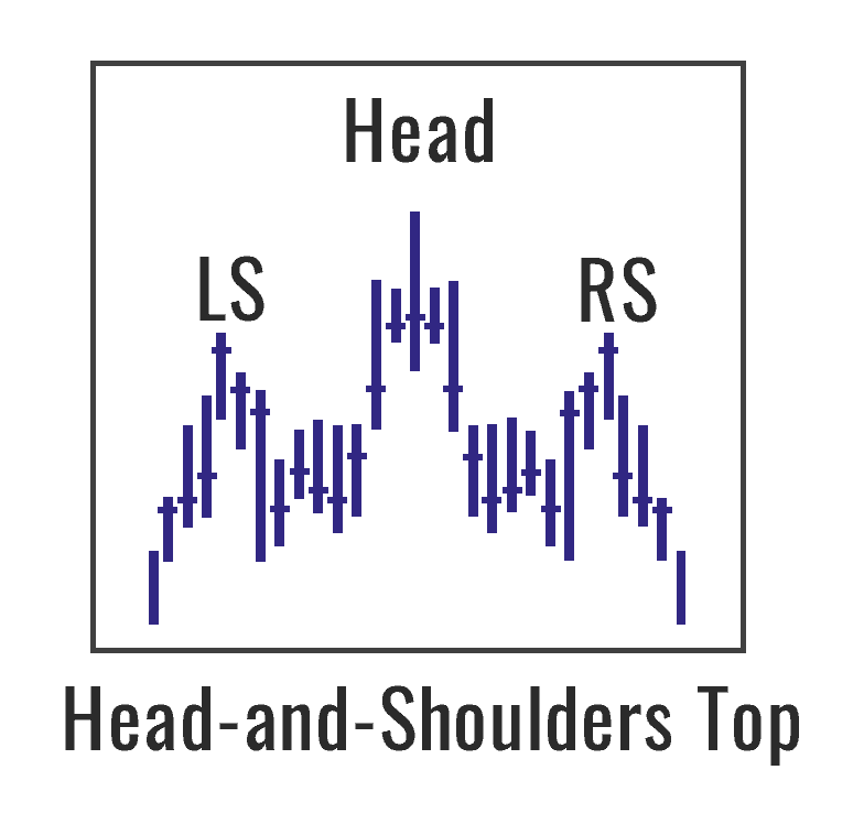
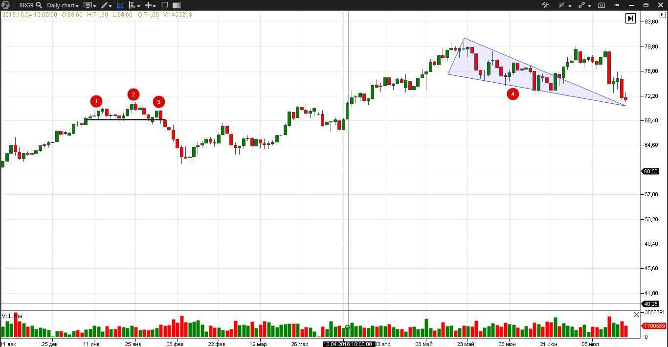
The pattern example. Here is a day chart of a Brent oil futures. Numbers 1, 2 and 3 mark the left shoulder, head and right shoulder. The movement potential is bigger or equal to the distance from the head to the neck level.
The Falling Wedge chart pattern
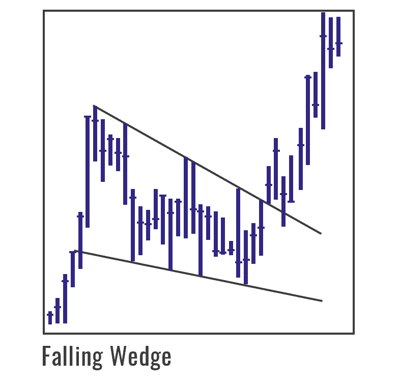
The falling wedge could be either a reversal or continuation pattern depending on the breakout direction. The failure rate of this pattern is rather high. In the Bulkowski rating it takes the 18th place in the bull market and 21st place in the bear market. Two trend lines pass along the upper and lower candlestick shadows. When building the pattern, it is advisable to have at least 5 crossing points from each side. The movement potential is equal to the wide part of the wedge.
The Picture shows a falling wedge from the Thomas book. What action is hidden in this pattern of the trend continuation?
- On the one hand, the cunning market involves traders into dangerous short positions with a pretended downward movement.
- On the other hand, a series of lower lows breaks stop losses of the buyers before the coming upward breakout.
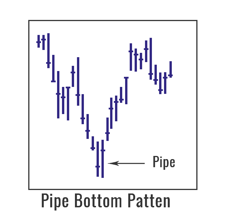
The Pipe Bottom chart pattern
A short-term reversal pattern. It shows the best results on weekly charts. The failure rate is about 18% in day charts. In the Bulkowski rating, it takes the 2nd place in the bull market and 3rd place in the bear market. The classical pattern consists of two candles and looks as follows.
The pattern example. The US passed sanctions on a number of Russian companies on April 9, 2018, and the stock market sharply fell down. In those days the pipe bottom pattern could be found in the charts of practically all liquid stock, since the market came back fast after a negative influence of the news.
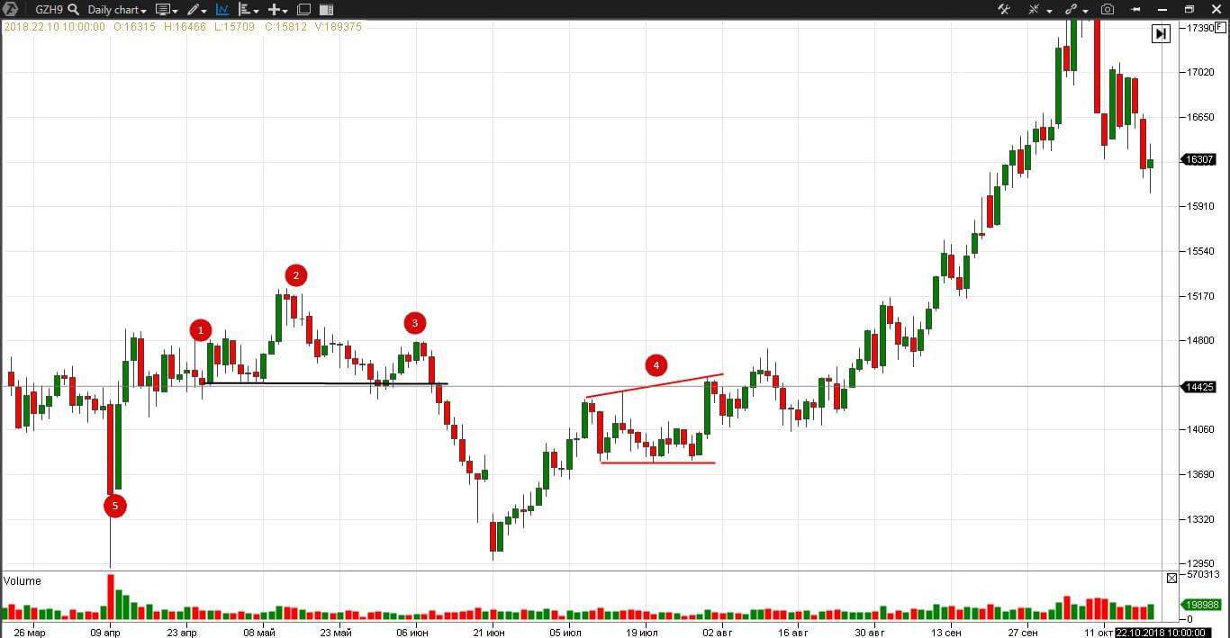
5 – pipe bottom
1, 2 and 3 – head-and-shoulders top
4 – broadening wedge
The Broadening Wedge chart pattern
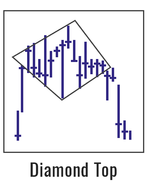
It could be either a reversal or continuation pattern depending on the breakout direction. Its shape resembles a loudspeaker and could slope upward or downward. It takes the 6th and 10th places in the rating in the bull and bear markets respectively. We connect lower and upper candlestick shadows with the trend lines. When building the pattern, it is preferable to see at least 5 touches from each side. Partial rise or fall and a failure to touch the opposite line warn about the trend change.The Diamond Top chart pattern
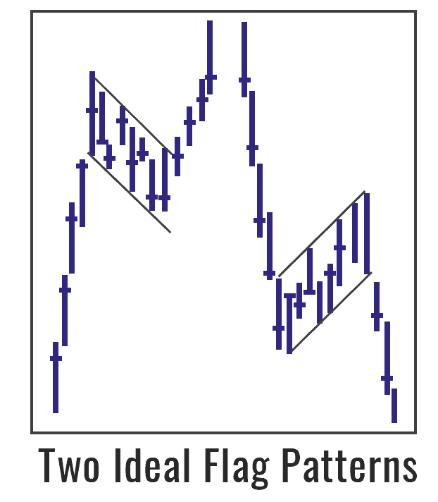
The Flags chart pattern
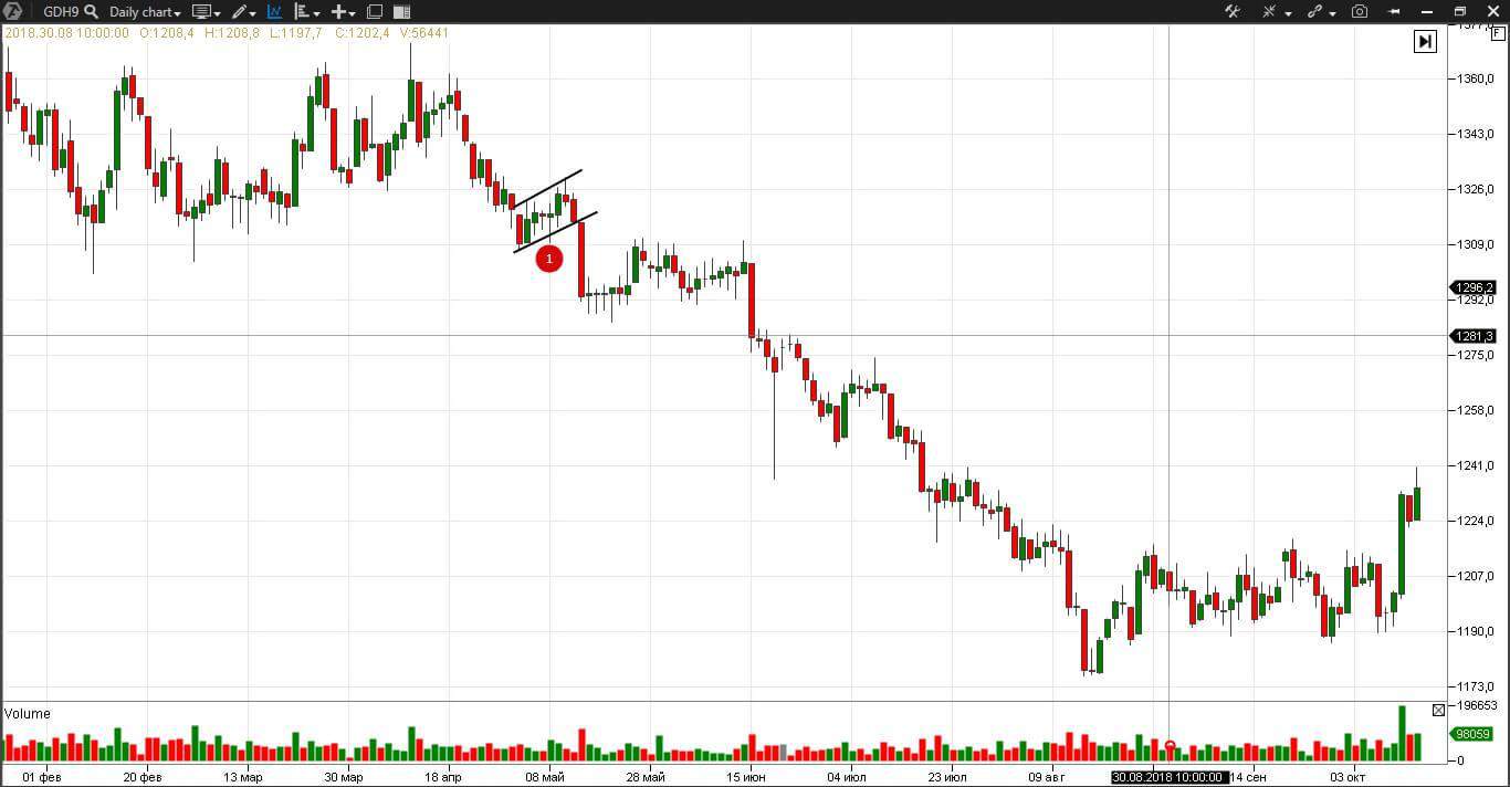
Flags is a continuation pattern. Reliable flags emerge during rapid and sharp trends. The flags are bounded by parallel trend lines. Ideal flags continue for several weeks and slow down the price movement. Bulkowski specifies several types of flags.A flag pattern example. Let us consider a pattern in the gold futures (GD) day chart.
The Double Top chart pattern
The double top is a pattern of a short-term reversal. Bulkowski specifies 4 types of double tops depending on the peak shapes and their symmetry. An example of a double top in the RTS index futures (RI) day chart. There is one more falling wedge marked with number 1.
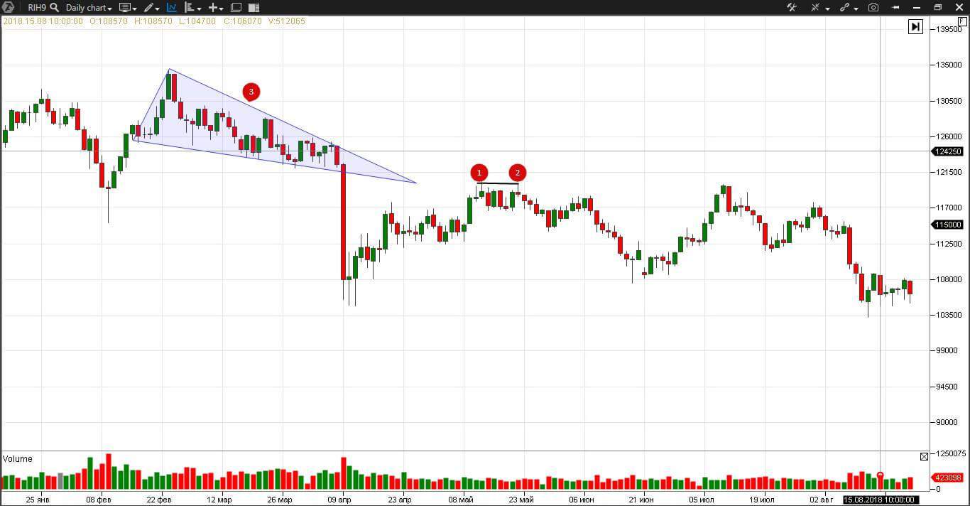
Chart pattern samples or modern trading and analytical systems?
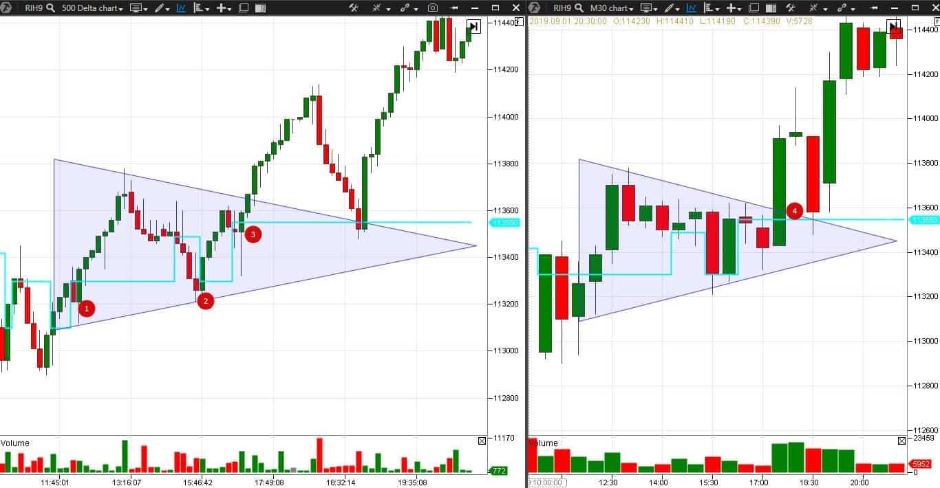
Below is a symmetric triangle in the RTS index futures (RIZ9) chart, which was broken upwards at 17:30. A symmetrical triangle is a continuation pattern. Let us compare trading possibilities with a set of different instruments.
Let us consider a chart pattern example – a pipe bottom in the S&P mini ESH9 chart.
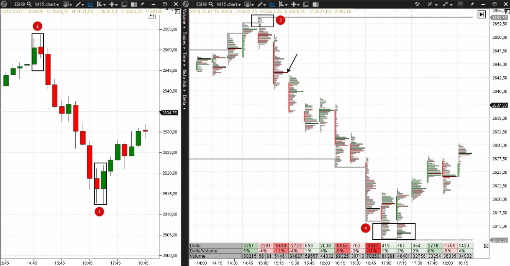
There is a Bid*Ask Volume Profile cluster chart to the right, which shows the order flow and selling volume at each price level in the real time mode:
- the Cluster statistic indicator shows information about the delta, volume and percentage ratio of the delta in the volume. Information in this indicator could be adjusted – it is reflected in the cluster mode only.
- the Daily HighLow indicator shows dynamic movement of the day high and low. These levels are important, since the price stops at them, turns around or breaks this level.
We can see the following features of a possible trend change in the cluster chart:
- number 3 marks drying out of the buying volume in the candlestick high at the day high;
- the negative bar delta marked with number 3 emerged at the day high;
- decrease of the level of the maximum volume in the bar marked with number 3 if compared with the previous bar.
We can see a successive reduction of the maximum volume level of each of the subsequent bars and an arrow marks the beginning of this movement. The buyers try to hold the price and even push it upwards at 16:00 and a positive delta emerges, however, the volume is less than in the previous bars. The bounce effort does not find continuation. The peak of aggressive sells falls at 16:45. We observe the biggest volume and explicitly expressed negative delta. However, buyers appear in the subsequent bars marked with number 4. The aggressive behavior of the sellers did not find its continuation. And we again face the features of a short-term trend change – a positive delta on the day low, increase of the maximum volume level in the bar and drying out of sells in the candlestick low.
Pros and Cons of chart patterns
Advantages
- There is no need in modern software;
- You can calculate take profit and stop loss levels approximately, just measuring the pattern.
Disadvantages
- Subjectivism. Some patterns look contradictory even for experienced traders;
- The patterns often fail on small timeframes. The movement potential is higher in the day charts.