
This article is mostly for those traders who have just started to study trading by cluster charts. A beginner should develop own understanding of how to read footprint correctly. We speak here both about training of visual perception, that is, how to find necessary information in the chart, and about training of analytical skills in order to understand what it means. Material in this article is not unique and might not be the best approach – it is just a recommendation. That is why each of you can modify it depending on your needs.
It is assumed that the reader already has some basic understanding of what a cluster chart (footprint) is and how it is built in the trading and analytical ATAS platform.
Tapes data are traditionally displayed in the table form with the help of the Time and Sales window. The old concept of tape reading refers to the ability to read and interpret permanently changing data in the Time and Sales window in order to get an idea of the order flow. Tape reading is a process that brings a trader to mental strain when it is easy to overlook something important. A few traders have the ability to notice patterns hidden in these data. Interpretation of information, which is provided by Footprint, can significantly simplify reading the tape in its pure form and even help to identify the market dynamics and price behavior, which is not easy to do when reading the tape.
Theory Won’t Train Your Eyes — Live Charts Will
The patterns in this guide only become useful once you’ve seen them form in real time, bar by bar. The ATAS footprint chart software tool gives you Volume, Delta, and Bid×Ask footprints on live futures and crypto data — everything you need to train your visual perception from day one. Start free, with no time limit on the trial.
ORDER FLOW
If you do not understand the meaning of the “order flow” phrase, you will be definitely able to understand it after reading our articles about cluster charts. Order flow analysis is a missing element in market interpretation for many traders. This refers to understanding of how orders come to the market and how they are executed.
Order flow is a two-way auction that takes place at the market micro-level. Analysis of the order flow in real time can help a trader to understand how buying and selling trades are executed.
Order flow patterns in a cluster chart, which we will consider today, are NOT traditional price patterns. Rather, they are Time and Sales patterns, which many traders are not aware of. Data in the Time and Sales window move very fast and it is difficult to interpret the incoming flow of information.
Footprint patterns could be divided into three main categories:
- patterns inside the bar
- patterns at the end of bars
- multibar patterns
These patterns rarely (or even never) mean anything by themselves. That is why reading cluster (footprint) charts is very different from a traditional analysis of price patterns and/or analysis on the basis of indicators.
Footprint is not a system with a red/green “flicker”. However, a deep understanding of data, presented in the form of a cluster chart, would allow a trader using them in combination with the current market context and rational market logic. The theory of a stock exchange auction or any other viable analytical philosophy in combination with footprint would provide a trader with a high quality support in making trading solutions.
In general, a volume profile, analysis of support and resistance areas, trend lines and other types of macro-analysis of the general state of the market shows traders WHERE TO TRADE. Footprint is designed to show traders WHEN TO TRADE, since it displays the order flow.
Footprint is a graphical or table presentation of the very basic and fundamental market data, which are results of trading activity. It is a very natural way of presenting data.
It is necessary to learn how to monitor the data presented by a footprint chart after you get a basic understanding of what this chart is (and we hope that you already know this type of a chart). First of all, you need to learn how to identify key elements of the cluster chart structure. And our articles about the footprint are aimed at solving this task.
First, we need to understand what various elements of the footprint structure are and only then to make conclusions regarding these elements in different contexts. Moreover, in future, you will be able to put the elements together into patterns by yourself. Thus, you will establish your own rules based on real data and not on traditions or books of yet another pseudo-guru of trading. Footprint will give you a possibility of making your own conclusions if you learn how to analyze it objectively.
STRUCTURAL ELEMENTS OF A CLUSTER CHART / FOOTPRINT
What should you pay attention to?
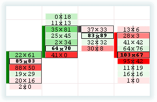
As you already know from the “Cluster Chart (Footprint) Anatomy” article, there are a number of variants of footprint presentation. For training purposes, we recommend to use the classical BidXAsk Footprint.
BidXAsk Footprint displays all data in the maximum possible resolution. Only after you get experience of using the BidXAsk cluster chart, you will be able to make a conscious choice in favor of other types of a cluster chart, which would suit best of all for your personal style of trading. As for now, we would focus on training our visual perception, in other words, what to look at.
We recommend you to stop trading while studying this material. Trading and emotions, connected with it, can disturb our ability to interpret trading data objectively. Additional load, connected with studying the footprint, would deform your perception of objective information.
STRUCTURAL BLOCKS OF FOOTPRINT PATTERNS
Below, we will give you examples of some most important footprint patterns. All patterns could be divided into three general categories:
- Intrabar patterns are patterns that are formed inside a bar in real time.
- Patterns with volume nodes at a bar end are patterns that could be assessed and analyzed only during or after the bar is closed.
- Multibar patterns are patterns, which consist of a number of bars.
The study of the pattern structure at a high degree of detail brings us to understanding of the fact that all of them consist of the following structural blocks:
- Intensity of the volume and/or delta in a set footprint bar or cell.
- Level of balance or imbalance between the traded volume at Ask and Bid prices in a specific cell or cluster of cells.
- Ability or inability of the price to continue its movement towards the current order flow on the basis of the context of items 1 and 2 stated above.
INTRABAR PATTERNS
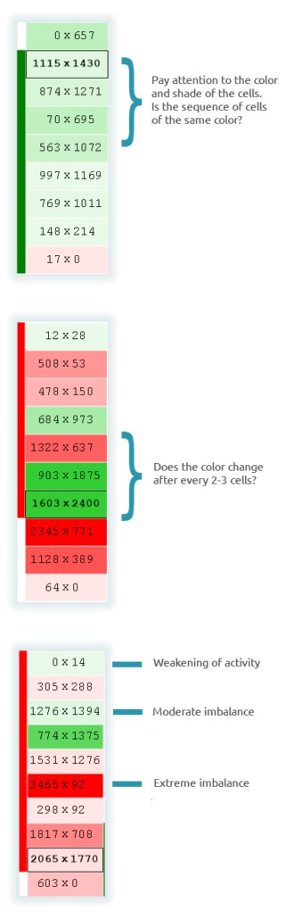
Colors and shades of individual cells
The darker a cell, the more imbalanced is the order flow. Lighter shades indicate a more balanced trading. Similarly, a row of neighboring cells of the same color indicate a focused trading. Sharp changes of color from cell to cell indicate a balance and/or indecisiveness. You will not see ideal patterns in the market. Try to assess them critically and do not try to look for a pattern of one or another structure in the market. Put aside your adherences and focus on the objective picture.
Relative and absolute values
A relative balance between the Bid and Ask volumes in each cell gives information about how trading developed in the context of supply and demand. If the Bid and Ask volumes are practically the same, it indicates a balanced trading. Unequal values indicate a focused trading. However, when this inequality reaches its extreme value it means that the supply or demand peak has been reached.
While monitoring the above described factors, remember where the price is now and where it came from, in other words, the general context. For example:
When did you notice an extreme imbalance in a cell – after a significant price movement or when it started?
Where is the price now – at the boundaries of a long-term range or inside it?
Everything depends on the market context.
What does happen with the Bid and Ask volumes while the price moves towards extreme points (intraday highs or lows, day highs or lows and so on)?
The goal of monitoring the footprint is to identify whether the trading activity becomes weaker or, on the contrary, it becomes stronger at some extreme price levels.
Numeric values can have both relative and absolute meaning. Relative values show how a specific value correlates with itself at the stage of the bar formation and with neighboring cells and bars. Absolute values help to assess volatility. Each market has its own specific absolute values. Moreover, they depend on a specific timeframe. When assessing absolute volume values, it is necessary to take into consideration the time of a day and some specific events (pre-holiday trade, pre-expiration period, news broadcast and so forth).
PATTERNS WITH VOLUME NODES AT A BAR END
A high volume node is a price level with a pronounced general volume, which was traded at this price. Low volume nodes are also important. It is necessary to track appearance of these nodes and also to analyze the price behavior at a repeated approach to them.
Ask yourself, when analyzing the footprint, at what bar end the main part of the traded volume is. Was it closer to the bar opening or closing? Was the volume distributed along the bar relatively smoothly? Perhaps, the volume was distributed in a bell shape, which assumes that the market is balanced, at least, at this moment of time. And again, always pay attention to the context. Is the volume so high in the node that you can assume that the price met a strong area of supply/demand? Also, take into consideration the general volume in the bar. In case it is too low, perhaps, it makes no sense to take this node into account.
Markets in microbalance could mean different things at different times. The trader’s task is to understand the context: whether the balance is caused by a typical inactivity of market participants at lunchtime or this balance emerged in the result of a real price consensus of all participants.
Is the microbalance a part of a bigger balance? Is it a stop in a strong trend? Is the balance a result of rather serious market movements or it emerges after a weak or practically absent market activity?
One more node variation is shown in the picture below. Note the similarity of volume distribution with the first example. General volume distribution is the same. Nevertheless, the node represents a high volume of sales in the first example (top right). In the example below, the node is at the bottom of the bar, but this time with a significant volume of purchases. There is a fight in the market and not a stop. Is it a turnaround? Difficult to say for sure. In fact, it is not clear what happens next, but such data could be useful anyway. Availability of information, which assumes uncertainty in the market, can also be useful. For example, you can use this signal of uncertainty in order to fix the profit or just to abandon a trade.
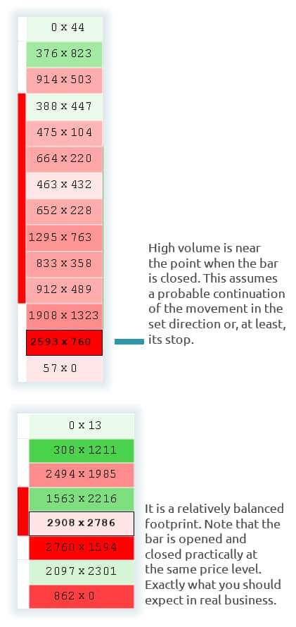
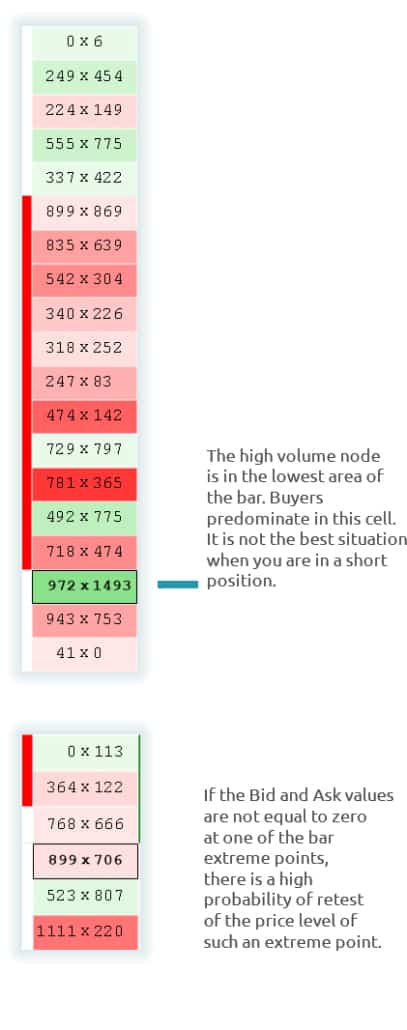
Non-zero values in extreme bar cells
The fact that buying and selling volumes do not run out at the extreme point of the bar (the auction theory concept) means, at least in the short run, that the trading will continue at this price level and its repeated test is quite probable.
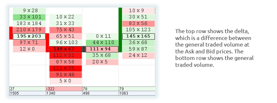
General volume, which was traded in the bar
Do not forget traditional data, such as general volume and price range. The footprint does not discard the basic analysis of correlation of price and volume – it supplements it. However now, a trader can see the general delta, which reflects direction of the order flow, apart from the general volume for a certain period of time. It might be very useful to compare price range, volume and delta values both from bar to bar and in order to identify correlation of the volume and delta in a specific bar. In order to help the traders, the trading and analytical ATAS platform has the Cluster Static indicator, which reflects these resulting data. The indicator panel can display a number of other values and could be completely customized by a user.
MULTIBAR PATTERNS
A failed auction
Failed auctions can have various forms. In fact, a failed auction is a situation when buyers or sellers are not active at a certain price level, in other words, this is a situation when neither of the parties is interested in current prices. Learn to differ a really failed auction from a seemingly failed auction. Let us imagine a situation when the market went up to the key level of resistance on a big volume immediately after it was opened and then the volume went down to minimum values at extreme price levels. Let us consider another situation for comparison: the market shows weakness at the price extreme points during lunchtime, when there are no news. In the first case, there is a sufficient potential for execution of trades, in the second case, it is reasonable to stay outside the market.
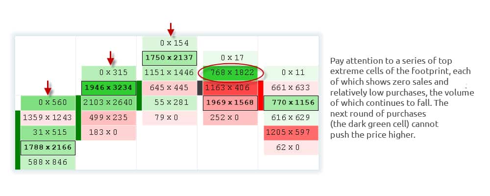
We can see in the below example that the volume goes down while the price slowly moves upward and that the next buying round (the dark-green cell) cannot push the price higher.
This example clearly demonstrates how analytical puzzles are assembled into a general picture. First of all, pay attention to how the market moves, bar after bar, to higher prices. Auctions failed at top points in each of these bars. Then the order flow demonstrates a relatively strong buying activity in the form of the dark-green footprint cell (768 sales against 1,822 purchases). This cell demonstrates a strong imbalance, nevertheless, the best price after the strong buying activity makes one tick movement and volume fall down sharply in the above cell.
Then we see how the strong buying activity turns into the strong selling activity in two neighboring cells below. Our example clearly shows how to read the footprint. If we face such a situation at a significant price level (for example, at the extreme level of the previous day, at the boundary of a multiday range, at the top boundary of the value area and so on), this scenario will be an ideal signal for entering the market. However, we do not urge you to look for patterns that simulate this scenario exactly. We speak about how to learn to assess various aspects correctly in a specific context.
Movement of the Point of Control (the high volume node)
Identification of the time when the instrument is traded and in which price area is an important component of real time trading. This is a part of the answer to the question – what is the context?
It is also important to understand in what direction the trading moves.
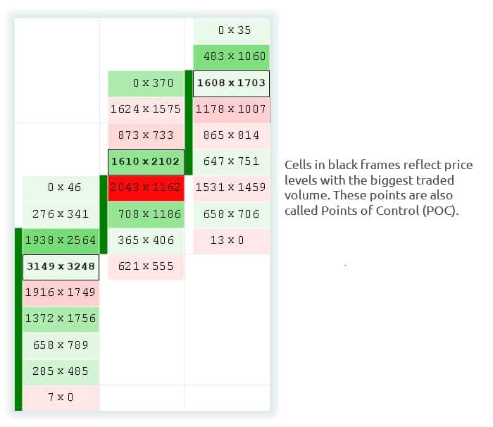
If we look at price bars only (which are not a footprint), we will not be able to assess the real situation in the market. However, if a trader tracks POC (a high volume node) movement, it would help him to identify a real market trend in the set timeframe. The biggest volumes are marked with black frames in the sequence of bars below. This avoids the need to calculate the prices, at which the biggest volumes were displayed in the bars, in your mind.
Divergences (discrepancies) between the direction of the price movement and general delta
Delta-divergences can have different forms, but, in the end, they show one thing only: the traders’ opinions do NOT correspond with the price movement. There is a behavioral disagreement. In fact, this price movement lacks aggression, which is usually required for supporting further price movement in a certain direction. Such divergences may appear in sequences of any number of bars.
We hope that you enjoyed this article. Please, click the “like” button and check for updates of our blog. Many interesting things are ahead!
Attention! Exchange trading is connected with financial risks and is not good for all investors. This publication is of informative nature only. Carrying out trades in the financial markets can result in losses. Make sure you understand all risks and have relevant knowledge and experience for exchange trading before you start using trading ideas.


