Cluster analysis and VSA. Accumulations and distributions.
- This is the final article of the Cluster Analysis and VSA series. We considered the following in the previous articles:
Today’s topic is Accumulations and Distributions. Two out of four stages of the market cycle are called by these terms:
- Accumulation on lows against the depression background. Represents the best potential for long trades.
- Growth of prices.
- Distribution on highs against the euphoria background. Represents the best potential for short trades.
- Reduction of prices.
By their form, Accumulations and Distributions are stages that consist of a sequence of climaxes, upthrusts, tests and signs of absence of demand and supply.
When analyzing Accumulations and Distributions we would combine previously considered separate patterns into sets of patterns. It is a specific feature of this article and difference from the previous ones. Figuratively speaking, if we take the previously discussed patterns as letters, today we will assemble them into words and phrases in order to read the history of how a financial instrument changes its trend in the chart.
Today in the article:
- Accumulations: description + 3 examples;
- Distributions: description + 3 examples.
Accumulations. Description.
The Accumulation concept originates from the Richard Wyckoff’s theory.
It’s worth reminding that Tom Williams, the VSA founder, started to trade after studying trading by the Wyckoff method. In fact, the Volume Spread Analysis is an interpretation of the Wyckoff method made by Tom Williams.
Accumulation is a trading range at the market lows, at which a financial instrument changes its owner. As a rule, the major interest (insider, smart money or composite operator) uses the current market situation in order to accumulate an asset at a low price and gain benefit from its further price growth.
Signs of Accumulation:
- selling climaxes – panic price falls against the background of ‘bad’ news in mass media;
- springs or false breakdowns (traps for bears);
- supply testing shows exhaustion of the sellers’ pressure. Reduction of volume on reducing bars in the same area is a specific feature of accumulation, as it will be shown in the next picture;
- for the stock market – the stock starts to act stronger than the index.
Accumulations. Example 1.
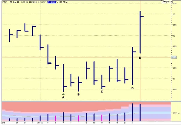
Tom Williams, the VSA founder, himself gives this example of accumulation.
It is a day period; the chart of the ETF FAZ stock. Pink color in the volume bar chart shows that the volume is lower than the previous two.
- Bar A. January 7, 2010. Sharp fall of the price on a high volume, perhaps, is caused by ‘bad’ news.
- Bar B. Supply testing in the area of Bar A. The volume fell significantly. It shows insufficient pressure of sellers.
- Bar C. It is the same again. The price fell to the Bar A level. The low volume again shows absence of sells. Note that the stock acted stronger than the index within the A-C range (the index chart is not provided in this article – just take into account that it decreased), ignoring lows in the general market. It is a sign of strength by itself.
- Bars D&E. We have growing bars with a wide spread. The volume is very high, which might mean some sells inside. However, the asset acts much stronger than the index, so, potentially it is a bullish market, when the index will be ready to reverse upward.
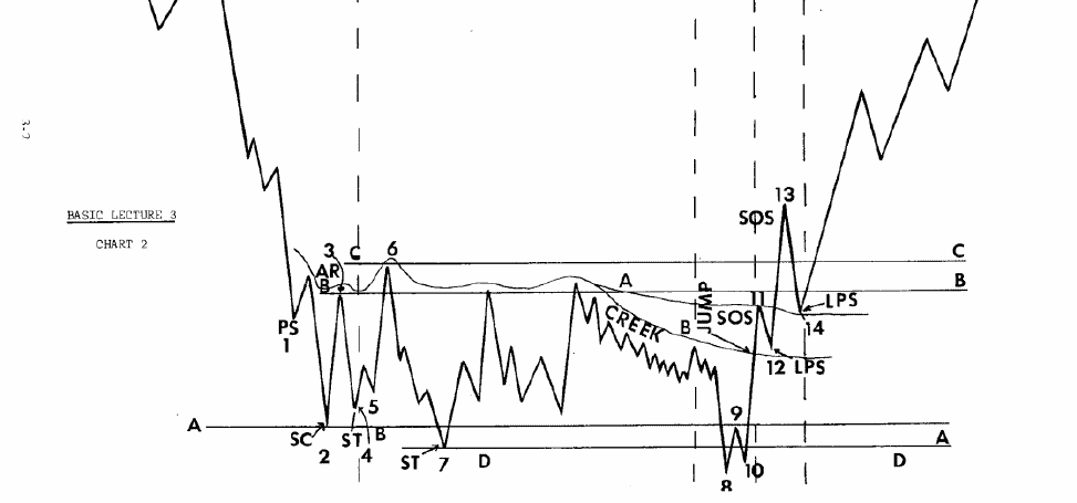
Note that the process of accumulation in modern versions of the Wyckoff method is extremely detailed, as it is shown in the picture below.
It is split into stages and each stage presents specific actions of the price and volume. On the one hand, it helps to identify the process of asset accumulation by a major player in the chart. On the other hand, there is a great multitude of variants how accumulation is visualized in a chart. Some patterns might be absent or not be obvious. This would confuse a hunter for an ideal pattern.
Ability to identify the phase of the asset accumulation correctly is both profitable and difficult. And there is no other way, since we speak about a point of entry into a low risk long position at the very beginning of the growing trend.
Accumulations. Example 2.
Let’s consider the accumulation process through powerful X-rays of instruments of the analytical and trading ATAS platform.
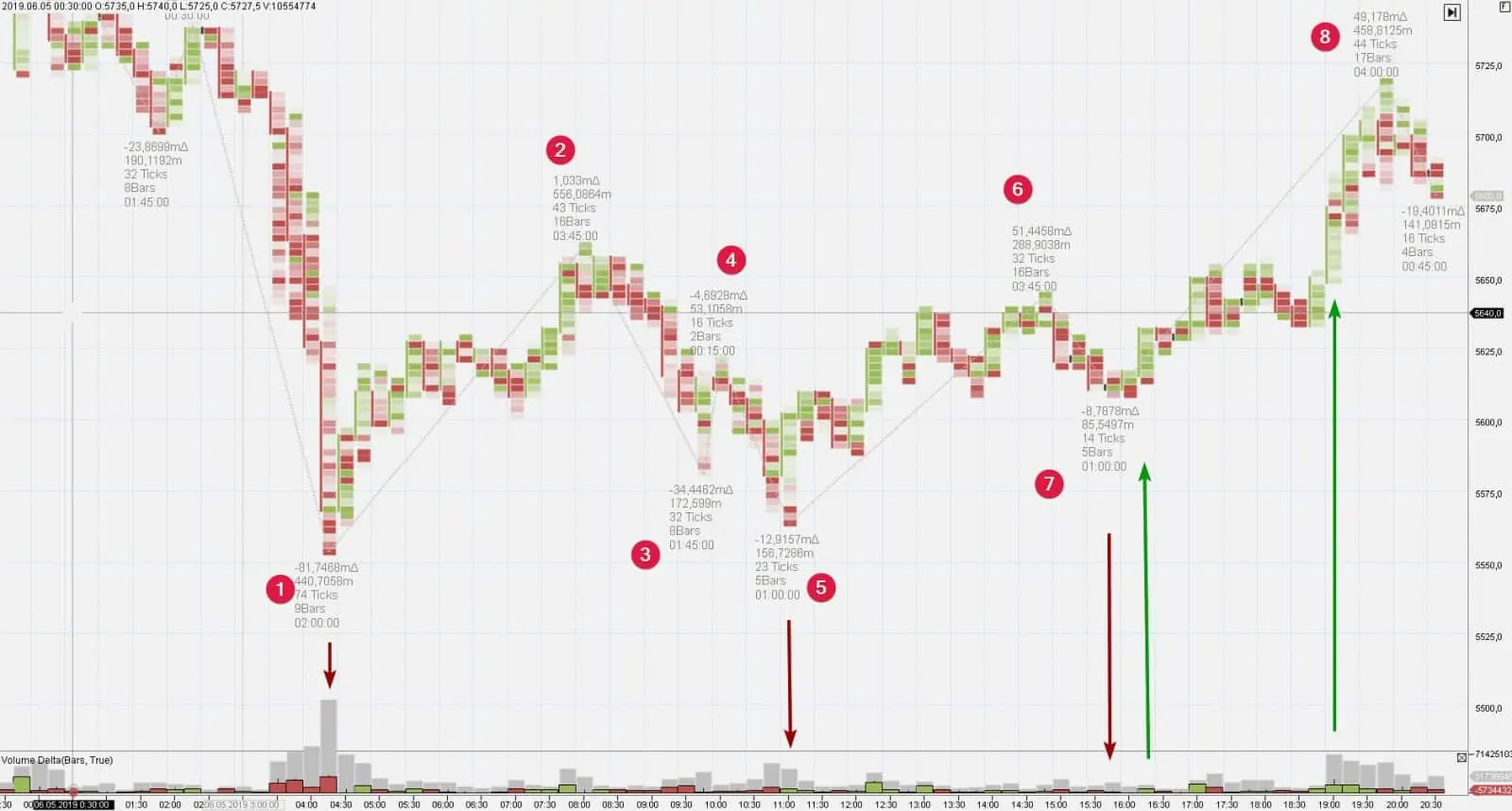
The picture below shows the chart of XBTUSD – a 15-minute timeframe of a bitcoin futures from BitMEX (May 6, 2019).
- Climax. Panic sells started at breaking the 5,600 level, which can be seen from a huge (in the current period scale) splash of the volume with the negative delta (first red arrow).
- Further efforts of bears to renew the downward movement failed. It can be seen from the behavior of waves 3 and 5. Downward movement below the 5,600 level took place on a much smaller volume than the volume on a climax bar. The second red arrow points at an interesting bar – buyers entered the market and pushed the price up and closed the bar at the high with a positive delta after a splash of sells at the low. It is an indication of strength.
- The third red arrow marks a barely visible downward wave. Bears managed only to move closer to the 5,600 level without an effort to break it.
- Green arrows point at successes of buyers. A change in the market behavior, which broke the resistance line drawn through peaks 2 and 6, marked with the second green arrow, is especially vivid. Would you have entered into buys in points marked with the first or second green arrows?
A beginner VSA trader might face a paradox. How comes that the market moves up after a splash of sells? Because the sells in the beginning of accumulation reflect orders of panicking beginners (or a crowd, if I may say). Professionals start to accumulate their positions using limit buy orders below the falling price, absorb the supply and accumulate the coin (share or futures) on their accounts. It becomes easier to push the price quote up after the supply has been consumed (third red arrow in the chart above) and they lay their cards on the table starting to send buy-market to the exchange (green arrows).
The above considered range is a local intraday accumulation of a small scale within the growing trend on senior timeframes. Small accumulations within the current up-trend are called re-accumulations.
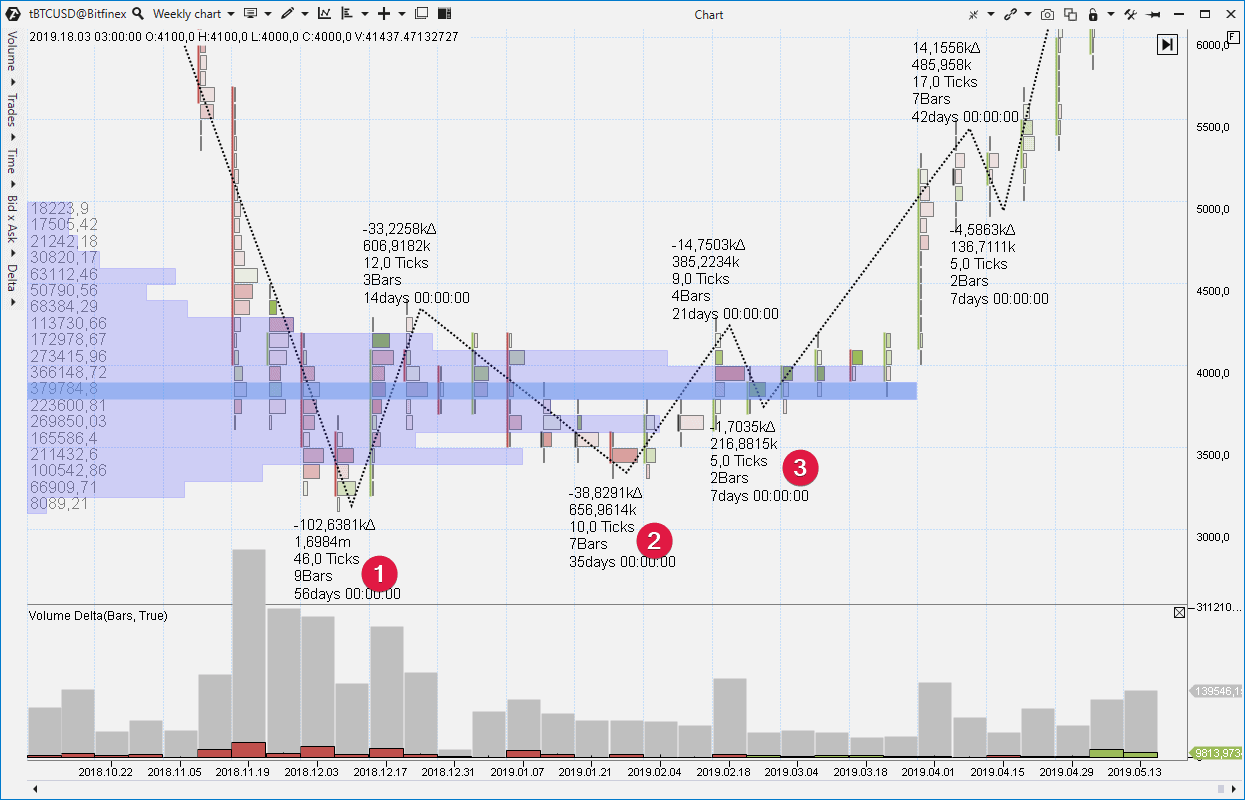
Let’s consider the reason of a medium-term trend, which came into force in April 2019 after accumulation of bitcoins at the level of USD 4,000 for one BTC. Let’s analyze this process in a cluster chart with a week period using data from Bitfinex.
We set the ZigZag Pro indicator in the chart, which automatically splits the sequence of bars into waves and provides a detailed statistics of each wave.
- A sharp price fall started in November 2018 after a standstill in the 6,000-7,000 range. Bitcoin was traded below 3,500 in the beginning of December. However, look at the clusters. They expand, showing that big volumes pass in the market against the background of reduction of the bearish progress. It is an early sign of accumulation, which means that a major player has entered the market and consumes the asset against the background of the panic mood, caused by a fast fall.
- Volumes fell 2-3 times compared to climax values on wave 1. The pressure of sellers ‘dried out’.
- The descending wave 3 confirmed that the market experiences a shortage of supply. Note that mainly buys took place in March, which can be seen from green clusters.
The price quote ‘shot up’, as a result of accumulation of bitcoins at about 4,000 (which is clearly seen from the market profile), and quickly reached 5,000, without giving a possibility to ‘late’ bulls to enter closer to the accumulation area.
Accumulations. Example 3.
While learning to detect accumulation areas, a chart reader by the VSA method would inevitably turn to history in order to develop his skills. Download ATAS, analyze ranges on historic lows of the markets of interest. You can track how accumulation developed at any period of any market. Let’s take, for example, an FB share.
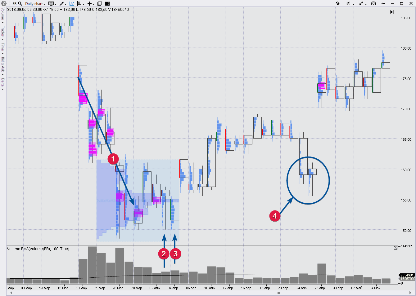
The Facebook stock started to fall sharply in the end of March 2018 against the background of negative news about data leakage. Do you remember that scandal with Cambridge Analytica? How did US officials ask Mark their questions?
Let’s see what questions-answers we can find in the chart.
- The dynamics was obviously bearish starting from March 19, 2018. Pink squares are the moments of actuation of the Cluster Search indicator, which tells us about huge volumes that go through the market. The splash of activity at the USD 155 per share level breakout on March 26 is of special interest. It is noteworthy that the market traded predominantly above this level in one session, namely on March 28, but the activity was not high. What does it mean? Has the panic calmed down? Or, more correctly – has a major player consumed the flow of panic sells, stimulated by ‘awful’ news?
- The price came back again to the 155 level on April 3, but look at the clusters. They are very narrow and the profile is thin. It is a deficit of sellers, which means that the pressure of bears exhausted.
- The activity went up on April 4, but if the nature of this trading meant weakness, why did the price grow with a gap the next day?Holding the market above the 155 level on April 6-9 confirmed availability of the bullish interest. And the price quote started a slow upward movement from the area of panic sells, which is clearly outlined by the market profile during March 26 – April 4 period. It is a strength area now. A major operator accumulated stock there and, most probably, he would protect this area.
- The price tested the accumulation area at the end of the first summer month. The splash of activity under the USD 160 level, most probably, reflected activation of stop losses of bulls. Look at the thin candle profile on April 25. This is No Supply. Deficit of sellers with a strength area in the background is a sign of a forthcoming rally.
Well, let’s move from Accumulations to Distributions. Distributions are the other side of the process of Accumulations.
Imagine that you are a wholesaler who bought cheap goods in China in the lump (accumulation), transported it to the US and now sells it by retail using commercials. The same takes place in the financial market where assets are moved in time and not between territories. The ‘buy low, sell high’ principle is true and works in any type of commerce.
VSA Distribution.
Distribution is a trading range at the market highs, at which a financial instrument changes its owner. As a rule, the major interest (insider, smart money or composite operator) uses the current market situation in order to distribute the asset he owns at high prices.
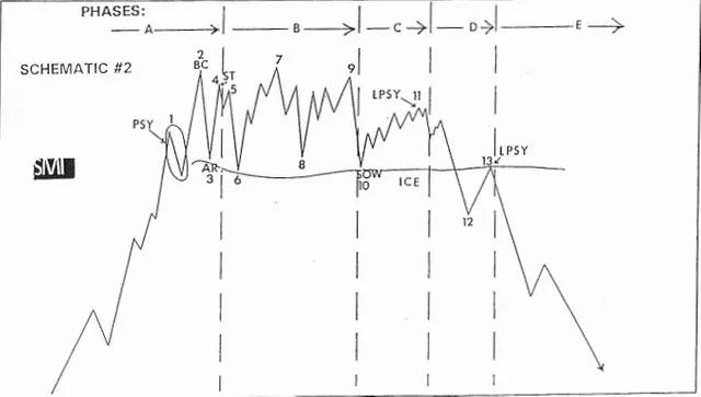
Wyckoff followers split the distribution range of an asset into the following phases:
The general features are the following:
- A super-powerful upward impulse passes in the beginning of the distribution area. Usually it is accompanied with good news in media. A major player, sort of, advertises stock/futures/currency in order to make minor players snap the instrument up like hot cakes. An analyst registers, from the VSA point of view, the buying climax and/or End of Rising Market.
- Then the buyers’ pressure exhausts. The upward waves become less powerful. New high is just a situational overrun of previous records. The major player renders false support to the market only to buy time and sell more instruments.
- Downward movement starts on the growing volume (Selling Pressure) after the final false upward movement (Upthrust) and is accompanied with weak rallies (No Demand).
- The stock becomes weaker than the index for the stock market.
Let’s see how it looks in reality.
Distribution. Example 1.
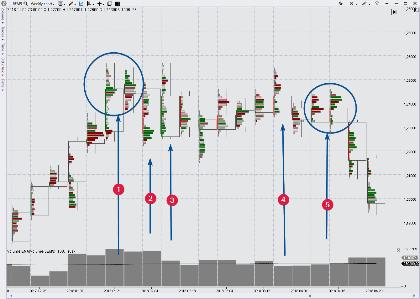
Let’s take the EURUSD market, which is very popular among Forex traders. We use the week period, Delta Colored Trades Histogram cluster type and futures market data.
- Having jumped above 1.23 in the 20s of January 2018, the EURUSD market attracted interest of buyers. Probably, good news (no matter what news) encouraged general interest. But look at the range and volume. Trading was going on quite actively within the range of 1.24-1.25 without a significant continuation of the bullish progress. So, why didn’t the price grow? A conditional major operator used euphoria for selling, setting the sell limit a bit above the current price. It explains a paradoxical fact when a prolonged decrease ‘unexpectedly’ starts after abnormal sells.
- The bearish candle confirmed availability of a hidden weakness on previous two ones.
- The main event this week is inability of the market to break the previous high. Closing at lows adds weight to the idea that a distribution has started. The price quote moved sideways during the next weeks, which corresponds with the phase B in the scheme above.
- Upthrust. A final trap for bulls and activation of stop losses of early bears.
- Long tails on top show absence of the market desire to move up. Note the activity of bulls on top of the second candle. If a real strength would have been there, why did the candle close at lows? Most probably, bulls were closed in a trap here. The cunning market would hardly give them a chance to exit without losses.
Let’s note that entry into long-term short positions is a bad idea when we speak about initial distribution phases. The growing weakness and down trend approach become more evident closer to the range end.
Distribution. Example 2.
Let’s continue to speak about distribution areas in the currency market, but this time we would analyze faster movements, if it is boring for you to read the weekly timeframe, which we considered in the example above.
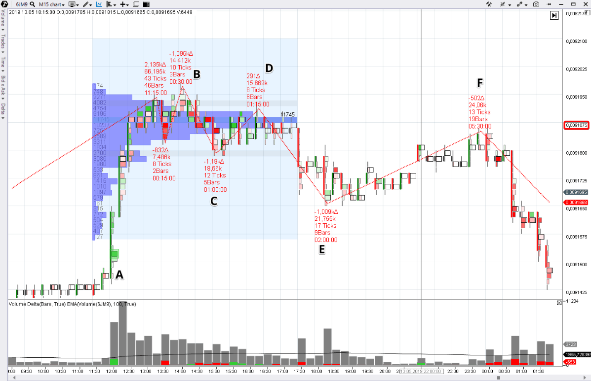
Let’s take a cluster chart of an intraday JPY futures (what a futures is) with the 15-minute timeframe. The Cluster Search, Delta, Volume, ZigZag Pro and the Market Profile drawing tool are activated in the chart.
A narrow range with high trading activity at the 0.0091875 level was formed in the market on May 12. Why does the chart say that this was a small distribution?
- A-B. Growth at 12:00 was caused, most probably, by some good news. The Cluster Search indicator, pointing to the high buyers’ activity, actuated. The price rushed upward. The late buyers hurried to grasp at the flying away rocket. However, the growing impulse started to reduce by 13:00 despite the 2 times above average volumes. ‘Too many buyers grasped at the rocket and it was difficult for it to fly higher’. The market moved sideways.
- C-D. Analyze this growing wave. It is much weaker by characteristics if compared with the previous wave 1. The volumes are clearly below the average values although the delta is positive. The total volume is 15 thousand contracts, according to the ZigZag Pro indicator. This behavior testifies to reduction of the buyers’ pressure.
- D-E. Volumes grow on reduction. Sellers achieve progress and push the market out of the range. If we take activity in the area of 0.0091875 as a dispute between buyers and sellers, it is evident that sellers provided more arguments and won the dispute.
- E-F. From the point of view of the Market Profile analysis, we can say that this is the POC (Point Of Control) level test.From the point of view of VSA, which is focused on a detailed breakdown of demand and supply balances, low volumes (only 24K for as many as 19 bars) point at the deficit of buyers. It means that a probability of a breakout of the yesterday’s range is very low. The version about distribution of contracts at high prices collects a sufficient number of confirmations and the game on the short side of the market gains priority.
As you can see from the example above, the market profile instrument could be useful for detecting accumulation and distribution areas. It’s a p-profile at distribution and b-profile at accumulation. Let’s consider one more distribution example with laying day profiles upon a chart.
Example 3. Distribution in the gold market.
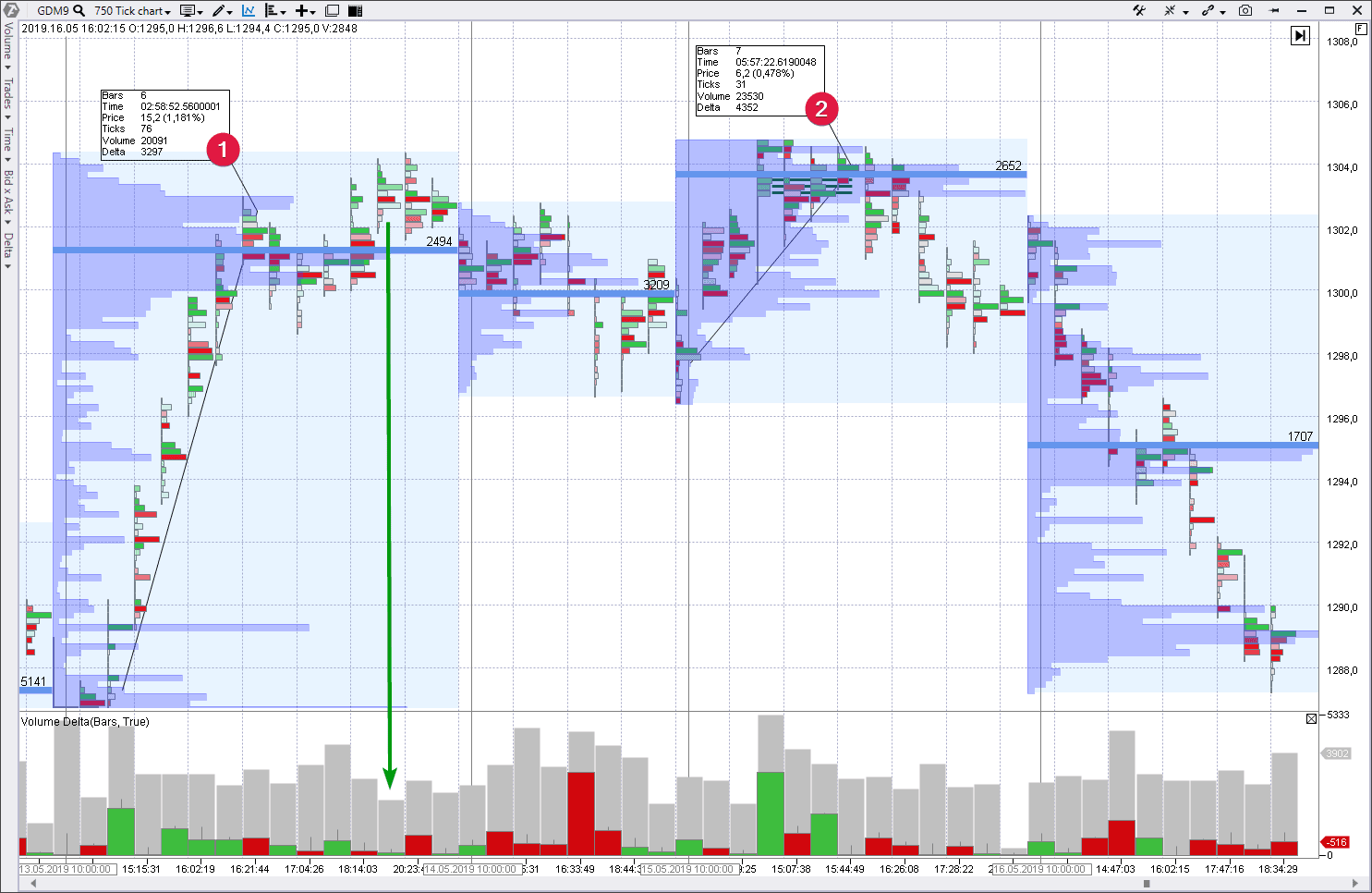
It is a market of gold futures, where a cluster chart covers trading during 4 days – from May 13 until May 16, 2019, inclusive. Data is from the Moscow Exchange, GDM9 contract, each bar – 750 trades.
May 13. Two ascending waves can be seen. One is quite powerful, reached a serious progress and broke the round level of 1,300 as a result. The second one showed that the buyers are not ready to move the price higher. It could be seen from the VSA No Demand pattern (a separate bar marked with an arrow). Formation of the p-profile gives first warnings about a possible distribution area.
May 14. Trading activity could be described as consolidation (pullback) after activity of the previous session.
May 15. It is a very interesting day. A splash of buys (green delta) above 1,300 didn’t produce results in the form of reaching new highs. The price just slightly exceeded the high of May 13 in order to tease buyers and activate stops of early bears. Note that the Imbalance indicator sent a signal of the buyers’ activity, which became a reason of formation of a bulge on the day’s profile. Compare waves 1 and 2. The second wave shows a bigger volume but smaller result. The market hit the ceiling.
The price pulled back below 1,300 by the end of the session. Here, an analyst got serious facts in the chart, which tell him that the market is not ready to move higher. Most probably, all buyers met limit sell orders. Someone from among serious players wanted to hide his sells. The profile produced one more p-shape.
May 16. We can see obvious reduction, which was the result of the distribution area. The effort to go up on the first bar has a far too low volume and the price would not be able to be pushed through the levels with high volumes of the previous day with such a deficit of buyers. This weak growth is a reasonable point for entry into shorts against the background of actual weakness, which was noticed during the previous days.
Summary.
Accumulation area is a reason for further upward trend. Professional traders lay the foundation and accumulate the asset using the current circumstances. You might not have inside information, but ability to read the chart gives you a chance to be equipped.
Distribution area is a reason for further downward trend. Professionals use a splash of activity in the market. Interest of mass buyers allows them unloading their longs, accumulated earlier at lows.
Conclusions for the series of articles about VSA and cluster analysis.
VSA founder Tom Williams never used clusters. He started to trade when there were no computers. Tom Williams built his charts using a ruler. However, the principles, which were developed by Wyckoff and which served as a foundation for the Volume Spread Analysis, act independent on the chart types. They are:
- the Law of Demand and Supply;
- the Law of Effort and Reward;
- the Law of Cause and Effect.
Cluster charts just help to see better those market processes, which take place behind the classical candles and bars.
Knowledge of VSA and availability of ATAS provides an unquestionable competitive advantage, due to which you will be able to study true motives of traders and carry out your operations on the right side based on facts.

