VSA: No Demand & No Supply
We continue the topic. This is the second article of our VSA and cluster analysis series. The first one was about the End of Rising market and Bag Holding signals. In the end of it we mentioned the Effort and Reward Law – one of the laws of the Richard D. Wyckoff theory.
Today we will consider the Supply and Demand Law and such VSA signals (or patterns) as No Demand and No Supply.
- No Demand – the situation of a deficit of buyers in the market;
- No Supply – the situation of a deficit of sellers in the market.
In this article:
- how to read the No Demand and No Supply signals in the price and volume chart;
- how to get the signal confirmation using the cluster analysis;
- how to use the No Demand and No Supply in making trading decisions.
By the way, No Supply is one of the favorite patterns for entering a long position of Tom Williams, whose story we already told you before. When conducting webinars and sending weekly market reviews to his subscribers, Tom always focused on a search for No Supply. He also called it Test of Supply or just Test.
We will consider the Tom’s chart and his description of Test of Supply a bit later and now we start with No Demand.
No Demand
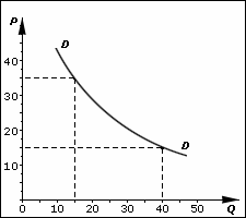
Let us consider this VSA signal from the point of view of the economic theory, addressing the Wikipedia. The picture below shows a graphical interpretation of the Law of Demand.
The classical law states:
The size of demand decreases as the price on a commodity increases, in other words, there is an inverse relation between the size of demand and the price, when the price growth reduces the demand size and reduction of the price leads to the growth of the demand size.
Let us consider a practical example.
Let us assume that one apple seller named Ahmed opened a shop on a Dusseldorf market where he never traded before. In order to understand what price he should ask for, he changed the price every day:
- Monday. EUR 5 per kilo. 10 kilos sold;
- Tuesday. EUR 10 per kilo. 1 kilo sold;
- Wednesday. EUR 3 per kilo. 25 kilos sold.
This is the law of demand in action. The higher the ASK price, the less are the buyers (real demand).
As a result, Ahmed realized that he should ask for EUR 4 per kilo on this market, because it is an optimum price, which would provide him with sufficient cash receipts and trading volume.
What is this theoretical preface and fictional story for? Because the Law of Demand from the textbook of an economics student acts the same way both on a vegetable market and in any financial market, whether it is a stock, oil futures or cryptocurrency exchange.
The only difference is that some markets are more stable than others. In other words, the apple market is subject to such factors as seasonality and productivity. And having realized where the level of a fair / optimum price is, you can be sure that in future the balance of the demand and supply will not deviate from it for more than conventional 10% during a year.
Financial markets are different. Securities, currencies and other exchange instruments are very sensitive to a big number of influences. It happens quite often when a common stock increases (or decreases) in its value by 20-30% during one day after a newscast.
Let us consider a bitcoin, for example (how to make money on cryptocurrencies).
The amplitude of the price fluctuations in this market is 2-3% on a standard day. However, can the VSA and No Demand signal help to identify seemingly unforseen steep dives?
Yes, they can. The VSA No Demand pattern sends a signal that the current price in the market is too high. Examples will follow further.
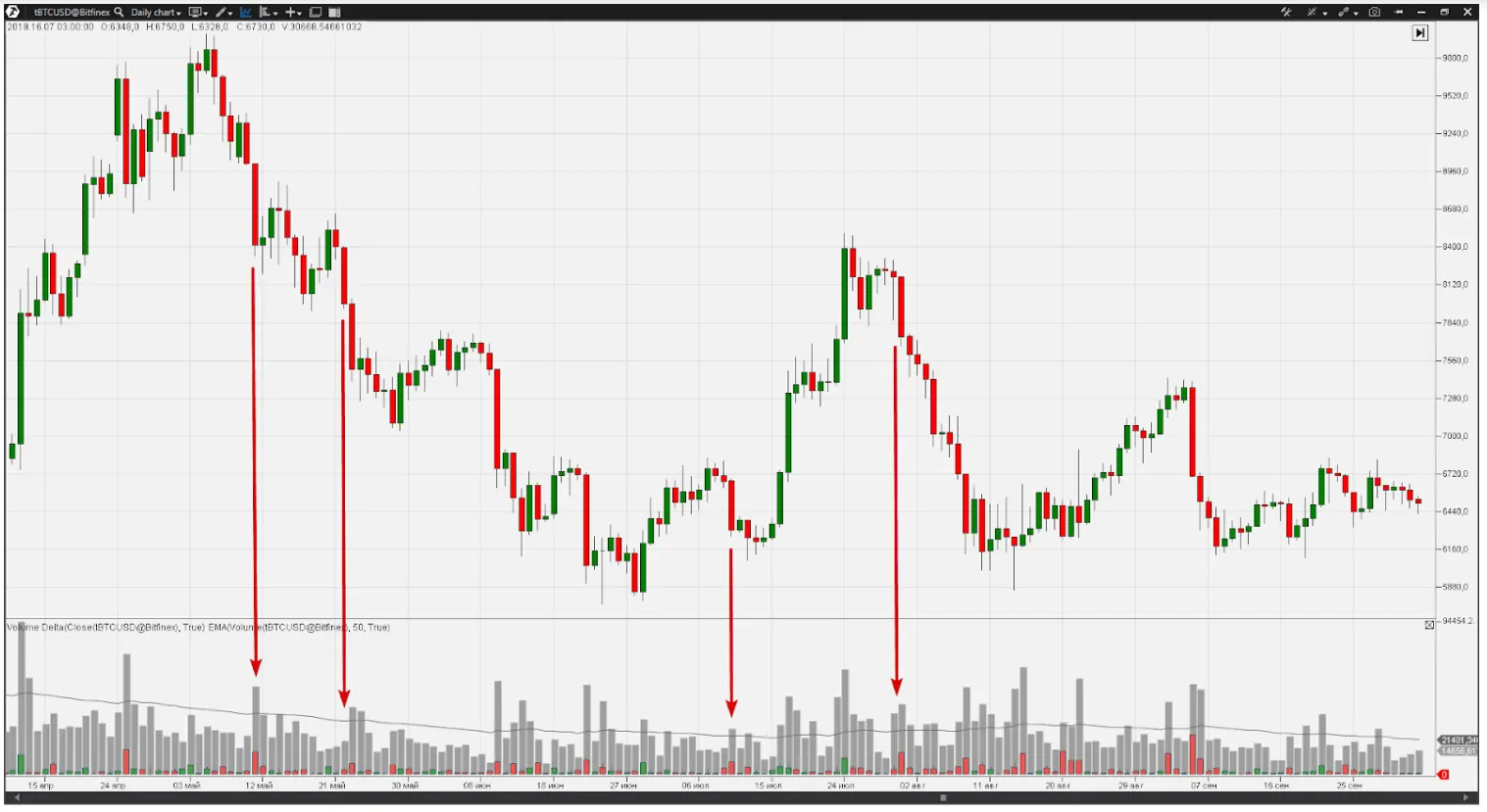
Launch the ATAS Crypto and open the BTCUSD exchange rate chart from the Bitfinex cryptocurrency exchange. The chart has the volume indicator (grey bars) and the delta indicator (red and green bars) laid over it and showing an overweight of the executed selling and buying orders respectively.
On May 11, 2018, (the candle is marked with red arrow No.1) the bitcoin price dropped from 9,018 down to 8,333 at the day low. It was the beginning of the downtrend, which lasted for many days and ended in the summer, when the bitcoin found its support at the 5,800 level.
The market behavior on the eve of this long downward movement was quite interesting. Note the trading volumes on May 4-5. The price was above 9,500 and volumes were nearly two times less than average ones, which means that there were less trades than usual. Perhaps, the market participants were not interested in that price.
Who was in deficit in the market? If the buyers, they were not satisfied with the high bitcoin price. If the sellers, they did not want to sell the cryptocurrency cheap. And the fall on May 11 clearly answers this question by going down on a growing volume. So, we read information from the chart, which tells us that the Bitfinex cryptocurrency exchange had a deficit of buyers at the beginning of May, that is why there was a small number of trades.
Comparing this situation with the one of Ahmed from Dusseldorf, we can make a conclusion that bitcoins in the beginning of May 2018 at USD 9,500 is like apples at EUR 10 per kilo.
Continue to read the chart. Trading volumes on May 19-21 were not high at the 8,300 price per bitcoin. The downward movement started on May 22 (red arrow No.2) on the growing volume and even accelerated the next day. It gave the ground to assume that effective demand rapidly goes down.
he deficit of buyers on June 7-9 (low trading volume) was fixed at the level of 7,500. This confirmed the fall on the growing volume with predominance of sells on June 10 (red arrow No.3).
Bouncing from the 5,800 support level in June, the bitcoin broke the 8 thousand level in the end of July. Many traders started to say that “crypto is on a roll again”, “to the Moon” and planned to buy a new Lambo. But look at the volumes.
The volumes are very low on July 28-29. And the accelerating downward movement from July 30-31 (red arrow No.4) with the growing number of sells told us in the chart language – there is no demand above 8K.
Those situations, which the market experienced on the eve of the falls that are marked with red arrows, are the No Demand pattern.
The simple economic principles, which are in the basis of the Law of Demand and Supply, work in any market. As soon as the growing price ceases to satisfy buyers, the trading volumes go down. Figuratively speaking, the market climbs up the Mount Everest and reaches the thin air zone. As well as a mountain climber needs oxygen, the market needs demand. That is why the further price reduction is natural and the growing volume revives trading, letting in more buyers who are ready to spend money and buy goods (bitcoin, currency, stock – anything).
In order to avoid a situation when the price drop catches you off guard, learn to identify the No Demand pattern in your working market/timeframe.
How to detect the No Demand signal in the chart
This is how a VSA strategy expert Philip Friston describes the No Demand signal:
The up bar on a narrow spread was closed in the middle with a low volume or lower than the previous two bars. It could be a down bar if its top is higher than the previous bar. This shows that professional money were not interested in higher prices at that moment. If a price spread is bigger than a narrow one, it still might show a weakness.
Pay special attention to the background. If the previous several bars show signs of strength, this indicator might be the reason of the fact that the market plans to have some rest during several bars, since the professionals stepped aside for a while before starting the upward movement.
The next bar should be a down bar for confirming the No Demand. If the background has strength, expect testing of the supply or the up bar on the increased volume (an effort to push through this sign of weakness). If there are other signs of weakness in the background, expect price reduction. Specialists noticed this weakness and are not interested in upward movement any more. The further weakness signals, such as upthrusts, will confirm the bearish mood of the market.
If you are near an old top, it is very unlikely that the market will move up through this old top when there is no demand. Be careful if you see a down bar with a narrow spread and lower volume than that of the two previous bars after the absence of demand. This tells us that there is no pressure from the sellers, which confirms the No Demand pattern.
Another VSA expert, Sebastian Manby, also pays big attention to the general context of the market. He uses the Volume Spread Analysis for 20 years already and Tom Williams, the founder of the VSA, and other professionals in analyzing price and volume call Sebastian “the chart reading machine”.
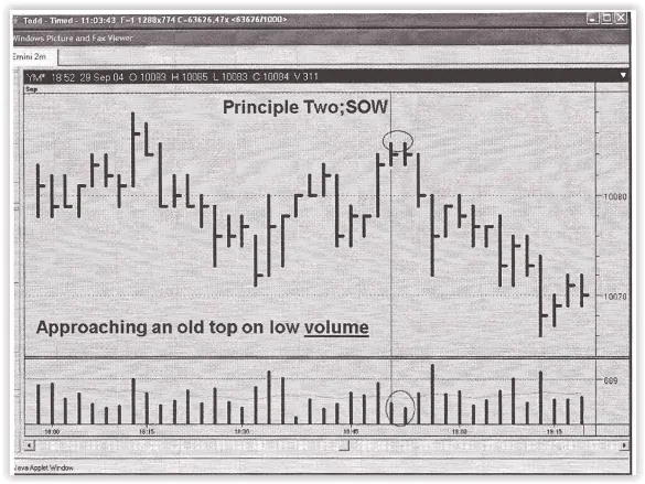
Here is a perfect example of the VSA No Demand in an old Sebastian chart (a Dow Jones Index futures as of 2004).
Sebastian says:
If a peak has been formed but the price continues to move up, it will need to undertake some effort in order to overcome resistance of the traders that got stuck in loss-making longs on that peak. And if the market grows towards the previous peak on a narrow spread and low volume (I marked this situation in the chart), you need to look for entries into shorts and run out of longs, because the clockwork is ticking and the bomb is about to explode!
So, in general, the VSA No Demand pattern usually looks like:
- an effort of the market to go up and the price slowly moves up, …;
- … but it closes in the middle of the bar or near it;
- a narrow or medium spread;
- a low volume;
- the next down bar on the growing volume is a confirmation of a deficit of buyers.
An important nuance.
No Demand (ND) is a complex phenomenon representing a process, which may run in an endless number of variations. The VSA strategy reduces the ND detection algorithm to a check of compliance of an individual bar with the above criteria. A trap appears here. “A narrow up bar on a low volume – it means ND – should sell” – it is a very light-minded decision.
How to avoid a trap when reading a chart bar after bar and how to start thinking in general. Follow the recommendations.
- First. ND – as it was already mentioned – is a process. It can non-obviously unfold both inside a bar and over several bars in a row. It should be taken into account when analyzing the chart using the VSA method, especially when we do not speak about day periods.
- Second. Mind the context. The No Demand pattern has a bigger weight if it manifests itself at the levels with the previous signs of weakness or under conditions of a downward trend.
These two recommendations are also true, with certain corrections, for the No Supply signal, which we would consider below, as well as, actually, for other VSA signals.
We had enough of the theoretical stuff, so, let’s do some practical one.
Examples of No Demand in the modern markets
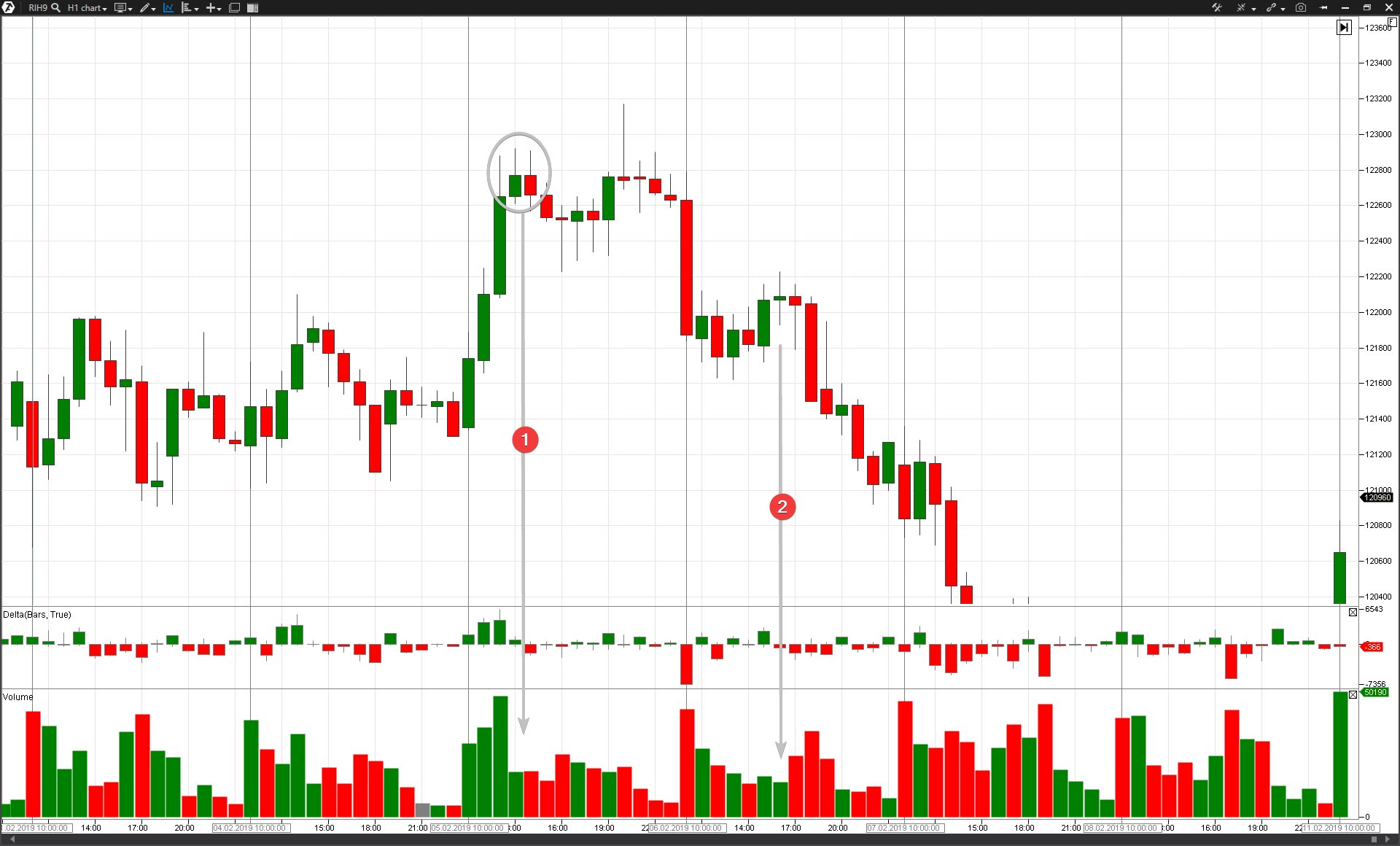
Let us consider an hourly chart of an RTS index futures (what a futures is). A recent example.
The price went higher than 122,800 during the daytime on February 5. But the trading volumes went down at this level (arrow No.1), which gave ground to assume the No Demand situation. After the evening session was opened, there was, most probably, an act of sabotage: manipulators activated stop losses of the sellers above the local high and reversed the price down. (It is an upthrust, we will speak about it in our next articles, so, check out our publications).
The next day, on February 6, the futures price dropped on the opening. The volumes are big and the delta is bright red. This change in the market behavior testifies to a real weakness and the No Demand pattern was among the first to send a signal about it. What a trader should do in such a situation under the VSA strategy? It is logical to implement “a bearish plan” and look for entries into short positions. The No Demand pattern again will be of use here.
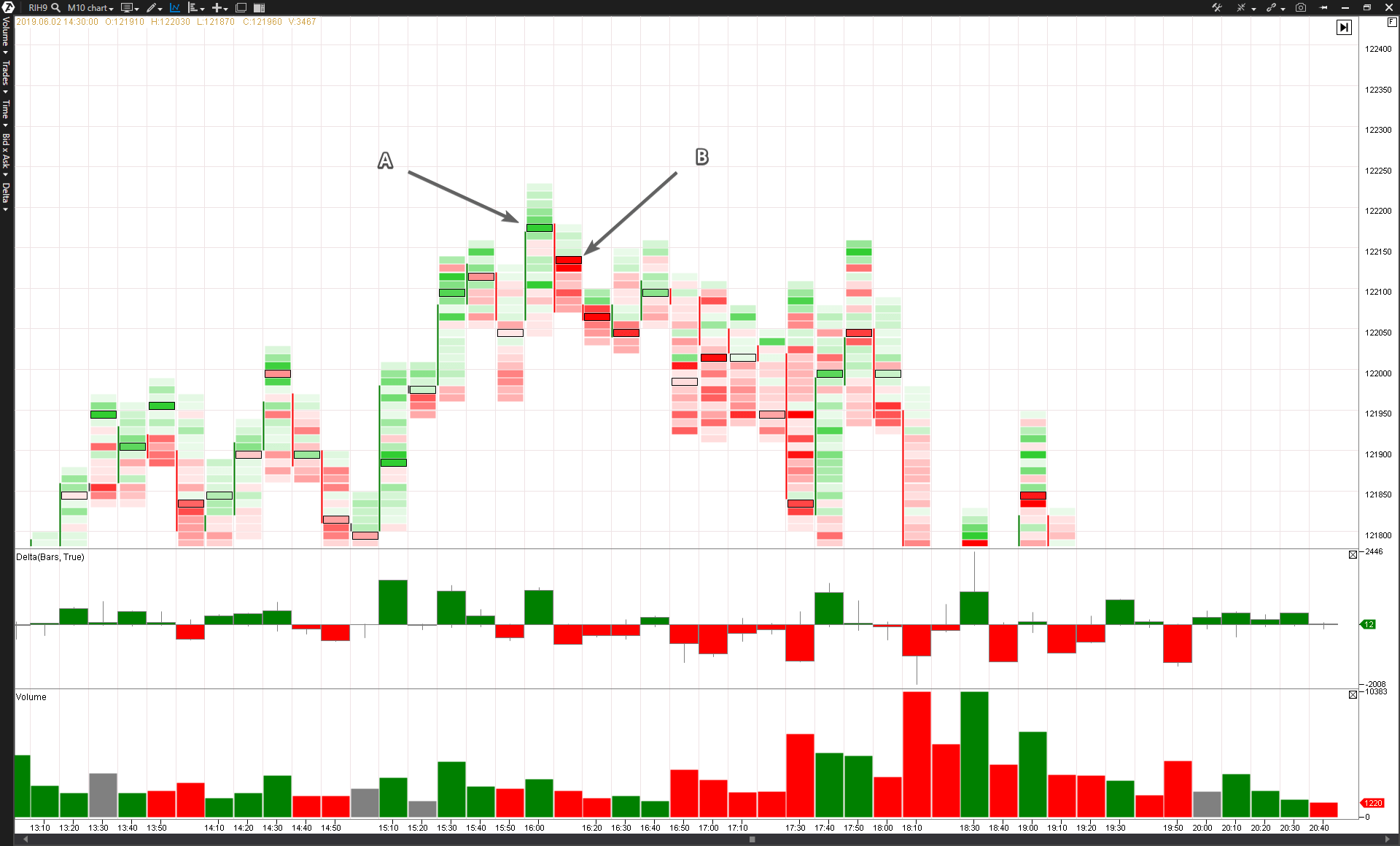
Note the arrow number 2. It is an effort to go up, but the volumes are small. It is a potential ND. The market participants do not believe in further growth against the background of a sharp drop on the market opening. That is why we switch to younger timeframes and check clusters.
Note the splash of buys (A) in the 122,180 cluster and the following splash of sells (B) in the 122,140 cluster. Perhaps, these were:
- A – a trap for the buyers and activation of very close stop losses of the sellers. Perhaps, they opened shorts during the morning sale, but were thrown out of the market in point A. The professionals accumulated short positions under the hat using Sell Limits;
- B – the real sells. The incoming aggression of the sellers pushed the market below. This “breakage” level is now a priority one for opening shorts during the forthcoming cases of testing (not to be confused with the VSA Test of Supply). As you can see in the chart, further on the price stayed above 122,100.
Download ATAS and find the No Demand. Analyze the cluster chart and you will surely see similar processes but in different variations on peaks of the areas with a deficit of buyers.
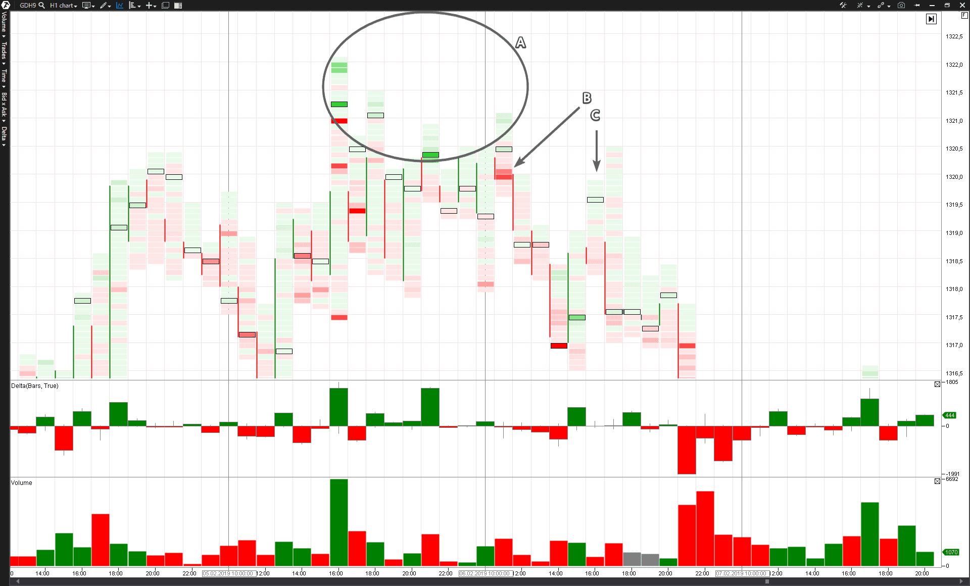
Another example is from the gold futures market. Let us consider events of February 5-6 on the Moscow Exchange on an hourly period using the Delta Colored Volume cluster type.
Let us reason for a while:
- A – Most probably, a major player gained a short position on peaks on February 5 using Sell Limits. It can be seen from splashes of green clusters;
- B – “a breakage” took place here. A major player entered the market with the market selling orders and started to consume all available BIDs;
- C – the price went up to the level where “the breakage” was fixed or there was a change in the market mood. However, note that the growth took place on a low volume. This is the VSA No Demand pattern. Note the “paleness” of the clusters – it reflects a low trading activity. Most probably, the resistance level, which was built from the “breakage cluster”, will not be broken and will work properly, reversing the price downward. A false breakout of the peak of the previous bar happened on the next bar and the price confidently turned down, confirming reluctance to attack the area of the yesterday’s weakness. This false breakout was not a surprise for those who did not fail to read the ND in the chart.
Now, let us consider the “reverse brother” of the No Demand pattern.
The VSA No Supply pattern
No Supply, in principle, is “a reversed reflection” of the No Demand pattern
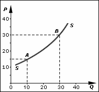
Let us check the Wikipedia again. The picture below shows a graphical interpretation of the Law of Supply.
This law establishes a direct relation between the price and the volume of supply of a commodity (stock, contract, currency, etc.). The lower the price (P) of a commodity, the smaller the quantity (Q) of the sellers, who would agree to enter a trade, will be.
How does the No Supply look in real life?
Let us imagine that your Chinese auntie Aimin went to the market to buy nuts to bake cookies for her nephew. Alas, she forgot her purse with yuans at home. She was lucky to find some coins in her pocket. However, the sellers on the market did not want to sell nuts for a small change. Aimin was very unhappy. One of the sellers noticed that and asked her why she was so sad. She sympathized with Aimin (she also had several nephews) and agreed to sell her some nuts at a lower price than it was on the market.
This fictional story shows that sometimes trades in the market are executed at prices that differ from a fair equilibrium price. However, while the auntie Aimin story can happen in real life, things are a bit different in the financial market. There is no place for a good nature there and the trades at a lower than a fair equilibrium price are executed mostly due to misapprehension of the traders. Richard D. Wyckoff wrote about it in his method, which became a predecessor of the VSA strategy:
The Wall Street business is financing corporations and trading securities – stock and bonds – which are a result of this financing. Some papers are good and some – not much. Those who produce and sell them to the public, know their value better. The public has a comparatively weak understanding of their real value, except for well-known papers, which existed in the market for a long time.
hus, if, for one reason or another, the exchange price deviates from the real value of a security, this opens a profitable opportunity for entering a relevant position. VSA will help to identify such a case. It is possible to read the No Supply pattern from the chart, when the current price of an instrument goes too low in the undervaluation area, using the Law of Demand and Supply.
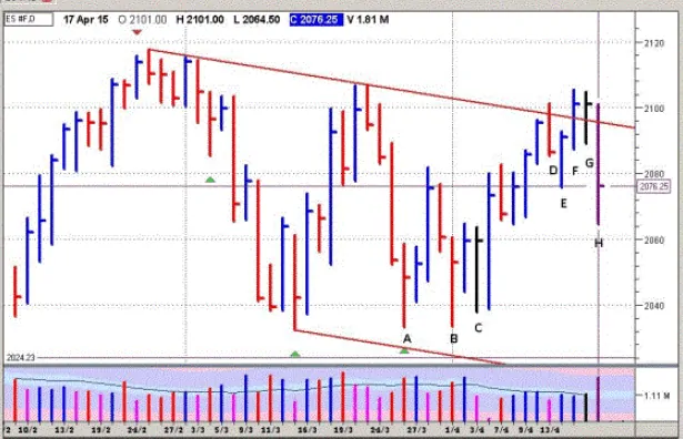
Look at a Tom Williams (the VSA founder) chart
Analyze the C bar. This is how Master Tom describes it:
This is a clear test. The price sharply dropped to be closed at the upper quarter and look at the volume – it is low. It is a very positive sign of the fact that the market is about to start the bullish movement. Why? Since the markets move the demand and supply. We saw that the stopping volume entered in Point A and we saw a test in Point B where the volume was, perhaps, just a bit lower. Now we have a very clear test in Point C, where the volume is clearly low. This means that there is no inflow of selling offers in this market. Thus, you should expect higher prices.
Note that Tom uses the “test” term. In order to avoid ambiguity, the “test” term here is short for “supply test”. The test is conducted with the aim to assess the volume of supply in the market. A successful test means the No Supply situation.
The “testing” term, which means “a bounce” from a certain level in the classical technical analysis environment, is different from the “test”, under which Tom Williams usually means the situation of No Supply, Supply Test. The price increase is implied after a successful VSA supply test.
So, in general, the VSA No Supply pattern usually looks like:
- a market effort to go down, …;
- … but the closing takes place in the upper part of the bar;
- the volume is low, which shows absence of interest;
- the next up bar on the growing volume confirms the NS.
Figuratively speaking the market submerges under the water. As well as a diver needs oxygen, the market needs supply. That is why it is natural that the price increases and the growing volume revives trading, letting in the sellers who are ready to exchange their commodities (cryptocurrency, securities – anything) into money.
Examples of No Supply in the modern markets
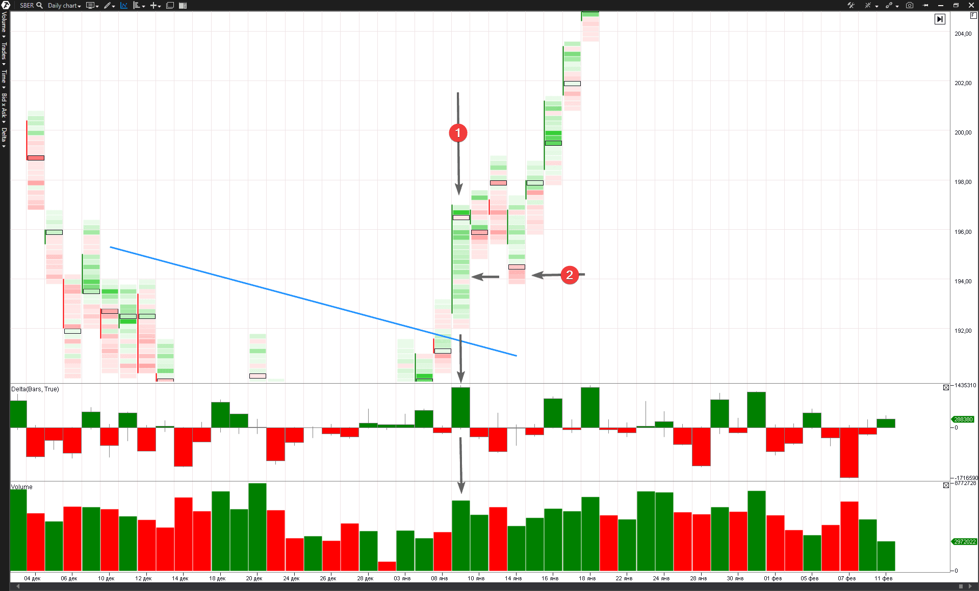
On January 14, 2019, the Savings Bank ordinary stock price formed the day’s low at the level of RUB 194 per share (going down approximately by 1.7% in relation to the closing level of the previous day), but the closing price was RUB 196.80 – closer to the day’s high. The volume was not big – it was smaller than the volume of the previous three days.
A trader who reads a chart using the VSA method can see a bit more if he is equipped with a footprint. He realizes that the testing showed a deficit of supply at the level of the previous strong bar on January 9. Tom Williams would surely have said that this test have provided the professional players with confidence in their intention to move the stock further up. The chart verified the strong mood of the market and the further breakout of the RUB 200 level was not long in coming.
Clusters add transparency into understanding the ongoing processes.
- January 9 – a real power entered the market. Practically all clusters are green. They demonstrate domination of buyers nearly at all levels. The price rapidly grows and breaks the resistance level (marked with a blue line). It is a real demand.
- The No Supply testing. Note the red area on the test low on January 14. It is a splash of sells – most probably, it is an activation of stop losses of the buyers, who were smart enough to go into longs on January 9 but less smart on January 14, when they started to panic and to close manually by stop losses, located in the break-even zone. The market activity shows absence of a real pressure of sells and only a preparation for further breakout of the RUB 200 per share level.
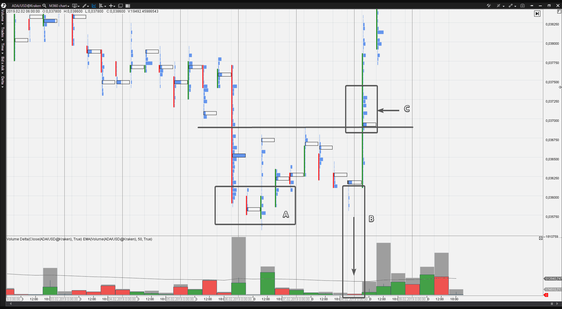
One more example. Let us open something non-standard, for example, a 6-hour ADAUSD chart. It is the cryptocurrency market and data are taken from the Kraken exchange.
- A – the area of active trading. Looking back, we can see that these were panic sells and a major player “built” a long position on the eve of the growth;
- B – a test or No Supply. The price went down to the previous zone of activity (A), but the trading volume was microscopic. It means that the panic was consumed and the market is not interested in trading at those levels and is ready for the growth phase;
- C – a major player confidently consumes ASKs (the green delta) at the breakout of the resistance level, pushing the price to the upper floors.
Download ATAS and look into the market as a professional. You will see “NS Supply Tests” before many important upward breakouts.
Summary
No Demand – is a failed effort of growth on a low volume. The market experiences a lack of liquidity from the buyers’ side. The further price decrease in a combination with the volume increase confirms that the market participants are not interested in the price increase.
The No Demand signals have a bigger weight:
- in a combination with other signs of weakness;
- under the downtrend conditions.
If the market still actively grows, showing the bullish mood in the price and volume behavior, then the No Demand signal could be just a short pause before a new ascending impulse.
The same is true for the No Supply signal but in the opposite direction.
No Supply (or Supply Test or just Test) – is a failed effort to go down on a low volume. The market does not experience a lack of liquidity from the buyers’ side. There is no interest in lower levels. The further price increase in a combination with (not extreme) increase of the volume confirms the bullish mood of the market.
The No Supply patterns have a bigger weight:
- in a combination with other signs of strength;
- under the up-trend conditions.
When the market actively goes down, the No Supply pattern could be just a short pause before a new descending impulse.
If you are inclined to use investment strategies and wish to buy the stock with the aim to hold it on a long-term basis, then the No Supply pattern (VSA test) can become your reliable partner for entering a long.
This is how a professional investor and VSA expert Philip Friston uses the No Supply signal for entering a trade:
I have my own process of stock selection, which corresponds with my risk profile (but it might not be good for someone else).
- First, I exclude the stock, which does not correspond with my fundamental criteria (every trader has his own criteria, but my list will include consideration of such things as the level of depth, cash flow, etc.);
- Then I need to check whether the parent index is in an upward trend and does not have a significant weakness in the background;
- Then I open the exchange chart and look for accumulation areas in the background and mark the support and resistance levels;
- Then I ask myself how the stock works in comparison with the parent index. Is it stronger or weaker?
Then, taking into account the background, I address to the right part of the chart looking for an entry signal of, say, the test on the growing market, trying to avoid entry slightly below the important area of resistance.
Thank you for reading this article. We will continue the VSA + cluster analysis topic, so, check out our publications.

