VSA and cluster analysis. Buying and selling climax patterns
Read today:
- what VSA Buying and Selling Climax patterns are;
- inner mechanics of panic sells and euphoric buys;
- how to detect VSA Buying and Selling Climax patterns in the chart;
- trading recommendations.
So, what are VSA Buying and Selling Climax patterns? The Buying Climax takes place at the market highs and Selling Climax – at the lows. In general, these VSA patterns are “brothers”, since the processes, which take place in the market in these cases, are mirror reflections of each other. And the main specific feature, perhaps, is that the driving force of the Selling Climax are such human emotions as panic and fear. While the Buying Climax is driven by greed and easy gain.
Let us consider both patterns in different variations one-by-one. We start with panic.
VSA Selling Climax
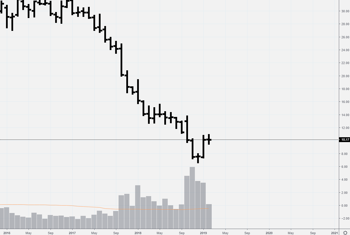
The General Electric stock stably traded at around USD 30 per share in 2016. However, something went wrong the next year and the exchange trading was closed, in December 2017, at the level of USD 17.45 per share or -44% compared to the price in the end of December 2016, which was a very bad result, taking into account the global bullish trend in the stock market in 2017.
The situation became even worse in 2018 and GE stock reached USD 6.66 per share at the December low. The public went into panic (“GE is USD 6.66 – this stock goes to hell!”) and sold GE stock in a hurry.
What the chart tells us (timeframe is 1 month). Look at trading volumes and price dynamics. November volumes grew up to extremely high values (more than 2 times above average). If this volume represented a true weakness and pressure of sellers, why did the price restored in January 2019 surpassing the November 2018 high? Perhaps, the panic was bought up at lows. This assumption is confirmed by our “old friend” – VSA Bag Holding pattern – a narrow December bar on an extremely high volume (read about Bag Holding in the first article).
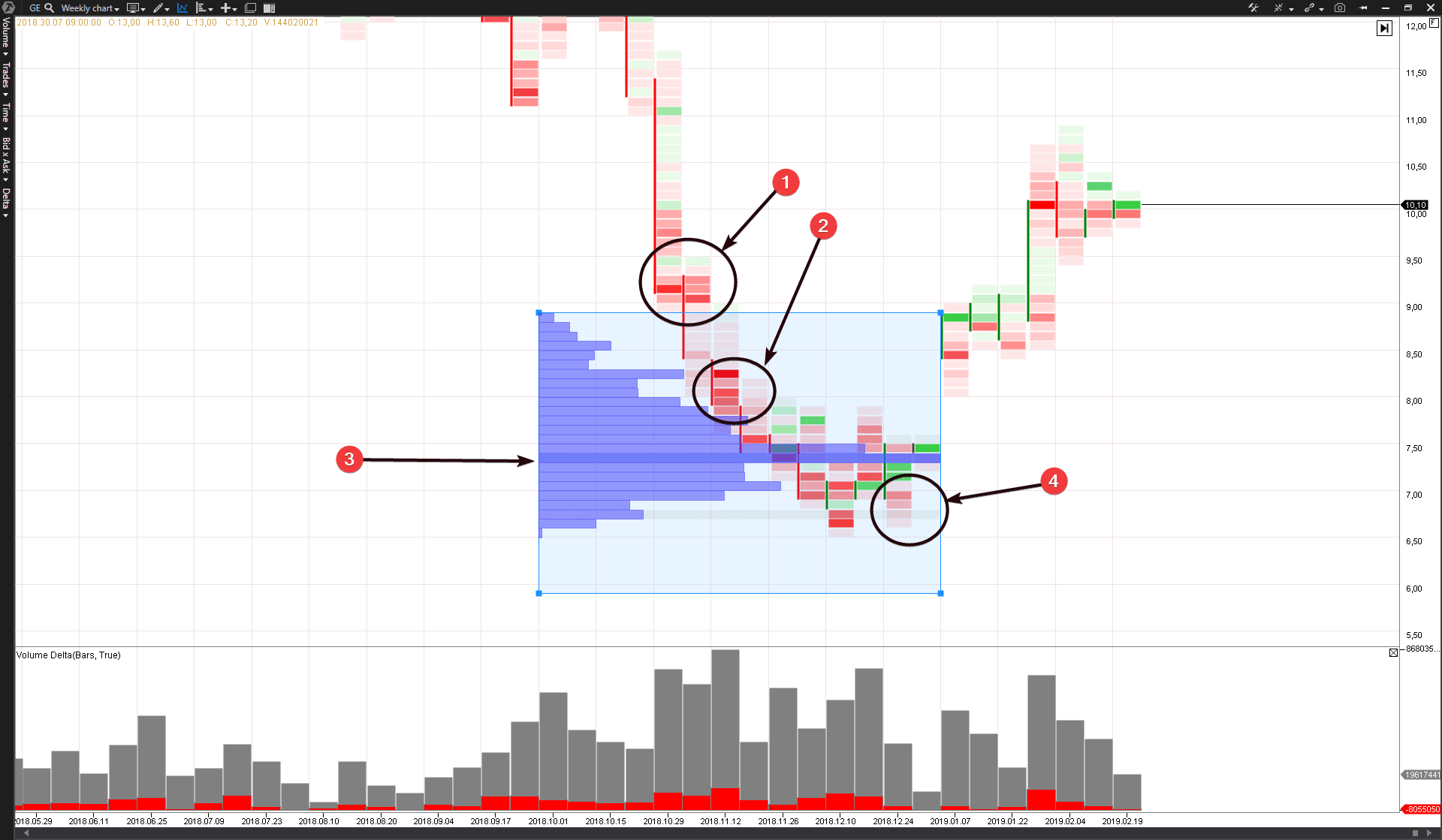
Let us consider this situation in more detail on a weekly period, using the cluster type of a chart in the ATAS platform.
The October 30 news were awful, since Earnings constituted -2.62 instead of expected +0.13 per share. Since then the market submerged into the depths of depression with a frightening speed.
What clusters tell us:
- sellers pressure – breakout of the USD 9 per share level;
- sellers pressure – breakout of the USD 8 per share level;
- The sellers pressure smashed down support levels and the public gave up the last hope for recovery. And the major interest, which has no emotions and knows the true value of stock, decided that the situation was favorable for accumulation. It entered the market and started to buy the buy limit stock at the level of 7.40-7.50. A splash of activity in the market profile testifies to it. It is interesting that, when the general indices of the stock market were at lows in the twenties of December, the GE stock refused to go down to a new bottom;
- The panic was engulfed. The sellers’ pressure was exhausted and there is a deficit of sellers in the market (read more about the lack of supply in the No Supply article). Note that green clusters became brighter. Proactive buyers returned to the market. They realized that the panic subsided and the stock is undervalued and provides an opportunity for investments at the low.
By the way, Baron Rothschild, a British nobleman of the 18th century and a member of the Rothschild banking family said “the time to buy is when there’s blood in the streets”. According to some sources, the original phrase was “Buy when there’s blood in the streets. Even if the blood is your own.” Perhaps, he meant global panics.
Panic sells as the essence of the Buying Climax is quite a frequent phenomenon in the history of financial markets.
SELLING CLIMAX IN THE FINANCIAL MARKET WAS DESCRIBED IN DETAIL FOR THE FIRST TIME BY RICHARD WYCKOFF
Let us check the original source. As we already said, VSA is a derivative from the Wyckoff method. The Volume Spread Analysis strategy emerged as a result of the fact that its author, Tom Williams, did a training course in the Stock Market Institute, where they teach the market analysis using the Richard Wyckoff method. And here is what Richard Wyckoff writes about panic sells in his investment and stock trading course, which is known as the Wyckoff method:
The selling climax is caused by a panic sell-off of shares (supply) from the public and other weak holders, which is compared with buys (demand) from:
- experienced operators;
- major interests and sponsors of various stocks, who now see a wonderful opportunity to cover shorts at low prices, which they sold higher.
Thus, the shares get into strong hands for a short or longer period. Anomalous volume increase is one of the indicative symptoms of the selling climax, since both demand and supply should both sharply expand under these conditions. However, the supply is of bad quality now, while the demand is of good one, and, since the supply power shall be exhausted further on, the technical rally will follow.
Operators’ buys during a selling climax serve to temporarily support the prices and control panic or relieve the stress situation. This stock support will be thrown back to the market at the very first possibility, as a rule, at a technical bounce, which usually follows the selling climax. These and other bounce sells could increase the market supply sufficiently to reduce the prices through the climax day’s lows and result in new reduction, that is a liquidation renewal.
On the other hand, if a secondary reaction follows after a technical rally and the prices stay at the climax lows or above them, while the volume significantly decreases, we have an indication that the liquidation has been completed and support comes to the market again.
Wyckoff also writes that selling climaxes take place in various scales – both on daily/weekly and short-term periods.
It should be noted that the same principles, which are applied to big fluctuations, are also applied to small actions and intraday buying and selling waves.
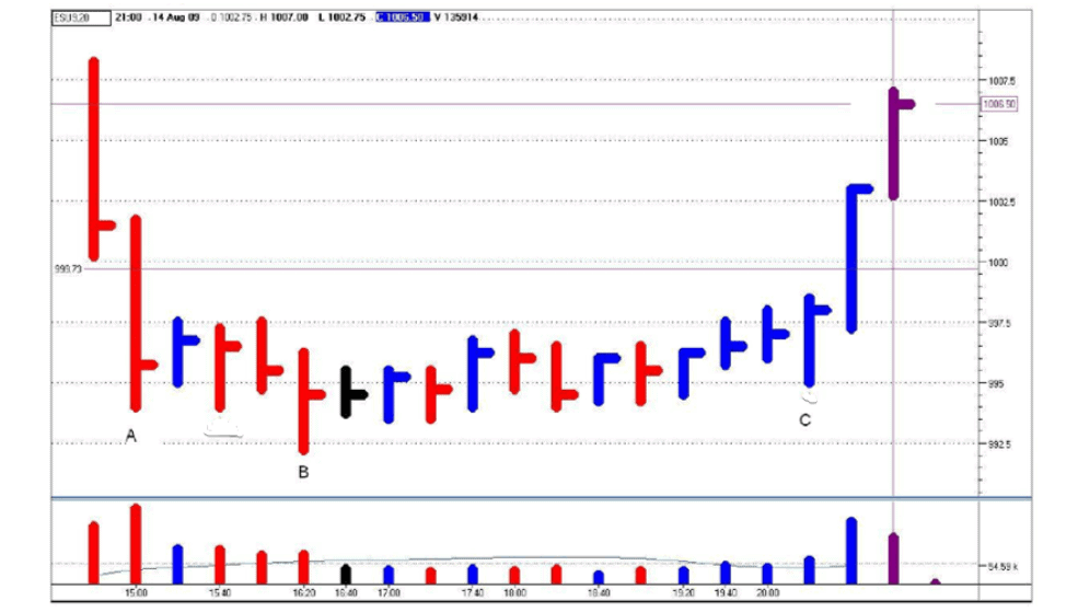
Let is consider panic intraday sells in the S&P-mini futures market.
It is a 20-minute chart of Tom Williams. Here is what the VSA developer writes about the situation, which took place in the market on August 14, 2009.
Bar A is a Selling Climax. Traders start to panic on sharp price drops, especially if their positions are on the wrong side of the market. That is why they start panic sells on Bar A. Professionals will say: “Thank you. We will buy out everything here and make profit”. This sell panic pushed the market aside.
ANOTHER SELLING CLIMAX EXAMPLE
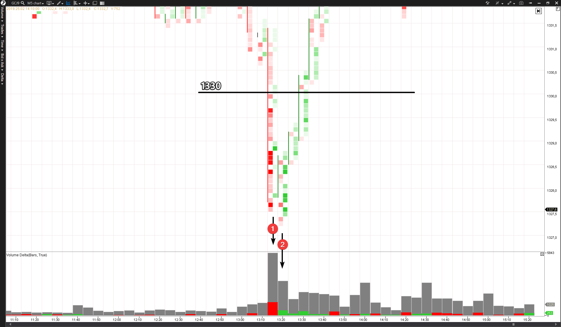
Let us consider the intraday panic in the gold market on February 25, 2019, in the futures market on the COMEX exchange (read more about the gold futures market).
The gold traded within a range in the afternoon of that day, when “all of a sudden” the price sharply broke the support level of 1330 and rushed down. The traders, most probably, did not have the vaguest idea why this sharp reduction happened, started to close longs (manually or by stop losses) and open shorts in a hurry. They thought: “We will learn soon what happened”. Bright red clusters on Bar 1 testify to the selling pressure.
However, everything changed on Bar 2 – just like in a thrilling blockbuster. The delta turned green and proactive buyers decided that the gold is undervalued and provided support, buying out the full supply that was in the market at that moment. The price gave way and moved up. This change in the market behavior marked completion of the unexpected (intentionally organized?) panic.
We considered only some examples.
You shouldn’t expect that one Selling Climax will look the same as another one. You can observe the same basic features, but the time and value of the price movement and trading volume, and also the degree and sequence of price bars, nearly always would be different. Richard Wyckoff
One more example of Selling Climax can be found in the previous article – VSA and cluster analysis. No Demand and No Supply – in the last ADAUSD chart (A case). You can find more examples in any market. Conduct a search and study of Selling Climax with the help of ATAS – the most advanced platform for the cluster analysis of exchange trading.
VSA BUYING CLIMAX. EXAMPLES
Before we analyze practical examples, get acquainted with the VSA Buying Climax pattern description, provided by a VSA expert Philip Friston.
Buying Climax is a bar with a high to super-high volume, closed in the middle. It identifies professional sells and shows that supply surpassed demand. In order to sell, specialists should unload in the growing market, selling to “the crowd”. If they would have sold on down bars, the prices would have dropped against them too fast. This bar should reach new fresh highs.
The upward movement should have been earlier. In the end, “the crowd” loses control in fear to lose higher prices and buys on the flow of good news. The professional groups will sell during this insane behavior of buyers.
A down bar for confirming the Buying Climax should be the next. Look at several next bars for confirmation. Expect to see an upthrust and absence of demand. The next up bars on a high volume, closed in the middle, may confirm weakness. Remember that professionals could have more sell orders in their reserves. For this purpose they would need to support the market within a range. If you see down bars with a low volume (no supply) or extremely high volume (shakeouts or minor panic sells), closed in the middle, it means that the market is not ready to fall.
Buying Climax may turn out to be an intermediate stop only. Up bars on a wide spread with high volume (supply engulfing volume), closed above the previous high, represent strength.
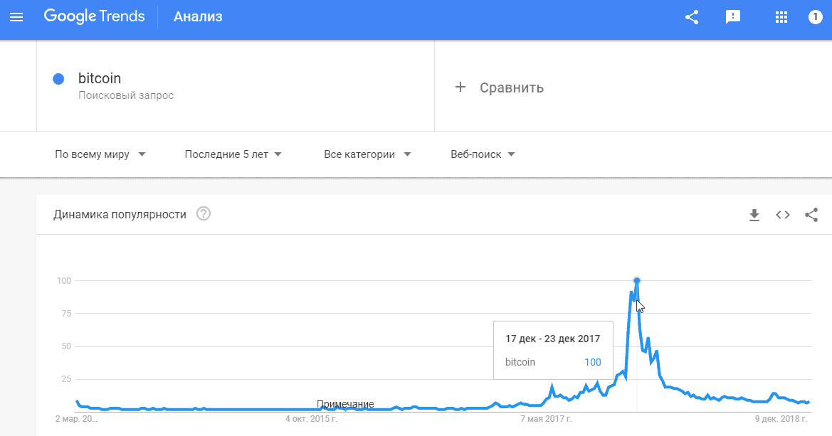
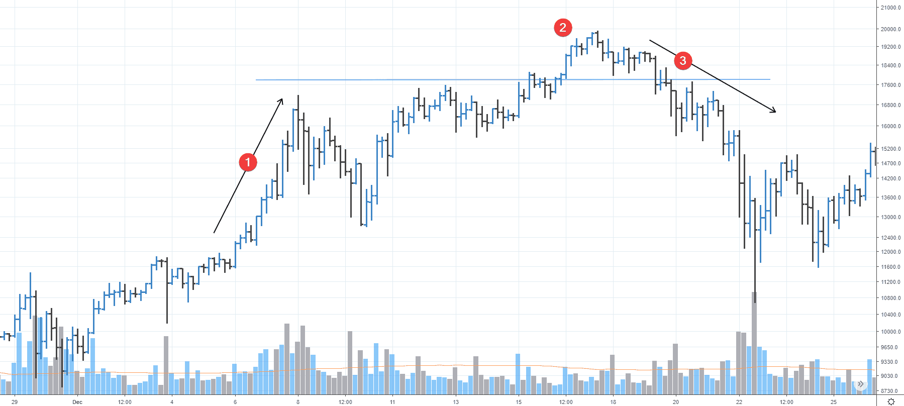
Philip mentioned good news, which often accompanies the Buying Climax. That is why the first example of the Buying Climax would be from December 2017, when the whole world was obsessed with cryptocurrencies.
What the chart tells us?
- Buying Climax takes place on the wave marked with A arrow (December 7-8). Note the wide price movement. The sweeping amplitude of the price whipsaw is a sign of professional activity.
- Peak breakout on December 7-8 happens, most probably, by inertia. The trading volume is not high at the price quote above wave 1 high. It is a sign of deficit of buyers.
- The down wave goes together with the volume increase, which indicates the bearish mood. The sellers’ pressure testifies to “a cold shower”, which extinguished the market, heated to volcanic temperatures.
Note that the Buying Climax is not necessarily the highest point. Moreover, as a rule, several unsuccessful breakout efforts, undertaken in order to drag more public into buys and cover close stops of “early bears”, take place after extreme volumes on a runaway price growth.
BUYING CLIMAX IN THE SAVINGS BANK STOCK MARKET
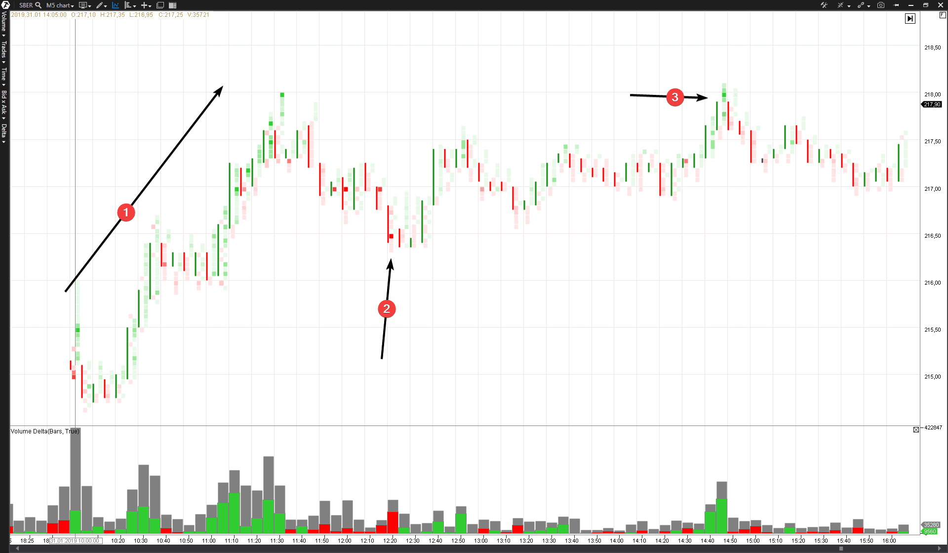
Another example from the Russian stock market. The Savings Bank stock trading was opened on January 31 at RUB 215.17 per share, renewing multi-month highs. The price actively moved up after the opening. It seemed like a typical bullish market. Everything was wonderful except for one “but”. It was a volume. The volume bar chart tells us that the trading volume during the first 2 hours was nearly RUB 8 billion, which was more than 2 times bigger than the average level of activity.
Let us look at the cluster chart of the BidxAsk Ladder type.
- It is the very up-wave during the first trading hours. Note the clusters – they are practically all green. The delta shows excess of buys over sells in more than 2 times. The public actively bought out the stock like hot dogs. But who was the seller? Professional traders used a favourable moment in order to close longs using sell limit orders above the current market price. This is the Buying Climax wave.
- Professionals temporarily supported the stock in order to execute more buy orders.
- It is a false breakout, which just teased the buyers and covered close stop orders of early sellers.
The market still undertook several efforts to surpass the January 31 morning high, but all efforts failed. Two weeks later, on February 14, SBER was traded lower than RUB 205 per share.
It is important to understand that the Buying Climax is not an individual bar but a complex process, which might last for several bars. It starts the distribution stage and forms the market peak when professional traders sell off the previously purchased papers, using a powerful splash of the buying activity on the part of multiple minor market participants.
A Climax could be completed within one day or distributed over several days and the volume could reach unusual values on a day when an extremum point is registered or several days before this high. Richard Wyckoff.
EXAMPLE OF THE VSA BUYING CLIMAX IN THE OIL MARKET
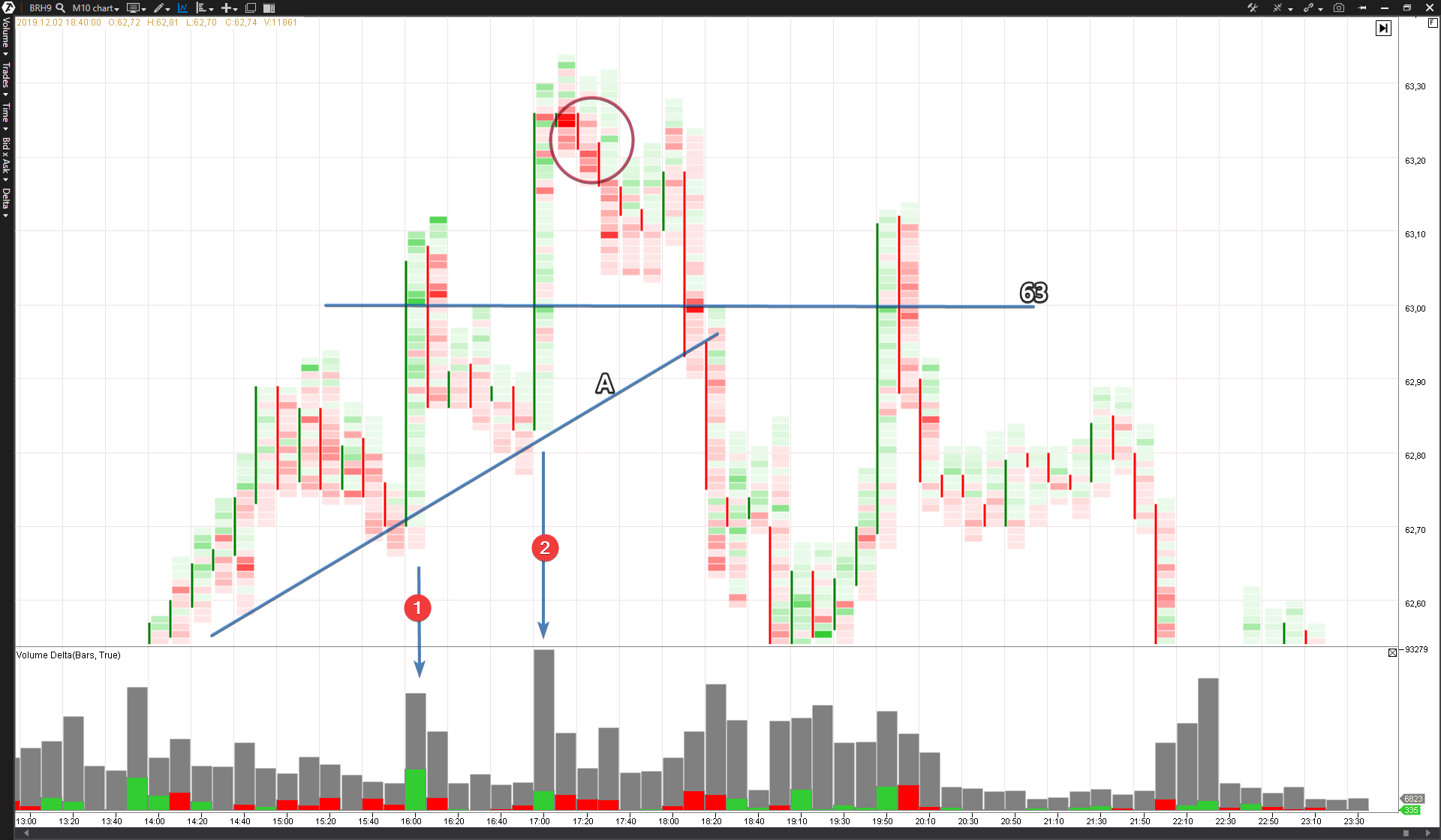
Here is a chart of the Brent oil forward market on the Moscow Exchange. Similar situations happen on other exchanges, with other instruments and during other periods. You might believe us or can check with the help of ATAS by yourself.
The described events took place on February 12, 2019. The level of 63 was broken on a big volume. Note the waves, marked with arrows 1 and 2. The delta is positive and the general volume is 2 times bigger than average. It is a variant when the climax is distributed over 2 waves and breakout of the round level 6, which attracts buyers from the crowd, works in favor of professional traders, who are interested in volatility for profit fixation. The red circle points at the splash of sells in the cluster chart, when, perhaps, professional operators passed from the sell-limit to sell-market tactics. The Brent price dropped deep below the level of 63, breaking the support level A, as a consequence of this aggressive change of the market behavior. The third effort of breaking the horizon of 63 was, most probably, a trap for bulls who were late. The change of delta from green into red during the third growth effort testifies to absence of the major interest in holding the price so high.
SUMMARY
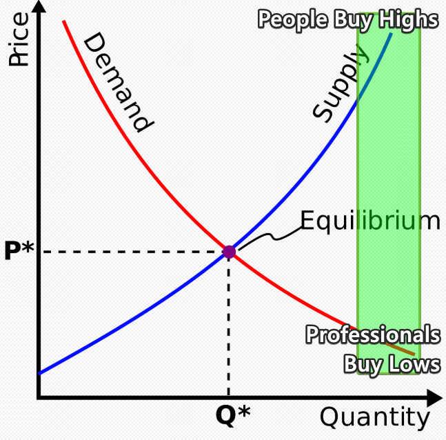
Let us describe the Law of Demand and Supply chart in terms of conclusions to this article in order to understand the idea of climaxes in the financial markets better.
The chart schematically shows the Buying Climax phenomenon. It corresponds with a general opinion that namely the public “buys out” the market highs. Similar action takes place from the other side, when the public sells out securities “for cheap”, allowing professionals accumulating a massive long position.
Why does the public delude itself? The answer is simple – emotions, poor understanding of the true nature of the market processes and absence of discipline. The exchange is a market for trading financial products and only few know the real fair (equilibrium) price of papers, which are quoted on the exchange. Market professionals are among these few. When the price quote deviates (or it is intentionally deviated?) from the equilibrium value, opportunities for profiteering emerge. Besides, the process develops by a standard scheme – a narrow circle becomes richer by the expense of a wide circle.
In order to exit this scheme and reduce the risk to become a victim of the exchange game – download ATAS, open the cluster chart of your working market and monitor the patterns at highs and lows. This is the way “to leave the crowd” and make your own balanced decisions. This is the way to your survival in the financial markets.

