10 Price Action patterns. Combining Price Action and Footprint
Price Action is a method of trading without indicators. Sooner or later, many traders, who are disappointed with indicators due to their delay, high frequency of false signals and redrawing, arrive at this idea.
They turn to the Price Action method. The name itself envisages that a trader, who applies this method, throws away everything but price patterns.
We will consider in this article, which is devoted to the Price Action method:
- how the method is used for analysis;
- 10 most popular Price Action patterns;
- whether Price Action patterns can be improved with the help of cluster charts (footprint).
Price Action is a wide concept, which was known long ago. It overlaps with other methods and uses proprietary names of patterns, that is why it doesn’t have clear boundaries or unambiguous definitions. Our goal is not to play a guru on the Price Action subject but to help those who are learning and want to understand how to trade in the financial markets better.
We will provide links to relevant Price Action materials from our blog at the end of the article. If you still have questions, ask them in the comments.
How the market is analysed with the Price Action method
Tracking the OHLC dynamics of candles/bars, comparing them and estimating their positions in the general context, a trader can formulate assumptions about the current and probable future behaviour of other market participants.
A trader tries to interpret price actions from the point of view of bulls’ (buyers in the market) and bears’ (sellers) behaviour and opposition between the ‘crowd’ and ‘managed money’.
Practically every bar/candle can be interpreted as a pattern. An experienced Price Action trader is well-trained to find various formations during the market monitoring in real time. He will have a subjective opinion about the strength of each of them.
However, a simple setup is often insufficient to make a trading decision. That is why a trader pays attention to a wider context and also, while building his own style, can optionally add the following additional sources of information to Price Action analysis:
- volume histogram;
- Fibonacci retracements;
- market profile levels;
- support and resistance levels;
- mirror levels;
- margin levels;
- trend lines and other ‘tricks’.
Further on you will find a description of how to use Footprint in a combination with Price Action.
How to trade Price Action patterns
A trader needs to find a proper entry point at the moment when he believes that Price Action signals are strong enough. As a rule, an entry signal is sent when a candle/bar, which completes pattern formation, closes. However, in real time trading, you can enter the market shortly before a candle/bar closes.
An entry into a trade, based on patterns, which haven’t been formed completely, is called an early entry. It is believed that it has a higher risk, since there is still a possibility that the market will change its behaviour sharply.
After entering a trade, a trader usually places a protective stop order to close his position with minimum losses if a trade goes wrong.
A commonly recognised place for placing a stop loss is 1 tick below the pattern, which sends a signal for entering a buy (or 1 tick above the pattern if a short position is opened). However, it is not a mandatory rule. As a variant, you can use the ATR indicator in order to find a stop level mathematically.
If the market moves as expected, a trader moves the stop order following the price to reduce risks, make the position breakeven and protect the growing profit.
10 Price Action patterns you should know
Now, we will consider 10 most popular Price Action patterns and will see how useful the cluster charts can be when analysing these patterns:
- Reversal Bar
- Key Reversal Bar
- Exhaustion Bar
- Pinocchio Bar
- Two-Bar Reversal
- Three-Bar Reversal
- Three Bar Pullback
- Inside Bar
- Outside Bar
- NR7
We will use classical time-frames based on equal time periods in all examples. It is improper to use such specific charts as Range and Renko for Price Action analysis.
Pattern 1. Reversal Bar
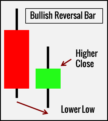
The Bullish Reversal pattern consists of two bars:
- The first bar is a down-bar.
- The second bar moves below the previous bar’s low and then closes above it.
The Bearish Reversal pattern is similar but opposite. The second bar moves above the previous bar’s high but closes with down movement.
What does it mean?
Bullish Reversal gives ground to assume that the market found support below the previous bar’s low. Moreover, the support was strong enough to push the price up to make the second bar grow. This is the first sign of a probable reversal.
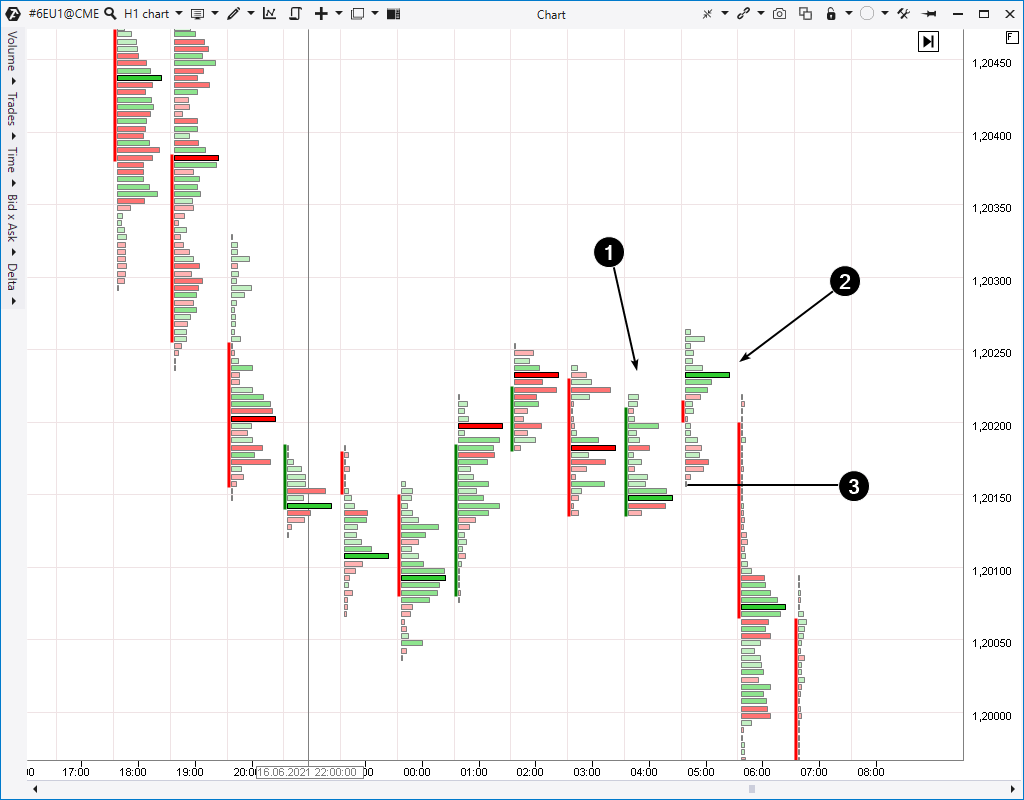
Cluster charts provide more transparency for understanding the current processes. Here’s a Bearish Reversal example in the 6E chart (CME Euro futures; hourly period).
The first bar shows the price increase, while the second bar shows decrease despite the fact that the second bar’s high is higher than the one of the first bar. The bright green cluster of the second bar clearly shows that the buyers got into a trap. They believed that the market had already formed the bottom and was ready to recover, but, unluckily for them, the downtrend continued.
An important circumstance is the decrease, which preceded the emergence of Bearish Reversal. In so doing, the market formed a favourable context and clusters instilled a sense of confidence for entering a position using the Price Action pattern.
How to trade?
- Buy above the Bullish Reversal bar when the trend goes up.
- Sell below the Bearish Reversal bar when the trend goes down (number 3 in the chart above).
Pattern 2. Key Reversal
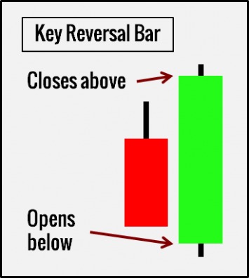
The Bullish Key Reversal pattern consists of two bars, besides the second bar opens below the previous bar’s low and closes above its high.
Consequently, the bar opens above the previous bar high for the Bearish Key Reversal and closes below its low.
What does it mean?
Opening with a down-gap is a strong bearish sign. However, it increases growth chances sharply when the market confidently dismisses such a strong bearish movement.
By default, Key Reversal patterns should contain price gaps. It is better to look for the patterns on daily time-frames and above, since intraday time-frame gaps are rare.
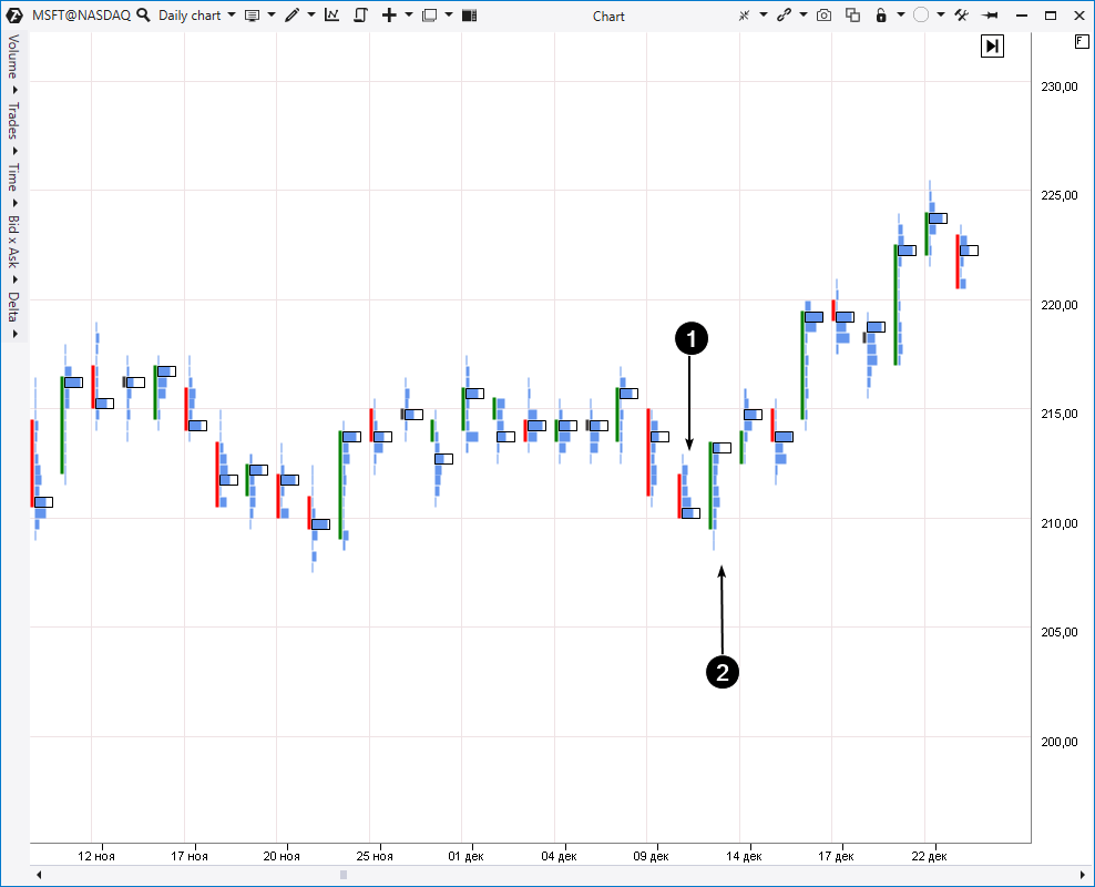
Example: cluster chart of MSFT stock; daily period.
The price moved down on December 10, 2020, and closed near lows at the level of USD 211.41 per share. The price was even lower at the session opening on December 11, namely, USD 210.05 per share. However, it moved up to USD 213.26 at the session closing and, in so doing, exceeded the previous day’s high. This is exactly the Bullish Key Reversal pattern.
The market context is an important issue. We can see on the historical data that the USD 210 per share level already showed its strength, providing support to MSFT. That is why, you should pay more attention to the bullish pattern formation at this price.
Cluster charts provide even more confidence. If we look at maximum volume levels during December 10 and 11, we will see that the maximum activity on December 10 was at day lows, while it was at highs on December 11. It means that the price consensus moved up sharply. Perhaps, those who traded at the lows on December 10 were subject to panic moods and, as a result, they made a mistake.
How to trade?
- Buy above the second Bullish Key Reversal bar (in case you are not sure, wait until the price closes above it before buying).
- Sell below the second Bearish Key Reversal bar (in case you are not sure, wait until the price closes below it before selling).
Pattern 3. Exhaustion Bar
The pattern consists of 2 bars and the volume is usually higher on the second bar.
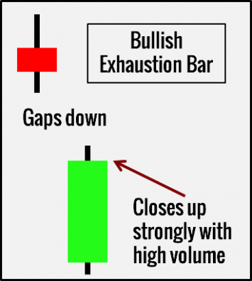
- The Bullish Exhaustion pattern opens with a down-gap, after which it moves up in order to close near the peak.
- The Bearish Exhaustion pattern opens with an up-gap, after which the price moves down in order to close near lows.
What does it mean?
The name speaks for itself. The pattern represents the ‘impulse exhaustion’ and failure of the effort to continue the trend. Traders expect that:
- bulls will gain the upper hand and the market will grow after bears are exhausted;
- the market will fall under the attack of bears after bulls are exhausted.
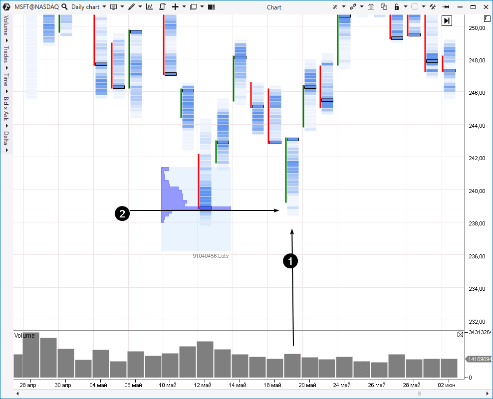
Let’s consider an example from the same MSFT stock market (daily period).
Trades opened with a significant down-gap on May 19, 2021. However, the price moved up during practically the whole session and closed near highs. It is the Bullish Exhaustion pattern.
Cluster analysis shows that the market used this maneuver to test the big volume level (2), which was formed on May 12. Most probably, the major interest actively bought stock at USD 239 that day, because the price stopped to move down thereafter and demonstrated the bullish dynamics. A major buyer ‘protected’ his position on May 19 and this understanding gives more confidence for entering a position by the Price Action pattern.
How to trade?
- Buy above the Bullish Exhaustion Bar. The buy in the example above was rather justified at the market closing on May 19.
- Sell below the Bearish Exhaustion Bar.
Pattern 4. Pinocchio Bar
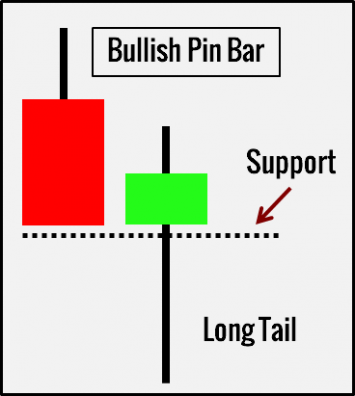
This pattern (also known as Pin Bar) resembles Pinocchio’s nose. The bar/candle has a long and distinct tail.
The lower tail takes up a bigger part of a bar for Bullish Pin Bars. The upper tail dominates for Bearish Pin Bars.
The Pin Bar breaks support or resistance by its long tail in order to deceive a trader and make him enter in a wrong direction or activate accumulation of stop losses.
Here’s an example from the Nasdaq stock index futures market, cluster chart, daily period.
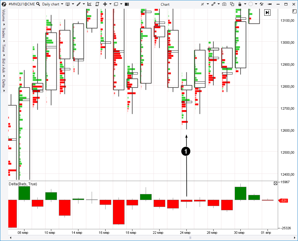
Trades opened at about 12800 on March 24, 2021, and the price moved down to the level of 12600 during the trades but closed at about 12790 having formed, in so doing, a long bottom shadow or Pinocchio Bar (or Pin Bar).
While viewing clusters, we can see predominance of market sells (judging by red clusters). But why did the price close much higher? We can assume that a majority of those sells belonged to the ‘emotional public’, or they activated buyers’ stop losses, which were hidden under the local March 18 low.
One way or another, those traders found themselves in a disadvantageous position since the index price showed stable growth until the mid April, renewing historical highs.
Note the Delta where a Pin Bar was also formed, testifying to the fact that the initial sellers’ pressure was later levelled down by the buyers’ activity.
The background is an important circumstance. The stock market was bullish during those months since the US authorities rendered serious support to the economy, which was recovering after the coronavirus strike. Many sectors showed stock price growth.
How to trade?
- Buy above the Bullish Pin Bar, which bounced from the support level (from the March 18 low in the example above).
- Sell below the Bearish Pin Bar after the resistance level blowout.
Pin Bars are often connected with false breakouts, which we discuss in an individual article. We recommend that you read it.
Pattern 5. Two-Bar Reversal
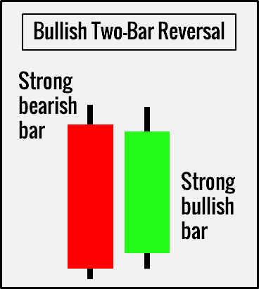
This pattern resembles what is called the bullish/bearish engulfing in candlestick analysis. We need 2 bars for the pattern formation:
- the first strong bearish bar + the first strong bullish bar = Bullish Two-Bar Reversal;
- the first strong bullish bar + the first strong bearish bar = Bearish Two-Bar Reversal.
What does it mean?
Explicit refusal from a down-leap is a Bullish Reversal, while explicit refusal from an up-leap is a Bearish Reversal. The first bar in this pattern represents an effort and the second one – its failure.
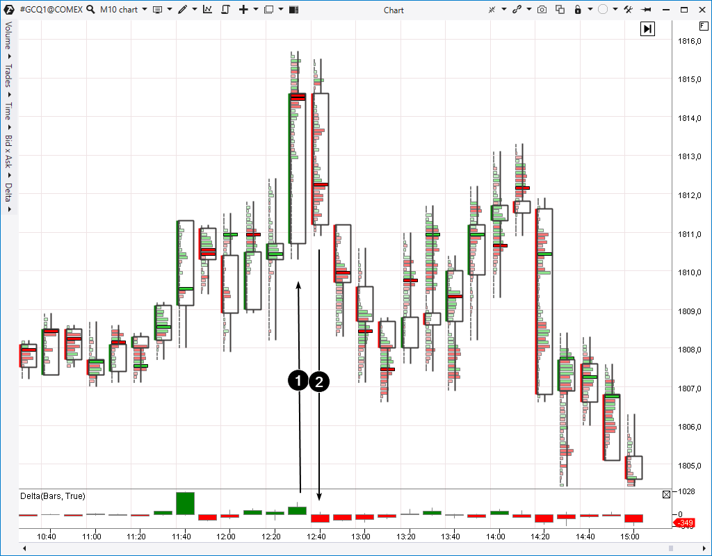
Example of a bearish pattern: the gold futures market; 10-minute time-frame.
Number 1 points to the bar of buyer efforts and number 2 points to the bar, which shows that the buyer efforts failed.
It took place on July 6, 2021. An important circumstance is the background, namely a sharp decrease of gold quotations on June 16 (it is not shown in the chart) after the Federal Reserve meeting, at which inflation forecasts were scaled up. The level of 1810 served as an obvious support during that decrease. That is why, when the prices increased to the level of 1810 on July 6 (in the chart), attentive traders, who kept in mind this mirror-like resistance, managed to focus on the signal for entering a short position. The Price Action Two-Reversal pattern sent them that signal.
Let’s note that clusters show emergence of sellers. The Delta was positive on the first bar but after the sellers displayed activity above 1814, the Delta started to move to negative values. We observe the obvious predominance of bears on bar 2.
How to trade?
- Buy above the highest point of the pattern with two bars for the Two-Bar Bullish Reversal.
- Buy below the lowest point of the pattern with two bars for the Two-Bar Bearish Reversal.
Pattern 6. Three-Bar Reversal
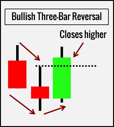
3 bars are required for the Three-Bar Reversal pattern.
The bullish pattern consists of:
- Bearish bar.
- One more bearish bar, which has a lower high and a lower low.
- Bullish bar with a higher low, which closes above the second bar’s high.
Consequently, the bearish pattern consists of:
- Bullish bar.
- One more bullish bar with a higher high and a higher low.
- Bearish bar with a lower high, which closes below the second bar’s low.
What does it mean?
The Three-Bar Reversal pattern shows a reversal point. This pattern is the most conservative one if compared with other reversal patterns, since it includes three bars and uses the third bar to confirm that the market has changed its direction.
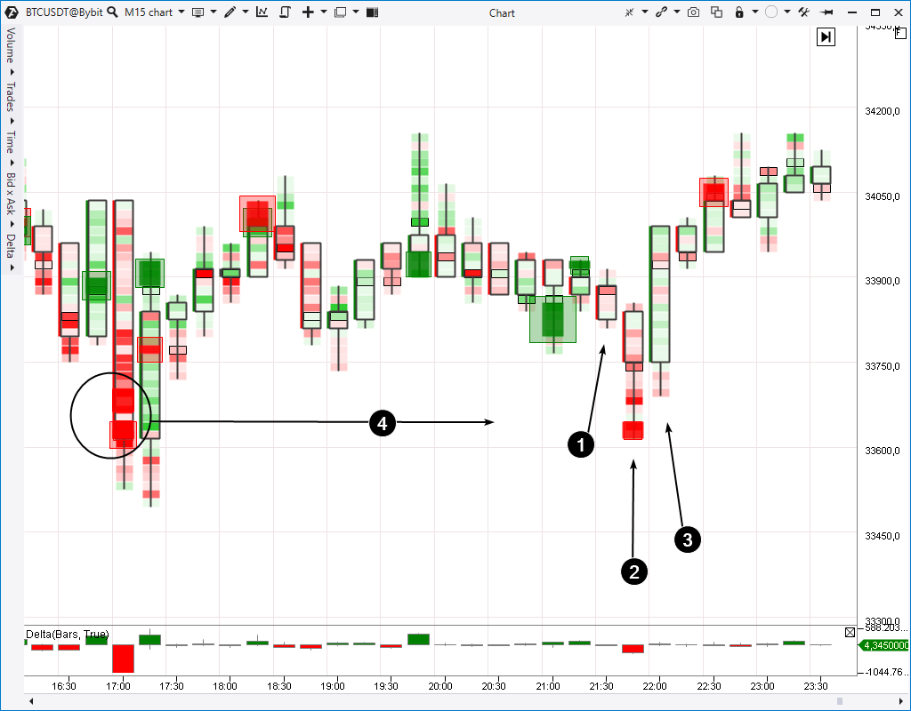
Here’s an example from the bitcoin market (15-minute period).
The bar, to which number 1 points, demonstrates bearish dynamics. We can see continuation of bearish dynamics on the next bar, marked with number 2. However, a sharp up-impulse takes place on bar 3 and the price closes above the previous bars.
We added the Big Trades indicator to the cluster chart and it helps to make the picture clearer. Most probably, the decrease on bars 1 and 2 had the goal of testing the big volume level, which was formed several hours before (4). The price went up when the decrease reached its climax.
How to trade?
The following rules are the classical ones:
- Buying above the most recent bullish pattern bar.
- Selling below the most recent bearish pattern bar.
However, a trader can act more proactively without waiting for the pattern formation fact, taking into account valuable confirming information in cluster charts.
Pattern 7. Three-Bar Pullback
It is easy to identify this pattern. It should be looked for within the acting trend.
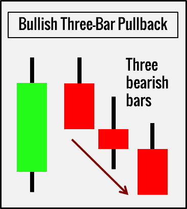
Three subsequent bearish bars form the Bullish Pullback pattern, while three subsequent bullish bars form the Bearish Pullback pattern.
What does it mean?
It is difficult for the price to form a long-term pullback against the main impulse when the market is in a trend. Consequently, a trader expects that a trend is ready for renewal after a Three-Bar Pullback.
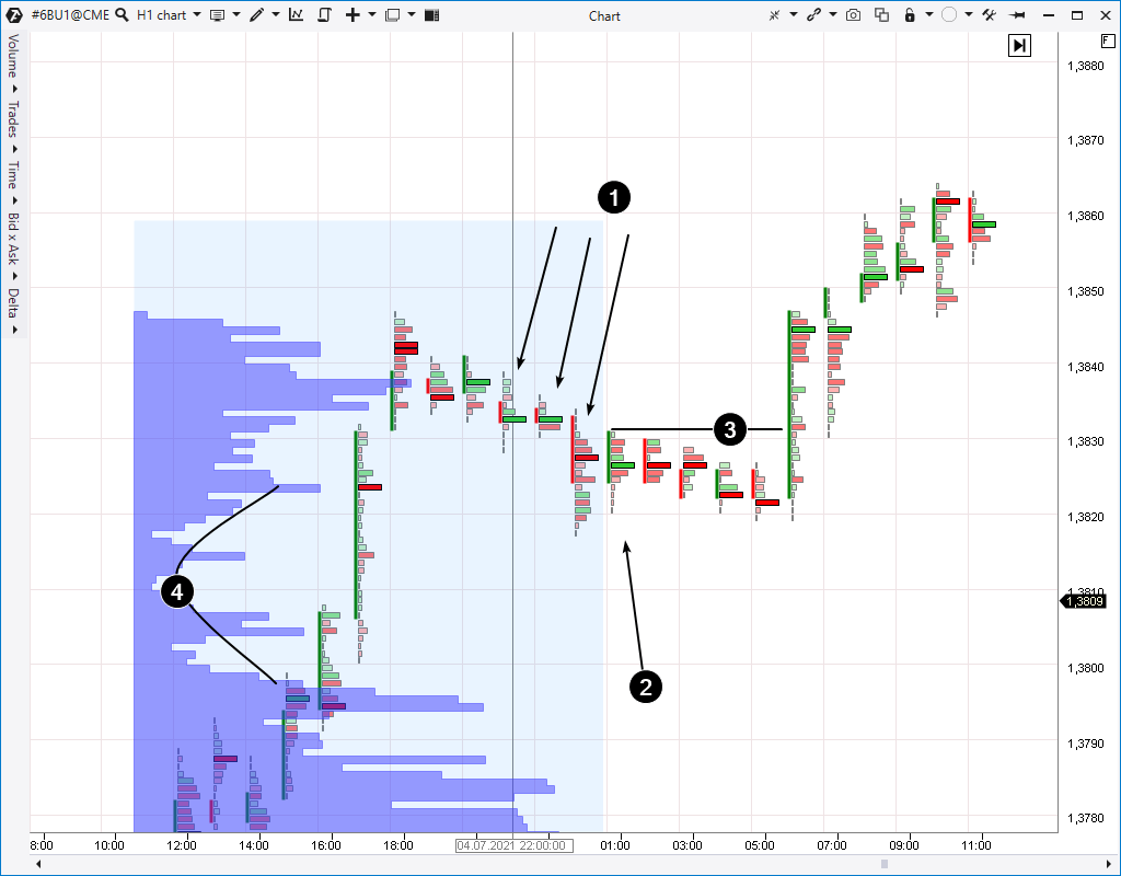
The market ‘calmed down’ after a blasting up-impulse, which took place on July 2 (we should note that it was a week-end break). Three arrows and number 1 point to a sequence of three down-bars, which fit into the general uptrend. Number 2 points to an Up Bar, which assumes that the pullback is over.
Information from horizontal volume can give confirmation that it’s high time you bought. Number 4 shows a narrow area in the profile, which was formed because the price had not met resistance in this area and exceeded the area near 1.3810-1.3820 rather quickly.
We have an individual article, which shows that such areas of disbalance quite often support the market. A trader can open a long position with more confidence if he combines this knowledge with a Three-Bar Reversal pattern signal.
How to trade?
- Wait for three subsequent bearish bars within a bullish trend and buy above the next bullish bar.
- Wait for three subsequent bullish bars within a bearish trend and buy below the next bearish bar.
Pattern 8. Inside bar
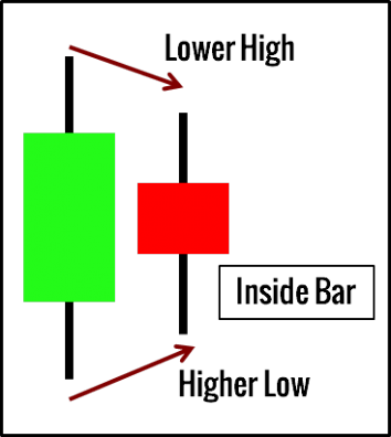
Inside Bar should stay completely within the range of a bar, located directly before it. In other words, the second bar should have a lower high and a higher low.
What does it mean?
Inside Bar is a decrease of the price range/volatility. The market stays completely within the previous bar’s range, demonstrating temporary indecisiveness. It is a pause in price movement, which doesn’t show obvious strength in any direction.
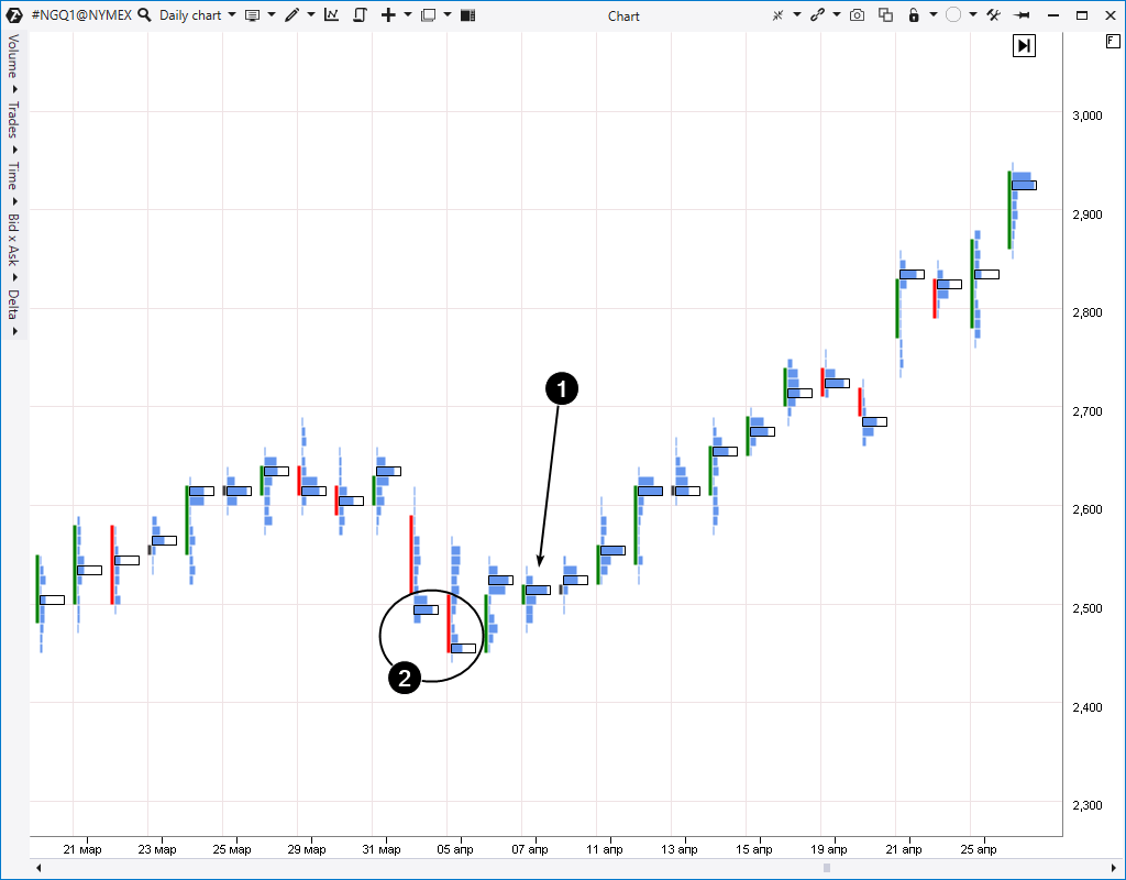
Here’s an example from the natural gas futures market. We took a daily period because many irrelevant Inside Bars, caused by different trading activity at different times of a day (you can find more details in the article about trading sessions), can be formed during a day.
Number 1 points to an Inside Bar (in fact, it is even a double Inside Bar, because the April 7 bar is inside the range of the April 6 bar, and the April 6 bar is inside the range of the April 5 bar). The April 7 bar is within the previous day’s range.
It is allowed for a trader to place orders for Inside Bar range breakouts in both directions under consolidation conditions with an intention to have a position in the direction, in which the price will move after the period of volatility decrease. However, a long position would have been more preferable in this case. Why? Look at the clusters.
It is allowed for a trader to place orders for Inside Bar range breakouts in both directions under consolidation conditions with an intention to have a position in the direction, in which the price will move after the period of volatility decrease. However, a long position would have been more preferable in this case. Why? Look at the clusters.
Number 2 shows big volumes, which the market had when the price moved down under the round level of 2,500. It was a false movement for sure. This idea is supported by the fact that the market ‘resurfaced’ above 2,500 during the next few days and consolidated there, demonstrating unwillingness to move further down. That is why, having bought on the Inside Bar breakout on April 8, a trader would have thought how to accompany the long position with a growing profit better.
How to trade?
- Place orders at both sides of the Inside Bar (a buy stop order above its high and sell stop order below the low; cancel the other order when one order has been activated) under flat conditions.
- Place one order only (buy or sell) in accordance with a market trend under trend conditions.
- Wait for an Inside Bar breakout. Accompany your position in accordance with your risk profile.
Pattern 9. Outside bar
The Outside Bar pattern is the direct opposite of the Inside Bar.
The Outside Bar range should outrange the previous bar having a higher high and a lower low.
What does it mean?
It is an expansion of the price range/volatility. It shows the impulse in both directions. In a majority of cases it is unknown whether bulls or bears have won. The only thing you can be sure of is that volatility increased. Consequently, risks also increased.
To make a more weighted decision, use cluster charts and other powerful ATAS instruments.
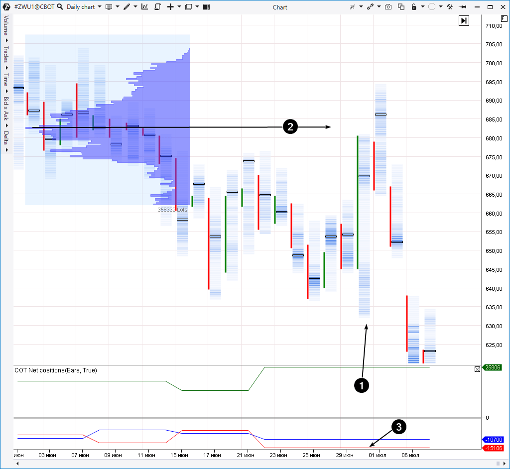
Here’s an example from the wheat futures market; daily period.
Number 1 shows an Outside Bar. At first sight, this signal has a bullish nature, because this bar engulfs ranges of many previous days and closes at the very peak. The fact that the maximum volume level is in the upper part of the bar speaks in favour of a buy.
However, having considered the situation wider, we can note that the market has shown signs of a downtrend after it was traded in the range above USD 670 (the high volume level was formed near USD 680 there, as it is shown by number 2) for a long time. That is why, any buys, executed at the Outside Bar breakout, could meet resistance immediately, which, actually, happened.
Perhaps, the volatility splash was aimed at testing the big volume level near USD 680 before continuing the downtrend. By the way, the COT report indicator shows that a group of Commercials traders (it usually acts shrewdly in this market) preferred to open short positions providing yet another warning against buys at the peak of the Outside Bar.
How to trade?
Trading rules envisage analysis of additional information sources.
As a variant:
- Wait for a bullish breakout of the Outside Bar and for impulse fading in order to enter sells. It is especially relevant for the bars, which are growing against the downtrend.
- Buy at the Outside Bar breakout with the idea that the market renews the uptrend on the way to new peaks.
The opposite is similar for selling setups.
Pattern 10. NR7
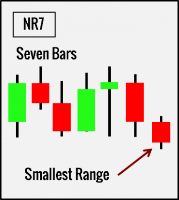
Seven bars are required for this Price Action pattern. If the last bar has the smallest bar range in the sequence, it is the NR7 pattern.
What does it mean?
NR7 points to volatility decrease as well as the Inside Bar does. The NR7 pattern is a stronger sign of volatility decrease, since lower volatility takes place in the context of seven bars.
However, unlike the Inside Bar, the NR7 pattern can stay above or below the previous bars’ ranges.
NR7 warns us about the necessity to be ready for explosive movements while the market alternates its fluctuation amplitude between contraction and expansion.
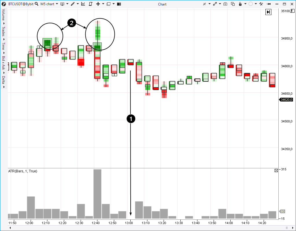
Here’s an example from the bitcoin market.
Number 1 points to the NR7 pattern. In order to detect it easier, we added the ATR indicator to the chart in the histogram format with the period = 1. The ‘dip’ in the histogram tells us that the market ‘froze’ and a trader, perhaps, should get ready for entering a position along the movement, which should start.
In what direction will the movement go? The NR7 pattern doesn’t give a valid answer. It is popularly believed that traders should prefer trades in the main trend direction. However, we can make more justified conclusions using cluster charts from the ATAS platform.
Note the splash of active buys, marked with number 2. They are apparent due to bright green clusters and Big Trades indicator signals. If these were buyers’ efforts to push the price through the round level of USD 35,000, we have enough facts to state that those efforts failed. Most probably, it was a false bullish breakout of psychological resistance, which often occurs with the aim to activate seller stop losses before a down-impulse starts (you will find more details in the article about upthrusts). That is why, if a trader has described indications in the chart, he has grounds to go for bitcoin selling when the NR7 pattern low is broken.
How to trade?
Use classical rules:
- Buy the last bar’s high breakout if it is an uptrend.
- Sell the last bar’s low breakout if it is a downtrend.
Use information from cluster charts to make more justified decisions. This recommendation is true for trading by any Price Action pattern.
Conclusions
The Price Action method doesn’t guarantee that you will make money trading on exchanges. There is no proof whatsoever that Price Action patterns will increase your account even if some Internet expert, who trades Price Action patterns, tries to convince you of their profitability. That is why we strongly recommend you to conduct a trustworthy experiment on your demo account before you put real money at risk.
Price Action patterns, whether they are graphical patterns or Japanese candle patterns or patterns that are represented in proprietary methodology, can be improved by means of cluster charts.
Since Price Action patterns intersect with other methods, we give you several links that can be useful:
- Japanese candle patterns, as Price Action patterns: one and two.
- Graphical technical analysis patterns, as Price Action patterns: one and two.
Download the ATAS platform to make sure that cluster charts help in understanding real stock exchange processes.
Information in this article cannot be perceived as a call for investing or buying/selling of any asset on the exchange. All situations, discussed in the article, are provided with the purpose of getting acquainted with the functionality and advantages of the ATAS platform.

