ATAS has 14 chart types – from standard time charts to tailor made range charts. We will speak about Reversal Charts in this article.
Setting the Reversal Chart
You can select this type of display in the upper menu. There are two default variants – 7/4 and 10/5, but you can add any variant of yours.
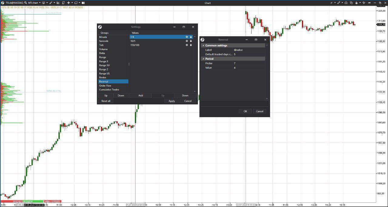
These charts are not connected with time. A new bar emerges when two conditions coincide:
- the price passes a certain number of ticks from the opening – it is a minimum bar height. The price could move up and down and the movement is not necessarily focused;
- the price reverses and passes a certain number of ticks in the opposite direction – this value is set in settings.
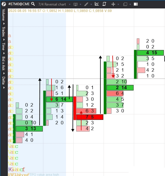
Black arrows in our example show the minimum bar height – 7, while red arrows show the rollback – 4. Not all the bars will have tails, sometimes the next bar could just open significantly lower or higher. The minimum height could be higher or lower than the rollback depending on the trading strategy. It is better to select settings for any instrument by way of trial.
The longer the candle with any chart settings, the stronger the impulse was, because the bar heights were limited only by the minimum value.
Using Reversal Charts
Reversal Charts were developed for identification of market reversals, but they could also be used in different trading situations. We will show you examples further on.
For the market noise filtration and better visualisation. Let’s compare the 5-minute and Reversal charts of the Tesla stock. We added the Volume and Market Profile (in the form of TPO) indicators to the chart. These charts are very different visually.
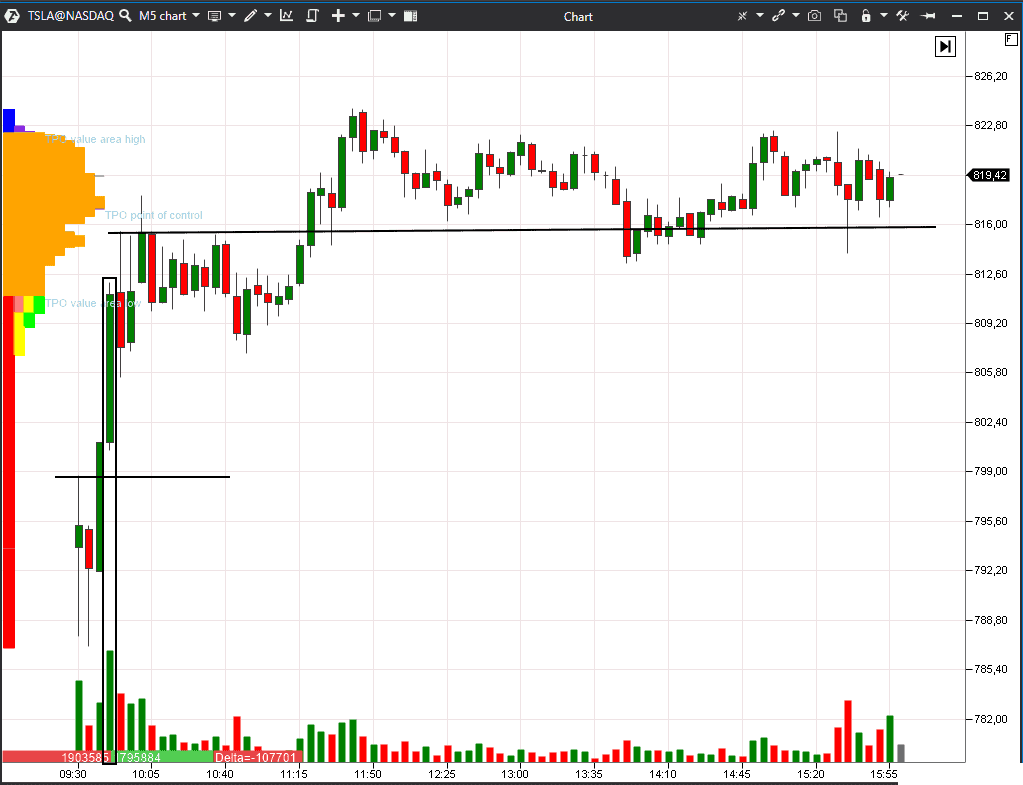
We see two huge green candles at the beginning of the trading session in this 5-minute chart. If a trader failed to take part in this movement (which is quite possible), then the marked candle opened above the first bar’s high – it means he missed the strongest impulse of the day.
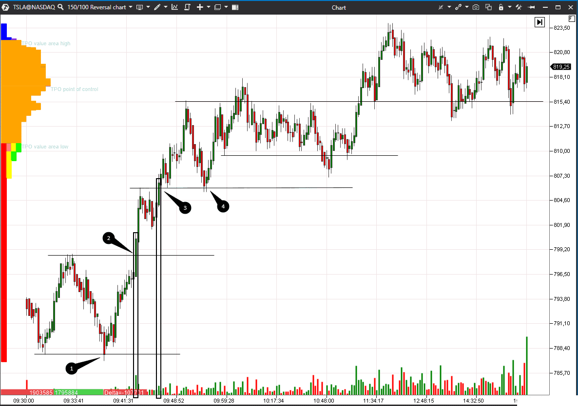
There were more trading opportunities and the profit potential was much higher in the 150/100 Reversal Chart.
- We see the market reversal in the chart in point 1 – it is the second low at the support level, that is why risk is low here.
- The price breaks the previous high on the increased volume in point 2. The green candle is rather long, which means that traders bought without much resistance.
- The price breaks the previous high again in point 3. The volume here is lower than in point 2 but higher than in previous bars.
- The price stops at the level of one of the previous highs in point 4.
We will not analyse the whole trading session but will just note that impulses are seen much better in this chart than in the time one. Green candles are longer and their volume is bigger than in red candles – it means the buyers are more aggressive.
For competitive advantage, because the charts differ from time ones, with which the majority of traders work. A trader may act faster and more efficiently when he looks at the trading session at another angle.
For working out a certain trading idea or strategy – for example, for the search of clusters by the set criteria after a rollback. The Reversal Chart type will show more candles with shadow in this case.
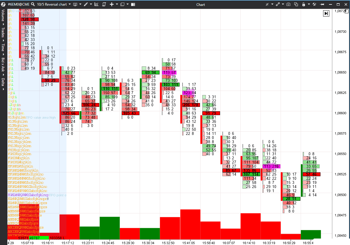
Let’s consider an example of a 10/5 Reversal Chart of the EUR futures (6E). We added the Volume and Profile (in the form of TPO) indicators as well as two Cluster Search indicators.
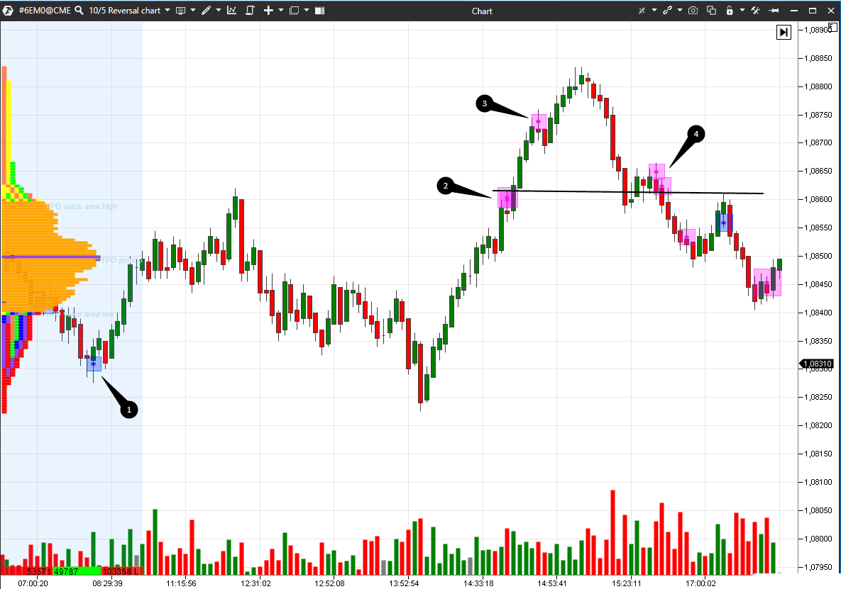
The first indicator looks for asks of more than 100 contracts in bullish candles on the lower shadow and marks them with blue squares. The bigger the square, the bigger number of contracts were bought. We want to see big buys at the candle’s bottom, after which the price moved up. If the next candle closes higher, it means the buyers are strong.
The second indicator looks for bids of more than 100 contracts in bearish candles on the upper shadow and marks them with lilac squares. We want to see big sells at the candle’s top, after which the price moved down. If the next candle closes lower, it means the sellers are strong.
The local trend should be taken into account for correct analysis. If lows go up, it makes sense to buy. If the highs go down, it makes sense to sell.
- Point 1: the Cluster Search indicator shows major buyers, the volume increases and the candle with a long bottom shadow closes above the previous candle – all these signs could be used as the reversal indicator.
- Points 2 and 3: there is a growing local trend where either buyers register profit or sellers try to accelerate the reversal. It is risky to open short sells here since there are no other signs of a trend change.
- Point 4: sellers appear again after formation of a new lower high. The fact that this level approximately coincides with the level 2 adds confidence when opening short trades.
Let’s enlarge the chart and look at the marked clusters in the Footprint (how to use Footprint). Lilac squares are big sells on the upper shadow of bearish candles.
How to set the market reversal indicator
Traders often ask the question how to identify the market reversal. Nominally, the following reversal types could be specified:- V-reversal on two bars. Ideally, the first bar is falling and has high volume while the second bar is growing and completely overlaps the first bar.
- W-reversal is represented by such chart patterns as ‘head and shoulders’, double and triple peaks and valleys.
- U-reversal is smoother and consolidation takes place while the price is at low or high.
It is profitable to trade at local lows or highs, because the risk is much lower here than the movement potential.
Summary
Reversal Charts show the market reversal clearer plus the strengths of buy and sell impulses could be compared between themselves due to the different candle sizes.
Some trading software has reversal indicators, which look for and mark local highs and lows or reversal bars. As well as other technical analysis indicators, they lag behind and/or produce false signals, that is why it might be inefficient to use them in trading.
Reversal Charts, cluster indicators, understanding trading psychology and market player logic increase efficiency of your trading strategy and create competitive advantage.


