The nuances and benefits of using Range XV
Range XV is a special chart type. It significantly differs from standard chart types, built on the basis of equal time intervals (time-frames and periods). If you are looking for fresh trading ideas and want to build a unique strategy – take heed of Range XV. In this article, we will describe this chart type, which has a long history, in detail. Range XV originates from Japan, as well as many other charts. However, to understand Range XV we start from afar – from Japanese candles. Read in this article:
- Introduction into Japanese candlestick patterns.
- What a Range XV chart is.
- How a Range XV chart goes with indicators of technical and volume analysis.
- How to add and set up a Range XV chart.
Introduction into candlestick patterns
The majority of us consider it to be customary to analyze the market with the help of a candlestick chart. Japanese candles came into the use of traders and analysts so long ago that it is difficult to say when they first appeared. In fact, Japanese candles were invented and put into circulation by a Japanese rice trader Homma Munehisa as early as in the 18th century after rice exchanges started to operate in 1730. Since then, Japanese candles continue to be used in their original form by modern traders. A specific feature of Japanese candles is the fact that each candle has 4 reference points. Each candle reflects the price action for a certain period of time, hence we have time intervals (time-frames). Each of 4 reference points influences the look of every individual candle.
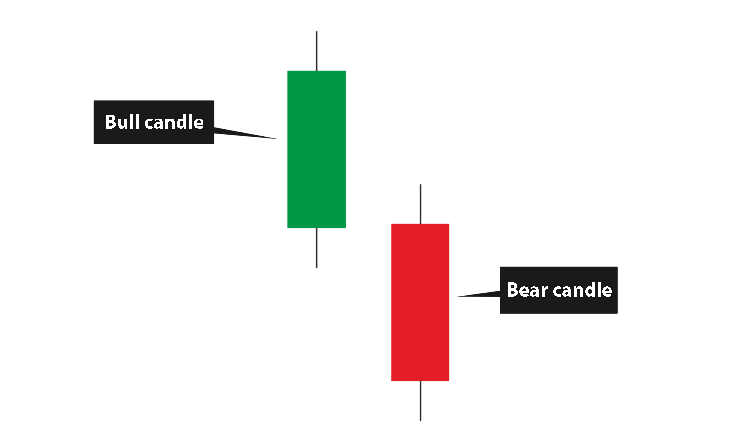
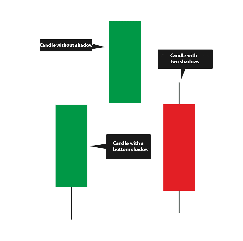
The first two points are the candle opening and closing prices. Opening means that the previous time interval is finished and a new one starts and a new candle starts its formation namely from this point. The candle is not considered to be closed until the current time interval is not finished, which means that its look may change. The candle takes the final look only after the current time interval is finished. It will depend namely on where the candle was closed (above or below the price of opening) whether it would be a bullish or bearish candle. Remember that a bullish candle is also called ascending and bearish – descending. This analogy came from the world of animals where a bull throws its prey upward and a bear tries to pin its prey to the ground. The picture below shows an example of an ascending and descending candles.
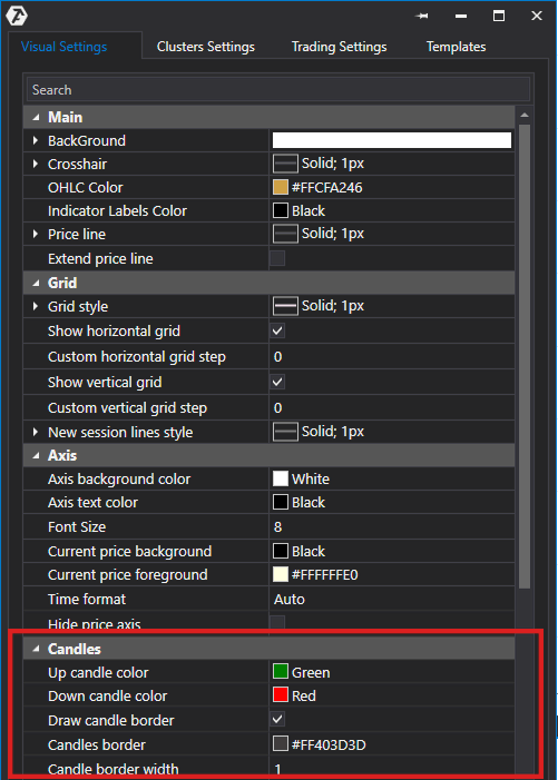
It is impossible to differentiate ascending and descending candles without colouring them, that is why it is generally accepted to colour ascending candles green and descending candles red. However, colour preferences are personal, that is why the ATAS platform provides you with a possibility to select colours for your chart individually. To do it you need to open visual chart settings (mouseover the chart and click the right mouse button) and go to the candle parameter section. Here you will find all necessary settings for customization of the candle look in the chart:
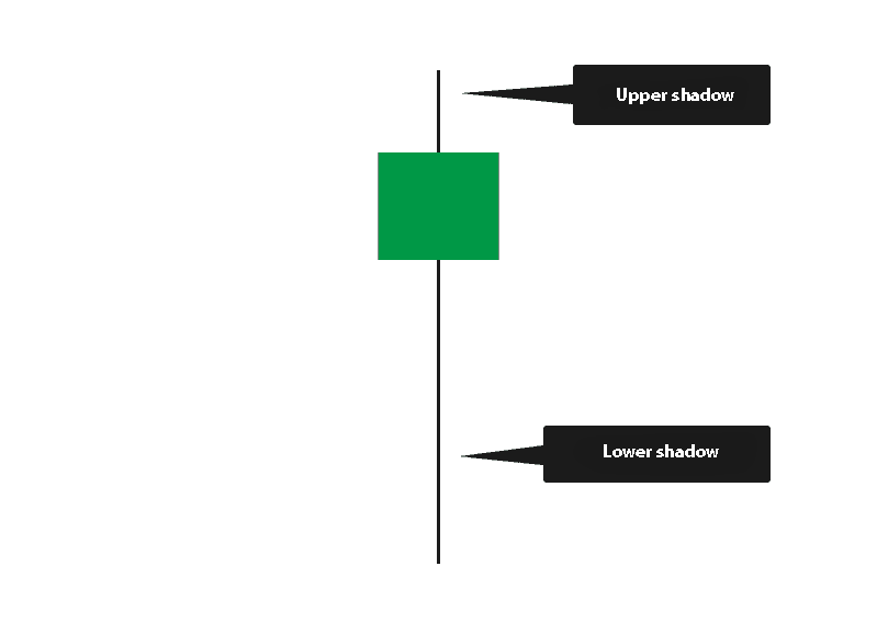
Apart from opening and closing points, the Japanese candles also have low and high points, since, while moving inside a time interval, the price may form extreme points, moreover, the candle closing points could be below the high or above the low. Shadows, or how they are also called ‘tails’, are formed under such circumstances.
However, not every candle has shadows. Shadows might be absent. In such cases points of opening and closing are extreme points. Another individual case is when a candle has one shadow only – above or below.
Due to availability of 4 reference points in Japanese candles, the chart becomes more informative than a linear chart built by the prices of closing. Japanese candles started to visually reflect a behavioural factor in the market. Various chart patterns, characteristic for the market reversals or trend continuation, developed in the course of time.
What a Range XV chart is
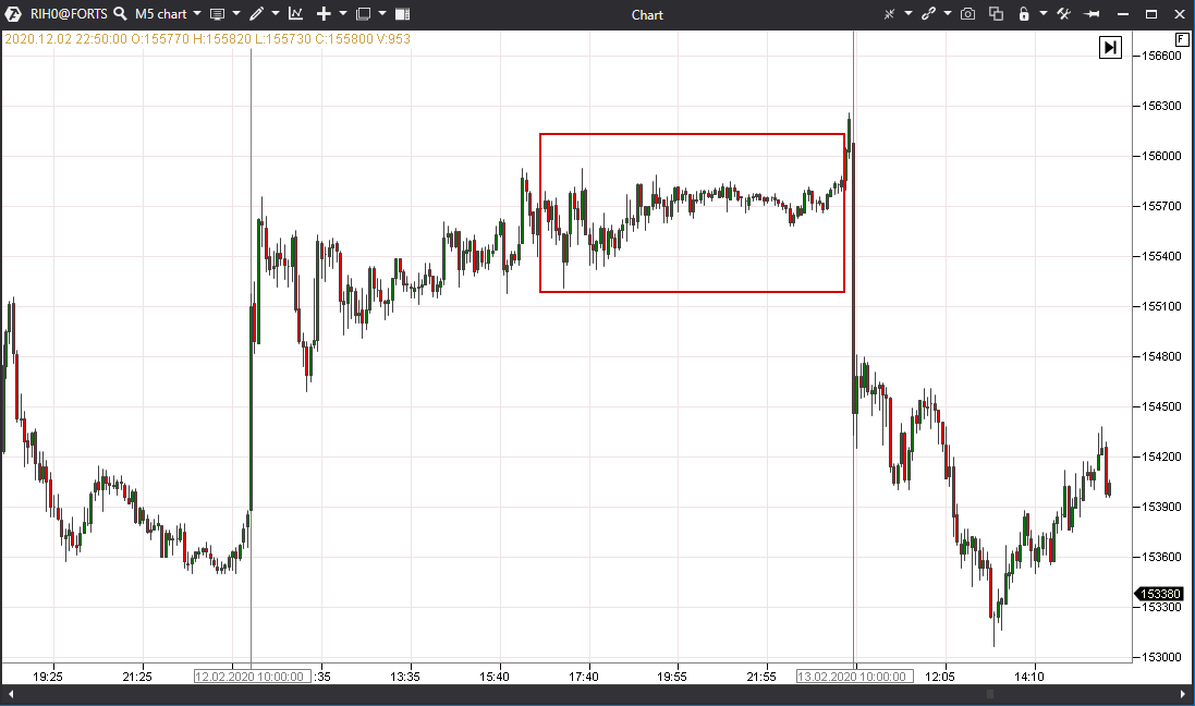
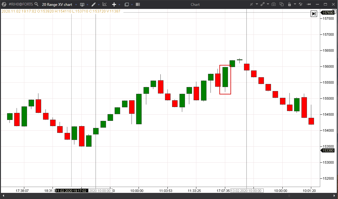
There is an evolution of Japanese candles, which we observe nowadays. The principle of formation of a candle by 4 reference points stays unchanged, however, other bases than the time axis are used: for example, volume, delta, ticks, points and others. If we do not use time but a number of points the price passes after the opening or closing the previous candle, we can get a Range format chart. One such format is Range XV, which is available in the ATAS platform. The principle of candle building in the Range XV format is closed in accordance with the agreement with its developer, however, it is evident that such a chart format allows identifying trends and filtering out market noise more efficiently. As an example (the picture below), please check one and the same area in the 5-minute chart (to the left) and 20-point Range XV (to the right):
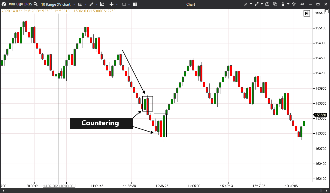
The left chart shows a lengthy flat, which lasted for 5 hours, while this period is displayed as one candle only in the Range XV format. While observing the candle formation in the Range XV format, note that if the price moves in any direction without counteraction – the candles will be formed one after another in a row. The opposite colour candles start to emerge as soon as the price meets counteraction.
Thus, the chart in the Range XV format shows areas of possible change of the movement direction. In case of such an approach, it would be interesting to supplement the chart with the indicators of technical or volume analysis.
How a Range XV chart goes with indicators of technical and volume analysis
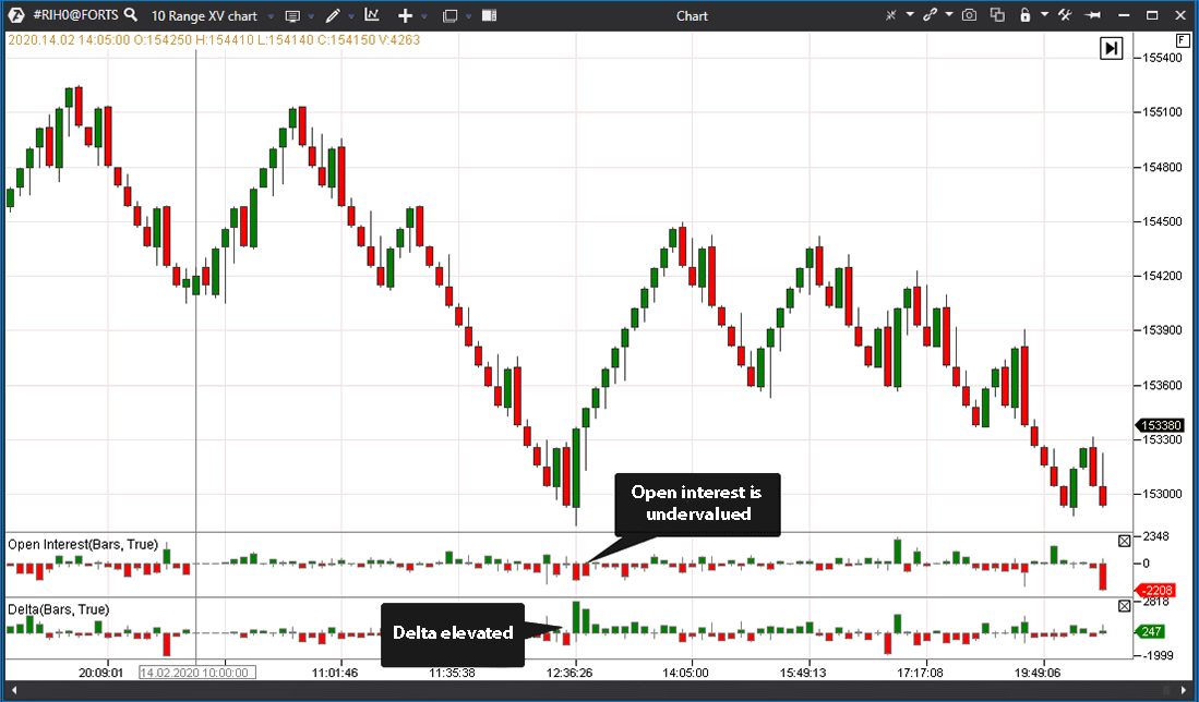
The below example shows the same area, where a high interest of buyers is seen on the Delta indicator and decrease of positions of both sides of the market is clearly traced by the Open Interest indicator. We could assume on the basis of these data that a good trend down movement will be exhausted at this moment.
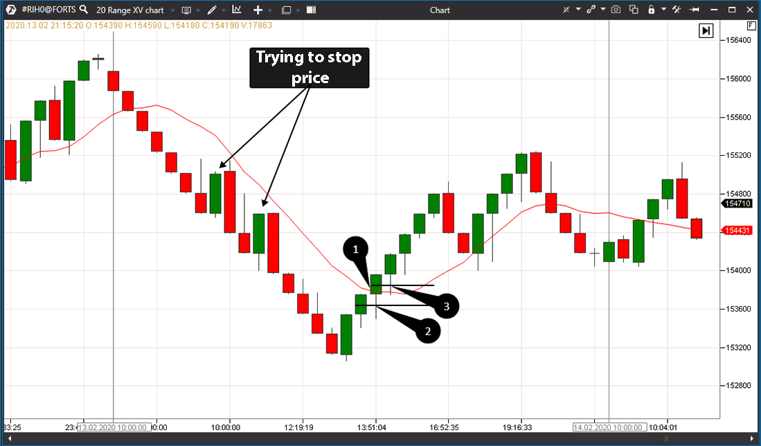
Let’s see how the Range XV chart goes with a simple moving average (SMA). The picture below shows the Range XV (20) RIH0 futures chart.
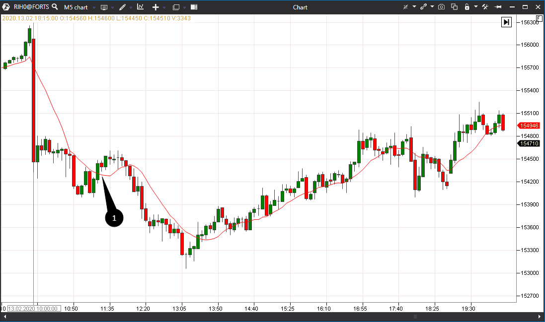
The chart breaks the moving average with an upward move in point 1 after a lengthy down movement during a day. Despite the fact that efforts to stop the price were undertaken above, this is the first case when SMA breakout takes place and the price consolidates above. Now, every opposite correction may be perceived as a good point of entry for bullish trading. We recommend using the middle levels of the previous candles (marked with points 2 and 3 in the picture) for entering a bullish trade. A stop, in this case, is posted behind the low of the candle, from the middle of which a trade is opened. Why does the SMA chart with such candle building differ from the SMA chart in a standard candlestick chart? We may notice in the candle chart that the SMA was falsely broken in point 1, although this breakout is not seen in the chart in the Range XV format:
The matter is that the SMA uses the period, which includes every bar and every candle, and calculates the average price by the points of closing the candles. Due to the fact that the chart ‘slowed down’ for some time in point 1, the SMA decided that the average price started to shift towards the asset growth. Unlike a standard 5-minute chart, the Range XV ‘packs’ this area in one candle only and, consequently, this cannot influence the SMA shift.
How to add and set up the Range XV chart
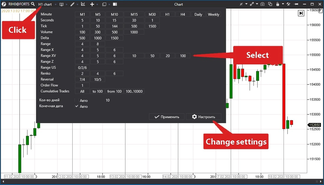
In order to change the type of a standard chart to the Range XV type, it is necessary to click the Period field (point 1 in the picture below).
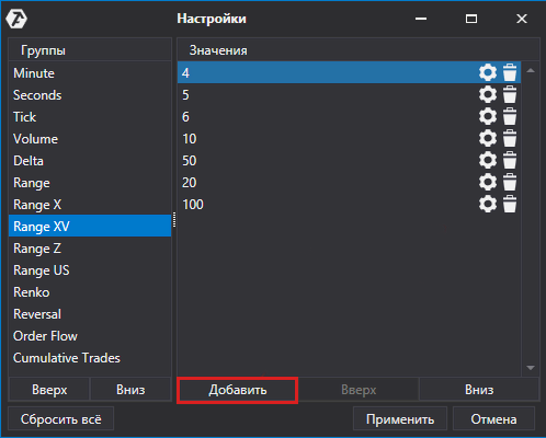
Further on, it is necessary to select the Range XV chart period from the available values. If the preset parameters do not satisfy you, press Change Settings and set individual parameters for the chart.
After adding new parameters, individual settings are saved and, from now on, they will be available along with the preset ones.
Summary
We can state in the end that the chart in the Range XV format shows domination of the initiative in real time. We can see the following in such a chart:
- who controls the market – buyers or sellers;
- where counteraction starts.
The Range XV chart format is really convenient for identifying points of counteraction to the main price movement and could be used in a combination with other indicators both in a manual and algorithmic trading systems. If you have found this article about Range XV interesting, you can also read the Chart types article. It gives more examples of building nonstandard charts for exchange trading.

