What can the cluster charts tell you?
What advantages clusters give? Real information, received before the others received it, allowed Rothchilds to play a lossless game on the exchange. Namely that is why Nathan Rothchild pronounced his legendary utterance: ‘He Who Owns Information Owns the World’. Nowadays, cluster charts help to receive more information than other market participants.
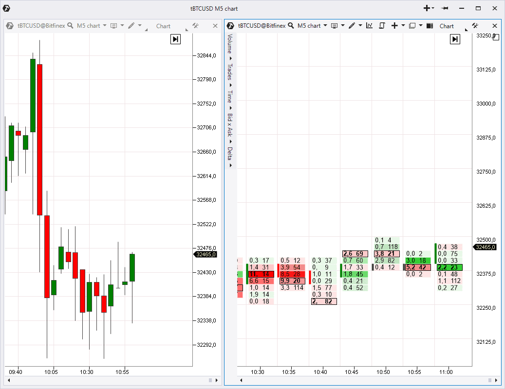
Usually, a majority of traders can see candles only (to the left). Unlike them, the traders that work with cluster charts (or Footprints) can ‘look into candles’ to learn what really happened there.
In the end, this valuable information could give a trader understanding of real processes that take place in the market, while others would focus on candlestick formations, moving averages and classical technical analysis oscillators, efficiency of which is doubtful.
The ATAS platform provides a surprising possibility to build 25 various types of cluster charts for stocks, futures and cryptocurrencies.
Third article subject – Working with clusters
This article from the ‘Getting acquainted with ATAS’ series will be interesting for the platform beginner users and for those who have got acquainted with exchange volumes and Footprint just recently.
How to open a cluster chart
You already can open charts after the first two articles of the ‘Getting acquainted with ATAS’ series. By default, the platform opens a standard candlestick chart.
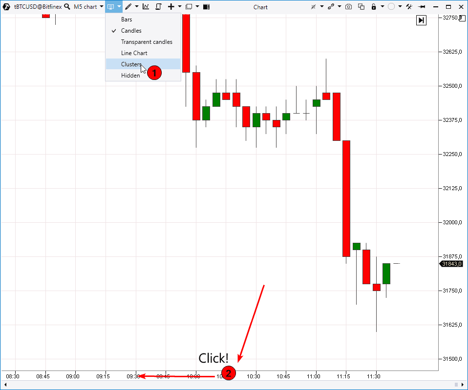
You can use any of the following ways to transform it into a cluster one:
- select the MODES item in the upper panel and click Clusters;
click the time axis and, without releasing the mouse button, expand candles horizontally until clusters appear.
Vertical scaling
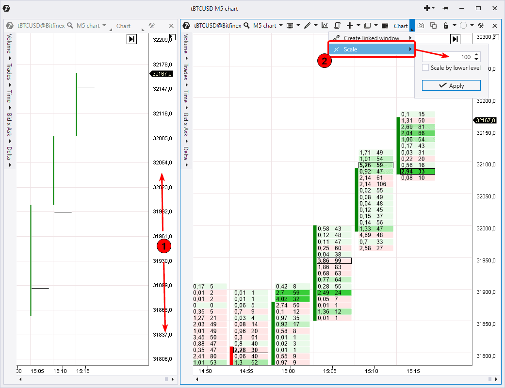
If the markets are too volatile, clusters could be displayed incorrectly (see the example below to the left). For example, this often happens when a day chart or bitcoin chart on cryptocurrency exchanges are loaded.
If you see such ‘empty’ clusters (in fact, they are so thin that they are not displayed on the screen), you need to drag the price scale vertically until clusters are displayed (1). However, there is one more variant (we recommend to use it) – to change the scale in the upper menu panel using the Scale item (2).
For example, if we set Scale=100, the ATAS platform will unite the closest 100 levels, converting these 10 prices in 1 cluster. After that, the chart will look like in the picture to the right. Acting this way, we will significantly reduce the number of displayed clusters and the volumes will look more compact.
Apart from a visually clearer picture, you would also reduce the load on your computer since less price levels will be displayed.
What clusters show
Before reviewing the cluster chart modes, we will speak about order matching since reading clusters is directly connected with this mechanism.
To do it, we will use the Depth Of Market indicator (it is added to the chart by default and is shown to the right in the form of a horizontal bar chart consisting of red and green bars).
The indicator reflects limit sell orders in red colour in the upper section (1). Limit buy orders are displayed in green colour below the price (2). The longer the bar, the more orders are posted at this level.
These bars are constantly changing in the real market since participants of trading cancel, add and change their orders.
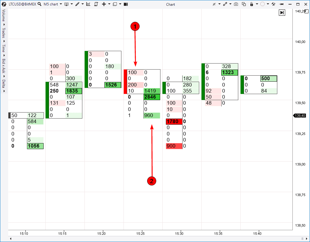
Let’s assume you want to sell an asset immediately. You send your order to the broker asking to sell the asset immediately at the price available at the moment. The broker sends your order to the exchange.
The trade will be executed when your aggressive sell order meets a limit buy order. This operation will be shown in red in the cluster chart (3). It means a trade, in which the seller’s market order was matched with the buyers limit order.
By the way, if you send a very big aggressive sell order, your operation could be executed through a series of trades at several prices, since your big volume will be matched with several small limit buy orders.
- You can see aggressive sell orders, matched with limit buy orders, in the left part of the Footprint in red colour (1).
- You can see aggressive buys, matched with limit sell orders, in the right column (2).
When there are more aggressive orders than limit ones, the price moves in the search of new liquidity and this process constantly drives the market.
Let’s summarise the above. Every trade has both a seller and buyer. If you see 2 buy contracts in the green column in the Footprint, it means that there are 2 seller contracts, which he sent for selling using a limit order, ‘from the opposite side’. This information is important for understanding in what column the processes take place.
By the way, a market order doesn’t guarantee the striking price. When you buy, the limit seller price may change and you will buy at a worse price.
Useful link:
Let’s speak about modes now.
Cluster charts modes and display settings
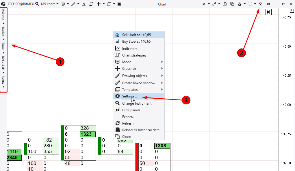
When you open clusters, you see a menu to the right (1).
There are 5 cluster modes in this menu. They are:
- Volume,
- Trades,
- Time,
- Bid х Ask,
- Delta.
Visual settings are very important for convenient and more efficient cluster analysis. Let’s check how we may set up contrast, colours and other display parameters.
In order to open visual settings of the cluster chart, use one of the following ways:
- click the Settings icon in the right upper corner (2);
- mouseover the chart, click the right mouse button and select Settings (3).
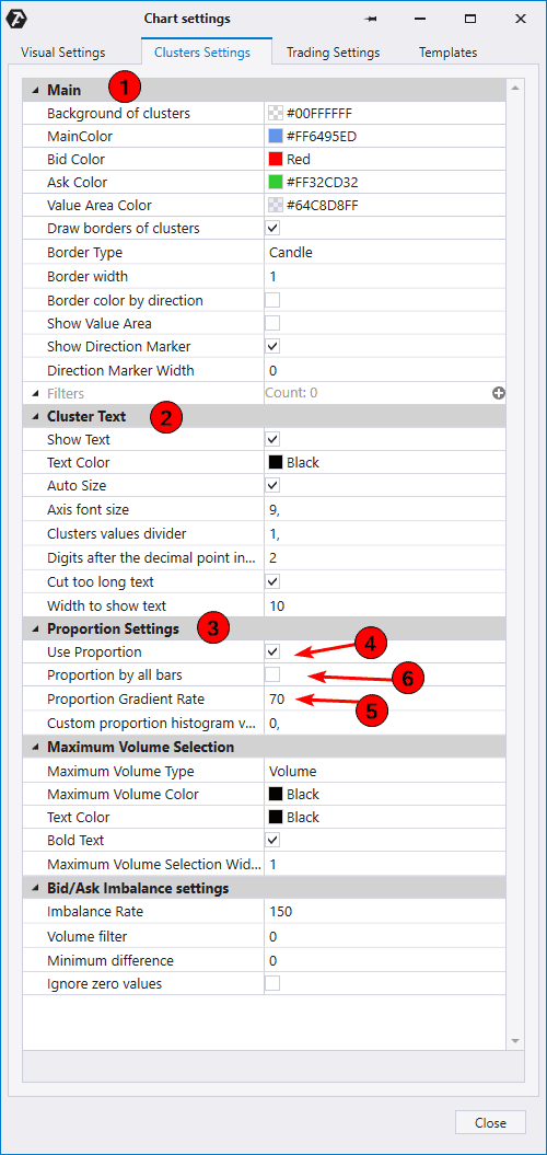
We need the Cluster Settings tab. Let’s consider it in more detail in the following screenshot.
- You may change the cluster background and colour (1) and border parameters in the upper section of the Settings window.
- Parameters for displaying text (numbers) inside clusters are set in the Cluster Text section (2).
- The Proportion Settings section (3) has the Use Proportion checkbox (4). If we check it, we may change the Proportion Gradient Rate (5). Try to increase the rate and you will see that there are less contrast clusters. If you check the Proportion by all bars item (6), ATAS will analyse all candles loaded in the chart and you will see contrast clusters with respect to the whole history. Pale clusters have much smaller volumes. Try various rate values and find out which one fits you best of all.
The Volume mode
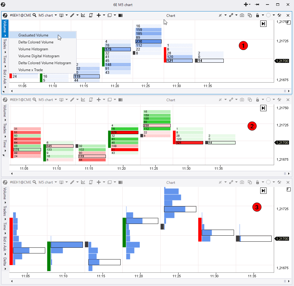
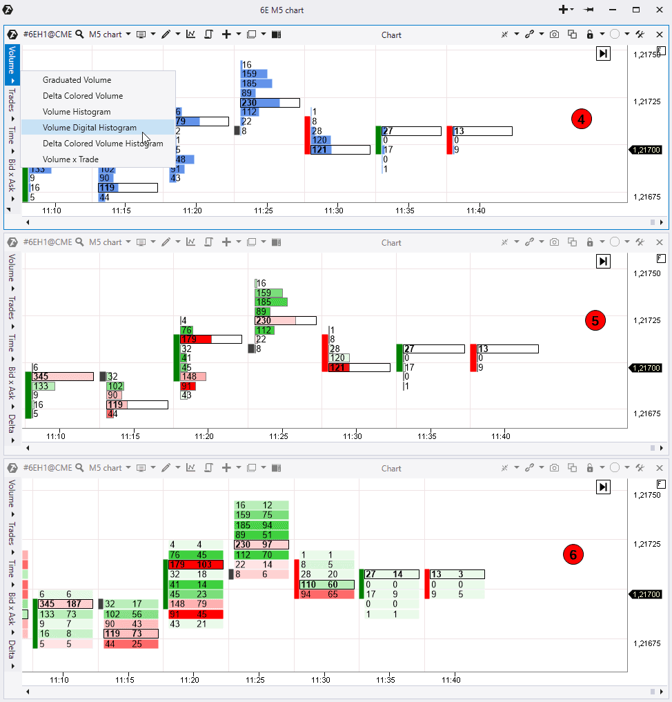
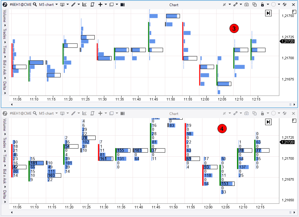
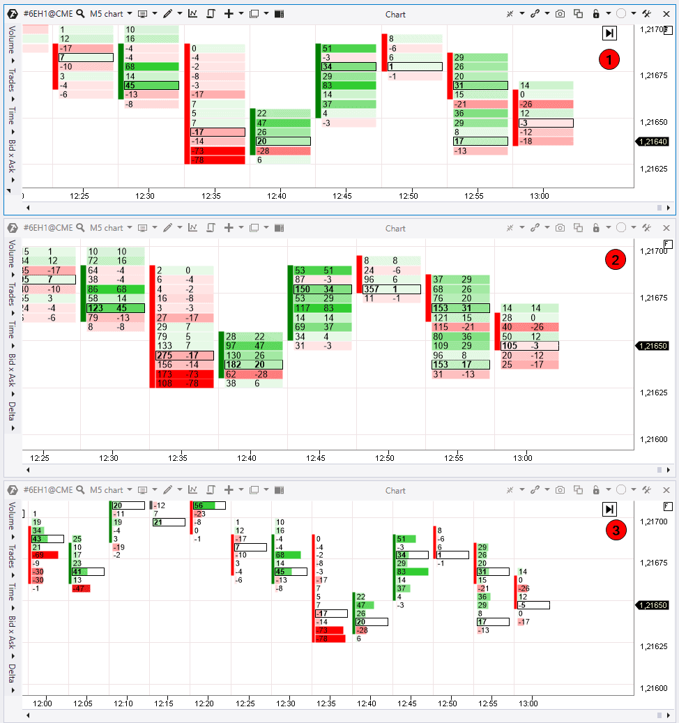
The Volume mode displays clusters with the aggregate volume of executed buys and sells at each price. There are 6 variations in this mode.
Graduated Volume (1) displays colour gradient or contrast based on where there were more trades and where less.
Delta Colored Volume (2) highlights the volume in red and green colours. This shows what Delta was at each price. Delta is calculated using the Ask – Bid formula. Delta is positive and green when there are more Asks than Bids. Delta is negative and red when there are more Bids than Asks.
The middle chart shows volumes at each price in the form of numbers but additionally it shows who won at each level – the buyer or seller. The contrast also helps to identify whether it was a big Delta dominance or small.
The next variant is Volume Histogram (3). This is the volume profile in each candle, besides the maximum volume is marked with black frame in every profile. You can see here (in the lower chart) where there were volume accumulations in candles. You can also see where there were imbalances when the price accelerated. Pay attention to such imbalance levels in the profile since they often influence the price in the short run.
The next variant is Volume Digital Histogram and it adds volume numeric values to the profile at each level (4).
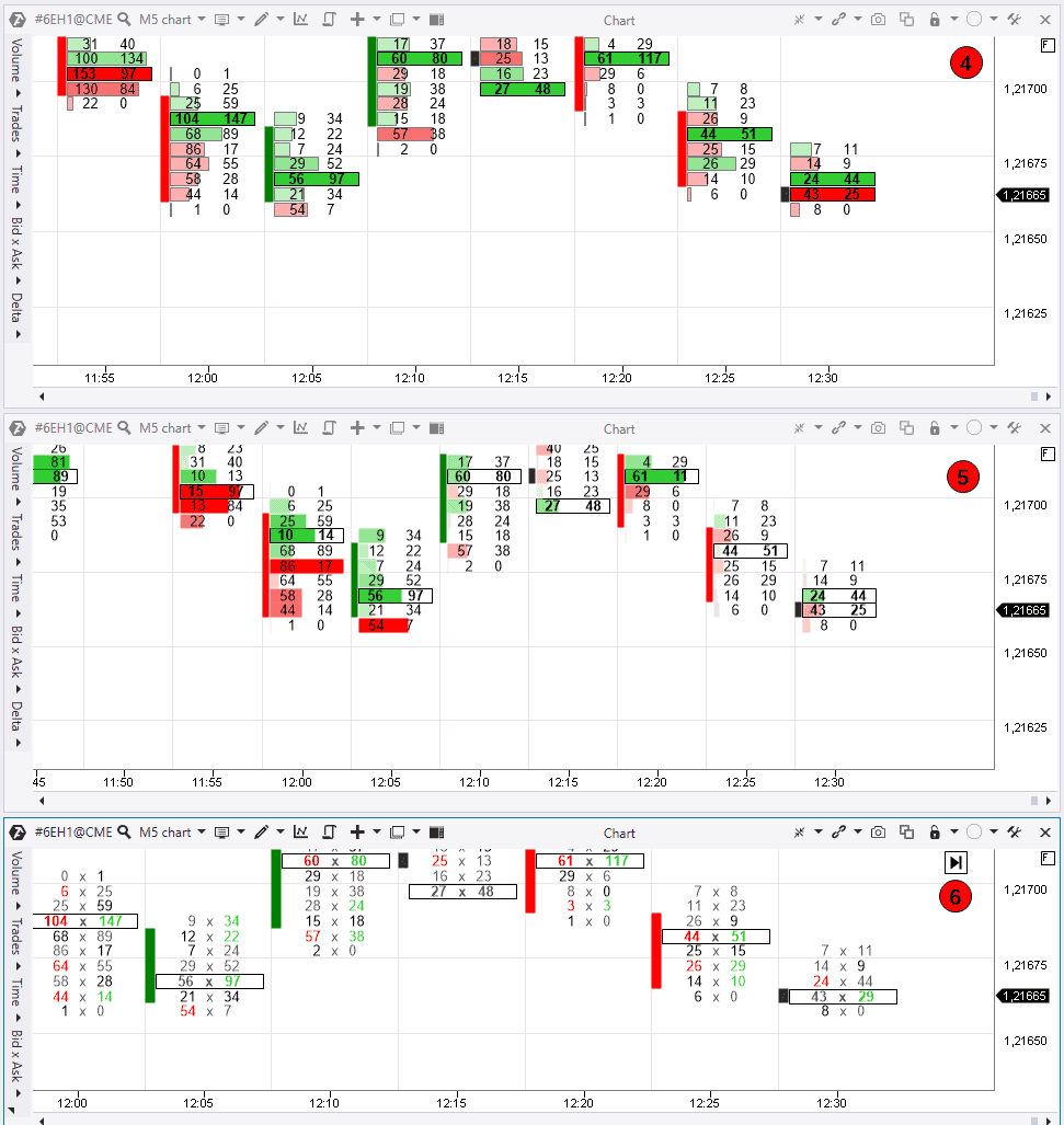
The next variant is Delta Colored Volume Histogram (5) and it shows the Delta highlighted profile. It is convenient to watch such levels and their colours by contrast.
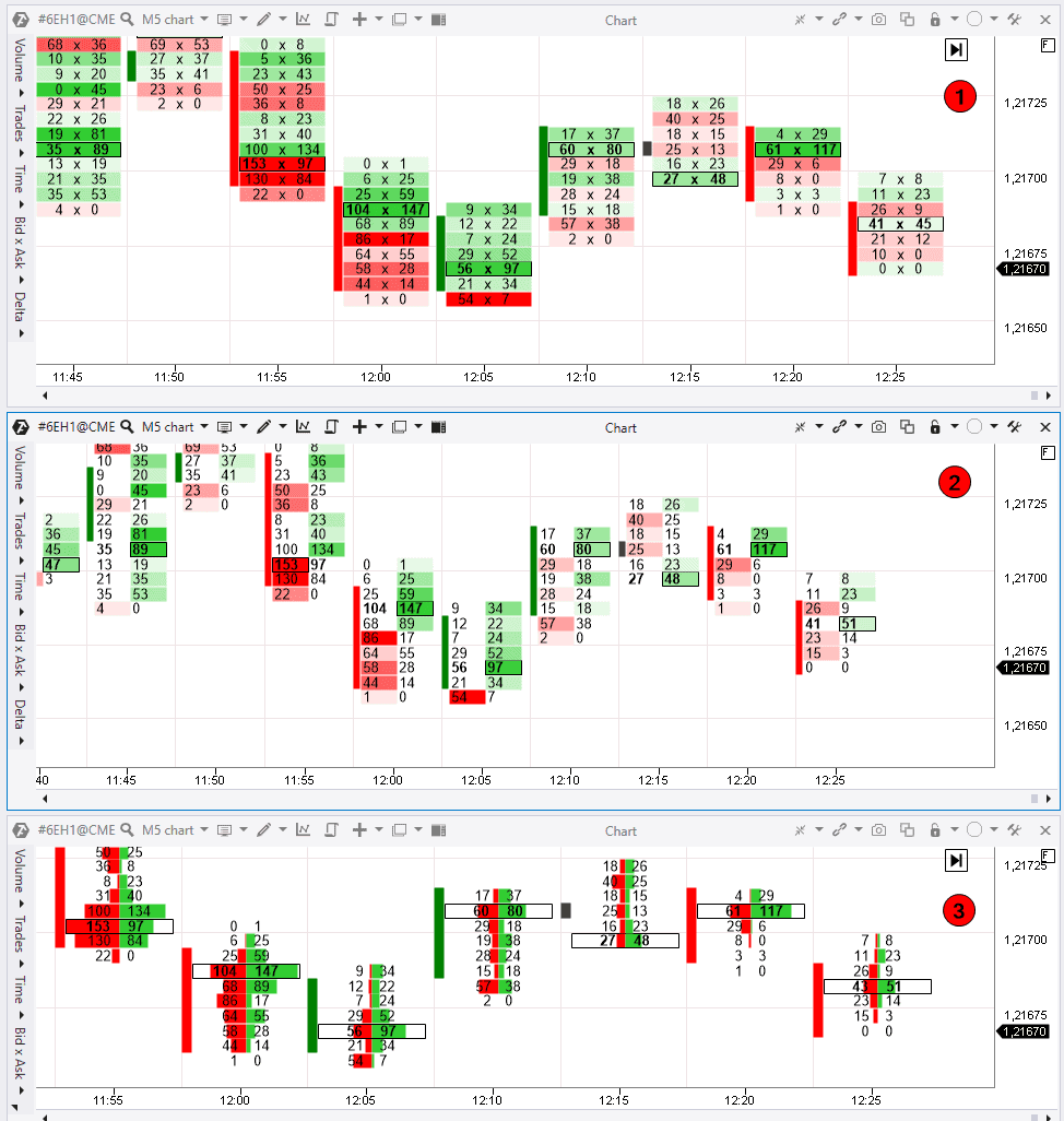
The last variant in this mode is Volume Trade (6). Information about trades is displayed in 2 columns in this variant. There is an aggregate volume to the left and the number of trades, in which this volume was traded, to the right. If we divide it into trades, we get the average volume value in 1 trade in this cell.
So, we have covered the Volume mode and now we will speak about the Trades mode.
The Trades mode
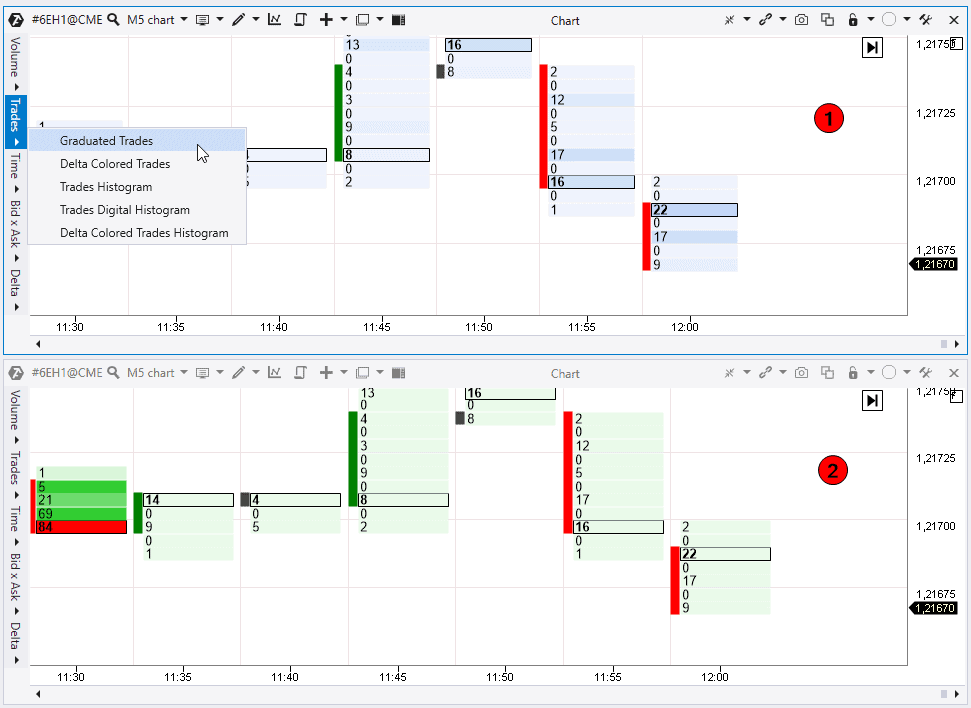
This mode presents a similar set of cluster chart variants as it is in the Volume mode. However, you will see here the number of trades, executed at each price, instead of trading volumes. The volume of these trades makes no difference.
The first variant is Graduated Trades (1) and it shows how those places, where there were more trades, are marked with gradients. The brighter the contrast, the more trades there are.
Then goes the Delta Trades (2) variant with the Delta colouring. The higher the cluster colour contrast, the bigger the predominance of buyers or sellers is.
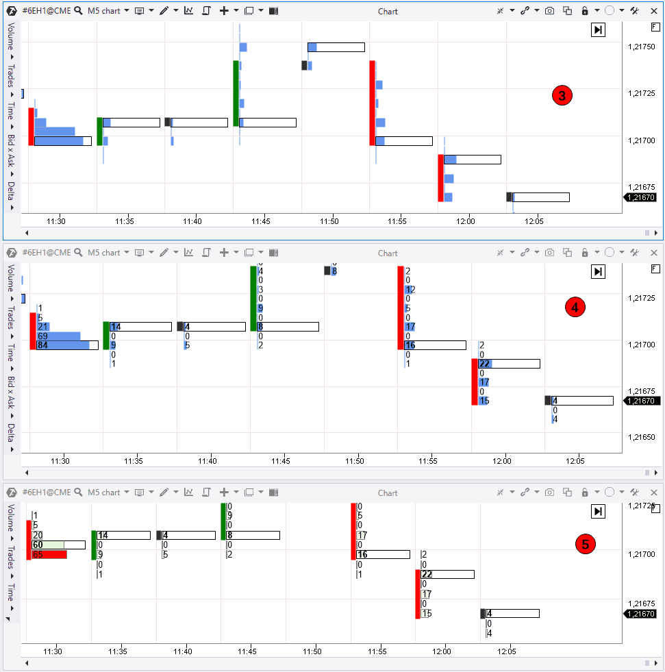
The Trades Histogram (3) variant displays executed trades in the form of a profile. Imbalance and balance levels are of interest here since the price often reacts to these levels.
Note that the histogram is built in candles in proportion to other candles. If you need to turn off proportionality, go to the chart and then cluster settings and uncheck the Use Proportion item. Now you will see correlation of levels in each candle independent of values of neighbouring candles.
The next valiant is Trades Digital Histogram (4) and it shows how many trades were executed at each level.
The last variant is Delta Colored Trades Histogram (5) with Delta colouring. You can track predominance of buyers or sellers, combining this information with the number of executed trades.
The Time mode
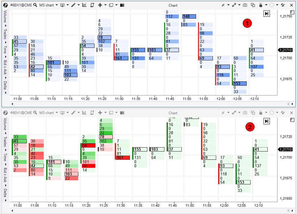
Then goes the Time cluster mode. Numbers reflect the number of seconds in this mode. Number 1 means that the price was at this level for 1 second during the candle formation.
The Graduated Time (1) variant marks those places with contrast, where the price didn’t stay long and where it stayed for a long period of time.
Then goes the Delta Colored Time (2) variant with the Delta highlight. As before, the brighter the colour, the bigger the predominance between the buyer and seller is.
Also, the cluster charts with the Time mode have histogram variants without numbers (3, Time Histogram) and with numbers (4, Time Digital Histogram), which show the number of seconds.
The Bid x Ask mode
Now we will consider the most informative mode, which is Bid x Ask. This mode is popular among those traders who analyse the Footprint and buyer and seller trades in dynamics.
There are 7 variants in the Bid x Ask mode.
The first variant is Bid x Ask (1). The platform presents information in 2 columns. The left column shows aggressive sell trades and the right one – aggressive buy trades. If there are more sellers than buyers, the cell is highlighted red. If there are more buyers, the cell is green.
The Bid x Ask Ladder (2) display variant splits every column and highlights only the Delta predominance column.
The Bid х Ask Histogram variant also has division into Bids and Asks. Perhaps, some traders would prefer this type of display. It also shows balances and imbalances. This mode could be with numbers (3) and without numbers (Bid Ask Digital Histogram. There is no screenshot but it is easily understood).
The Bid х Ask Volume profile (4) variant displays a more classical profile with Delta colouring and numeric value display.
As regards the Bid х Ask Delta profile (5) variant, it displays the horizontal Delta predominance histogram. The higher the level in the histogram, the bigger the Delta predominance is. This is a convenient display for tracking levels with a big predominance of buyers or sellers.
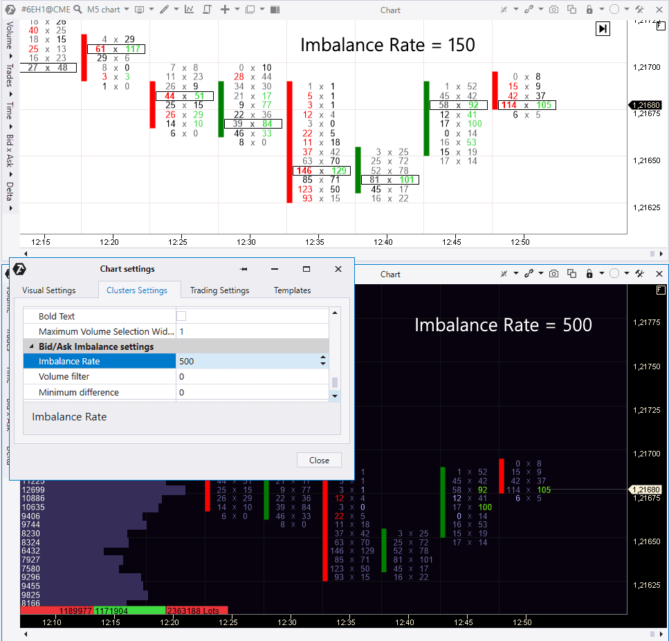
Bid х Ask Imbalance (6) is an interesting mode. This display is based on comparison of the Ask and Bid prices in the neighbouring cells. In other words, the market sell orders are compared with market buy orders diagonally.
If predominance of one of the sides is bigger on a set percentage, the winners are highlighted in the Footprint. If there are more sells, they are highlighted red. If there are more buys, they are highlighted green.
By default, the ATAS imbalance rate is 150%, which means that one of the sides should predominate the other by 150%. If you want to change the rate, go to the Cluster Settings and find the Bid/Ask Imbalance settings. If you increase the Rate, there will be less highlighted numbers in the chart.
Let’s have a look at the levels, which we get in the Imbalance chart. Let’s set the Rate=500%. We mark accumulations of highlighted clusters and see that the price often reacts to these levels. This method of level building will be good, at least, for market analysis. We can also turn off zero values in number couples in the Imbalance settings. Clusters will be ignored in this case.
Advice. Imbalance highlighting will be brighter and more vivid against dark background.
Useful articles:
The Delta mode
The Delta mode has 3 display variants.
The first one is called Delta (1). It displays predominance of aggressive buyers or sellers using the ‘Ask minus Bid’ formula. If there were more sells, the numeric value will have the minus sign and the cell will be highlighted red. If you see ‘-100’ in the cell, it means that there were 100 more sell contracts than buy ones.
If you select the Volume Delta (2) variant, the aggregate volume of all contracts will be displayed in the left column and Delta in the right one. This will help to understand how big the volume, in which Delta predominance took place, was.
The last variant is Delta Profile (3). It visualizes Delta splashes in a convenient form. If you see a significant predominance of the buyer, but the price goes down, you may assume that the buyer tried to take the lead but failed. This could give a hint with respect to the current trend direction.
Useful links:
Results of the third article of the ‘Getting acquainted with ATAS’ series
You have just got acquainted with the cluster chart basics and their display variants in the ATAS platform.
We recommend you to download the ATAS demo version in order to consolidate theory and feel the platform power and flexibility on your own.
You can take ideas for trading strategies from the playlist on our YouTube channel, dedicated to cluster analysis.
Information in this article cannot be perceived as a call for investing or buying/selling of any asset on the exchange. All situations, discussed in the article, are provided with the purpose of getting acquainted with the functionality and advantages of the ATAS platform.

