Renko Charts. How to build and trade Renko Charts.
Japanese traders applied renko for the first time in the 19th century. They called them “renga”, which means “a brick”, due to their rectangular shape. Steve Nison was the first who presented both renko charts and Japanese candles to the European and American public.
The main specific feature of Renko Charts is filtering out the market noise and improved visualization of the trend movement. If standard type charts, built on the basis of time intervals, produce too many false signals within your strategy, try Renko. Surely, you will have new ideas how to improve your trading with Renko Charts after reading this article.
In this article:
- how to build Renko Charts;
- what period to select for chart building;
- Renko Charts and chart patterns;
- Renko Charts and cluster analysis;
- logic of trading on Renko Charts;
- advantages and disadvantages of Renko Charts.
How to build Renko Charts
The trading and analytical ATAS platform provides a fast and simple way to display the price in the form of renko bars.
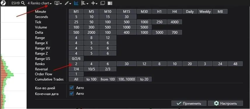
Open the chart of your market and select the period in the Renko upper menu item – and the ATAS platform will build you a Renko Chart in no time (the Japanese from the 19th century would have burnt with envy).
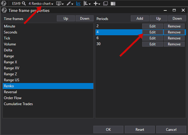
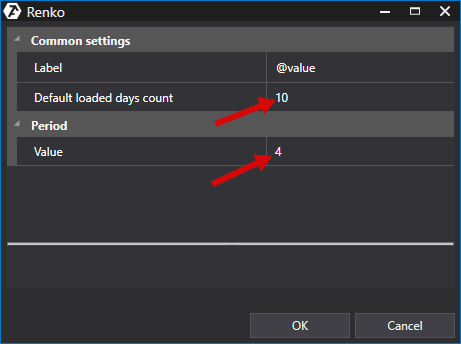
The picture below shows how to create your personal period for building renko bars.
Renko Charts are built in the form of a rectangle, which connects the upper and lower prices when the price changes to a set value. If the price changes to a lower than the set value, a new bar is not built. Renko bars do not depend on time. There will be more renko bars during the periods of high market volatility and less during quiet periods.
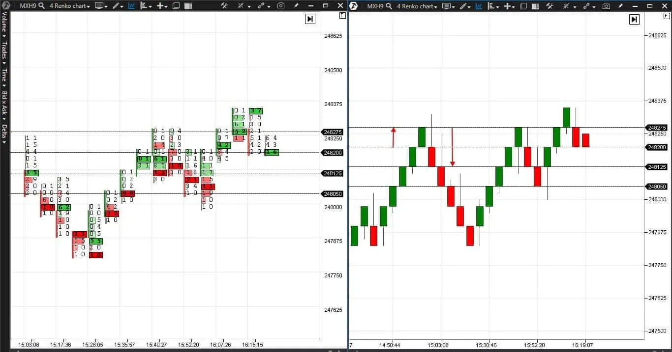
Let us consider an example of formation of renko bars with a 4 tick period on a MICEX index (MXH9) futures (what futures is). A MICEX index futures price tick is RUB 25.
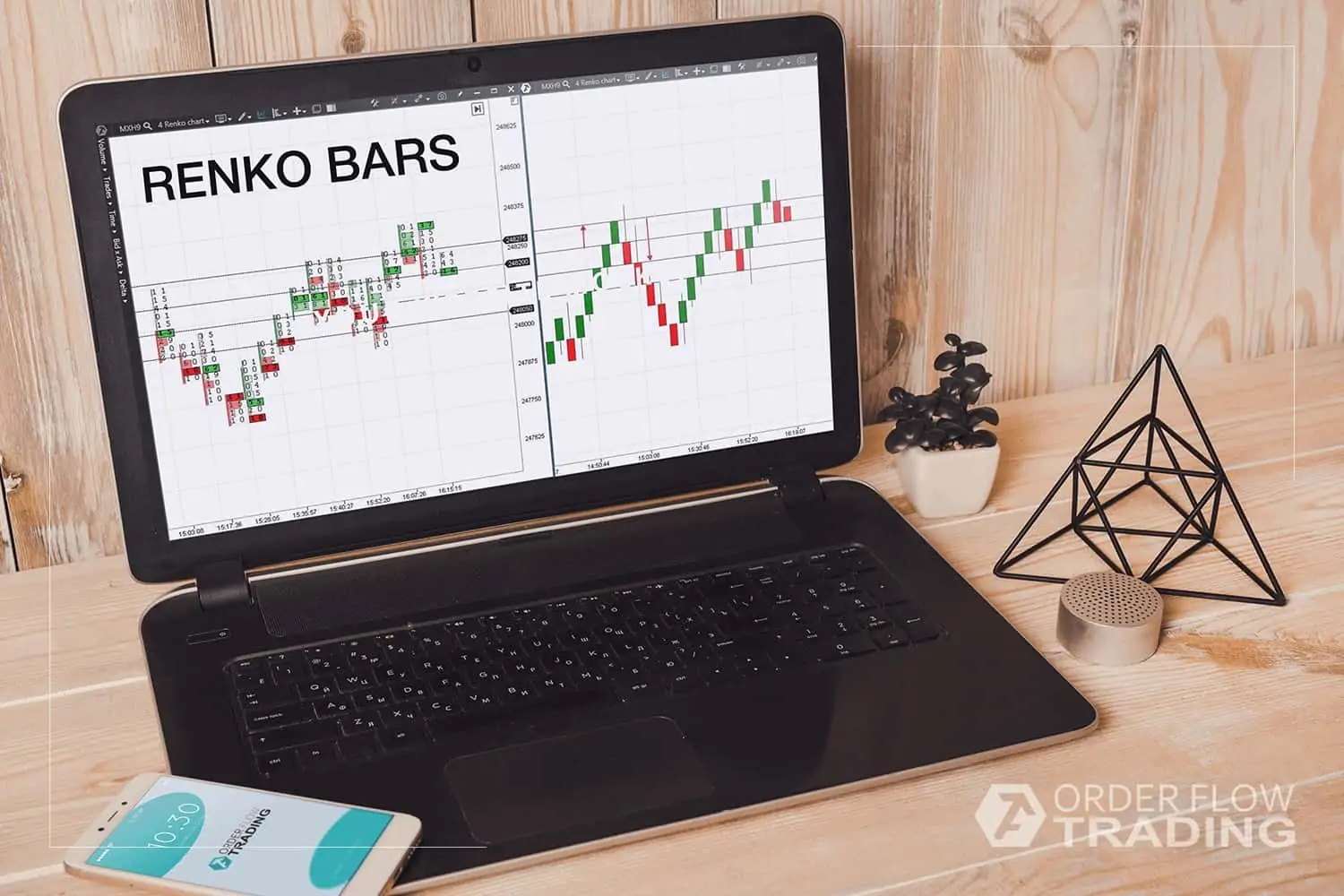
There is a cluster chart to the left. The opening and closing of the bars are marked by the price levels. There is a standard rectangular structure of the chart to the right. The price movement, which is required for formation of new bars, is marked with arrows.
The next bar appears when the price changes for minimum 4 ticks. A new bar in the same direction is opened at the level of closing of the previous bar. The bar is built diagonally at the 45 degrees angle.
The reversal bar in the opposite direction appears when the price changes for minimum 8 ticks, since it is necessary to pass the existing bar and build a new one below it. A new reversal bar will be opened at the level of closing of the previous bar. The bar is built diagonally at the 45 degrees angle.
What period to select for building a chart
We got used to the situation when periods in standard charts change in time – 1-minute, 30-minute, hourly and daily charts. However, the Renko Chart period is a price difference. This difference determines the renko bar size.
The size could be arbitrary. There are different methods of size selection for renko bars:
- by ATR (what ATR is);
- by percent of the asset value;
- by a method of acceptable risk selection.
Let us consider each method in detail.
Building Renko with the use of ATR.
ATR measures the asset volatility, which means that values would be different during different periods of a trading session and during different time periods. If you use this method, the renko bar value should be equal to the ATR value.
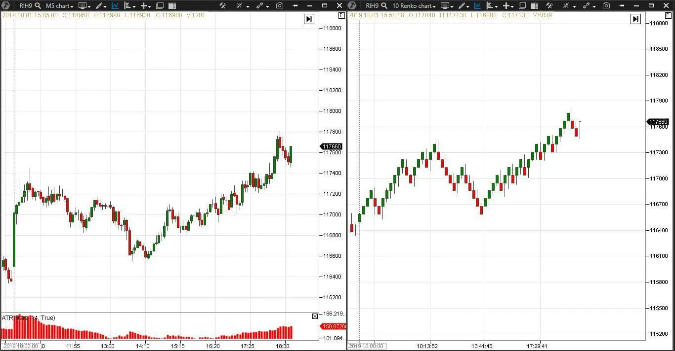
Example. There is a 5-minute RTS index futures (RIH9) chart and ATR (14) indicator to the left. And a Renko Chart with the period of 10 to the right. The average ATR value is 130, one RTS index futures – RUB 13.63 and the renko bar value is 130/13.63=9.53.
Building Renko by percent of the asset value
Some traders prefer to measure renko bars in percent of the asset value. You can use a range from 0.25% to 1%. The bigger the value, the less renko bars would be built and the chart will look more like a day chart.
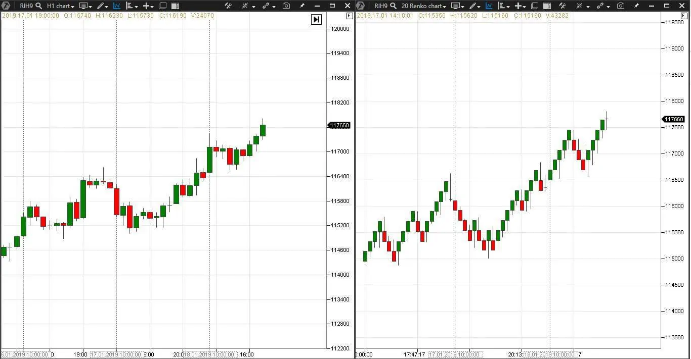
Example. The next picture shows an hourly RTS index futures (RIH9) chart to the left and a Renko Chart with the period of 20 to the right. If 0.25% of the RTS index futures cost is about RUB 290 and one tick of a RTS index futures is RUB 13.63, then the renko bar value would be 290/13.63=21.27.
Building Renko by the method of acceptable risk selection
When selecting the Renko “brick” size, you can take the size of acceptable risk as a basis. Then the minimum stop in the Renko Charts, when trading on reversals, would be equal to the size of the reversal bar. Consequently, the stop grows with the growth of the renko bar size.
| Cost of one tick of a RTS index futures in RUB | The renko bar size | The reversal renko bar*2 | The minimum stop for 1 contract in RUB |
| 13,63 | 4 | 8 | 109,4 |
| 13,63 | 6 | 12 | 163,56 |
| 13,63 | 8 | 16 | 218,08 |
| 13,63 | 10 | 20 | 272,6 |
| 13,63 | 20 | 40 | 545,2 |
Using simple mathematics you can select the renko bar size depending on the instrument volatility and your capital management strategy.
Renko Charts and chart patterns
Steve Nison thought that capabilities of the Renko Charts are limited and only reversal bars, which give good signals during the trend movement, should be traded.
However, this too much straightforward approach is undeservingly simple for the Renko Charts. Since practically all technical analysis instruments – chart patterns, trend lines and support and resistance levels – also work in the Renko Charts.
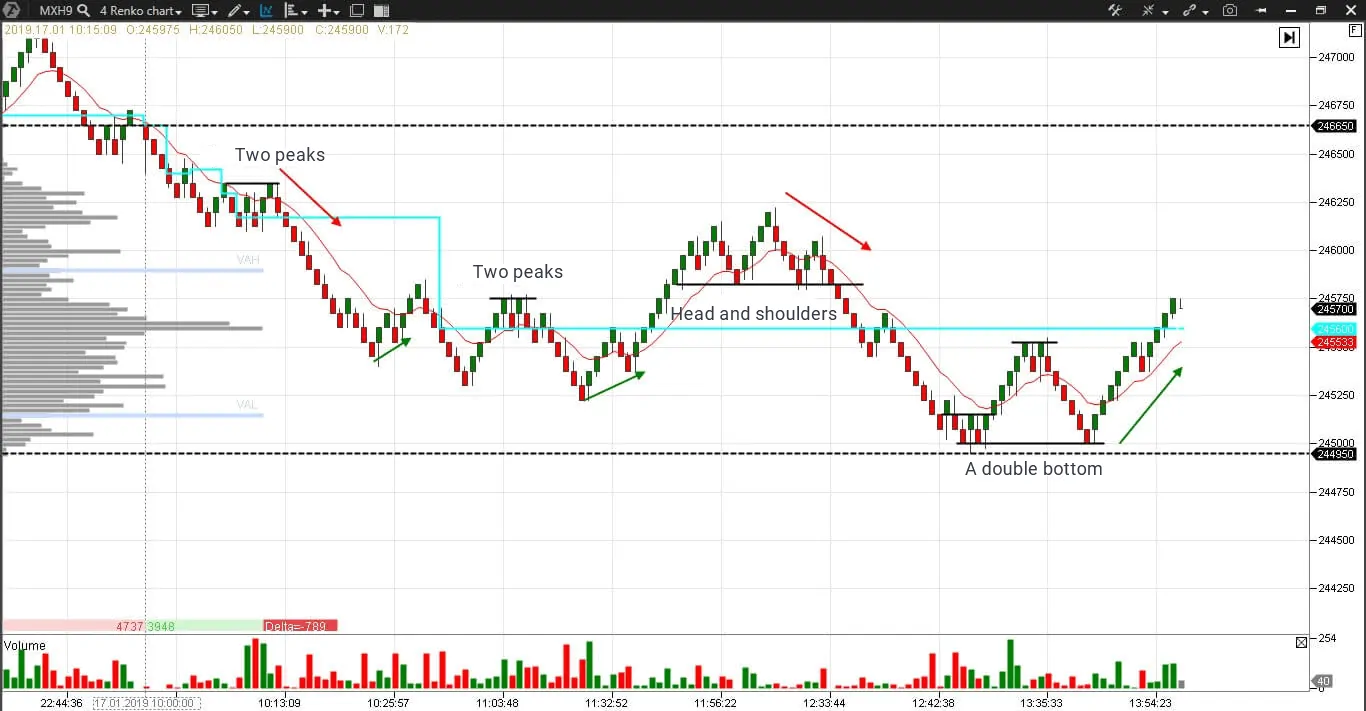
Example. Let us consider classical chart patterns in the Renko Chart (4) of a MICEX index futures (MXH9)
The chart shows:
- The maximum volume level – marked with a blue line with the help of the Dynamic Levels indicator. This indicator helps us to see movement of the maximum volume level during a day. This level serves as a support and resistance and also pulls up the prices, which went far away;
- The day’s high and low – (black dotted lines) serve as a support or resistance depending on the trend or range price movement. Interesting events, such as breakouts, bounces and tests, often take place at these levels.
How standard technical analysis patterns look like in the Renko Charts and how to trade them by classical recommendations:
- A double peak – selling from the neck level, which coincides with the maximum volume level, the movement potential is equal to the distance between the head and neck;
- A head and shoulders peak – selling from the neck level, the movement potential is equal to the distance between the head and neck;
- A double bottom – coincides with the day’s low, which increases significance of the reversal.
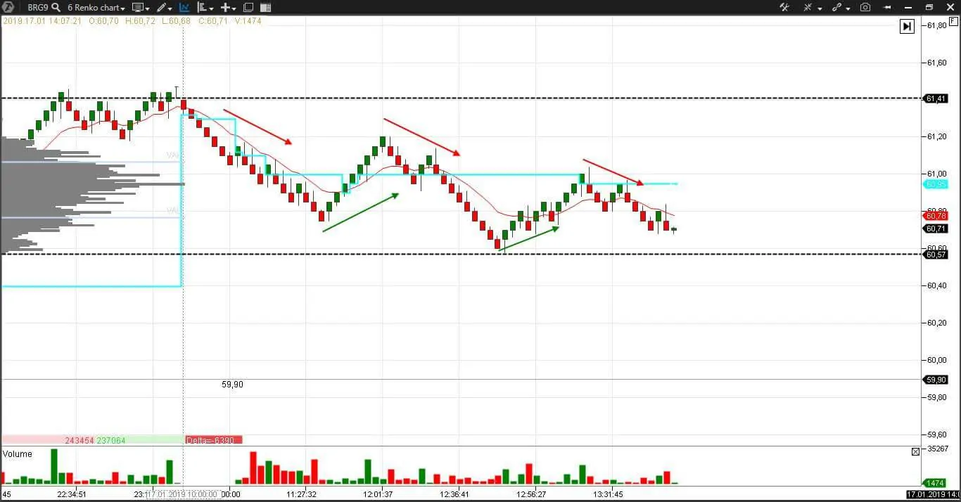
Let us consider one more example with the same settings but in a different market. This time – in a Renko Chart (4) of a Brent oil futures (BRG9).
There are no chart patterns here, but we can see:
- the downward peaks, which confirm the bearish trend;
- the maximum volume level, measured by the Dynamic Levels indicator, gradually moves down, which also confirms the bearish trend. Note how the price bounces down from the maximum volume level under the third arrow. This action is typical for a weak market;
- the day’s low plays the role of a short-term resistance level. A breakout or a double bottom pattern formation is possible at the second touch.
Renko Charts and cluster analysis
The trading and analytical ATAS platform provides a maximally convenient combination of the Renko Charts with the cluster analysis. You can expand the bars with one mouse movement and the Renko Charts will transform into a footprint, where you can see even minor details of what takes place at each price level in real time.
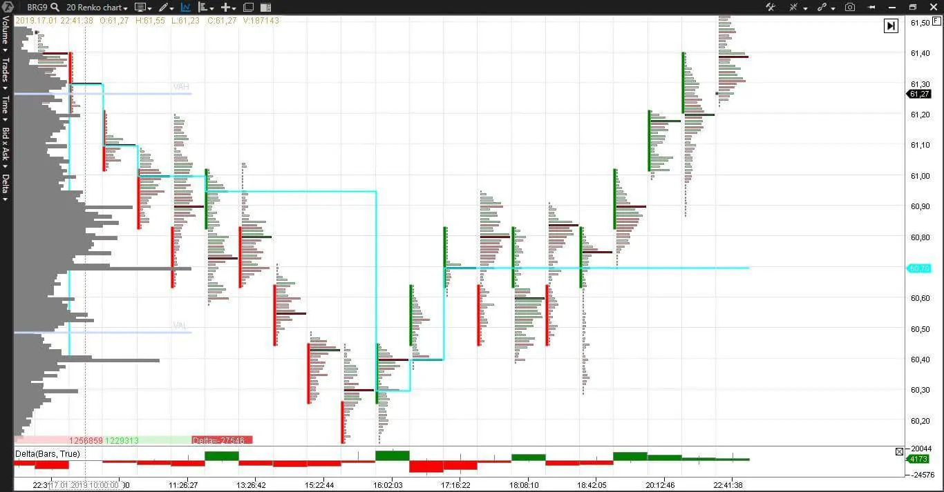
Example. Here is a Renko Chart (20) of a Brent oil futures (BRG9), which is expanded to the point when clusters appear.
The chart contains:
- The Delta indicator, which shows overweight of aggressive buyers or sellers in each bar;
- The Dynamic Levels indicator, which shows movement of the maximum volume levels during a day;
- The Horizontal Profile, which shows the current day volume distribution;
- The Bid/Ask Volume cluster type, which shows the order flow, price and volume in dynamics in each bar.
A reversal renko bar appeared at 16:02 on the day’s low. Activity was high and the maximum volume level also moved down to the reversal area. The bar was closed with a positive delta, which confirms presence of aggressive buyers. The price and maximum volume level move up on the next three bars, despite the resistance efforts of the sellers – the negative delta tells us about it. The price consolidates from 17:16 until 18:42. We can see the consolidation area, an exit from which, most probably, would be in the direction of the previous movement, by the shape of the cluster profile. The consolidation lasts until the 18:42 bar. We learn about it when the next bar closes above the maximum volume level and the delta is positive. The buyers achieved a victory, which is more readable with the help of the cluster analysis.
Renko Charts trading logic
General recommendations for the Renko Charts traders:
- look for a trend and trade only towards the main trend;
- an effort to catch the middle of a movement and of all reversals will be wasted when trading on renko bars;
- holding the profit until achieving a previously set aim will increase your profit;
- renko bars show the support/resistance levels and trading of reversals produces profitable results;
- an exit from the consolidation area, most probably, would be towards the previous trend;
- reversal renko bars are more reliable if they are near some significant level – the day’s high or low or the maximum volume level.
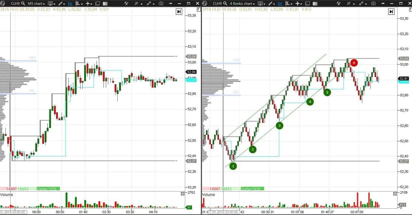
Let us consider one more example. Here is a WTI oil futures (CLH9). There is a 5-minute chart to the left and renko chart (4) to the right.
We added a new indicator, Daily HighLow, which shows dynamic movement of the day’s highs and lows, to a list of already familiar ones – Volume, Dynamic Levels, Horizontal Profile of the volume of the current day.
Judging by a horizontal profile we have a trend day, which is confirmed by the growing highs. The trend channel and probable buying points 1-5 are marked in the right part of the chart. Renko bars made this chart clearer. Figure 6 marks the trend channel breakout – it is a classical point of closing longs and profit fixation. A short position could be opened in this point, however, this tactics implies a higher risk, since there is a strong growth to the left.
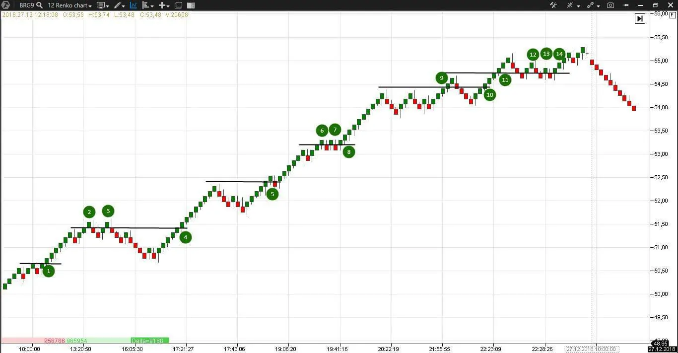
One more example of the Renko Chart Strategy in an explicitly trend chart. Here is a Brent oil futures – BRG9 (12).
This chart has nothing except for renko bars and short-term resistance/support lines, drawn one bar higher than the new high. The trading logic during a trend movement is simple – enter into selling every time when a new price high is confirmed. Trades 2, 3 and 9 will bring losses if stops are placed close enough. Trades 6 and 7 will be profitable if stops are properly placed. Trades 1, 4, 5, 8, 10 and 11 are profitable from the moment of opening. Trades 12, 13 and 14 are risky, since they are in the end of the trading session – it is more correct to fix profit on longs at this time. The general number of potential trades, without including three last ones, is eleven and only three of them are loss-making. If you accumulate your position gradually and move the stop with the help of protective strategies, you can significantly increase your portfolio on such days.
Advantages and disadvantages of the Renko Charts
Advantages
- Short stops at small renko bars
- Good clearness at trend movement
- Compatibility with the technical and cluster analysis instruments
- Compatibility with the wave analysis
- A small number of reversal bars and false signals at trend movement
Disadvantages
- Big price movement at reversal bars formation
- False signals at movement within a range
- Signal lag at big “brick” sizes
- Reversal bars are formed longer due to a big price movement
- The bars form consolidation areas at flat movement
- The bars are built too fast during volatility
Summary
“The one who pursues the goal, pulling all strengths together, will win”. Steve Nison
Renko Charts will become a useful instrument in your trading system. The more knowledge and possibilities you have, the bigger your competitive advantage in the struggle for survival in the cunning financial markets is.
Check our publications. We will soon explain how the Renko Charts go together with the Wave Analysis.

