Delta is the difference between market buy orders and market sell orders. It could be calculated:
- for a period of time (Vertical Delta);
- at the price level (Horizontal Delta).
Beginner traders often misjudge the Delta concept and its interpretation. The present article will help them to understand the Delta better.
We will also give some practical examples how to:
- set up the Delta indicator;
- use its readings for making trading decisions.
There is also a bonus at the end of the article.
How to understand the Delta
Beginner traders often wrongly assume that big positive Delta values mean a long net position of market players and big negative Delta values mean a short net position of market players.
In fact, positive values show that there were more market buy orders in a specific candle than market sell orders. And vice versa – negative values show that there were more market sell orders in a specific candle than market buy orders.
How could it be?
Given that every trade has a buyer and seller…
Trades take place when market and limit orders meet (are matched) and the price moves in the direction, in which aggressive orders send it. Main Delta patterns are associated with understanding who are stronger – aggressive traders that trade market orders or patient traders that trade limit orders.
In order to better understand the difference between market and limit orders and how they ‘meet’, we recommend you to get acquainted with the following resources.
Where to take the Delta indicator from
Many popular trading platforms of the basic level do not have the Delta indicator by default.
It is important to have good quality incoming data for the indicator trusted operation, namely, a flow of information about trades on the exchange. This information is sufficient for calculating various Delta variants in the platform.
ATAS has many approaches to use the Delta:
- the Delta indicator shows the difference between market buys and sells for every bar;
- the Cumulative Delta indicator shows the Delta, accumulated for a certain period of time;
- the Delta, as the base of calculating various indicators, for example, Cluster Search, will look for clusters with the set Delta values;
- chart visualization with settings by the Delta. Every new bar in such charts is built as soon as the Delta reaches a set value;
- the Footprint chart display modes in the form of Delta. Traders will see the Delta data at every price level in such clusters.
How to interpret the Delta indicator readings
In order to understand ‘messages’, which the Delta indicator sends us, you need to apply the effort and reward principle. What does it mean?
Similarly to any other life sphere, exchange traders want to have a reward for an invested effort. They expect that a big number of market buys will result in a higher price. And vice versa – a big number of market sells will result in a lower price. If it were so simple, traders, perhaps, wouldn’t lose their capitals so often.
Sometimes, in the market, the price increases when the Delta is negative and decreases when the Delta is positive.
Relation of the invested efforts, expressed through the Delta, and rewards (the price progress) – this is what you should pay attention to.
Interpretation of Delta patterns. Example 1
The first example, which we will consider, is called engulfing.
Such a situation occurs when a big number of market orders cannot push the price in a required direction. It means that despite the fact that the Delta falls or grows, the price stays in place and aggressive traders do not receive reward for invested efforts.
In order to see engulfing, it is more correct to consider not only every bar’s Delta but also the Cumulative Delta of a trading session.
For the purpose of increasing efficiency from trading by Delta patterns, try to mark significant support and resistance levels on senior time-frames and develop a trade plan beforehand.
Let’s consider an example in Euro futures (6E) charts. We will work with various chart types and periods.
First, let’s mark significant (in our subjective view) levels in a 30-minute chart with black horizontal lines and then consider cluster charts in order to assess engulfing. See Picture 1.
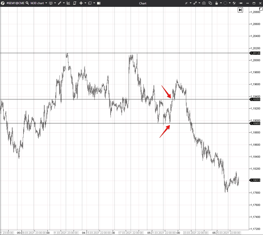
Building levels is a personal ability of every trader, that is why they could be drawn differently in one and the same chart.
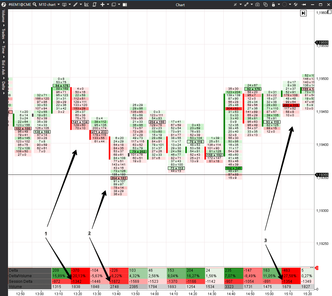
We marked two interesting situations with red arrows when the price was near the levels, which we found. Let’s consider them in more detail in a 10-minute period Footprint chart. We will add the Cluster Statistic indicator for convenience in order to be able to view actual information about the Delta and volumes in every bar at the bottom of the screen. See Picture 2.
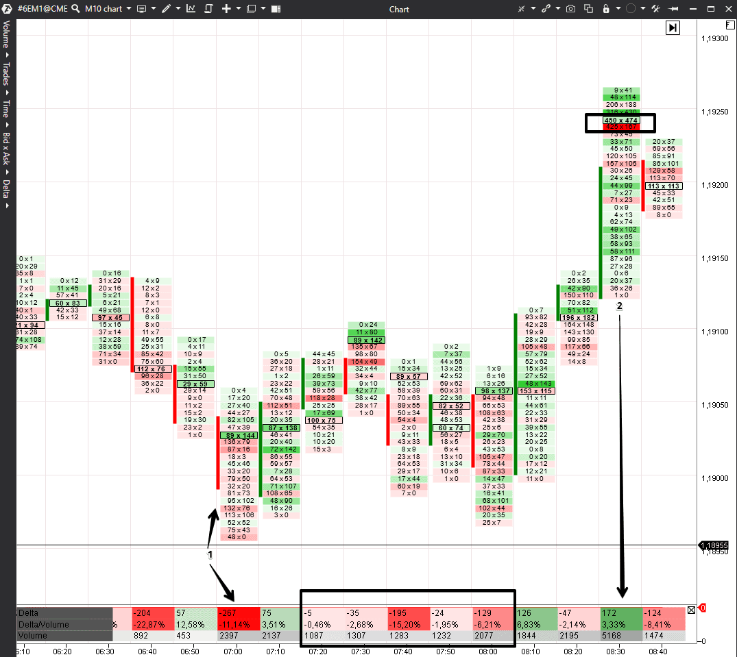
The Delta is negative in bar 1, but the price didn’t reach the level (which we marked) by 1 tick. In the next bars (which we marked with a black rectangle) – the Delta is negative, but volumes have decreased and the price moves in a flat. Perhaps, there are not many aggressive sellers at this level and traders with limit buy orders hold the level.
Volumes have sharply increased in bar 2, but there is no positive Delta in this bar. The big positive Delta is a significant excess of market buyers – more than 20-30%. However, we see only 3.3% here, which means that buyers and sellers fight between themselves, while the maximum volume level moves higher. The number of aggressive buyers is comparatively small and the price, perhaps, grows due to support of limit buy orders.
Let’s add the Session (that is, Cumulative) Delta to the Cluster Statistic indicator. It will help to understand better what takes place during engulfing. See Picture 3.
The Session Delta stays negative from bar 1 to bar 3, but the price doesn’t fall. The price slightly decreases in bar 2, but the bar closes above the set value. Someone engulfs the market sells every time the price approaches this level.
Interpretation of Delta patterns. Example 2
Engulfing could be seen with the help of other instruments, for example, the classical Delta indicator. It shows the difference between market buys and sells in the form of a histogram.
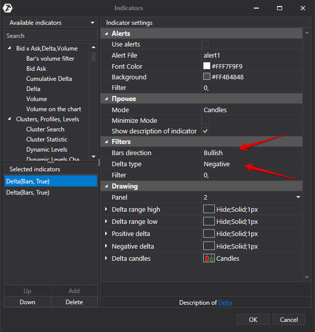
Let’s add two Delta indicators with unusual settings into the chart:
- The first one will show only bearish candles, in which the Delta was positive, in a separate panel. Limit sellers engulf market buyers here. Maximum levels and big clusters often serve as resistance levels in such candles.
- The second one will show only bullish candles, in which the Delta was negative, in a separate panel. Limit buyers engulf market sellers here. Maximum levels and big clusters often serve as support levels in such candles. See below a screenshot with settings.
See Picture 4.
These settings will help us to understand where aggressive traders tried to influence the price but failed. Traders invested efforts but received no reward.
You can use big time-frames (for example, hourly) on volatile instruments like cryptocurrencies. You can work on smaller time-frames on less volatile instruments.
Let’s consider one example in a 30-minute E-mini S&P 500 futures chart. See Picture 5.
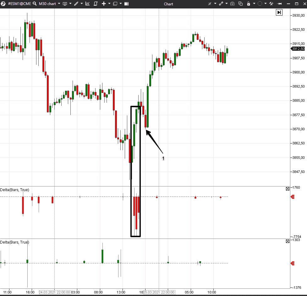
We marked three bars, where the price grew despite a huge negative Delta, with a black rectangle. It means that limit buy orders definitely engulfed market sellers here. Market sellers are forced to close short positions, pushing the price even higher, when they get in such traps.
There is a small test in point 1, after which the price moves up once again.
Interpretation of Delta patterns. Example 3
Let’s consider now another pattern, when traders with market orders invest efforts and receive rewards. As a rule, it is a trend movement, trading against which is inefficient and dangerous for a trader’s deposit.
We will consider this example in a USD to RUB exchange rate futures (SI) chart. This contract is traded on the Moscow Exchange. Traders have advantage here compared to other exchanges because the Moscow Exchange shows Open Interest data in real time. The Open Interest helps you to understand whether traders open new contracts or close old ones.
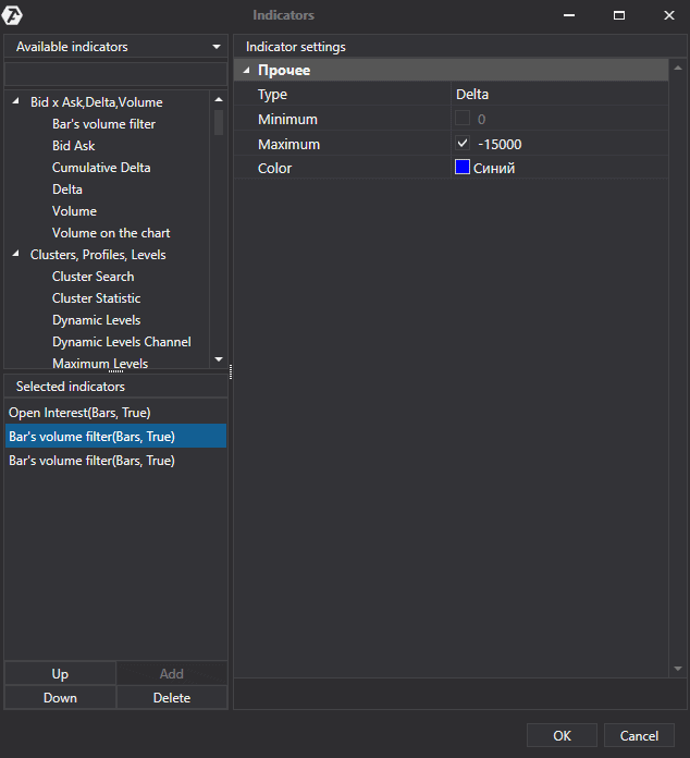
We will add two Bar’s volume filter indicators for this example:
- the first one will mark blue those bars, in which the Delta is less than 15,000 contracts;
- the second one will mark yellow those bars, in which the Delta is more than 15,000 contracts. See Picture 6.
We will set up the Open Interest indicator in such a way so that it would show only growing bars. To do it, we will make falling bars and their boundaries transparent. Having done it, we will see only green candles in those bars where traders opened new trades. See Picture 7.

In order to confirm a growing trend, we should see:
- growing Delta,
- growing price,
- growing Open Interest.
If these three indicators coincide, you shouldn’t open short trades. It is more reasonable to open long positions in order to join those, who participate in an uptrend, as soon as possible. The only blue bar is, most probably, registration of long position profits, since the Open Interest doesn’t change and the market has just reached a local high.
Bonus – video
We propose you to watch this ↓ video in conclusion to the article. It will help you to solidify the material of this article.
Here are some useful articles about using the Delta:
- How to use the Cumulative Delta indicator.
- Strategy of trading by the Delta and Vertical Volume.
- Ideas for trading by trend with the help of the Delta chart.
Information in this article cannot be perceived as a call for investing or buying/selling of any asset on the exchange. All situations, discussed in the article, are provided with the purpose of getting acquainted with the functionality and advantages of the ATAS platform.