Candles patterns & clusters at M5 chart
Forex beginner traders tend to practice their initial knowledge opening small timeframe positions. Moreover, they usually use simple patterns, which use forex candles. This happens because:
- small timeframes, such as 5-minute ones, exclude long waiting. They allow immediate feeling of a faster heart beating when they see profit or loss fluctuations;
- forex patterns, built on the candlestick analysis, are simple and it is easy to study and see them in the chart.
However, there is a danger of making loss here. Why? According to the literature on technical analysis, candlestick patterns are not efficient on the timeframes below H1. Consequently, forecasting future price movements on small timeframes by forex candlestick patterns looks like gambling. You might be lucky today, but tomorrow you may lose a half of your deposit, since after making first profit beginners usually do not follow the money management rules and start gambling.
How to increase trading efficiency if you want to trade candlestick patterns with small periods?
Read in this article:
- classical forex candlestick patterns in 5-minute chart;
- classical trading analysis by candlestick patterns as an effective way to increase trading efficiency;
- indicators that help you to understand the currency market better;
- trading patterns, candles and clusters in a GBP/USD futures example.
We will use currency pair futures within this article. These regulated markets, which function on official exchanges, are an advanced alternative for the popular EURUSD chart in the Metatrader terminal, which most of beginners use as a starting point on their way to search for a profitable strategy.
Candlestick patterns on 5-minute timeframe
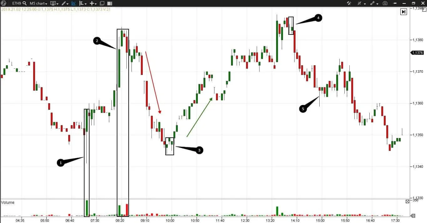
Here we have a 5-minute candlestick chart of EUR E-mini futures (E7H9) and the volume indicator. It is a standard set for the trading pattern analysis.ттернов.
It is difficult to find here ideal candlestick patterns, described by Steve Nison. Nevertheless, we can note the following candlestick patterns in this chart:
- Number 1 marks a candle with a long bottom shadow. Alexander Elder calls these shadows a kangaroo tail. These trades are opened in the basis of the candle body in the from-the-tail direction and the stop is posted approximately in the middle of the tail. If the next candles start to “chew the tail”, you should exit from the trade. An increased volume of buys was formed in this candle, which confirms a possibility of opening a long trade;
- Number 2 marks a group of candles, which would form a reversal, since an increased volume of buys is followed by an increased volume of sells. A volume, which is more than two times bigger than a usual one, can warn about a trend change;
- Number 3 marks a group of candles, which might have resembled hammers, if their bottom shadows would have been longer;
- Number 4 marks candles that look like harami and a falling star. Being on top, they can warn about a trend change;
- Number 5 marks a hammer in the bottom of a short-term bearish trend, which shows a reversal;
- Red arrow marks a short-term bearish trend where candle closings are located at the low and below the low of the previous candle, which confirms the candle strength;
- Green arrow also marks a short-term but bullish trend. Candle closings are at the high and above the closing of the previous candle.
Trading solely by the candlestick patterns in the above chart is not based on real market mechanics, hidden behind the candlestick shadows and bodies. This does not add confidence in correctness of the opened position and reduces trading efficiency both in short-term and global prospects. Let us try to improve this situation.
Candlestick 5-minute chart and ATAS indicators
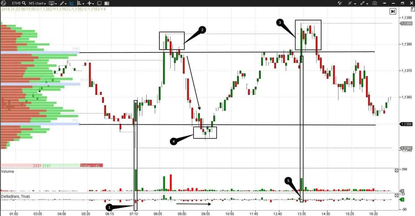
Let us add advanced ATAS indicators to the same trading day in order to increase confidence and add some justification to the decisions made.
We added:
- The delta indicator, which shows aggressive buyers or sellers in green or red colors;
- The daily highlow indicator, shows the upper and lower levels the price reached during a day;
- The horizontal volume, which shows in the left panel how many bids and asks were at each price level. The Value Area includes 70% of the traded volume. POC (Point Of Control) is the level at which the maximum volume of the day was traded. All levels are dynamic.
For better visibility we marked the lower and upper boundaries of the Value Area with black lines across the whole chart. What details we can see differently after adding new indicators:
- The tailed candle marked with number 1 is at the day’s low and lower boundary of the Value Area. The delta of this candle is negative but its long shadow tells us that there are buyers who offered struggle to sellers and moved the price up, forming a kangaroo tail. Long shadows on the delta and inside the candle itself confirm its reversal nature;
- Numbers 2 and 3 mark upthrust or false breakouts of the day’s high and upper VAH (Value Area High) boundary;
- Along with the fall of the price from point 2 to point 4, the delta is stably negative and confirms the short-term bearish trend;
- Number 4 marks spring and a failed breakdown of the lower boundary of the Value Area. Note that the action under consideration is at the level of the candle’s tail, marked with number 1. The price tests this level and cannot go lower. If you read this spring, you get an idea to enter the trade with a small stop;
- Number 5 marks an interesting candle, which is a part of upthrust under number 3. The buyers break the upper boundary of the Value Area after a big volume consolidation. The delta can understand whether this breakout is true or false, and the delta is positive but with a long upper shadow. Perhaps, it is an activation of stop losses of bears over the previous local high. The negative delta in the next candles tells us about sells. The new day’s highs with the change of the delta to negative are signs of a reversal. This information adds arguments to the assumption that the breakout is false.
So, the delta and horizontal volumes confirmed possible trades, reduced stops, increased profit and saved some nerve cells. Can we add even more transparency into our considerations and further trades? There’s no limit to perfection.
Cluster analysis in trading
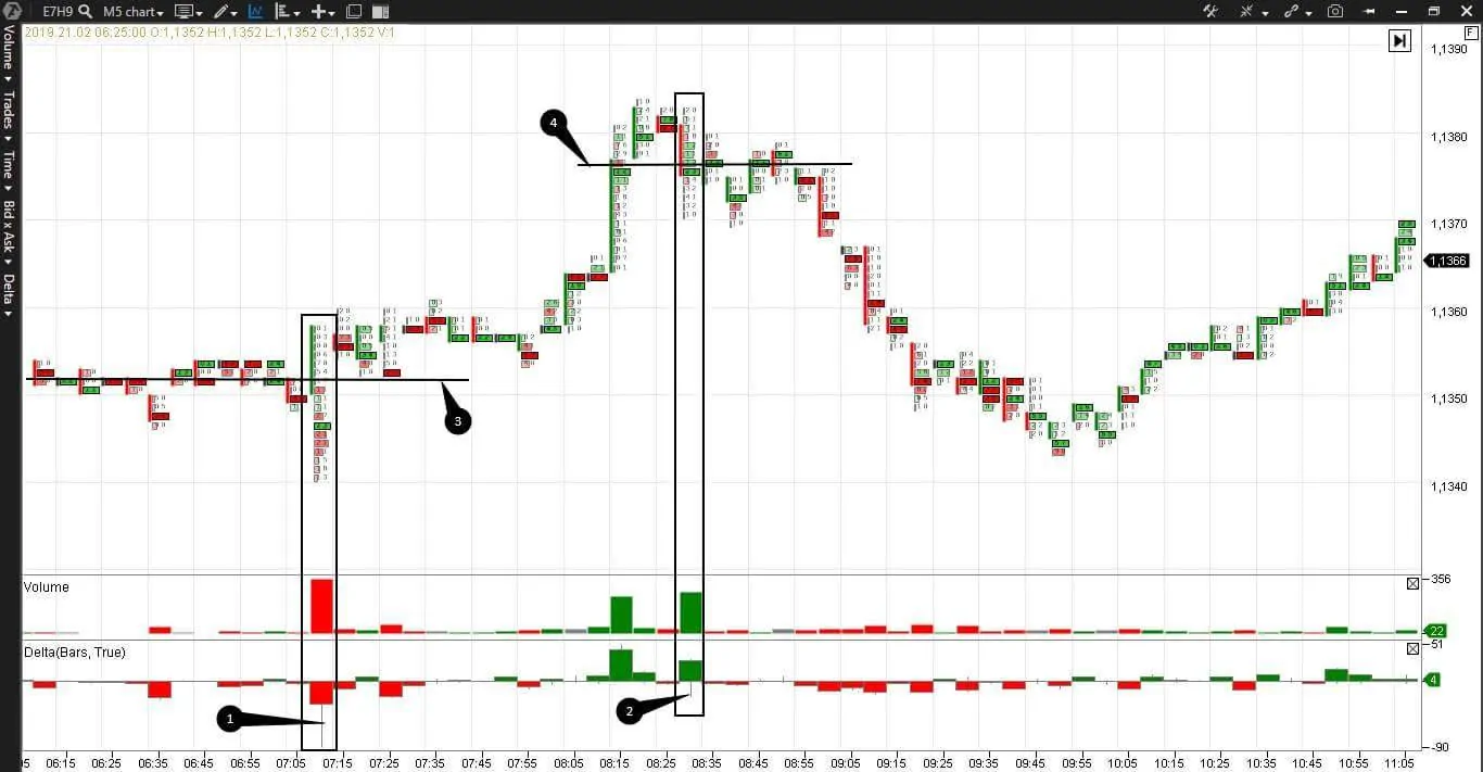
Let us try clusters. First, we would see what advantages we can find in the Bid/Ask Volume cluster chart in the beginning of a day.
- Number 1 marks the already familiar tailed candle. The price consolidates before it and the maximum volume levels of the nearest bars are marked with a black line under number 3. Exhaustion of sells can be seen at the low of the marked candle. The price does not go below the level we marked, which became the support level. Note that we can enter a trade just 1 tick above the support level twice after the marked candle;
- Number 2 marks a reversal candle at the day’s high – buys are dried out at the candle high and the maximum volume level is lower than the previous candles and support level;
- Number 4 underlines the maximum volume level at the day’s high. This level becomes the resistance level. Here we also can enter a trade several times with a limit order exactly at this level and the stop would be 3-4 ticks only.
Formation of the support and resistance levels just in front of the trader’s eyes allows entering into a trade with limit orders and with reasonable restriction of possible losses.
Cluster 5-minute chart and ATAS indicators
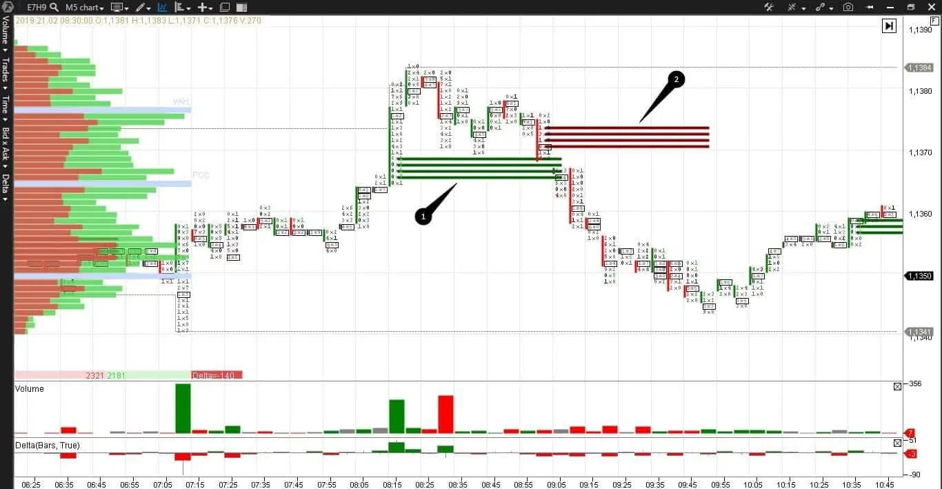
Now we add a unique Stacked Imbalance indicator to the cluster chart and we will see at what levels there were more bids or asks (what bids and asks are). In other words, the indicator shows at what price levels there were more sellers or buyers. And again, we study the same 5-minute chart of a EUR E-mini futures (E7H9).
- umber 1 marks imbalance of buyers;
- Number 2 marks imbalance of sellers at the level of the previous high of the day.
The day’s high breakout looks quite trustworthy after appearance of the first imbalance. However, the second imbalance tells us that the breakout failed. In other words, the goal of the breakout was setting a trap for bulls. In such a situation it is more expedient to follow the most recent imbalance, that is why it would be logical to open short positions.
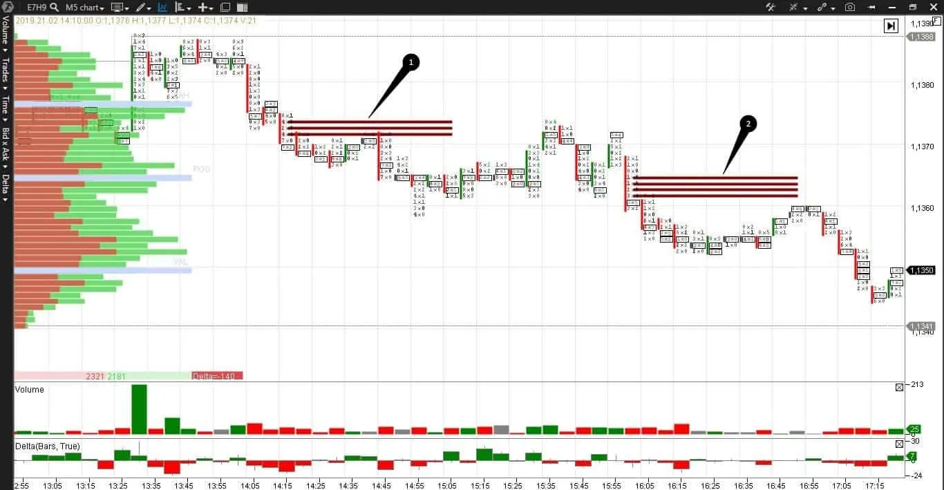
We continue to elaborate the second half of the day and again see sellers’ imbalances under numbers 1 and 2. The indicator not only allows the traders, that were late or inattentive, entering the trade but it also allows the traders, that were attentive, accumulating a short position. As a rule, the candles that follow imbalances test the marked price area at least once.
Candlestick patterns on a GBP/USD futures
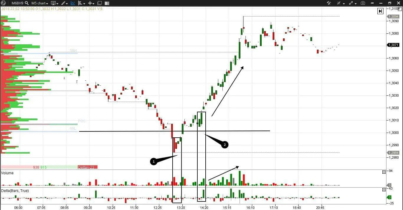
Let us consider the candlestick pattern in the chart with ATAS indicators on the E-micro GBP/USD currency pair futures (M6BH9).
- We already know the delta, volume and horizontal volume indicators. Again we do not find ideal candlestick patterns. Those who trade ideal forex candlestick patterns might stay out of bounds, but the traders that use the cluster analysis will find their entry points.
- Number 1 marks spring at the lower boundary of the Value Area. In this case, the delta does not send warning signals, since it stays negative;
- Number 2 marks the test of the lower value area. Growth of volume and delta confirms a reversal and further price growth;
- The green arrow marks a short-term bullish trend. Candles are closed at the high and above the closings of previous candles;
- New price peaks coincide with new volume peaks, which confirms strength of the bullish trend.
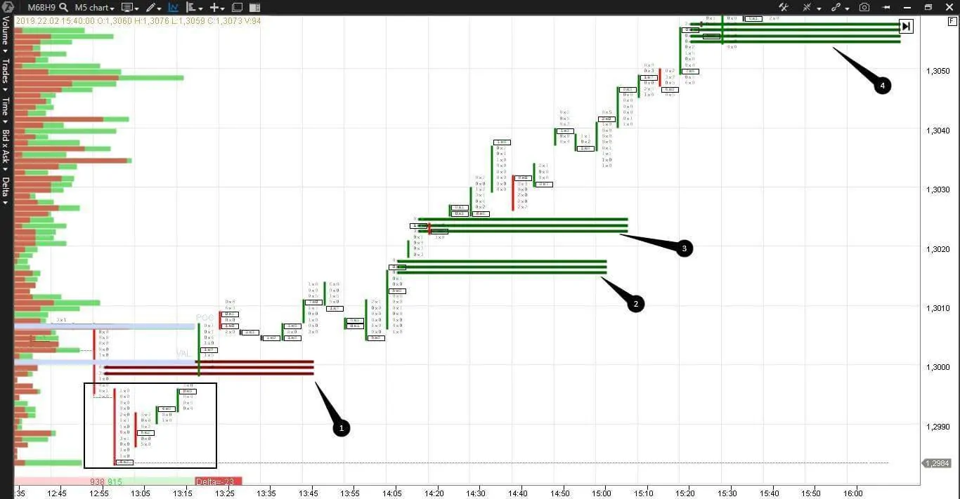
Let us consider the same reversal in the cluster form with the Stacked Imbalance indicator, which we discussed recently.
Number 1 marks the sellers’ imbalance. The sellers failed to hold this price and the imbalance became the first support level. Imbalances of buyers marked with numbers 2, 3 and 4 became the next support levels.
The maximum volume levels of each bar, in the spring marked with a rectangle, go up, warning us beforehand about a possible reversal. Using the cluster analysis we managed to post limit buy orders four times at various price levels, aggressively accumulating the position or cautiously waiting for confirmation. It is convenient to use the previous stacked imbalance levels for the stop orders trailing.
Summary
It is possible to work with conservative methods of technical analysis and Japanese candle patterns in the 21st century. You can even draw charts on paper and build forex patterns manually. But, of course, it is an outdated approach.
As well as we use dish and laundry washers to make our life simpler, let us be in tune with the times and increase our competitive advantage using new technologies. Increase the comfort and efficiency of your trading with the help of a cluster analysis and modern indicators.
We also hope that this article will help the Metatrader users, who trade forex patterns, to broaden horizons. Discover the endless elaboration of the trading activity in the currency markets with the trading and analytical ATAS platform.

