- Graphical horizontal levels. These are horizontal levels, built by one or several extreme points, from which the price bounced in the past. These levels are commonly used by many different traders.
- Indicator horizontal levels. There are some indicators (Pivot Points, Murrey Math Lines and others), which build levels by themselves, while a trader can monitor interaction between the price and levels, built by the indicator.
- Indicator dynamic levels. Indicator lines could also be considered as levels. For example, these could be moving average lines with the periods 50,100 and 200; Bollinger Bands; Ichimoku indicator lines; etc.
- Fibonacci retracement levels. They help to identify the retracement depth after an impulse and the length of a new trend.
Most probably, traders use a big number of other methods for building levels. The main issue is how to identify efficient levels among this variety. Which of the identified levels are really important for the market and which are not?
You need a reliable check-out instrument.
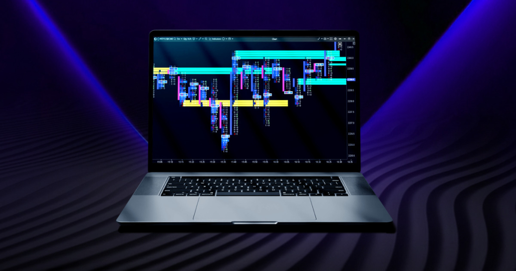
Cluster chart is your assistant in level analysis
One instrument, which can help you in working with various levels, is the cluster chart from the trading and analytical ATAS platform. The cluster chart allows seeing and analysing not only the price but also volumes and direction of executed trades inside every candle.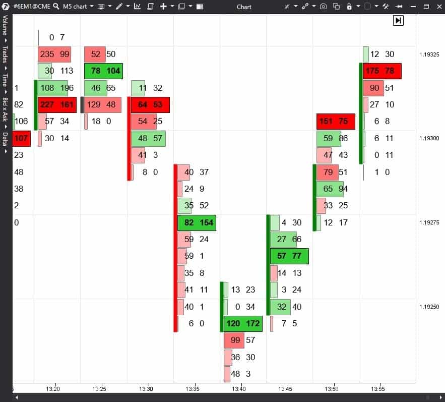
The cluster chart will help you to increase efficiency of trading by levels. Let’s consider several examples in detail to see it. There are two methods, with the help of which you can trade:
- A level breakout.
- A bounce from a level.
Level breakout
First, we will consider a level breakout.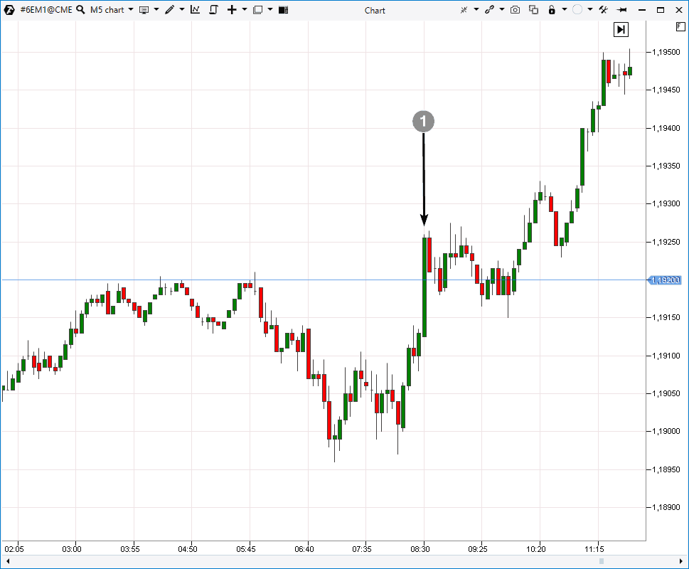
To find the answer, let’s consider this breakout with the help of the cluster chart:
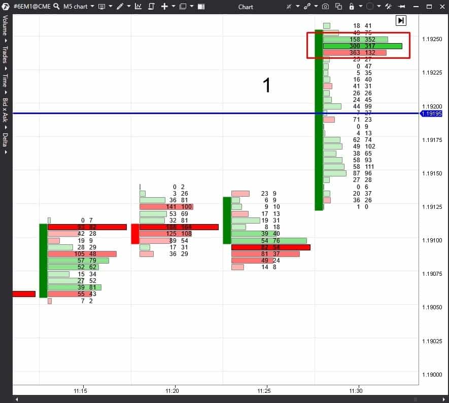
The maximum trade volume took place above the level. In the result of this fight between sellers and buyers, the price was pushed up since the candle closed near its highs. There were more buyers than sellers in the maximum cluster (judging by the green Delta).
A conclusion could be drawn from these data that, most probably, it was a true breakout. Now, a trader can act in accordance with his trading system.
So, what you should pay attention to when analysing a level breakout with the help of the cluster chart:
- Have bulls or bears (depending on the breakout direction) managed to move the maximum cluster behind the level?
- Is the maximum cluster volume of the breakout candle bigger than the maximum cluster volumes of the previous candles?
- What was the price reaction to the volumes, traded in the maximum cluster? Did the candle close near its highs or lows? In the event of a true breakout, the maximum volume should push the price in the breakout direction.
- If it was an up breakout, were there more buyers in the maximum cluster or sellers? And vice versa if it was a down breakout.
Having analysed these issues, a trader may formulate a judgement whether this level breakout was true or false.
If the breakout is false, it is transformed into a bounce from a level.
Let’s consider examples of bounces from levels.
A true bounce from a level
The screenshot below shows an M5 candlestick chart of the same futures: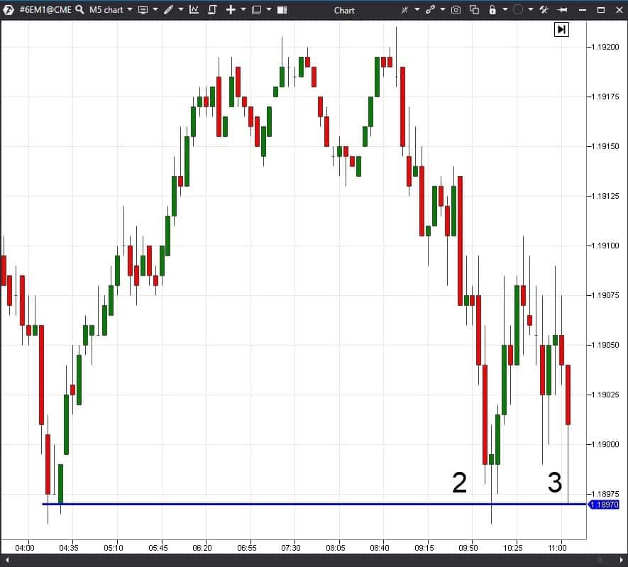
Let’s consider these points with the help of the cluster chart.
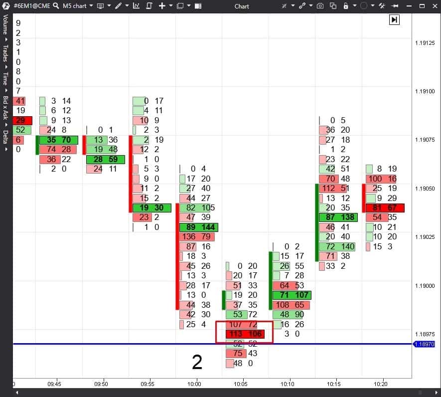
Everything tells us that, most probably, there was a bounce. However, one thing can get your attention – the selling volume in the maximum cluster is higher than the buying volume (that is why the cluster is bright red). It is better to wait in such a situation.
And here is how the cluster chart looks like in point 3:
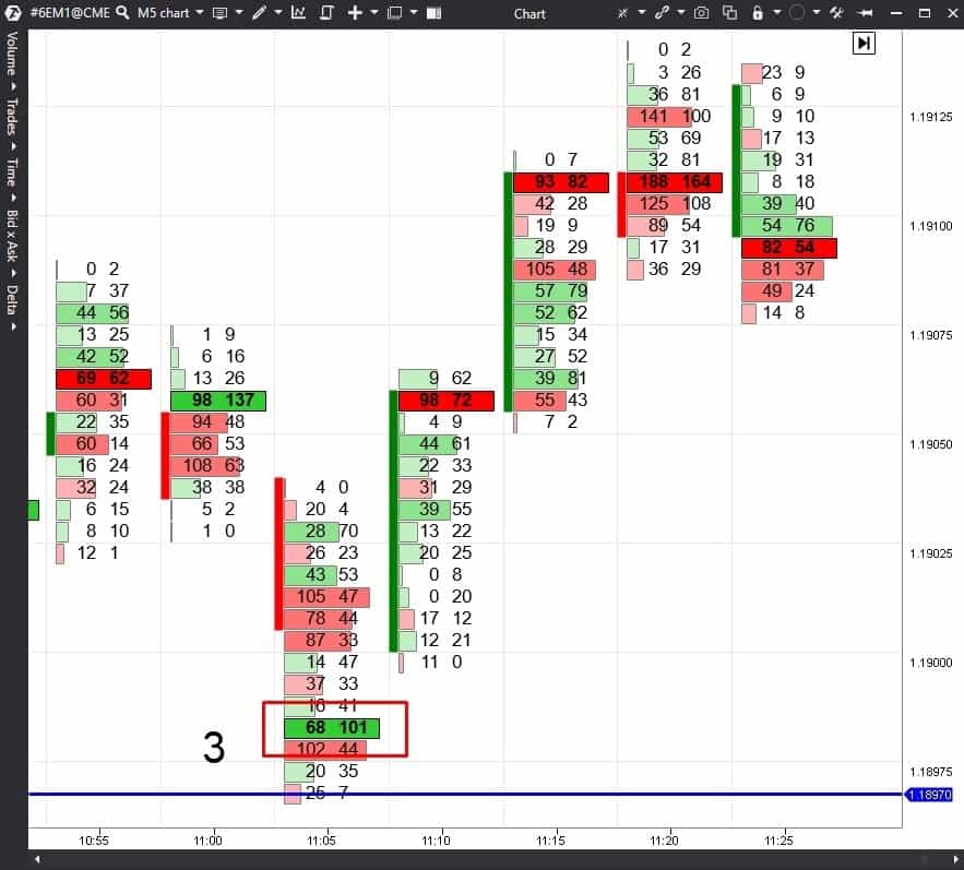
That is why, there is a high probability that this point is a true bounce from the level and a reasonable point for entering into buys.
It is important to pay attention to the following data in the chart for identifying a true breakout:
- Did the maximum cluster stay above the level in the event of an up bounce or under the level in the event of a down bounce?
- Is the maximum cluster volume of the bounce candle bigger compared to the previous candles?
- How did the price react to the ‘volume inflow’ in the market? Did the candle close above the maximum cluster in the event of an up bounce or below it in the event of a down bounce?
- If it was an up bounce, were there more buyers than sellers? Everything is opposite in the event of a down bounce.
Analysis of a situation in the cluster chart is like study of the market through a magnifying glass. Clusters provide advantage since they contain valuable information for making decisions.
You can use the cluster chart on any time-frame – both for intraday trading and middle-term one.
Conclusions. What to do in practice
Levels are an efficient instrument in trading and it goes without saying that it should be used. However, in doing so, it is important to check how the market reacts to one or another level.In order to reduce a number of false entries into the market, you should use the cluster chart in order to analyse behaviour of buyers and sellers in-depth and understand who had a local win in this fight.
In order to identify a true breakout or bounce, you should pay attention to:
- the size of the signal candle maximum cluster;
- selling / buying balance in this cluster;
- price reaction to the volume inflow into the market;
- location of the maximum cluster and closing price with respect to the level.
Download the test version of the ATAS platform free of charge. Use the cluster chart in your trading for increasing efficiency of your strategies.
Information in this article cannot be perceived as a call for investing or buying/selling of any asset on the exchange. All situations, discussed in the article, are provided with the purpose of getting acquainted with the functionality and advantages of the ATAS platform.